Post-contest Help/Critique of my November Contest Entry
-
Hi Everyone!
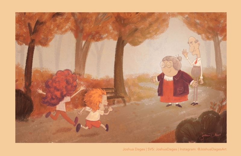
I have really been trying to learn from each Critique Arena and apply it to my drawings. I haven't made the top 16 yet (or the top 30ish this month), so I'm wondering if anyone has any thoughts on my piece for "Together."
I really felt like this is one of the best pieces that I've done so far, so I think I'm blind to what could be better.
 I know that showing the kids from behind was a mistake, but am wondering what else I could rework, even if it means reworking the whole piece.
Any help would be much appreciated! I really want to figure out how to get better, and could use some good feedback. Thanks! (Image below)
-
@JoshuaDages This is a lovely piece! I think it's lacking a bit of value range - not enough contrast. Everything is in that middle gray range. The girl's hair is getting really lost in the foliage for instance. I also feel like the presentation could be improved? The illustration has a kind of heavy sepia look to it, I think you could boost the whites and brightness to make the illustration much more luminous and ditch the beige border that's also very heavy feeling.
Overall, I absolutely agree with you that it's probably the best piece I've seen from you! You're improving by leaps and bounds and that's a very exciting thing
") The style is also much better suited to picture books than the previous style you were doing with big black outlines. But it is going to be an adjustment to not rely or those outlines and instead have enough contrast in the piece for each element to stand out even without the outline.
The style is also much better suited to picture books than the previous style you were doing with big black outlines. But it is going to be an adjustment to not rely or those outlines and instead have enough contrast in the piece for each element to stand out even without the outline.vanessastoilova.com
instagram.com/vanessa.stoilova/Check out my Youtube channel for tips on how to start your career in illustration! www.youtube.com/c/ArtBusinesswithNess
-
@JoshuaDages the biggest issue I’m seeing that the girl’s hair is the same color as the bushes. Maybe color her hair brown or something that standout against the red.
Portfolio: nyrrylcadiz.com
Instagram: https://www.instagram.com/nyrryl_cadiz/
YouTube: https://www.youtube.com/channel/UCbJCF1Im8ZO7hpGWTKOJMuA -
@JoshuaDages agree with @Nyrryl-Cadiz the girls hair just blends into the background.. maybe you could darken it up.. also maybe add more shadows and have more contrasts in the composition.. make the path in the foreground more warmer and cooler as it fades away.. also the placement of the characters.. maybe you move their placements to make it more interesting . Hope this helps
-
@NessIllustration Thank you so much for the encouraging words. I see what you mean about the value range as well as the sepia and border. All things that I am looking forward to working on now!
And yes, I am struggling to get away from the black lines. I come from more of an ink pen background so it's difficult! (Even my #draw50things still has them, haha!)
Thank you again for your help!
Josh -
@Nyrryl-Cadiz Thanks! I agree that her hair needs to be darkened. Would you say that turning her head to show her face a little might help as well? I think that could add to the image and get away from the back-of-head 'sin' in illustration.
-
@Rekha-Salin-0 Thank you! That's a great idea about the path. Color is not my strong point, so I'm still trying to teach myself the ins-and-outs of warm and cool color contrast with lighting. I will work on the character placement as well! Thanks again!
-
@JoshuaDages yes that would help too.

-
I agree with what’s been said already about contrast. Also Maybe you can find some sort of middle ground when it comes to outlining? If you’re wanting to get away from it but it’s also what you’re used to? Play around with your inking a little
-
@JoshuaDages one critique I will add is that you almost never have a character's back to the viewer. (According to Jake and Will)
-
@powsupermum Thanks! Yes, it's good to find that comfortable middle ground, even though it can be challenging to figure out.
-
@chrisaakins Agreed! Working on it now. Thanks!
-
Hi Joshua! The image is very sweet. I like the grandma character a lot.
I think the biggest improvement would be better value structure. Just more contrast and better silhoullettes, value consistency within bigger shapes, clear edges will help a lot. Comparing adjacent colors : is it darker/lighter , is it warmer / cooler color?
Maybe just thinking, what time of a day, weather and light condition you want, might help. And get reference for it if needed. To me it feels like there is a wet, foggy weather in the park, which doesnt corespond with the storybeat.
The limited color pallette is a nice idea, but the colors feel a bit incosistent for instance in the girls hair (i suspect you used red to attract more attention).
Some other ideas to try:
Some experimenting with poses (grandma's more opened arms; grandpa more next to grandma, maybe kneeing, waiting for hug...; the kids feet make quite a tangent there, just showing a little of girls face)?
Creating visually clearer path of running characters with big bush shapes?
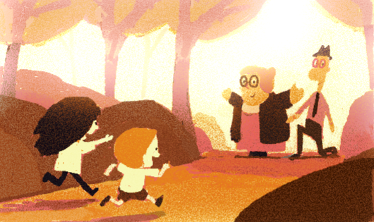
Putting the grandparents characters a bit up hill with overexposed bloomed light behind them to make them more heroic?A little scribble to see what i mean
-
Everyone else already said what I would have added
BUT didn't you do a really strong oz cover? I'm thinking I remember your oz cover and really loved it....was surprised it didn't make top 16! -
@marek-halko Again, thank you so much for taking the time to sketch out your ideas! I really love how you've changed the perspective and can also see what you mean about the colors (your color palette for your November piece was amazing, by the way).
I will continue to work on this piece and am excited to take into account all of your notes. Thanks again!
-
@Coley Thank you for your kind words about my Oz cover. I am very proud of that one as well and have added the updated version to my portfolio website!
-
Hi @JoshuaDages
Here is my 2 cents
I really like your characters and art style.
I agree with my fellow artist.
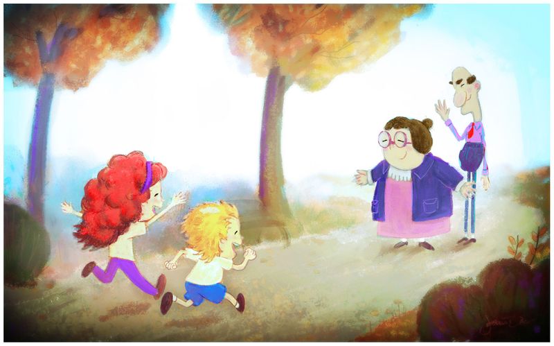
I wanted to give you constructive feedback by respecting your art style and painting over your existing illustration.
wanted to show you color variations, warms vs cools, color variety, and by adding neutral colors, you could achieve a very fun color illustration.
I think your original color pallet was too monochromatic
I hope this was helpful.
Keep up the good work!!!
-
@franksandovalart Thank you as well for the paint over! I like how bright it is and how it really helps the silhouettes. I also love the addition of the girl's headband to allow for her face to show up. I think that I will definitely add that into my new version. Thanks again!