Which of these fill methods do you prefer?
-
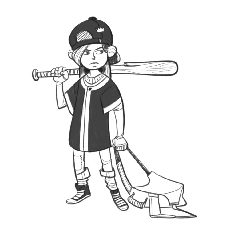
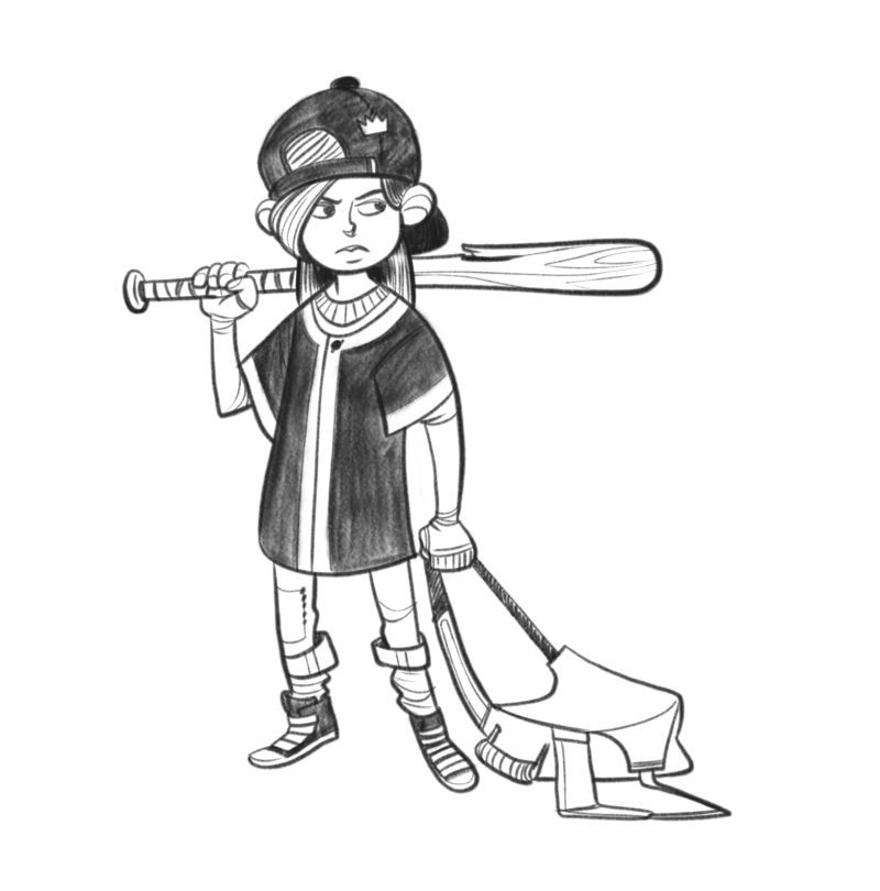
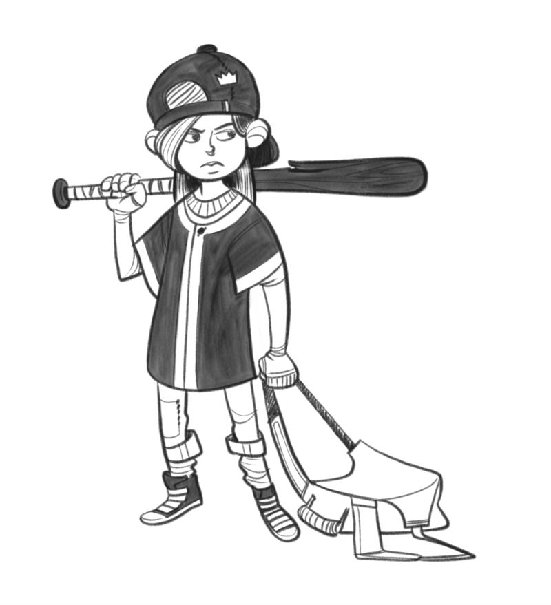
I wanna have a black and white section on my portfolio, since it's something I'm not bad at. Short comic titled 'The War of the Hamster'. However, I want to stick with my more grainy linework, so the fill method can't be 'flat black' if you get what I mean.
The first one is more flat with my detail pencil. Second one is more grainy with my sketching pencil, and the third one is more of an ink wash kind of effect. I'm rather partial to the inkwash.
Which do you prefer?
Thanks
")
-
Personally I like the first and the third option, but texture in your last one adds a bit more interest so that probably edges it to the top
-
The second one is my favourite, love that texture!
-
@art-of-b Also voting for #2
-
2 here. I like the texture.
-
Iiiiiiinteresting.
Of all of them number 2 is most certainly not my favourite :smiling_face_with_open_mouth_closed_eyes:
Though I may have to think about it a bit more
Thanks for everyone's feedback!
-
@art-of-b I like it because it feels... slightly looser, more spontaneous, more full of life! I love that sort of thing, but maybe it's not your own preference - there's really no right or wrong here because all 3 versions work. At that point it's a matter of personal preference!
-
@art-of-b I like 1 and 3, more toward 3.
-
I like the 2nd one more because of its pencil like texture. It kinda reminds me of my own method as well. Lol. I’m just starting to realize that maybe this pencil texture thing is SVS’s style rubbing off on us.
Portfolio: nyrrylcadiz.com
Instagram: https://www.instagram.com/nyrryl_cadiz/
YouTube: https://www.youtube.com/channel/UCbJCF1Im8ZO7hpGWTKOJMuA -
I like 1 the best I think that strong block in goes better with the style of the art.
-
I also think 1 goes best with the overall style.
-
I like 1, the flat color looks great with the lines. Gives it a comics/animation feel, which I'm particularly fond of.
The style you pick should be something YOU enjoy making, though, so if you discovered 2 is not your favorite, that might be a clue for how to go forward.
Carrie Copa
https://carriecopadraws.com/ -
@nyrrylcadiz said in Which of these fill methods do you prefer?:
I’m just starting to realize that maybe this pencil texture thing is SVS’s style rubbing off on us.
You may be right
-
@carriecopa Very true!
-
@nyrrylcadiz Hahaha this might be true! I observed the same thing at my university, CVM, when I was studying animation. We used to call it the CVM style hahaha..
vanessastoilova.com
instagram.com/vanessa.stoilova/Check out my Youtube channel for tips on how to start your career in illustration! www.youtube.com/c/ArtBusinesswithNess
-
@nessillustration @Art of B hahaha welp... each school has it’s own signature

-
@art-of-b I prefer fills 1 or 2, I think they could work equally well depending on the project. The reason I prefer the top two is because they both have a strong style - they look very deliberate and have a strong impact in one direction or the other. For me the third one is a little weaker being a mash of the two styles, simply because it does not take the design far in either direction. That is the Designer coming out in me though. I was once taught about the importance of making style choices look strong and deliberate, otherwise you risk things looking unfinished or like a mistake. It always stuck with me. I think it is especially important to be deliberate when using rough textures or styles.
-
I really like the texture of the second one ^_^
-
@art-of-b
I like the first one and the third one. But for the third one I would be more selective where that texture would be because I feel personally that it can easily go like the second. I really like texture it just feels to distinct from the the rest of your line art, where as the third one touch on both.
I did just notice that the first one on her shirt has a nice bit of subtle variation which I think gets across adding texture and still holds up strong with your line style. -
The third is my favorite.