Character Design - Feedback Welcome
-
Hallo All!
I'm designing the main character for a book for 3-6 years old about the building of a pole barn. The MC is a little girl carpenter, spunky and smart and with a need to prove herself. She faces a lot of difficulties and first, but then ends up helping the whole building team with a clever idea.
I have only four days to get one sample illustration done and one or two sketches, so decisions must be fast!
Which character sketch resonates most with you?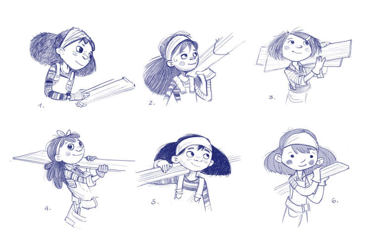
-
@smceccarelli I'm torn between 3 and 5
-
@smceccarelli 4 or 6. I am a sucker for eyes, so i like the eyes on 4 but the shape and design of 6.
-
@smceccarelli 3 and 6 get my vote - I think for me 6 might be my favorite - that look of determination and confidence in 2 is appealing but I think it could be successfully applied to the rest - they are all nice though
")
-
I think I'd say 2 or 5, and I think it's simply for the combination of gesture and potential for spunk on the faces. I can't really quantify the face comment, but the gesture suggests a smart, rooted way of going about work. By that I mean to say that she carries the board with only one arm and a shoulder in those two, and in 5 it appears that she's got a knowledge of how to balance whatever she's carrying by using her arm to leverage the object, which requires a sense of center of mass and smarts. Besides that, she's fairly nonchalant as she's carrying the object. All that said, I think 5 presents the best combination of expression and gesture, but if for some reason you need to use another design, 2 approximates all of the things I've brought up here.
There's my 20 cents
-
I like 3.

-
I like the design for 3 and 5. 6 is also a fav, because I personally love ears that stick out, noodle arms, and dots eyes.
-
5 stands out to me
-
@smceccarelli I'd say that #3 seems to have the most spunkiness for me. I think it has something to do with her shorter hair (but it might also be the wider face and/or the posture & way of holding the wood). As a side, I do like how you handled the clothing (shirt stripes & cuff, gloves & tool belt) of #4. I'd kind of like to see that a little more on #3.
Great stuff!
-
I'd go with #3 or #6.
For some reason shorter hair says 'intelligent and ambitious' to me. I'm also a fan of the simplistic dot eyes of #6 (and the apron/belt combo is pretty badass).
Is this for a competition or something(hence the deadline)?
-
I like 1 and 5. They look the most spunky and I like the freckles. The hair cuts also look more in keeping with a no nonsense girl.
-
#3, #5, or #6 (leaning toward #5 because she has sorta ambiguous nationality, which is nice).
#2 and #4 look older.
#1 look lost in thought. More contemplative, and less spunky.
-
I like 3 then 5 or 6.
-
I like 5
-
Thank you all, very useful comments! Now I´ll sit down with all and look at all your reasons and take a decision...like in one hour
@Art-of-B is not a competition, it´s a complicated story. There was an an open call for manuscript submissions at Charlesbridge Publishing on a specific topic, ending September 1st. I decided to write something just for exercise (the brief was intriguing) but I liked it enough to show it to my agent.
That sort of turned my week on the head, because she decided we should submit it (which is a rare thing with her!). Five versions and a complete re-write later (which changed basically everything in the story apart from the theme) and a deep-dive immersion in how you build a pole barn (which is very interesting!), she suggested that a) the main character should be a girl and b) we should submit art with it.
So, it´s a shot for publication wrapped up in a little more than a week. It´s sort of fun, actually.
In my limited experience of working professionally, it´s the third or fourth time a pitch opportunity comes with super-short deadline. ADs are very specific in what they want to see, sometimes, but they may give you a week to whip up something. -
I love the design of 6, mainly because of how you simplified a lot of the features I think readers would identify better with the character because of it.
-
1 and 5 are my favs.
-
I like 1 and 5 the most. They look fit to your personality description
-
I like 3 and 4, but all of them are interesting designs. I'm excited to see the final result!
-
@smceccarelli 3 and 5 capture all those things for me, for sure.