"Big" WIP - feedback requested
-
I think I like 5 and 8

With 5 you can have a lot going in with all the shocked expressions of the family members and the child realising he's woken up giant! You can also play around with the composition more in this one and really exaggerating how big he is by showing the small bed and how he fills the room. I'd definitely have the family looking really shocked but showing it in their poses and faces!
I like the look of 8 because it's different and you can have some beautiful scenery going on with him sat inbetween the mountains. It also shows a bit of a different emotion, with him being sad and lonely!Look forward to seeing where you take it next

-
I like number 5 because it reminds me of Alice in Wonderland.
I like number 8 but not the composition. I like the kid being in the middle of the mountains but not in the middle of the image.
I also like the cat idea but I would play around with increasing the size of the cat and if you could combine 15 and move it to the side like in 14.
-
I really like 7, so whimsical and I can just see it put in color, it would look beautiful

-
@johanna-kim #1 and I was going to say everything that @Coreyartus said.
-
@johanna-kim Number 1 is my favourite, but I also really like 4.
-
Thanks for taking the time to send me feedback on my thumbnails. I'm going to consider your thoughts and suggestions and continue to share my process. @inkandspatter @Chip-Valecek @NessIllustration @Heather-Boyd @hannahmccaffery @Coreyartus @theprairiefox
@theprairiefox I was actually thinking of soldier toys but since you went to that idea right away, as well, I might thinking of something else, something more unexpected or unusual to give this a darker feel (e.g., his teacher and classmates, his parents and older siblings, in his imagination of course). That is, if I go with this thumbnail idea. I'm torn between this and #8.
@Coreyartus Thanks for your story and costume suggestions. Your ideas making me like #1 more than I did at first.
@hannahmccaffery Thanks for your suggestions on expression and emotion for face and body. I rather have a soft spot for #8 because of the different sadder emotion. And I agree that if I went with #5, the composition could be improved to emphasize the child's giant size. Lots to consider!
@Heather-Boyd Thanks for your notes. Yes, I like #5, too, but re: all your thoughts on composition, it's definitely an area that I need to work on which you clearly picked up on:) Whichever thumb I pick, the composition will need further adjustment, for sure.
@NessIllustration Thanks so much for your vote and comments. Yes, I love that thumbnail, too, but I may save it for a later project since it doesn't seem to be resonating with the other commenters. It's always a bit of a surprise to see what folks prefer and how it sometimes differs from my own preference. It makes me doubt my own design sense.
-
I'm a fan of 4... The feeling of it seems magical.

-
OMG. #15 for sure.
-
My favourites are 5 and 15 I think they give you great story telling opportunities
-
I'd go with any of the ideas with the truly giant child. Being able to contrast the massive munchkin with itty bitty real boats and such will make the concept read nice and easy

-
I seem to be alone, cause 12 is too cute to me
-
Nah, @ThisKateCreates , I'm with you there. I'd say 2, 5, or 12. All of them are fun concepts that could be really fun to execute.
-
Thanks @Aaron-Pierce @ThisKateCreates @Braden-Hallett @DOTTYP @Laurel-Aylesworth @KathrynAdebayo for taking the time to share your votes and notes. It's incredibly helpful!
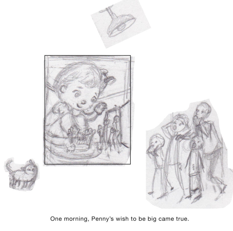
Last night, I explored numerous concepts for the Godzilla kid idea which got the most votes, none of which felt or looked quite right. Reluctantly, I went to the 2nd most popular thumbnail, of the giant girl in the bed, and things started falling into place. I changed the composition and added a few more details (e.g., a cat, a ceiling light, and 2 older siblings). I might also draw a kite somewhere in her room, and then follow through with a sequence of 3 images at some point that ties in with some of my other thumbnails. Lastly, I refined my idea: Being the youngest, Penny was always wishing to be big so she could do big kid things. Then one day, her wish came true.
If I had more time this month, I'd probably explore more thumbnails and compositions but this seems to work for now.
Still, I welcome any feedback throughout my process, and thank you in advance!

-
@johanna-kim I'm glad you picked #2. That was my favorite. It's very rich, story wise. I like your thumbnail. The composition follows the rules of thirds and the eye travels in a triangular shape from the child's eyes -> Family -> Cat -> back to Child. Looking great so far!
-
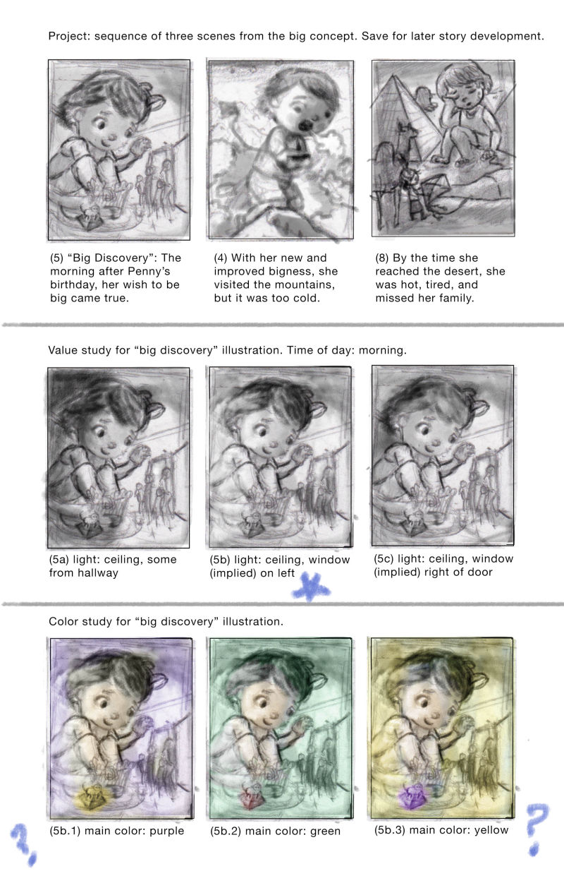
@johanna-kim Here's my progress update:
- Selected, revised, and put aside three thumbnails for possible story development and/or sequence of illustrations.
- Quick value study of the big kid being discovered in her bedroom.
- Quick color study of the one of the value studies.
Time to step away and do something else. Plan to return for a fresh look and assessment later tonight or tomorrow. As always, feedback, positive or negative, is always appreciated.

-
@tom-shannon Thank you for the encouragement. It's always, always appreciated:) And I hope you meant #5 (girl being discovered in her room), because that's what I selected (at least until I get lots of negative notes).
-
@johanna-kim Oh this is so good. I guess since it's morning, I'd go with the warmer tones. The purple one definitely reads nighttime to me.
-
I really like the yellow comp you made. Somehow, i’m just really drawn to it.
-
This composition is really lovely, and i love all the little details you've added, will your characters be in pyjamas? I always love illustrating people in pj's for some reason! I like the yellow colour tones too, especially if it's meant to be morning, you can play around with lots of nice warm tones and lighting!
Maybe you could try different positions for the cat, I guess when the illustration is finished you'll be able to tell where the best place would be to put him so that the whole illustration is balanced

-
@johanna-kim Oops! LOL! Yes, I meant #5. Not sure why I wrote down #2. LOL. I'm a little dyslexic, these things happen:-) Keep up the good work.