Childrens book character EDE
-
Its a good scene and captures the environment really well, the only thing I think that would help the image is to add rubbish and junk to dirty the place up. Really well done.
-
Awesome!
-
Hey Jana,
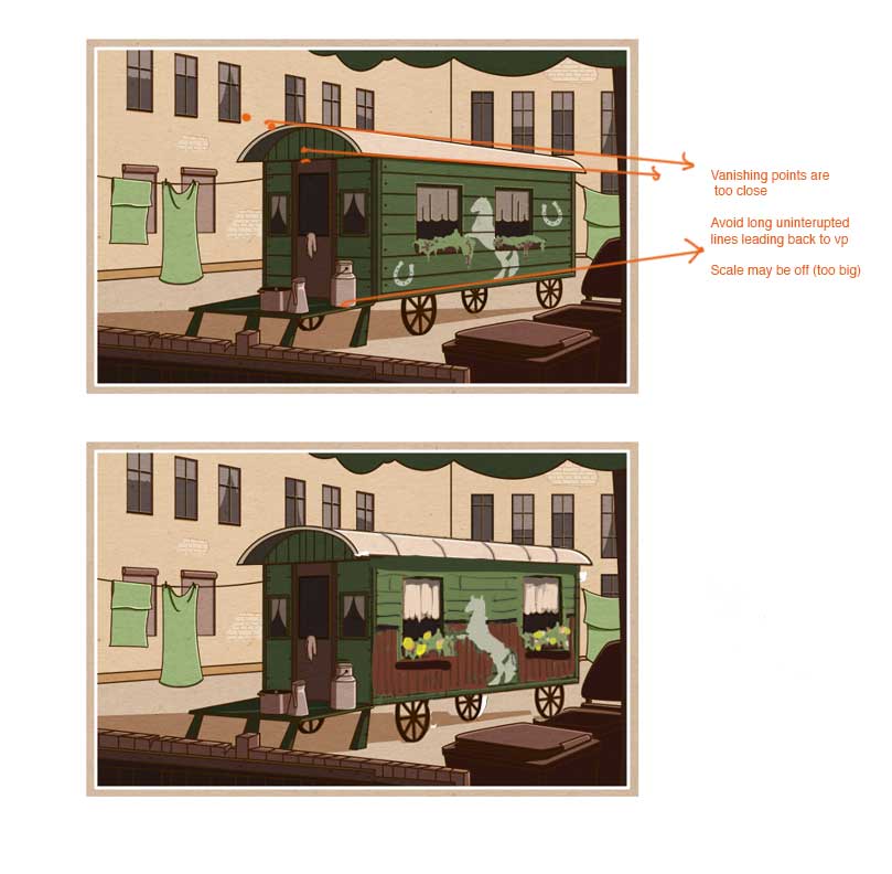
this is going really well! Love your sense of design and composition.One thing I would adjust is the trolley image. It is starting to have what I call "perspective creep". Perspective creep is when major elements of an image start to get "pulled" back to the vanishing point (which makes everything too wide). a lot of people do this by accident when designing exterior city scenes. What I recommend is trying to break up the lines leading back to the vanishing point by intersecting them with stronger verticals. Also, your right vanishing point is probably too close and is making the trolley converge a bit too much. If you are standing near a bus or single train car, it doesn't really go back into a vanishing point very much.
So here's a suggested fix. I lessened the convergence of the trolley on the back end. I added wainscoting to the bottom half of the trolly and added small vertical boards there. THen I shrank the size of your boards because they may have been a little on the large size. Lastly, I added a bit more light source to the right side of the trolley so it popped a bit more. These are all just suggestions, feel free to integrate as necessary. : )
I definitely want to see more from this series! You are really on to something here.
-L
-
@Steve-Young @jonathon-b
Thanks, Steve and Jonathon! I also felt that it is somehow to clean. Now, as you say it too, I will throw some garbage here and there.
@Lee-White
Thank you so much, Lee, for your feedback and for spending your precious time to work on this piece.
That is so awesome to see what you did with the trolley perspective. I felt some problems with it, but I had no idea where it comes from. I will sit down and make some corrections... -
Hi @Lee-White!
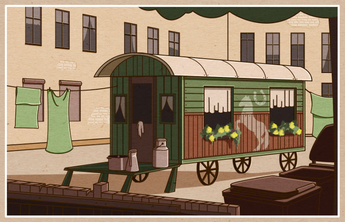
I tried to follow your advice, Lee, and made some corrections at the trolley. I like it much better now.
Does it go in the right direction?
I love the trick with the vertical lines! Thanks for that.
-
Oh yea! me likey!!!!
-
Hi everybody,
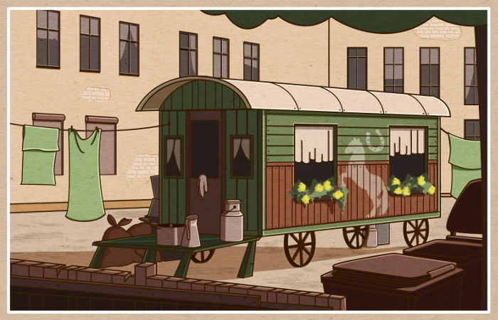
I made some more changes, @Steve-Young suggested. I added some garbage bags and boxes to make to place more dirty. I also tried to give the ground more dirt. Actually, I planned to throw some garbage also close to the walls of the houses, but this would be too distractive. What do you think?
-
Looks awesome. Nice job with the improvements. However, had garbage bags invented in the 1930s? Maybe a wicker basket and wooden crates or a washing basin and board would be more fitting with the period.
-
Much improved. I love your limited palette! I too think the modern cans look out of place as compared to the setting and character.
-
Thanks, @rob-smith and @K.w., for your feedback and for noticing the mistakes in the details.

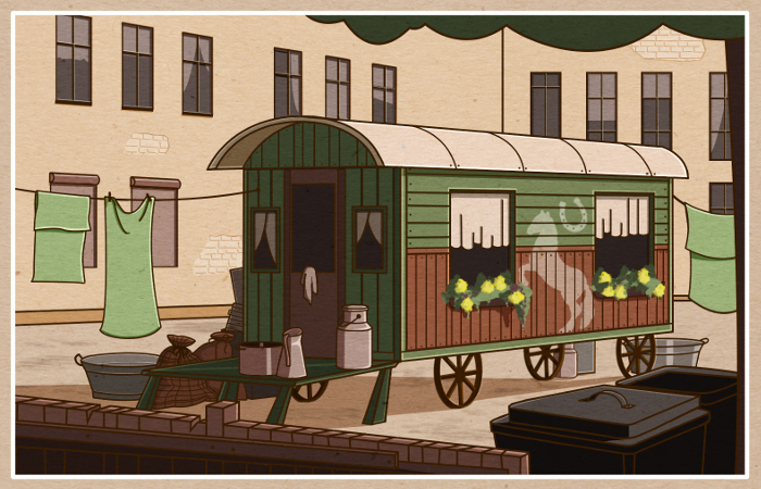
You are right about the garbage bags. I changed them a little bit and added some pattern, which should make them look like made of linen or something like that... hopefully there are potatoes in them now.
I also changed the garbage cans. They indeed looked a bit different at that time.
The washing basins were a great idea. Thanks, guys! How is it now?
-
Potato sacks--nice save!

-
Hi, everyone!
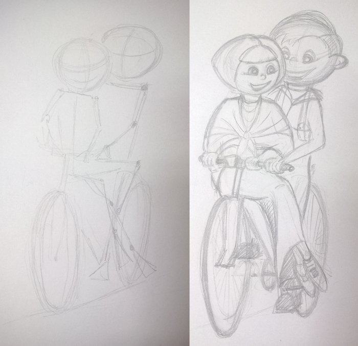
I continued working on Ede and Unku. Right now I am working on a sketch about showing them cycling on the bike, which Ede bought on credit to earn some money as paperboy.
I am thinking if I should make Unkus head a bit larger, to make her fit better to Ede. What do you think? Any feedback is very welcome as always.
-
They are adorable!
-
Hi, everybody, Hi Lee (@lee-White)!
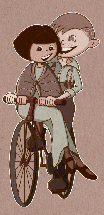
Here now the colored version of the current piece in my Ede and Unku series. I struggled a lot with foldings, hands, lights and shadows.
Any comment on that or on anything else, what you think should be improved?
Thanks!
-
These are very nice Jana! - a couple of things pop out as maybe needing some attention - the space between the boy's face and the girl's face in your sketch reads well - we see enough of the boy's face toy believe there is some distance between them - in the painted version that space is missing and it looks as though the boy and girl's heads are touching - i think the cast shadow on the boys face from the girl's hair amplifies this feeling - also there is twist in the girl's position but it does not read as such - her sternum is facing the boy's left forearm (or should be) but where the knot on her shawl is positioned it looks more like her sternum is facing forward - i think if you simply move the knot to our right a bit it will help quite a bit - the boy's arms should be almost straight i think - it is very awkward or very cozy (depending on the circumstance) to ride this way - you have to reach around to the handle bars and bend your elbows outward a bit if you don't want to squeeze your passenger - so i think a little straighter would be good - also i think you could add a suggestion of thumbs on the hands - i think we would see at least a small peak at each thumb in this position - lastly the lines that implied the foreshortened forearm of the girl is missing from the painting but was very helpful in the drawing..just one little line in the right spot on each forearm will make us believe her forearms are there and that they are doing what they should ...

-
Thanks for your feedback!

@Kevin-Longueil I am really thankful for your detailed feedback, Kevin. I can see what you mean and it is good that somebody pointed to all these little details. I will now sit down and work on it. Hopefully hear you soon.
 -
Good to hear!.. I am always worried that I will be taken as rude or annoying especially since I am obviously not the best at some of the things I am pointing out...there was one other thing I did not mention because I thought it might be a matter of it being your style - but I'll mention it now that I know you are not annoyed :)..if you were to draw a centerline down the girls face that went from the part in her hair down through her nose, through her teeth to the center of her chin, that line would go between her two front teeth...I think that is the point where her teeth on our left should start to straighten and curve maybe up and back a bit from..as it is now it looks as though either her upper jaw is tilted but her eyes and nose are not ..or that her teeth on our left get gradually longer...but this may also be a style thing too - I really enjoy what you are doing and that you are showing us your process...(pretty cool that Lee popped in and gave you a thumbs up too!) - looking forward to seeing your next piece!
-
they are so sweet!
-
Hi, everyone, Hi Kevin (@Kevin-longueil)!
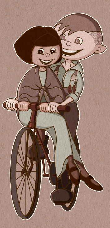
Here now my (hopefully) improved version of Ede and Unku on a bike. I am quite satisfy how it looks after working on it again. What else can be improved? Any more ideas?
-
@Jana Looks very good Jana - the only new item i would mention is Ede's head shape - if i look at your first drawing of Ede at the top of the page and the last drawing i think his head is a different shape - it looks to me that Ede's head should recede more quickly on our left than it does - the distance from his eye to the edge makes the plane of his face seem very wide and flat - i know his head is turned more in the first drawing but i don't think the difference would be great - so long story short...i think i would move the line that defines the right hand side of Ede's face (our left) should be moved in closer to the his eye - if you put your finger over the area and take it away it kind of jumps out at you as needing a small change -) i still think the there might be a couple of little thumbs poking out from one ore two hands..just a peek:)...really looks good though - the knot on her shawl looks great and she has a great smile... Ede's arms look great too!