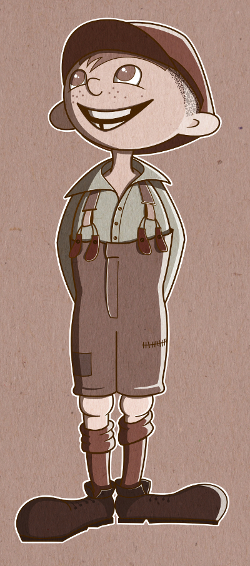
Childrens book character EDE
-
Very nice, cute character.
-
I like it! Now I will have to read this book

The thing I noticed about the shadows is that they seem to "outline" him - as if the light source is in front and above him. Maybe the shadows would be easier if you chose a light source to his upper left/right? then, only one side of his body, clothes, legs, etc. would really show shadow.
Great work!
-
@Carey-Bowden
Thanks Carey, for the idea to clarify the light source. I replaced the shadows at Edes left side into light reflections and added also some highlights on the body. I think this improved the image, what do you think?About the book, I have to say, it has a strong political touch. I haven't noticed that when we have read this book in school. But now I read it with different eyes. You should know, it was written in the early 30ies in Germany from the perspective of the labour movement. What I love about it is the background story, the friendship between these very different kids and how open they are for the life of the other. Maybe one can think about extracting this story out of it and leaving the agitating out...
-
the character is very cute! and I really like the outfit as well. And yes the shadow and the the direction of the light source read much better.
-
Nice, that looks a lot better! Highlights, midtones, shadows... all things I have to keep in mind.
 I would only add that he would be "planted" more firmly if you added his shadow a bit on the ground by his shoes... but since it's a character design, I don't think it's absolutely necessary.
Thanks for the book info! I'm always on the lookout for books to add to my list: my goal is to always be working on a book, and at least starting out, I know I will have a better time meeting this goal if I read novels, otherwise I will fall asleep, haha. I love classic children's literature, and I just finished C.S. Lewis' Space Trilogy. (Not children's lit, but whatever
 ) I just placed a hold on the audiobook of Till we Have Faces, hopefully I can pick it up soon!
 -
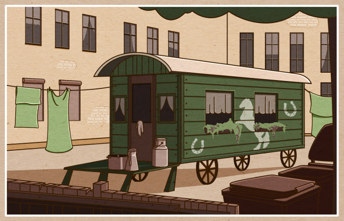
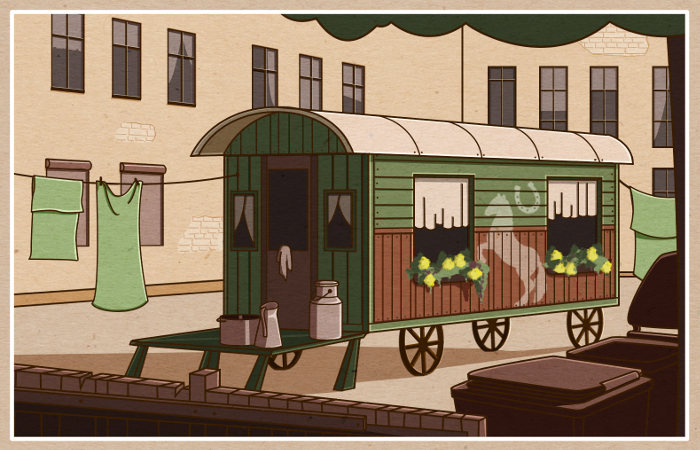
I continued with the idea to make some more illustrations for "Ede und Unku". Today I want to show you where Unku lived.
As typical for Sinti and Roma, she lived together with her huge family in a caravan, which was planted in a Berlin backyard of a tenement block.
With this piece I intended to train my skills in working with light and shadow. Any feedback is very welcome.
-
Its a good scene and captures the environment really well, the only thing I think that would help the image is to add rubbish and junk to dirty the place up. Really well done.
-
Awesome!
-
Hey Jana,
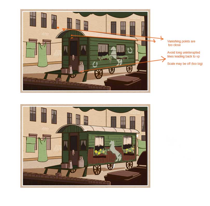
this is going really well! Love your sense of design and composition.One thing I would adjust is the trolley image. It is starting to have what I call "perspective creep". Perspective creep is when major elements of an image start to get "pulled" back to the vanishing point (which makes everything too wide). a lot of people do this by accident when designing exterior city scenes. What I recommend is trying to break up the lines leading back to the vanishing point by intersecting them with stronger verticals. Also, your right vanishing point is probably too close and is making the trolley converge a bit too much. If you are standing near a bus or single train car, it doesn't really go back into a vanishing point very much.
So here's a suggested fix. I lessened the convergence of the trolley on the back end. I added wainscoting to the bottom half of the trolly and added small vertical boards there. THen I shrank the size of your boards because they may have been a little on the large size. Lastly, I added a bit more light source to the right side of the trolley so it popped a bit more. These are all just suggestions, feel free to integrate as necessary. : )
I definitely want to see more from this series! You are really on to something here.
-L
-
@Steve-Young @jonathon-b
Thanks, Steve and Jonathon! I also felt that it is somehow to clean. Now, as you say it too, I will throw some garbage here and there.
@Lee-White
Thank you so much, Lee, for your feedback and for spending your precious time to work on this piece.
That is so awesome to see what you did with the trolley perspective. I felt some problems with it, but I had no idea where it comes from. I will sit down and make some corrections... -
Hi @Lee-White!
I tried to follow your advice, Lee, and made some corrections at the trolley. I like it much better now.
Does it go in the right direction?
I love the trick with the vertical lines! Thanks for that.
-
Oh yea! me likey!!!!
-
Hi everybody,
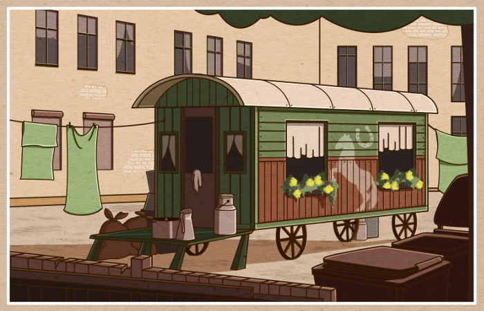
I made some more changes, @Steve-Young suggested. I added some garbage bags and boxes to make to place more dirty. I also tried to give the ground more dirt. Actually, I planned to throw some garbage also close to the walls of the houses, but this would be too distractive. What do you think?
-
Looks awesome. Nice job with the improvements. However, had garbage bags invented in the 1930s? Maybe a wicker basket and wooden crates or a washing basin and board would be more fitting with the period.
-
Much improved. I love your limited palette! I too think the modern cans look out of place as compared to the setting and character.
-
Thanks, @rob-smith and @K.w., for your feedback and for noticing the mistakes in the details.

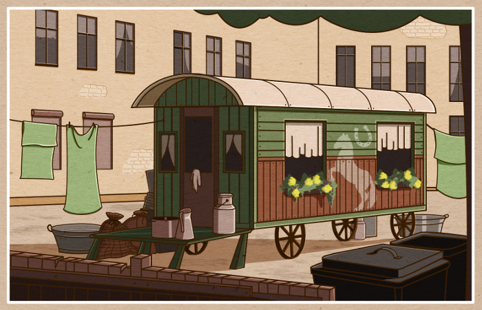
You are right about the garbage bags. I changed them a little bit and added some pattern, which should make them look like made of linen or something like that... hopefully there are potatoes in them now.
I also changed the garbage cans. They indeed looked a bit different at that time.
The washing basins were a great idea. Thanks, guys! How is it now?
-
Potato sacks--nice save!

-
Hi, everyone!
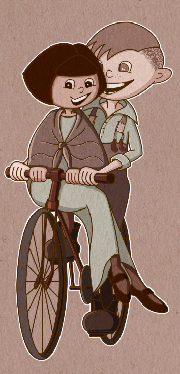
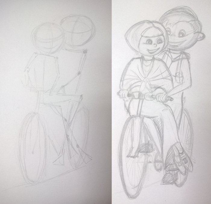
I continued working on Ede and Unku. Right now I am working on a sketch about showing them cycling on the bike, which Ede bought on credit to earn some money as paperboy.
I am thinking if I should make Unkus head a bit larger, to make her fit better to Ede. What do you think? Any feedback is very welcome as always.
-
They are adorable!
-
Hi, everybody, Hi Lee (@lee-White)!
Here now the colored version of the current piece in my Ede and Unku series. I struggled a lot with foldings, hands, lights and shadows.
Any comment on that or on anything else, what you think should be improved?
Thanks!
