Texture or no?
-
Playing around here...
A
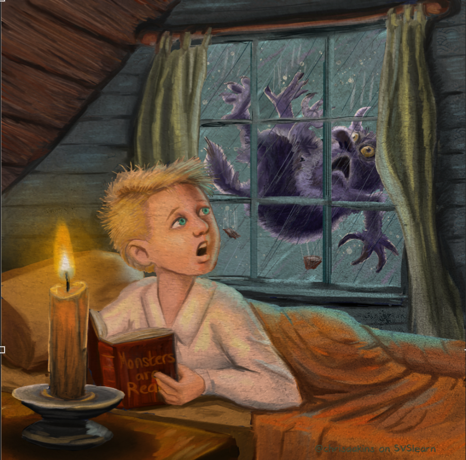
or B ?
-
I’m not too big of a fan of the texture. I say that if it isn’t needed to convey the story, then you’re probably good without it!
In some of my school work I had used a paper texture over a lot of my work only to regret it now, since the work more often than not was stronger without it.
-
@chrisaakins Maybe on the blanket and curtains? - and toned down quite a bit for the walls and ceiling but i think keeping it off everything else would be good. But if it is a choice between the two versions i would say no texture.
-
@chrisaakins I like the textured version! I think it looks less "photoshoppy"
")
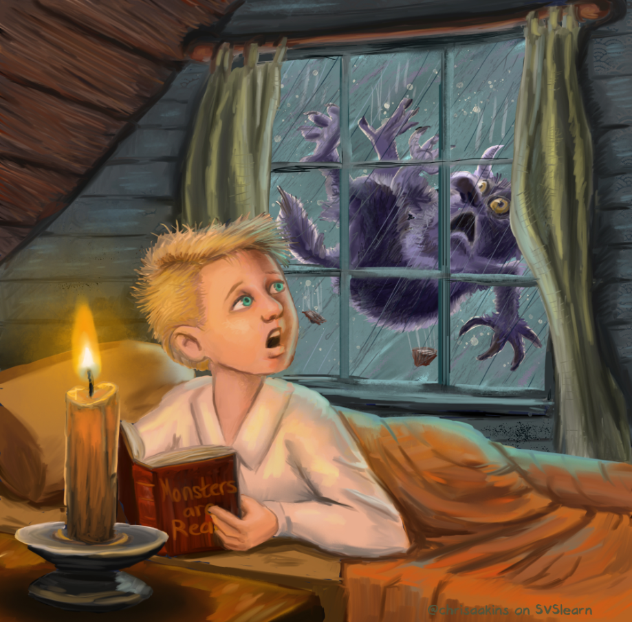
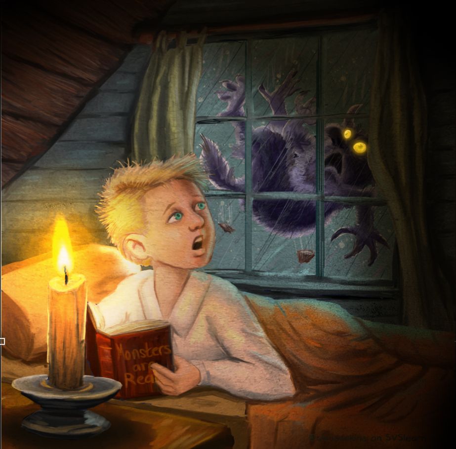
I have to say, I am SHOOK by how thoroughly you've improved this illustration in just a short time. It is night and day! However I still think you're missing a big opportunity with the lighting. Candle light at night is an intense lighting situation: bright warm light very focused in one area, the rest in darkness and big shadows. In your picture, everything is lit very uniformly. I've added a few filters quickly in Photoshop to show you what I mean and how you could make this lighting more accurate and also more visually interesting:
-
Hmm i cant really tell the difference very much. It took me a while.
-
I’m a sucker for texture - love it. But maybe just in the background here, or at least less on the boy’s face.
-
I agree with @Kevin-Longueil - I think some texture on the walls and bed would look good, but less (or just not at all) on the rest of the piece. Looking great!
-
@chrisaakins I agree with @NessIllustration . This is MUCH improved.
I always love texture, especially if it's to make it look like a painted surface (selectively applying texture to different object is tougher, but still worth it)
If you don't mind a suggestion, I would try throwing a mask layer on your texture (I'm assuming you're using an overlay or multiply) and then throwing around some greys in the mask layer to knock back the texture (more texture in dark or unimportant areas, less texture around focal points). If you use a nice blotty brush (maybe something with a very random stamp?) it'll blend it all in. That way you can keep the nice bright candle and clean-faced kid (texture overlay can muddy things up)
-
Haha! A divided house. I think I am leaving it the way it is at this point. I am ready to move on to something else. Now I just need a new assignment. But I can't tell you how grateful I am for all the help and support. You guys and gals are just the best!
@Kali @Kevin-Longueil @NessIllustration @Aleksey @neschof @A-G-Meade @Braden-Hallett -
This turned out so well!!
-
@Braden-Hallett @chrisaakins I agree. Less texture in the important places like the face and light.