Creating a Great Concept For Your Illustration
-

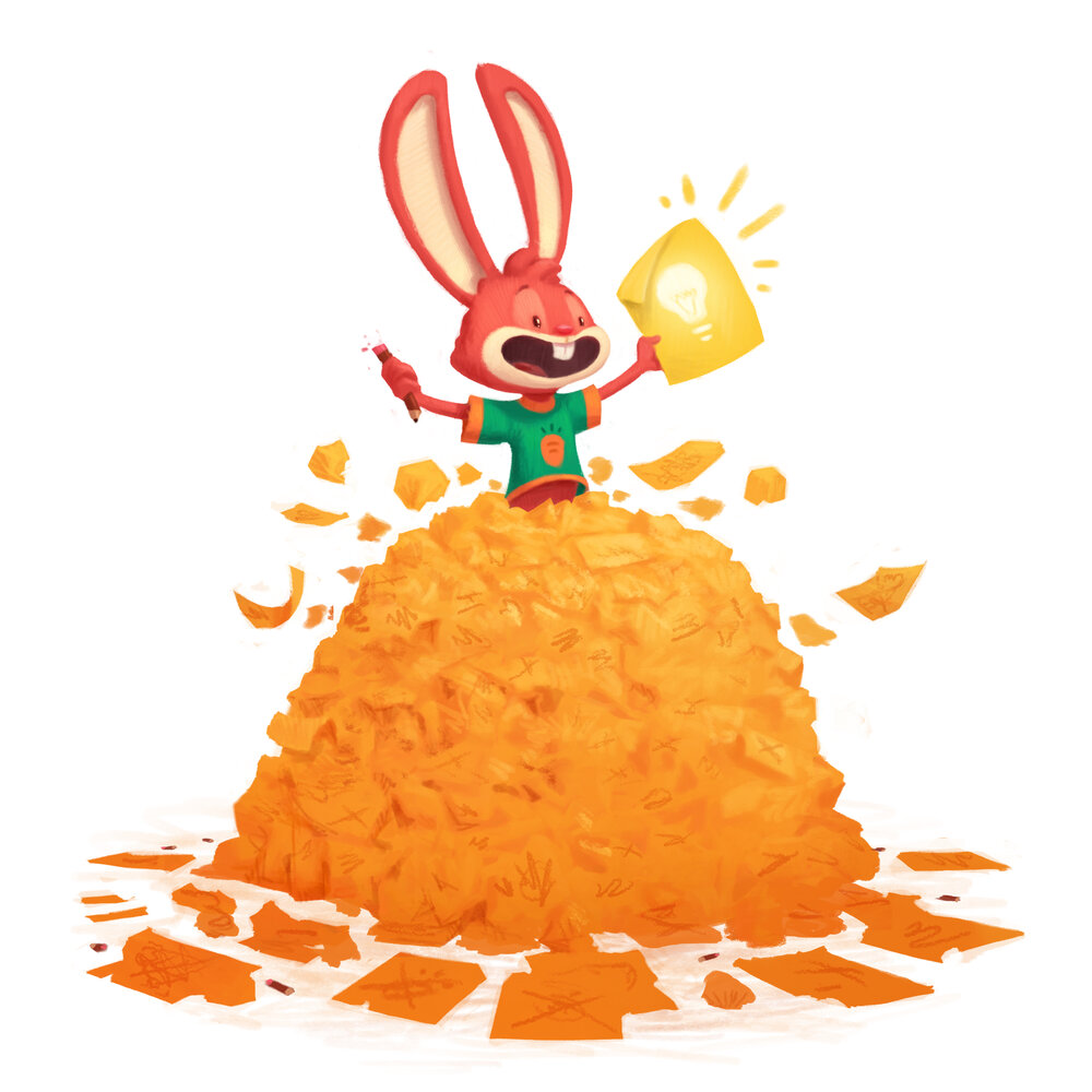
Art by Gary Wilkinson
Our most recent episode just dropped, click here to listen to it and to see links from this episode.
The foundation of a great illustration is a great concept. So often, as artists, we want to rush through the conceptual phase of an illustration to get to rendering things out and making it look amazing, often grazing over the concept or heart of our piece. In this episode we go over the importance of a solid concept, share some of our thought process for coming up with good concepts, and share advice while going over some common mistakes to avoid when coming up with a concept.
-
@Jake-Parker Yes, a new one!
-
Awesome! Looking forward to it, thanks @Jake-Parker!
-
love the art by @Gary-Wilkinson!
-
Thanks @Jake-Parker! Just listened to it, such valuable information as always! My first thought on the "Summer Vacation Gone Wrong" concept was to incorporate winter somehow. Did anyone head down that route?
-
-
This was a fun episode! The conversation veered toward some hilarious places. Pregnant dogs and POVs in a toilet bowl? Wut? :face_with_stuck-out_tongue_closed_eyes:
A shout out to anyone's submission that may have been mentioned. I watched many of them take shape here in the forums, and in some small part, I felt personally invested when some of them were critiqued in this podcast. Thanks for putting yourself out there so we can all learn!

-
Oh boy, my biggest fault. I rarely thumbnail/work out a comcept, for wanting something now, and out of a false fear of wasting time, and then spend little time rendering compared to many...Wasting more time in the long run with a weak piece. Listening to this tonight.
BTW, I looove the bunny in the pile of concepts.
-
Just listened to it - as usual learned a lot from the discussion. I feel I need to explain my bear family in the house having fun with human family coming to cabin in background.

 The concept was the bears’ summer vacation was about to be ruined by the humans showing up. Wonder now how I could make that more clear (less confusing) in the illustration - still don’t know
 ️.
️.
Anyhoo, very entertaining podcast
-
@MissMushy I don't know. I personally disagreed with Will and Jake on this particular criticism. I really liked what your piece suggested- that both families would potentially have their vacations ruined- because of each-other!
-
Great episode. Thanks for mentioning my forest restaurant piece! Glad it was memorable

I really like this episode and I think it's important to acknowledge who the participants of the svs contests are, and that a lot of them are just wanting to improve. Because they can't do this as often (whether it's because of time or other job stresses or whatever the case may be) coming up with concepts others may not come up with is very hard. We get an idea, we latch on to it then try to figure out how to make it look good because we only have 1 month to do a solid piece. In the end it may not be critiqued at all.
I also think acknowledging that while many people had similar concepts (camping/bears) it would be important to note this is how art directors might decide which artist to go with when the project involves camping trips or something. So it would only be an issue in a contest setting (at least I think I could be totally wrong)
Having said that I really appreciate the work you guys do on SVS and I really like that you switched from the First-Second-Third prize contest model to a critique centered approach. The prizes are nice and helpful but I think the biggest reward for us is when our pieces get critiqued by you guys. I know I use that as a filter for what to include or not include in my portfolio. Like this months superstition contest my piece wasn't mentioned and while I do wish it was critiqued, it's good to use this as a filter to exclude it from my portfolio. While the Wild Animal Restaurant piece is something I can fix and add it into my portfolio. So I'd love for you guys to continue using and improving that model.
Sidenote:
 Brendan Fraser, what ended up happening (from what I read on the internets) is he did a lot of physical comedy and stunts that the studios didn't take proper precautions with which ended up taking a serious toll on his body. Which is why he's not in the best shape today but hes still getting jobs! He was on Trust, and on Doompatrol.
 -
@Jake-Parker I really liked this episode and I’m chuffed you discussed my entry (mine was the girl on the toilet). While I was a bit disappointed not to be picked for the original critiques, I now understand why. Obviously I didn't know my public, I had no idea that this illustration might be a bit offending... I made sure yet skirt covered everything quite decently
 . It's funny how cultural difference pay a role in what is acceptable or even funny in an illustration.
I would like to make a suggestion about the competitions though, you guys mentioned I could have improved on this concept by showing the girl being in a restaurant, running of to the toilet in a panic. I think that is really cool, but as a beginner I have no idea how to pull this off... The winners of the competitions are always well deserved, great illustrations. But for a beginner such as myself it can be a bit daunting to try to live up to these great pieces of art. It would be nice if there was some sort of 'encouragement price' or recognition for beginners...
Anyway, I'm really happy that you picked my painting to discuss in this episode! Thanks!
-
@Annemieke you mentioned cultural differences and I think you're right, I'm a north american and I can see how the toilet thing was brought up. But I follow a Norwegian illustrator who throws in little bits of nudity or things we would consider inappropriate but she's a very successful children's illustrator (Lisa Aisato) WOW she's amazing!
-
@TessaW thanks. I do struggle with translating my somewhat odd sense of humour sometimes, so is nice to hear that you liked it

-
Thanks for a great episode! Mine was the burning boat and I was happy to get some feedback to hear what you guys are thinking. In coming up with the idea I thought it was slightly ridiculous since the boat was on fire and they are surrounded by water, but we did see a burnt boat while on vacation this year so I know it happens. It is always great to hear your discussions!
-
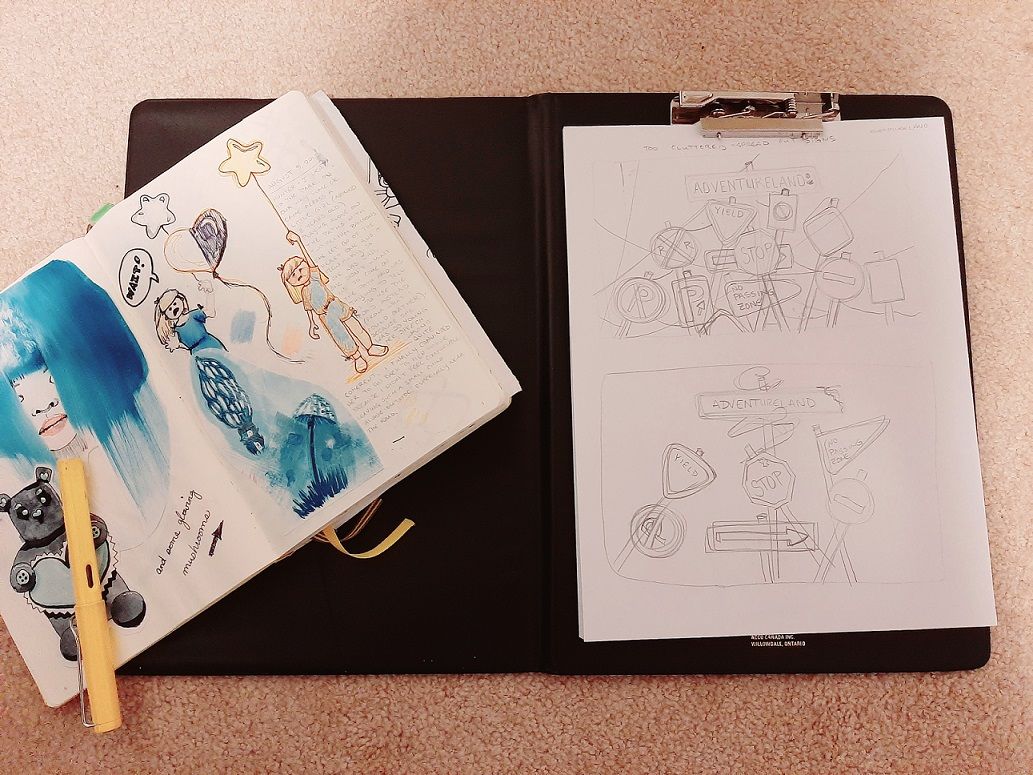
I like @Lee-White 's advice on calling the preliminary concept sketches "thinkings" instead of drawings. To add to that, I always disliked putting "thinkings" into a sketchbook because I can have up to 5 (sometimes more) pages worth of thumbnails and sketches for one concept. Often the sketches are ugly because I'm just focused on throwing the ideas onto paper. I ended up doing less sketchbook work in general because of this.
Now I use a folder-style clipboard stocked with copy paper for my "thinkings" and it works great for me. It's inexpensive, reloadable, portable and I don't have to worry about having a nice drawing. Plus, I like that the pages are super easy to scan (no binding to interfere) and that I don't have to store loads of sketchbooks with work that I mostly dislike.
If there are sketches that I do like, I cut and glue (or tape) them into my journal and call it a day.

All in all, a great episode. I tend to have a million and one ideas for an illustration and then at the end of the day, play it safe (probably too safe) because I doubt my ability to get my far-out-there ideas out onto the page. It's good to know that it's better to go more wild to begin with and be wrangled back in than to play it safe and end up with a boring illustration.
-
Great episode. It makes me want to kick myself in the butt for all these years of rushing through the idea phase.
I did it with the Vacation gone wrong piece as well. I drew the bears, with the the family on top of the trailer. I admit it was the first idea that came to mind, and I didn't push the idea any further. I didn't thumbnail, just went straight from one rough sketch to a finished drawing. Drew the bears first, and the family was the after thought, when it was supposed to be about them. It was ok, but could have been much more interesting..
.Thanks for another great podcast!
-
@Annemieke Hello Annemieke, I really liked your picture and... same! as an European, I would not have thought it could be offensive in other cultures! I found the drawing funny and... true!
-
@Julia Thank you Julia, that means a lot to me!
-
@Annemieke people in the US are WAY more uptight about stuff than other cultures. It bugs me that we are so conservative here in the states.