WIP, the Fox and the Crow
-
So here’s my current project (for those who may be interested).
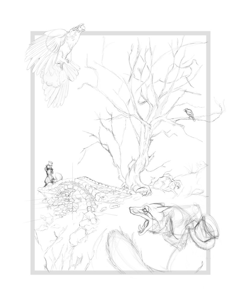
Back when the the monthly challenge was designing a book cover, I had wanted to do Aesop’s Fables, alas I just had too much going on to participate. Well afterwards I found that I still wanted to illustrate a fable when I remembered a little sketch I had done some years ago. Now while not actually designing a cover here, I did want to illustrate an image that could be found in Aesop’s book.
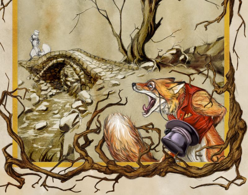
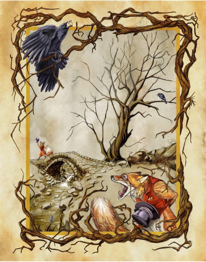
So for this piece, I’m thinking of splitting the actions between the Fox beguiling the crow (larger kitty corner characters) and the aftermath of the fox leaving the crow frustrated (center image). The grey border is a place marker for a winding branch border.
Anyways, never really been big on showing WIP, not because I dislike critiques (on the contrary), but typically because I get too forgetful to post while I’m in my process. I am open to thoughts or critiques as anyone wishes.
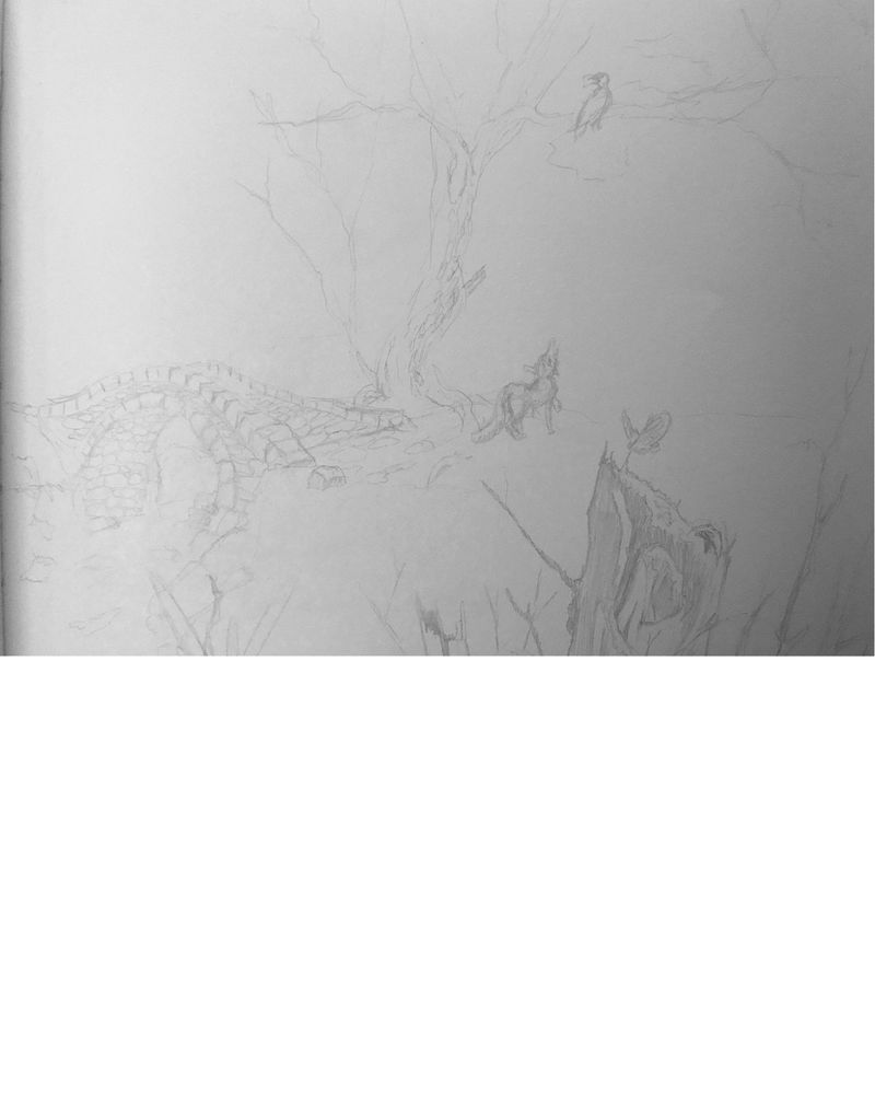
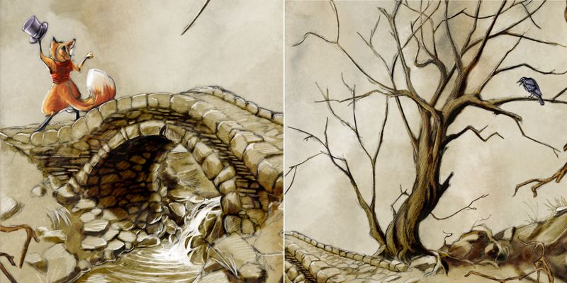
Original sketch.
-
I love the style you have. I think it is perfect for the old world charm of Aesop's fables. As far as critiques go, You might want to tilt the Crow's body so that he is leading the viewer into the composition rather than out of it. You might also want to vary your sizes of the critters. They are all on the smallish side. A little variety will make the composition stronger. Possibly you might want to add a fifth character because I read that odd numbers are more interesting and take longer to process than the symmetry of even numbers. Your action and movement are quite good, and the arrangement is nice. Just my two cents, you can feel free to disregard. Good job so far.
-
A bit closer on the overall look. Decided to keep the straight border with the winding branches.
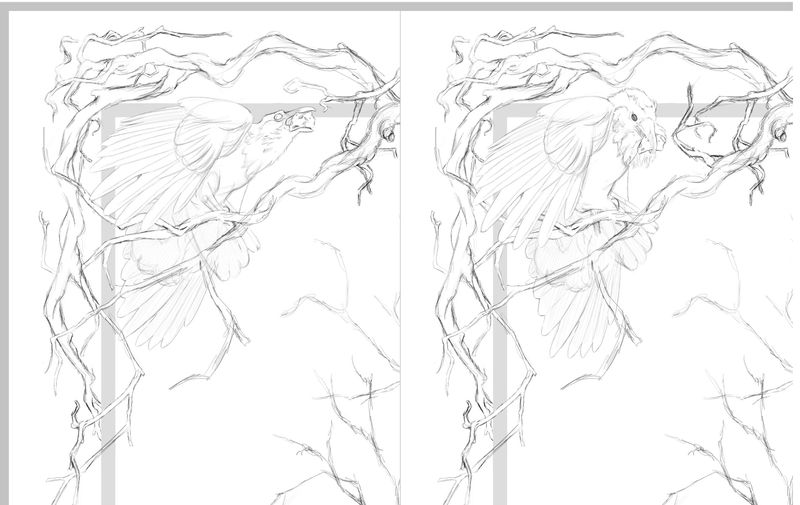
@chrisaakins I tilted the bird in the second pic as per your suggestion, also did a version of him looking down to bring the line of sight back into the pic. Not sure which I’ll do yet, I’ll digest it for a bit. Also I do like the idea of adding another character, but given the story only has two characters, I think I’m limited on what I can do, maybe a small critter in the boarder.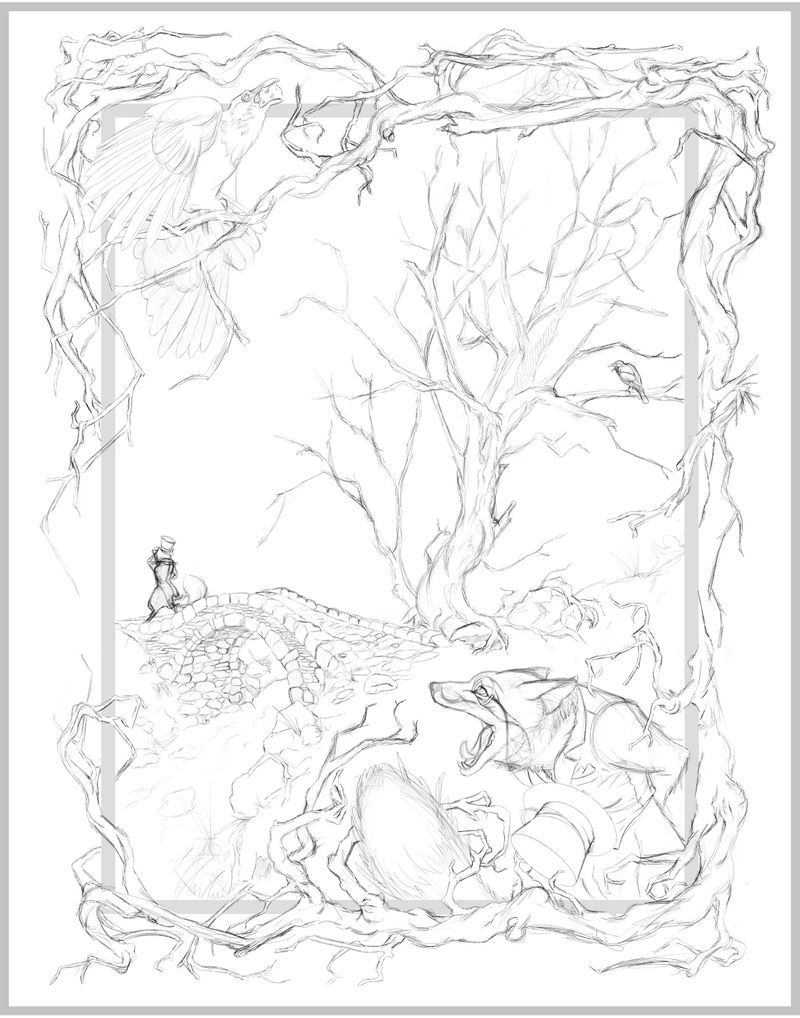
-
@Adrian-K This is great! Love the tree branch boarder and can't wait to see it finished! I really like the one with the crow looking down and the food in it's mouth.
-
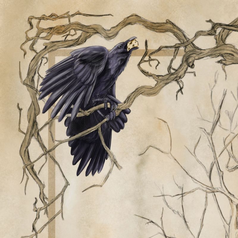
Tough choice on the crows! On the one hand, when I saw it I also thought: Turn the head down to lead back into the painting instead of aiming out of frame. But then the looking-up-crow strikes me as much more narratively interesting. I can already picture it caw-ing and losing the bit of cheese, whereas the down-turned head looks more contemplative and cautious, and doesn't strike me as arrogant. The fox's expression is also awesome
 great work, looking forward to seeing this develop.
 -
After playing around with different positions, I really can’t beat the silhouette this guy gives off. Also, I think having the boarder redirects the eye From falling off the pic.
-
As this relates to his image, I thought this might be of interest. One way I’ve been creating the stained backgrounds is with this image. A little bit ago I saw a whimsical picture where the character was on a parchment background, and I decided to make my own. Modern day parchment is typically just paper that’s been treated with dies to give an old or uneven appearance. I wanted to make something a little more. Originally parchment was made from sheep or goat skins that were prepared so that they could receive inks an pigments for illuminations and manuscripts. If you ever have the chance to see one you’ll notice that there is a grain to it, stretch marks and pores. These marking get more apparent as time passes.
So here’s one of several images I made using a watercolor brush on my iPad. I did my best to mimic the characteristics of real parchment. Made at a high DPI and deeper saturation; just playing with its hue, saturation, and brightness, I’ve found these backgrounds very useful in creating textures.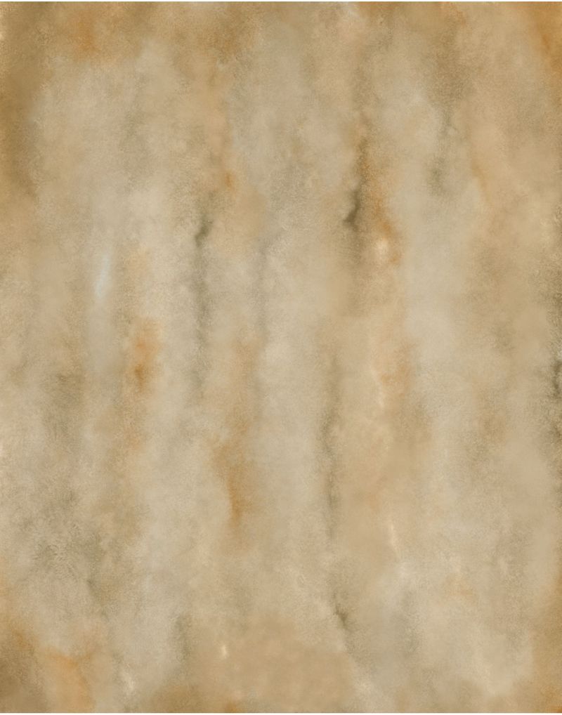
-
A little more completed. Thinking of keeping the background image in a limited pallet to avoid competition with the outside characters.
-
@Adrian-K It looks fantastic
-
@Adrian-K - just gorgeous!
-
Pretty much done at this point, and I’m happy with how it turned out. Feel free to critique as you wish. Feedback is always useful.
I’ve got to say, working digital is a weird thing. Sometimes I feel like a kid in a candy store, there are so many directions, styles, colors, little cheats and workarounds you can do, it can get a little overwhelming. One thing I’ve found that I miss (surprisingly) are the limitations inherent in traditional media. Limitations force you to be creative, so that you can get the results you want or hope for, despite the added time or hassle it takes. And often those creative efforts lead to something unexpected, organic or new that you can use latter. But having too many options can lead to a creative traffic jam in your head, or at least in my head. Sometimes these little cheats are a little too good and the picture is left looking stale or just not quite right some how.
I’ve been working digitally for a little over a year now, and I’ve gotten comfortable working in several different styles, but I think I’ve finally found the one that sings to me the most (yay!!) To an extent I’ve limited my approach to a traditional one. Using brushes and colors that replicate a traditional style. And I’m avoiding those brushes and techniques that leave a more digital look.
I always get lost in the smallest details of a picture, and have no issue spending way too much time there. However, in this pic and the last couple I’ve done. I’ve kept the base sketch somewhat loose. As apposed to getting clean crisp edges with even and precise crosshatching, rather I chose a messy scribble that tried to capture the feel of organic shapes fallowed up by only a little cleanup afterwards. This was then followed by color under the sketch, and then white pencil over the sketch. So far I like the results.
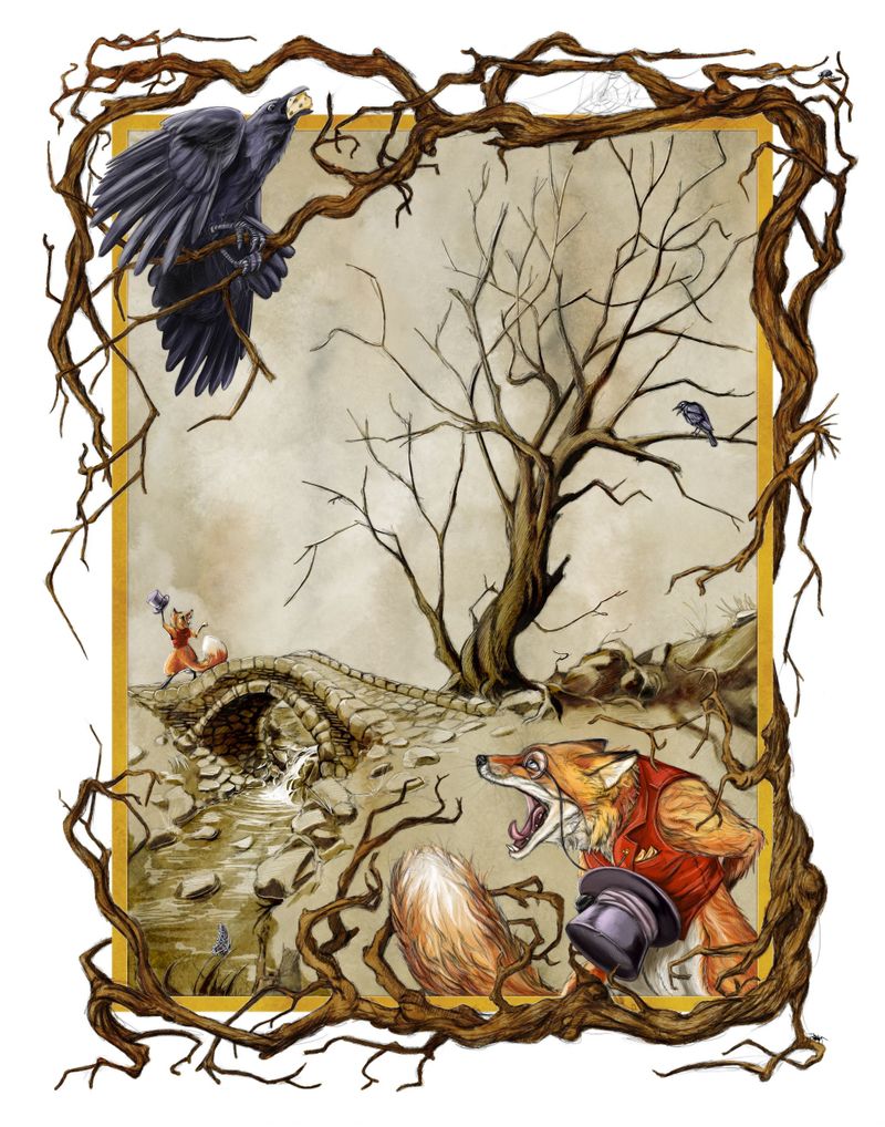
I’ve always liked the look of white pencil on toned paper, it brings a sense of realism that graphite on white seems to be missing. I tried to keep that in mind as I worked on the areas with limited color. I particularly like how the bridge and water turned out.
Anyway, hope you all enjoyed this.
")
Alternate version.
-
@Adrian-K WOW this is fantastic!
-
very strong in story and in colors and your style, love it
-
Extremely cool! Very fun to see your process too. Thanks for sharing.
-
@Adrian-K Here’s the best compliment I can give it — I have spent a lot of time looking at this and studying it. It’s beautiful and attention absorbing.
-
This is amazing!!!
-
it's awesome! Just yesterday i was driving my son to the bus stop and we saw a fox and a crow together!!! Then I remembered the fable (sort of lol...at least I remembered that it existed!)> Then i found this today. So cool. It really is an engaging piece! congratulations!
-
Wow! Great image. The border is handled beautifuly, so does the animals and composition. Long story short I like it