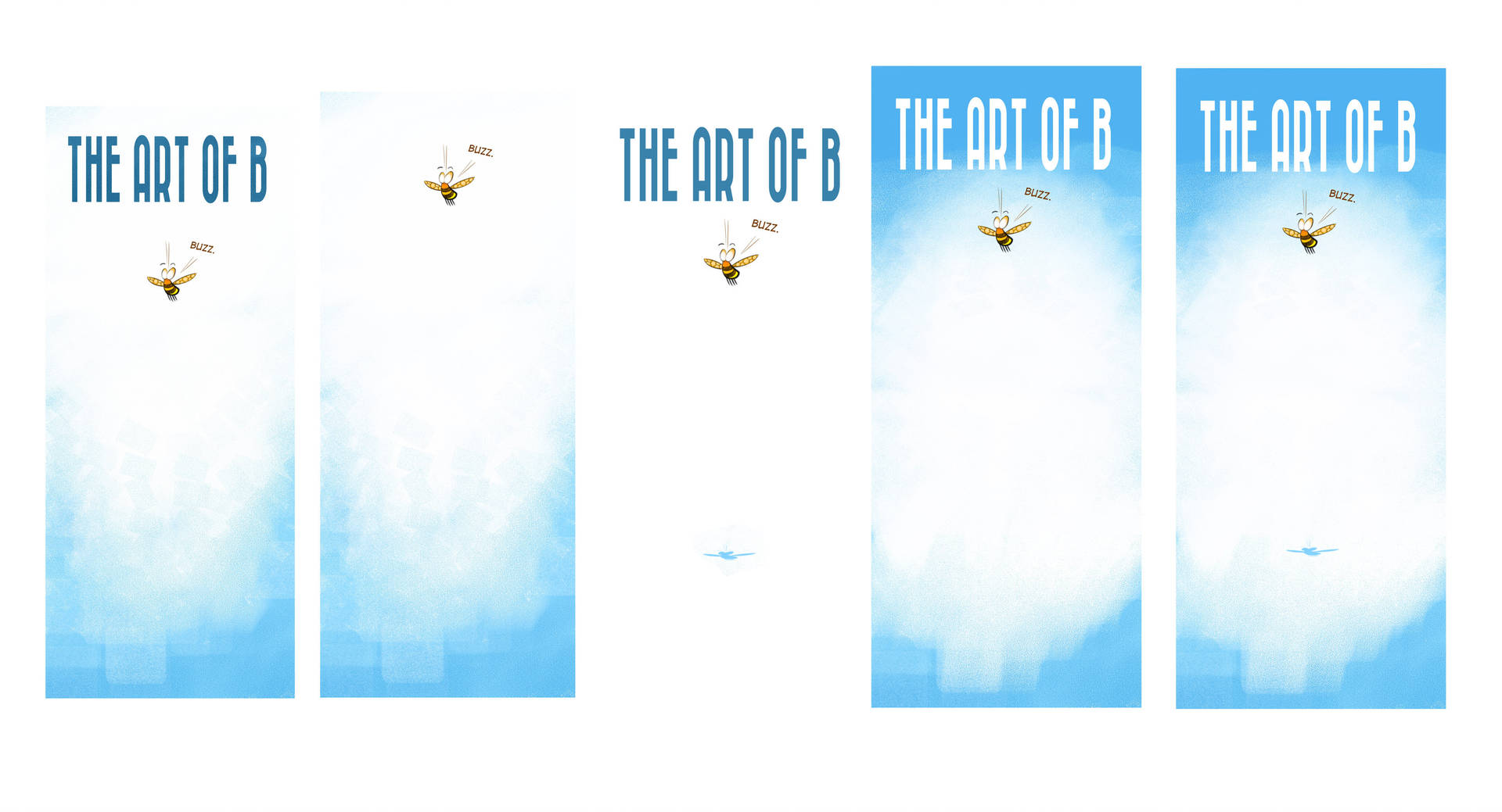
Which banner do you prefer?
-
I'm gearing up for con season, and I need a new banner! I know that I want to use a lot of white space (most other banners are super dense or dark) and I wanna keep it fairly light and simple.
Which one of these very similar options do you prefer?
Thanks!


-
I like the 4th one the best.
-
I agree with @Chip-Valecek --the 4th one is the one I prefer as well. In my opinion, I think it has the light/white quality you want without feeling empty like some of the others.
-
I like 1 the best, though 4 is nice.
 4 makes me think that something is missing from the white space.
 -
The 4th one is what immediately attracted my eye also.
-
@Braden-Hallett I like number 2 and 3. Perhaps have the bee in 2 say The Art of Bee instead of buzz or the words as a shadow under the bee.
What do you mean by “con season”?
-
I like 3, good use of negative space.
-
I like 1 & 3
-
I really like the third option all the white and the bee's little shadow on the bottom.
-
oh they're so cool!
I guess you wouldn't go wrong with 1 or 4.
What I am curious of though is: Will you have your website mentioned there? -
@Braden-Hallett I vote for number three
-
@Braden-Hallett I liked number one too
-
@Braden-Hallett I like 1 the best. The blue looks good on the white and your buzzy little dude stands out more because he isn't too close to the text.
-
I agree with @KathrynAdebayo that seen this way 1 appeals to me the most since with the last two I also look for something in the white area.
However generally speaking in my experience with cons most people never see the bottom of vertical banners or if they do it's after the top half has drawn them to your stall. From this perspective of the top half been the most important I'd say 4 is my favourite. -
I really like 3 and 5. The shadow pls your eye across the negative space and then back up to the bee.
-
I like 1, it has a nice gradient formed from a painted texture. The rest have it too but thats a lot more empty white space that isn't being used for anything and the white space is centered which makes me think like something is supposed to go there? I would clear that top left corner of 1 so that the top is completely white behind the lettering and maybe make the blue of the lettering the same as the blue of the paint below it.
-
I like 1

-
I like number three. It really stands out and the detail of the bees shadow is very simple but effective.
It is minimalist and that makes it stand out. -
@Braden-Hallett My personal preference goes out to number five. The first three it feels like the bee is getting a bit lost in all that white. And I love the shadow underneath the bee in the fourth! Nice going Braden!
-
I prefer the first because those words really standout against your light background. It makes it much easier to spot and read.