Fall - WIP (The battle of leaves)
-
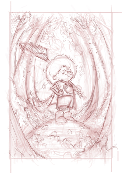
Did a few thumbnail idea sketches for the fall concept and one that I hit upon was the never ending onslaught of fallen leaves. I did a quick character sketch (bottom left) and thought it would be interesting to have a scene where the character is about to battle the leaves or is already triumphant. Here are 5 composition and value thumbnails, all about leaves.
1 - Character standing on a pile of leaves with piles she has already collected in the distance behind her.
2 - Standing on a clean patch of grass with (pre-swept) leaves piled up in the foreground and bare trees in the background.
3. In front of a pile of leaves but her brothers/ sisters are playing it in behind her.
4. In the middle of sweeping a mountain of leaves.
5. Standing on a rock with leaves surrounding it.
6. Standing in a cleanly swept area facing vast landscape of fallen leaves in the background.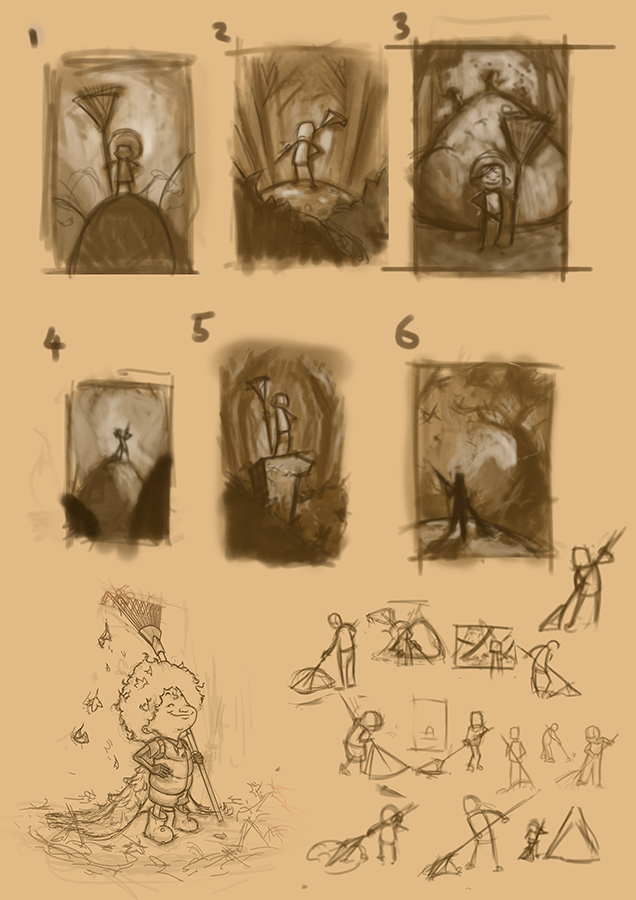
-
Hi Gary! I like 2 and 4, both for the composition/lighting and for the concept. I like the idea of having a bare patch but being surrounded by the enormity of the task, and especially in 2, I like the character's posture and how everything radiates out from her because it suggests triumph. Four is a little more ominous, but I like that too. I also like the concept of the sister and brother undoing everything she does, but I don't think it reads as clearly so that you immediately understand the element of futility. Because we all know that futility vs. satisfaction is what the battle of leaves is really all about! Depends on which feeling you want to be prevailing at the moment.
Also, when I saw the character sketch, I thought for a minute that her hair and cape were composed entirely of leaves, and the idea was very appealing!
-
@lauraa - Thanks for the comments. Actually in the character sketch she does have a cape made of leaves that I may still consider if it can fit in the scene. Her hair is quite puffed up with a few scattered leaves in (im hopefully going to have her as more ethnic character to give more diversity to my portfolio)
-
Great Idea Gary! I like the 6th one the most. It has kinda epic feel to it and basically you see what needs to be done from the character perspective. I also like the 4th one. Simple comp, but something draws me to it.
Looking forward to the result. Have fun!
-
Gary, great character sketch. I love the pile of leaves as her cape. I’m not sure which composition I would drop her in but I like the idea of #3. Every superhero need to have a nemesis or two.
-
I like 2, 3, and 6. The values and composition feel better in those. I also like @Davidingalls suggestion about the nemesis.
-
Looks like the votes are all over, I like number 2 the most. It frames the character nicely.
-
@gary-wilkinson Like this idea and 2 and 3 are my favorites. Really like the character sketch and 3/4 view. #2 is nice and simple, feels like a cover illustration, and you could even do it as cover, with a hand-lettered title. #3 brings in other characters, and feels more fun and active.
-
@gary-wilkinson 2,3, and 6 for me too - 3 with a bit of the gesture of 2 would be a great way to go - be a really nice book cover design with the space at the top. Looking forward to seeing where you go with this!
-
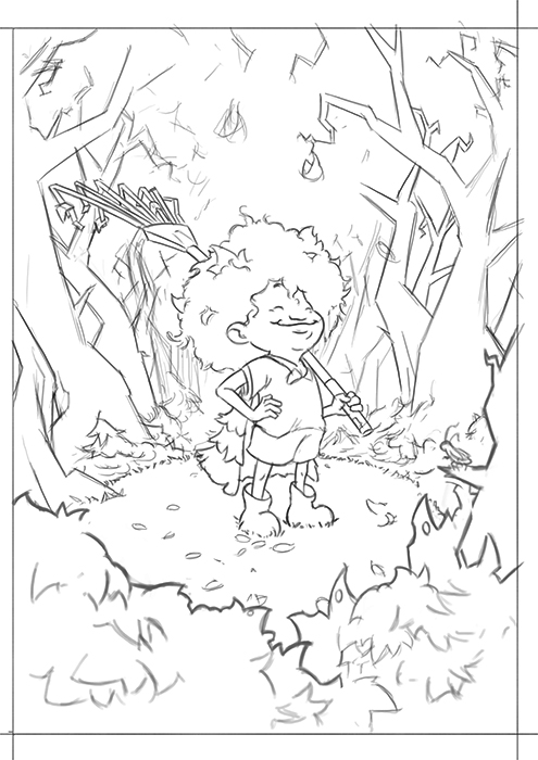
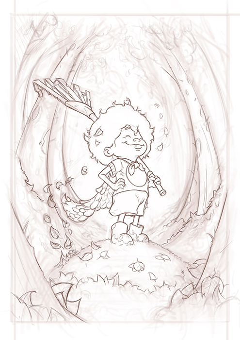
Thanks again for everyone's advice. I've decided to go with 2 (although I might look again at 3 someday in a different style)
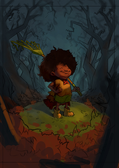
I've now got my linework down and have been playing around with a few color schemes. I quite like the idea of having the leaves around the mound of grass she is on and having somewhat of a dynamic light over her face with the background receeding into blue.
-
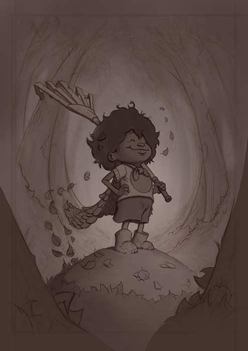
Nice work, love the characters expression, she looks so proud! I think the blue background with the shapes of those trees looks a little scary or ominous and it conflicts with how happy she looks. Although from your description she was battling them so it could have been a pretty dramatic battle haha! Great job, can't wait to see it finished!
-
@shiggins180 you're right about it being too ominous and think it would fit the right scene but maybe not this one. I was rewatching Will Terry's 10 step video again recently (along with creative composition) and he really pushed the idea of getting a good sketch if things aren't working out right. I think I will go back to the sketch phase again to fix a few things
-
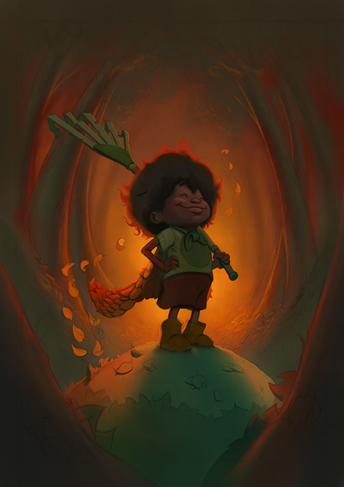
I think I really want to push the superhero angle of this piece and feel it needs more heroic impact and less eeriness. Take 2:
-
Nice improvements, and I do like your warm/cool color scheme! As I see it on my monitor, maybe push the lights a bit? The whole thing is keyed way down. But the glow looks really nice.
-
@gary-wilkinson The line looks pretty good. He definitely seems accomplish
-
@Gary-Wilkinson the FACE on that kid! Adorable and proud!! Awesome.
-
A few updates to the painting. I thought I would try and follow Will's process as he outlines it in the 10 steps to digital painting to see if I can get a process that is a bit more streamlined, my own process is very similar, but I feel like I jump around too much or correct issues that could have been resolved earlier.
Refined the linework
Added tone
Color Studies
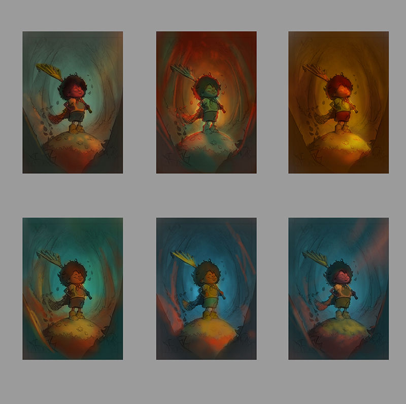
I think I like the middle top one with the back lighting as it's a style I haven't done much and seems to add to the heroic-ness of the character. What are your thoughts?
-
@gary-wilkinson Very nice! I think the top middle one feels very 'autumn'. It's a good choice.
-
@art-of-b i totally agree. That soft warm backlighting really gives off that autom vibe.
-
Slowly getting there, trying to decide on the best way to lighten up the front face of the character, along with a few other bits and pieces. I want the character to be of a dark skin, but finding it tough to balance the colors hitting her from the front as she ends up looking too green. Any advice is appreciated