UPDATE: Venom Contest (Done and Submitted)
-
I would suggest C.
Not only does the gesture capture more of the feeling of Venom (he was pretty aggressive), but if this piece might be used as part of promotion, I can see more places that they can put type and other graphic elements in 'C' than I can see in 'A' without messing with the focus of the image.
Looks like a fun piece!
-
First of all I would like to thank you all for your input. I am feeling really good with my progress so far. Here is where I am right now.
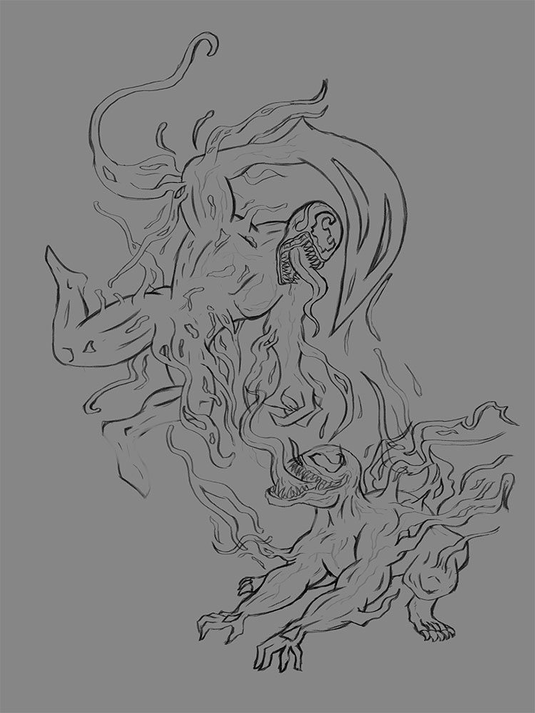
Cleaned sketch:
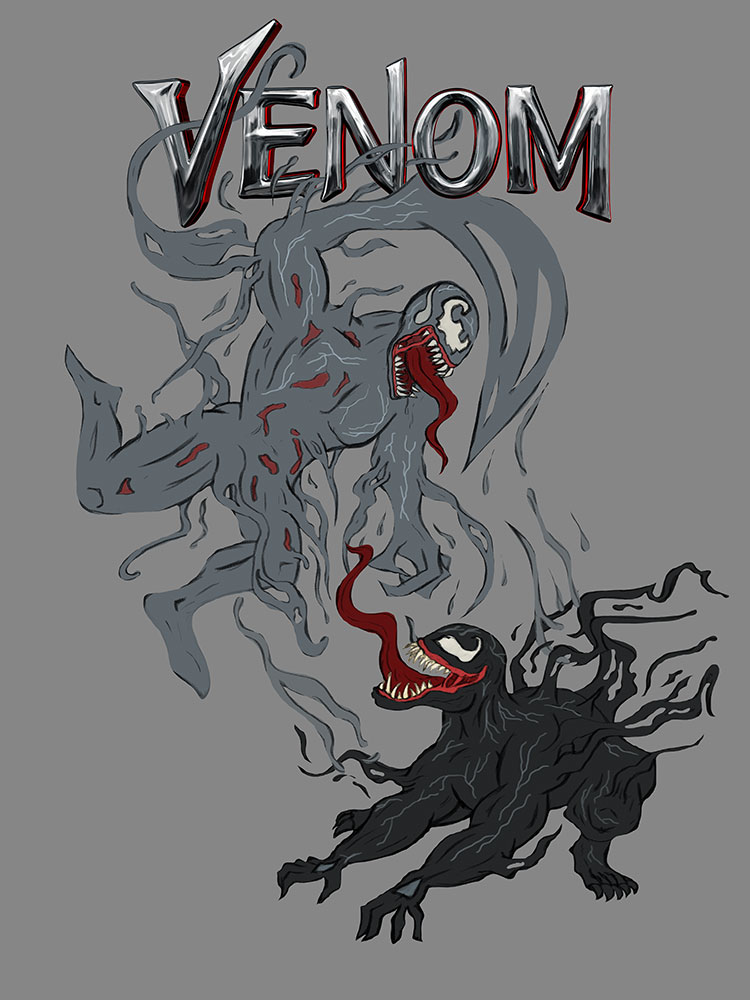
Local Color and masks on characters:
Background (keeping it simple but wanted hits of a city back there):
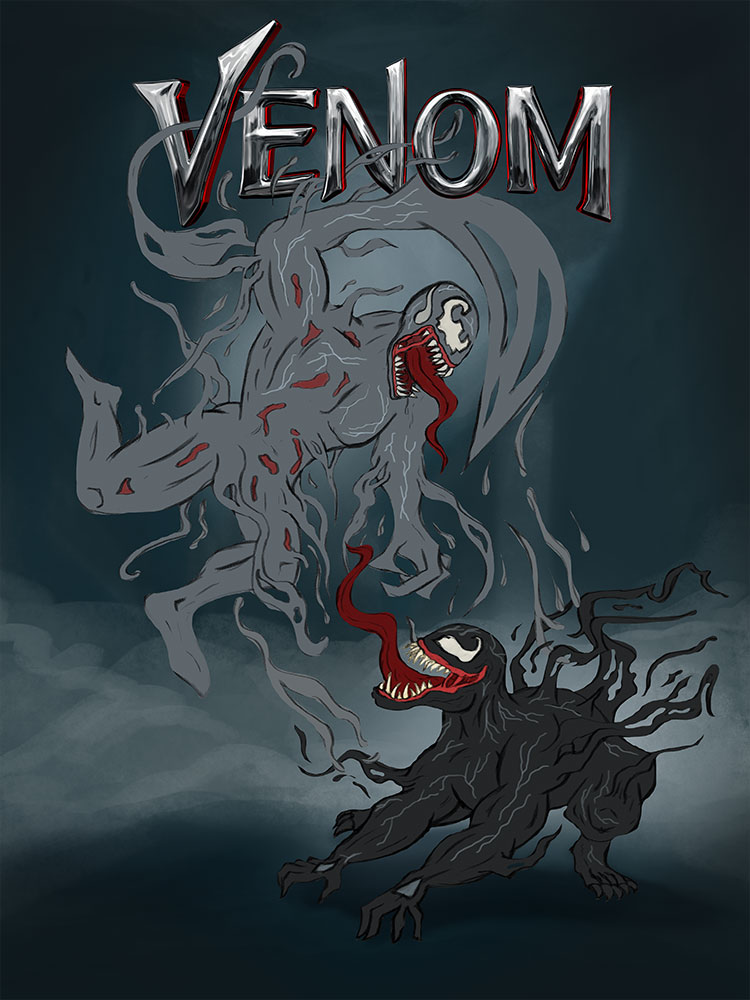
I am looking forward to working on the shadows and lighting. Going to be a busy day today so I hope to work on that later or tomorrow and then onto the fun part of rendering out the characters. Please let me know what you think so far.
-
@chip-valecek This is looking exciting! Love how the title looks metallic. Make sure to bring a feeling of mass or weight to the figures. Perhaps when you begin defining the muscles and tendons, it will achieve this. Looking at Google images of Venom, it seems that his body parts are massive and exaggerated.
-
@johanna-kim I can't take credit on the logo text, that was supplied for the contest. I will see if i can enlarge his body a little more.
-
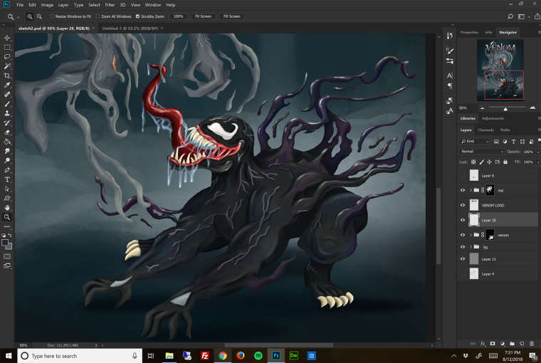
I made a few adjustments to body size, thanks for pointing that out @Johanna-Kim. I started finish up some of the details on Venom. I will move onto Riot now. How does Venom look so far?
-
@chip-valecek I like the cob web like saliva, that's creepy and cool!

-
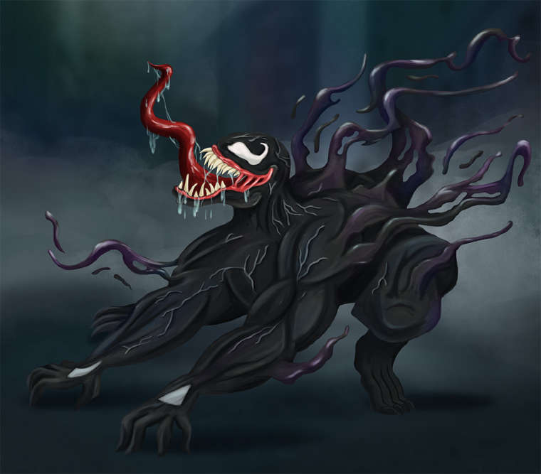
@chip-valecek This is better, and I like his face, mouth, teeth, tongue and squid-like tendrils coming off him, but I think you can bring even more weight and powerful force to Venom's body. When I look at images of Venom, he looks taut, from head to toe, with potential destructive power. Perhaps the muscles could be even more accentuated with highlights. The tendons/veins could feel more integrated with the muscles; right now they look as if they're lying on top of the muscles. My eyes are also drawn to his feet and white toe claws, which look relaxed/passive. How would you draw the feet so that even they feel just about to spring into action? Consider making the toe nails black and more pointy, like the teeth. Same with the finger nails; pointy, jet black nails.
-
@johanna-kim @Chip-Valecek you could splay the toes a bit. That would make them look spring-loaded for action. The muscles might need more definition if you want to be in keeping with the modern day taste in ultra-cut exaggerated muscles of supers.
-
Here is where I am at with Venom so far. Going to take a few days off on it while I work on my "Music" piece. Then this weekend I will work on Riot.
-
@chip-valecek I like c but I feel you need to show tension in his hands also
-
@chip-valecek I like the ooze on it. The chest and upper arms need reworked. Too much mass and the chest area needs reworked. You are also missing a back leg. I feel the pose is too dog like.
-
@michaelmattocks Thanks for the feedback, the back leg is there, just cant see since it is dark. The bottom of him will go deeper into shadow. My process it to paint the local values and define the forms before I add the shadow and light. Once I finish Riot I will add that in. I do see what you are talking about with the chest. I will tweek that when I get back to him.
-
I am late to the post, this looks fantastic, I have a 4 1/2 year old son who loves venom! We lost his figure under the couch once for a month and we all went crazy looking for it-Good Luck!
-
Face looks great! You can tell that’s what you want to be the focal point! What about creepy lighting reflected in the body? I love the subtle background. Totally going in the right direction with that. You’re headed in a great direction. Can’t wait to see it evolve.
-
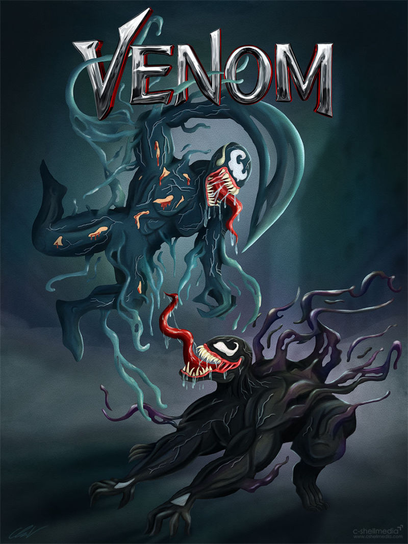
Well here it is, all finished and submitted. I hate when I get to a point in a piece and the fire dies down for wanting to work on it. Usually I can just put them aside and come back a few weeks later and I am excited again. But I had to get this finished and submitted.
-
Awesome! I'm digging the colors and lighting! I submitted a piece to the contest as well! Good luck!
-
This turned out really well! Nice work

-
I just scrolled through all the submissions. I know I won't be picked, there are some amazing work there. All I can say is at least I tried.
-
@chip-valecek Your piece is great and you got it done. Win or not, it's awesome.
-
@chip-valecek ~ you never know if you don't try!! You did a great job!