Frog Circus WIP Thread
-
I saw it also on instagram and it looks super cool. Love it. Maybe I would move the right foot more right of the still springing frog.
It is nice concept for the monthly portfolio challange. -
@Laurel-Aylesworth @chrisaakins @hannahmccaffery @MichaelaH Thanks
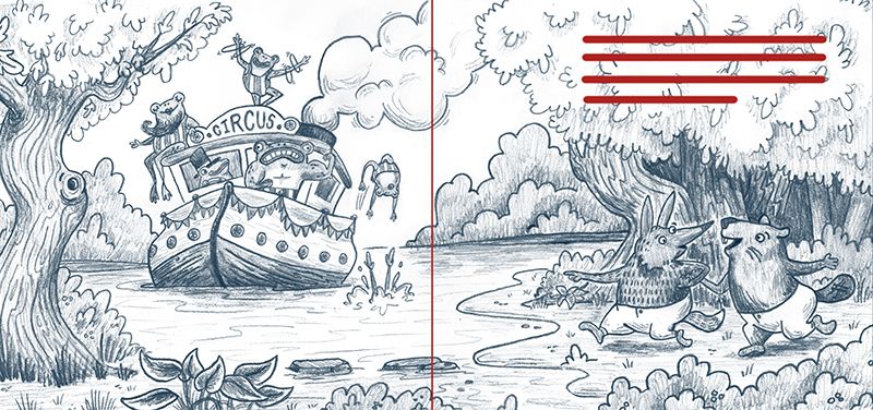
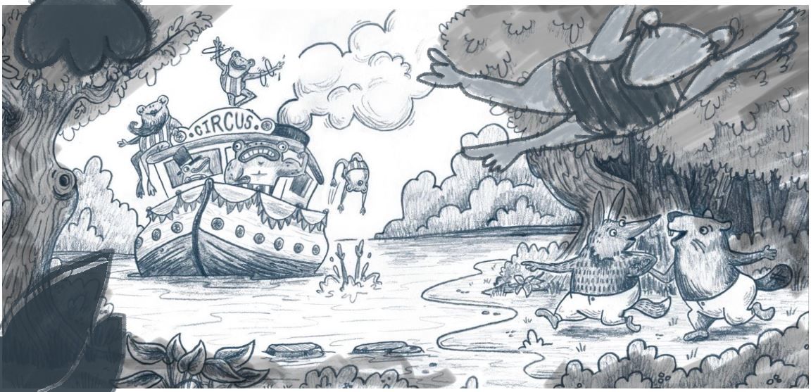
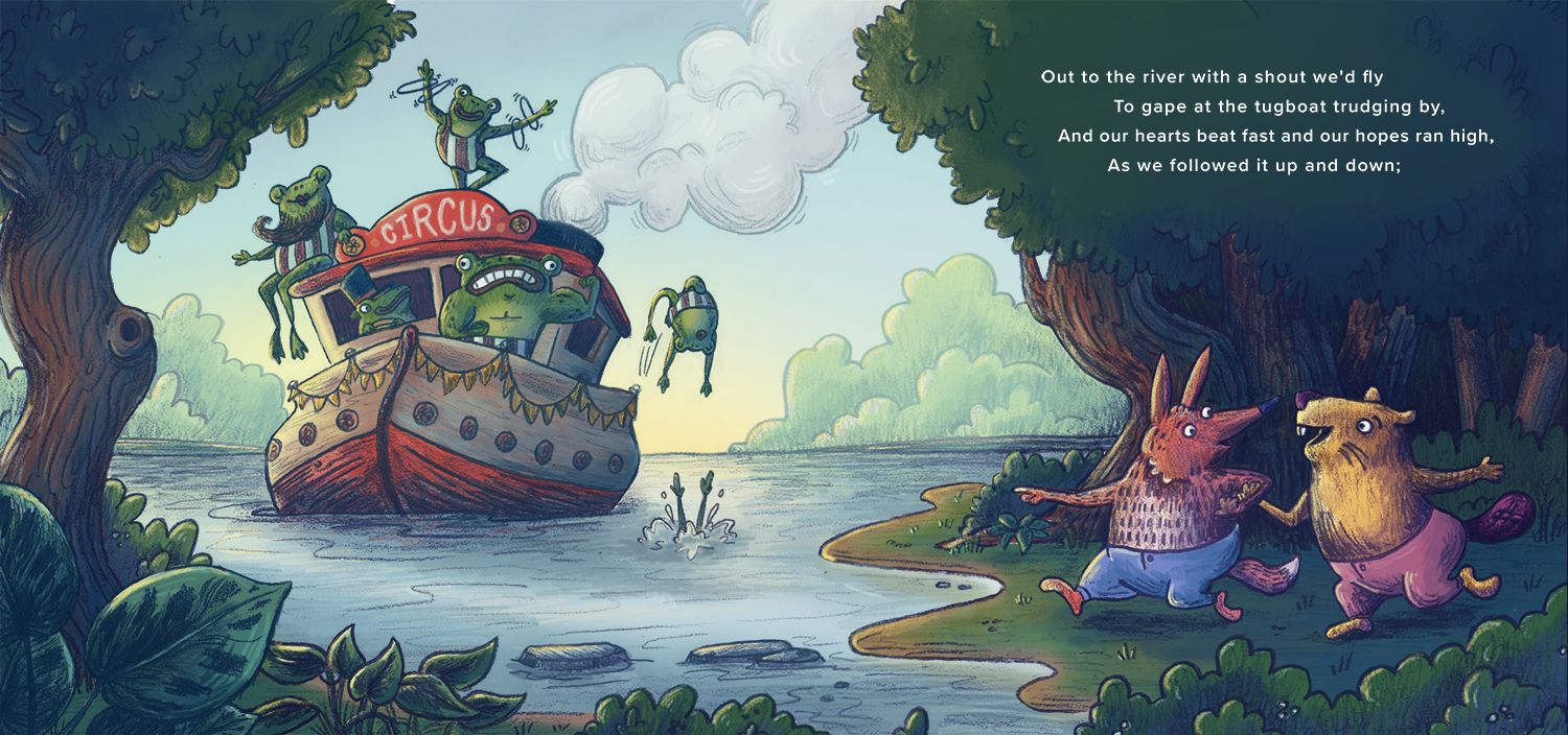
") there isn't an actual narrative behind this (maybe I should try to write one?) it's for #portfolioclub on instagram. The prompt word this month is circus so I kind of meshed a wind in the willows type world with the circus coming to town. I definitely want to push the characters in the foreground out more as I add color, and good point about the frog and the smoke. I scooted it over a little already, not sure why I didn't just move it completely off the puffs.
there isn't an actual narrative behind this (maybe I should try to write one?) it's for #portfolioclub on instagram. The prompt word this month is circus so I kind of meshed a wind in the willows type world with the circus coming to town. I definitely want to push the characters in the foreground out more as I add color, and good point about the frog and the smoke. I scooted it over a little already, not sure why I didn't just move it completely off the puffs. -
@StudioLooong - love this concept!
My only feedback is the frog steering the ship and the muscle frog are a bit difficult for me to read. Perhaps when you get to tone, this will be more obvious but also wonder if in the line work you might want to bring them further into the foreground.
I hope this helps!
-
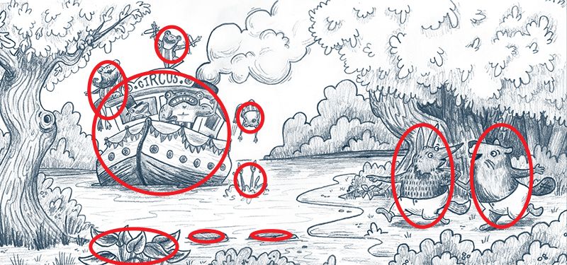
It looks great and my only critique is that the detail of your line work kind of splits the picture in half because the water creates an empty space in the middle. That’s good for making the frogs jumping more visible but if you could either move the frog in the water a little to the right or add a frog swimming toward the right shore or when you color it, use shadows on the water to join the two sides I think that would help. Overall though, I love the work and your line work is great.
-
Beautiful line work!!! I agree with moving the frog a little so he isn't so close to the smoke. The only other thing I notice (and it may be to far in to change, I can't tell if this is traditional or digital-awesome job) but all the pieces are of similar size. Will, Jake, and Lee are always talking about a range of sizes in a image. Maybe a large leaf in the foreground edge or a large piece of a frog upper edge (some feet) as if he has jumped of the boat towards us and is just above us-Other than that it is a stunning piece, congratulations!!!
-
The bearded lady frog is the main focal point for me! Looking forward to seeing this in color. Great piece, lots going on but easy to make out all the characters!


-
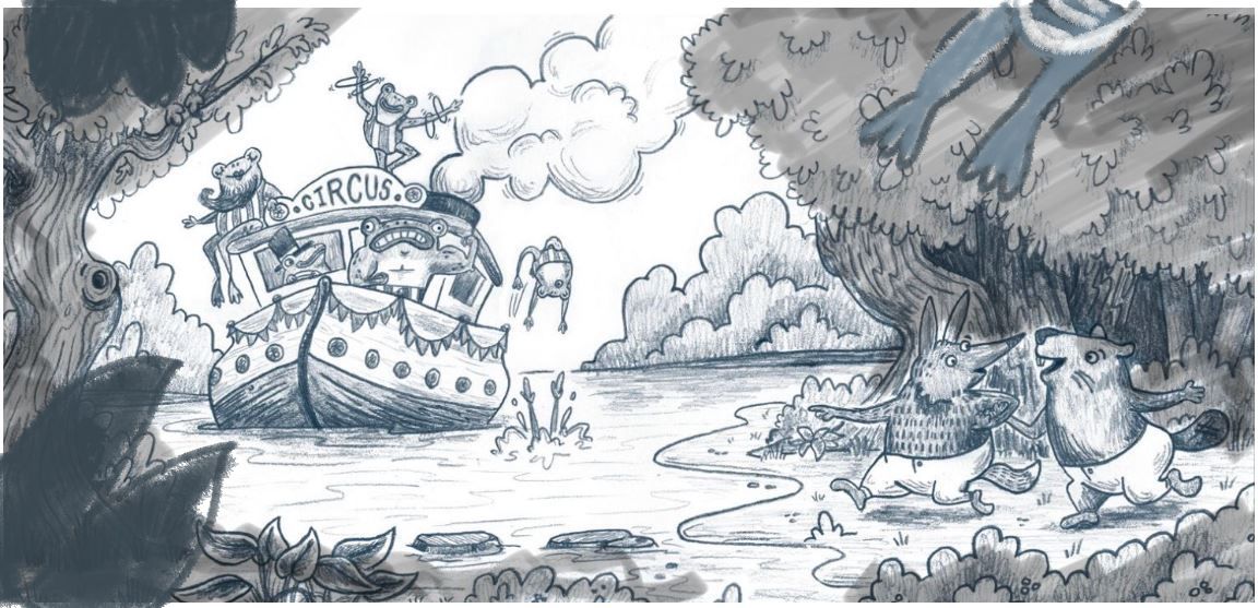
@demotlj do you think this is still an issue if I'm trying to set the image up to be a 2 page spread (I'm trying to practice keeping things out of the gutter and leaving room for text) I like the idea of adding another frog in the water and working with the tone of the water to connect the two.
@lmrush this is currently ~95% traditional pencil work that I've isolated in photoshop and 5% digital pencil brush retouching. I start out traditional because its faster and I think I get better results and then take it digital to edit/add color. So yes, it's traditional but it's never too late to make edits! I was thinking that I had shown a variation in size, do you think I need to push it more?
Taylor Woolley
(Formerly Taylor Ackerman / StudioLooong)
Website: www.woolleystories.com
Instagram: https://www.instagram.com/woolleystories/ -
@StudioLooong It certainly changes things if you are doing this as a spread because, as you said, you don't want the frogs in the gutter. I think in that case using shadows and tones in the water to connect the two sides across the gutter would be the best solution.
-
I think the frogs look great as they are and I love the composition and narrative feel of this. My one suggestion would be when you get to the color/contrast part that I would seriously push the contrast to differentiate the land critters from the trees behind them or they will get lost in the background. Great job though
-
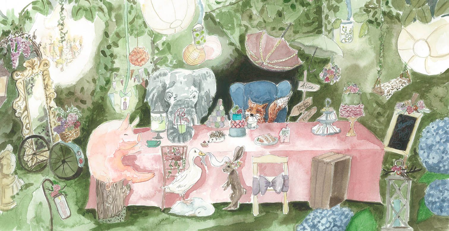
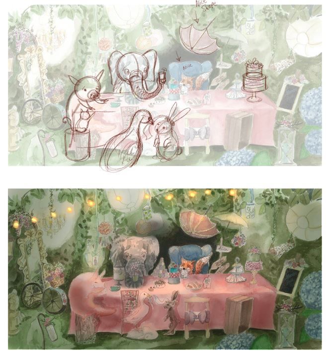
Maybe I said it wrong I guess I meant size varying in perspective eg., bringing some items up close so they are bigger. Here is an example of a draw over Will did in one of my images, where the duck and bunny are quite big as they are moved forward. In my original all of them are a variety of sizes but the size varying in perspective that Will does gives the image more depth- Sorry I hope that I said that better and that it helps.
-
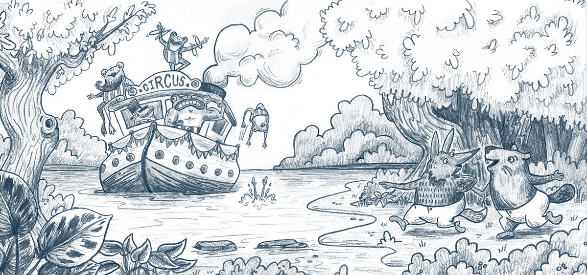
Hi! I really love your style! You said that you are trying to avoid overrendering which is very good idea beceause all the details on the trees are grabbing the attention. What I would suggest is darkening leaves and trees to put more emphasis on the most important part of the composition.
-
@lmrush ahh okay so now all the characters are pretty parallel to the picture plain and that's what I should vary?
@MartaD thanks, definitely will do! This is just the "line work." (I know it's a little more than line work but at this stage it's more about the texture of the pencil for me than the actual tone.) I'm planning on doing just what you've done as I add tone and color under the pencil work. There's more texture on the trees and bushes because I know I'll lose some of that detail as I add darker tone behind it.
-
Here are two quick examples of what I was thinking...If I am way off just ignore me
-
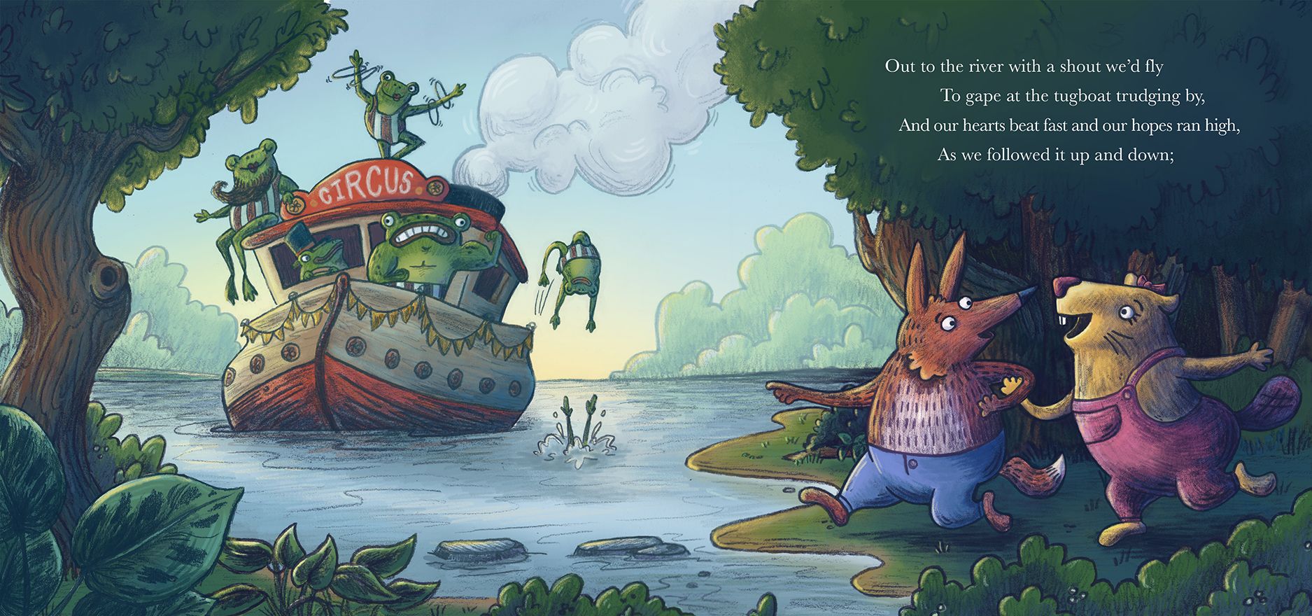
This works really well as spread with text, it's balanced really nicely on each side, and looks much better now that you've moved the frog away from the smoke
Another small suggestion, maybe move the frog that has dived into the water in front of the boat so all the characters are spread out a little bit more and it would fill a bit more of that water space.
I agree that the bottom left corner needs some kind of larger foliage there (not too much that its distracting), just so we can get a sense of depth, and maybe the horizon line of the water should be straight? It's catching my eye that it's higher on the right! But apart from that I think you have a really strong piece here and i can't wait to see it in colour
-
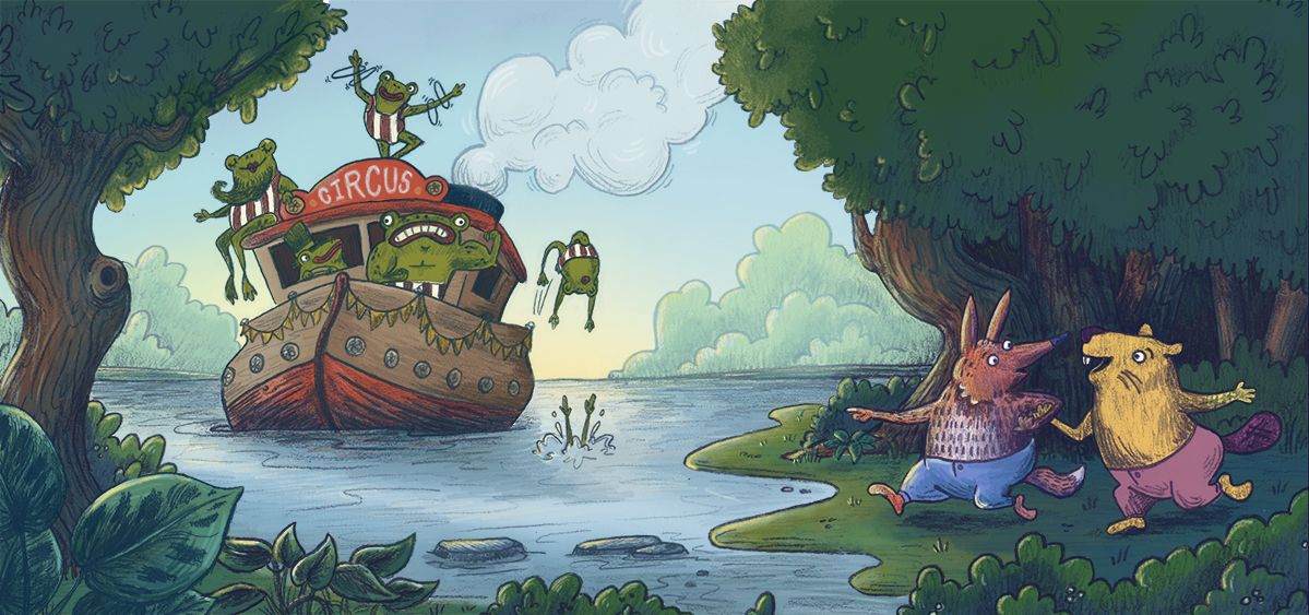
thanks for all the help everyone! I think i'm going to move into adding tone and color now.
Taylor Woolley
(Formerly Taylor Ackerman / StudioLooong)
Website: www.woolleystories.com
Instagram: https://www.instagram.com/woolleystories/ -
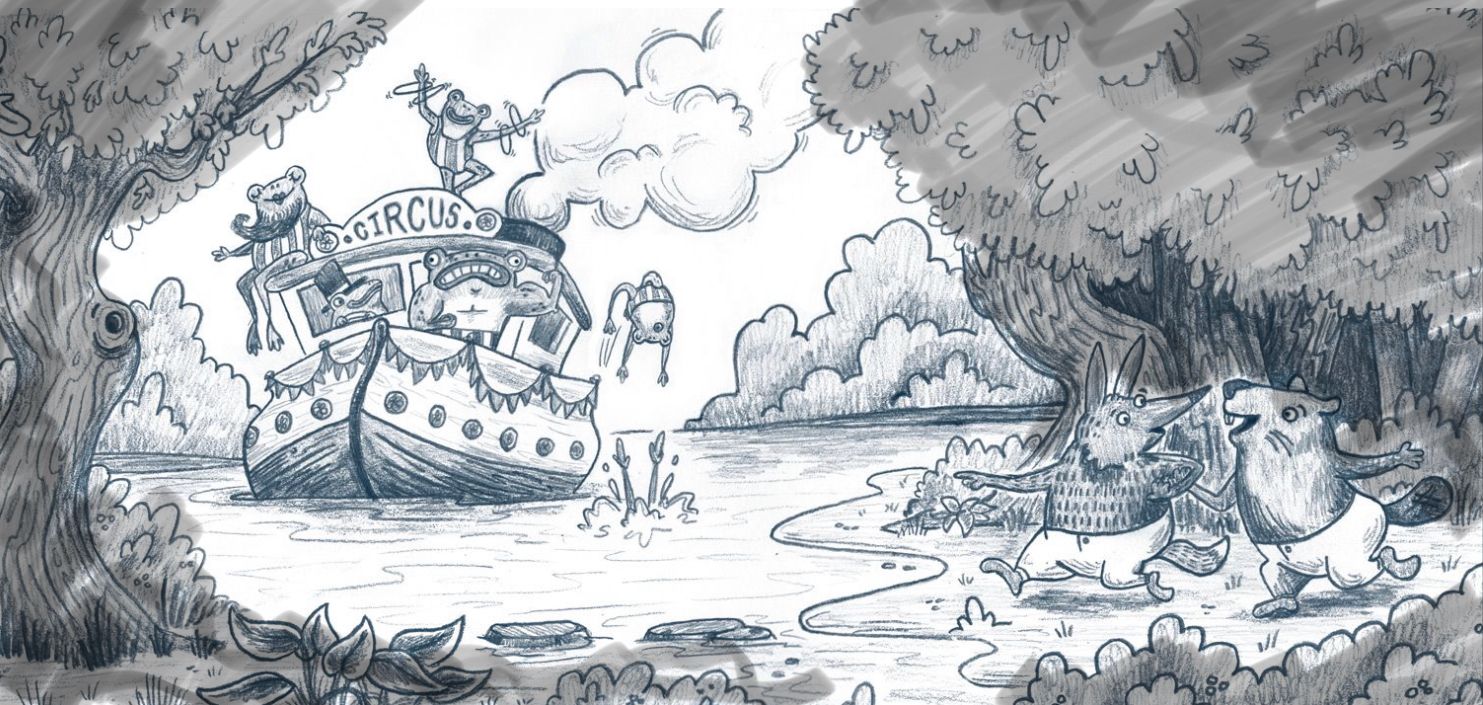
It's still only about half way done but here's my progress on the frog circus:
Taylor Woolley
(Formerly Taylor Ackerman / StudioLooong)
Website: www.woolleystories.com
Instagram: https://www.instagram.com/woolleystories/ -
@StudioLooong I think you can intensify the color a little bit on the background foliage. It has the same value as the sky and it wouldn't unless very very far away. It looks great otherwise. A two page spread is perfect and reads really well.
-
I'm thinking this is almost done, I am going to take a break and come back to it tomorrow with fresh eyes for a final pass. I've mocked in some text but the trees behind it are rendered so I can turn it off If I want to present it without.
Taylor Woolley
(Formerly Taylor Ackerman / StudioLooong)
Website: www.woolleystories.com
Instagram: https://www.instagram.com/woolleystories/ -
Finally calling this one finished!
Taylor Woolley
(Formerly Taylor Ackerman / StudioLooong)
Website: www.woolleystories.com
Instagram: https://www.instagram.com/woolleystories/ -
@StudioLooong looks great!