Wizard of Oz: Pick a thumbnail
-
Which one do you like best?
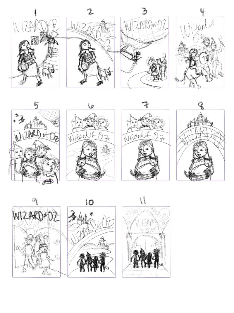
1: Dorothy about to throw bucket, scarecrow being taken away by monkeys
3: oz going away in balloon
4 Dorothy riding the lion
5-8, Dorothy holding Toto
9: walking into Emerald City with green glasses
10-11: silhouette of the 4 friends from behind
-
Hi Holley, I think nr. 3 is the most exiting in concept and also the Title would be framed very beautifully and it would stand out much more from the rest of the image.
-
Hey Holley,
#5 is my favourite since it has all of these different elements of the story, and the title makes a nice division of space.Also a tip that I've found when designing a cover: include space for the author's name in the thumbnails (it'll sneak up on you in the final design).
Looking forward to the final piece!
-
They all look really good to me but I think #5 is one of the best. That's just taking a quick look over.
Marsha Ottum Owen
-
@holleywilliamson I vote for number 5! I really like how you framed everyone under the title and incorporated the city above with the witch
")
-
I vote for #5 because it incorporates the most elements of the story and I like that it has big, medium and small sized items.
-
I like 5 and 10 the most!
-
@holleywilliamson I like numbers 3 and 5 the most
-
I like 10 most
-
I like 8, 5, and 3
-
@holleywilliamson I like no 10 the most. I have a problem with No 3. I think revealing what Oz looks like on the cover is a massive spoiler.
I'm just listening to the audible version with Anne Hathaway reading it to me - so good. And Oz being a mystery is such an important part of the story. BTW I've never watched the film or read the book before.
-
I like 3, 5 and 11 ... but looking at it again, I also kind of like number 9
-
@Marsha-Kay-Ottum-Owen says: I also like 3's compostion and 4 because she is riding a lion and I think that's pretty cool.
-
@holleywilliamson Very nice! i am liking 9 the best, it stands out as being unique - something i have not seen before for an Oz cover - they all look nice though!
-
I really like #5 as well but feel like its been done in that manner so many times..I vote for #3 for that reason. Its unique and adventurous and looks great as far as composition goes. Love them all.
-
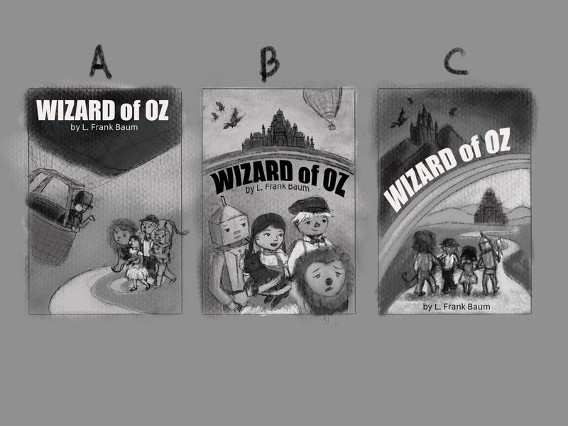
Thanks for all the feedback so far, I usually don’t have a hard time picking a thumbnail, but for A I am worried that it is giving away too much story, also that they all look worried. For B I am worried that it is too generic, not different enough, but you can really see the character design. With C, their backs are shown, which is pretty popular with book covers but is that too easy of a solution? Also For C I was going to do their silhouettes, but then it doesn’t really go with the dark vs. light theme.
Let me know which one you like!
-
B and C. Though with A I might make the characters a little smaller so thry don't go off the page. That might just be personal preference.
Marsha Ottum Owen
-
@Marsha-Kay-Ottum-Owen Since my husband is sitting next to me I asked him. He chose 3. Not an artist, just a regular guy with an opinion
-
I like B and C. Leaning more towards C.
Any reason they're all looking off to the right in B? Instead, I'd like to see some of the characters interacting with each other.
-
Wow, this is a hard pick. I think nr. 1 and nr. 2 are the strongest. Nr. 3 is split in two by the rainbow, I think that kind of creates an imbalance in the image.
In conclusion I think I would go with nr. 1, It is well balanced, the title is super clear, in your face with that strong contrast and also what is underneath fatefully encapsulates the story, and has everything that you need to know about OZ. So yeah Nr. 1.
Cant wait to see your Update!