Which promotional banner? Please Vote
-
I am creating a banner to include with my email submissions and can't decide which version to go with. Please help.

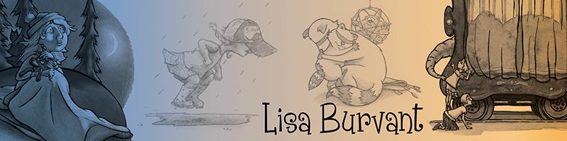
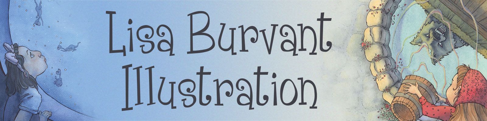
A
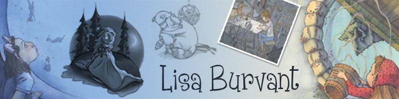
B
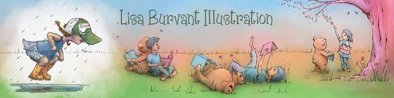
C
D
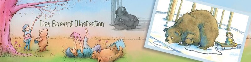
Lisa Burvant
www.lisaburvant.com
Instagram & Twitter & SVS: @burvantill -
I like C better because it is in color; the name is not too small (as opposed to D); the children friendly art environment is very much put forward (I can't really see it on B, which has for now the most votes. Also the pictures on B look too small for a banner : once shrink to the real banner size, we may as well not see anything at all)
-
@Julia Thank you for the comments. That’s helps me immensely.


-
@gavpartridge Thanks. Very appreciated.
-
I like D the best. I'm really drawn to the color. However, I agree with @Julia about the name being too small. Maybe you could remove the bear that is just to the right of the word "illustration" and use the extra space to increase the size of your name. Hope this helps!
-
Cool idea to do an email banner! I like B best because of how the large moon shape encloses and groups together most of the images except for the girl on the far left. I also like the limited palette and how it goes from monotone/dark to full color. With so much going on, it's easier for me to look at each vignette when the color is controlled. Your name is also nicely prominent, but not too big. And the "framed" image of the girl in her studio fits nicely with your identity as an illustrator. Lastly, I like the multiple circle shapes within this banner. It feels friendly and inviting, and my eye flows through the composition well.
-
Maybe D, but formatted more like C? I also prefer that your name be bigger like you have in B and C. I have to say that the wolf/well image looks really cool and dynamic on a banner like this . It might be cool to see if it could integrate with some of what you have going on in C and D.
-
@j-sienkowski YES! I was thinking the same thing.
-
@burvantill Don't get mad, but I'm really not sure about any of them ^^'''' While all of them look good, I've seen your recent work blow this out of the water and I think you can make this better. I think maybe the problem is that you're putting multiple illustrations in one banner. While I can understand the urge to show as much as possible in promotional material, the format is small and these banners look crammed with a bunch of elements that are great individually, but definitely look like they don't belong together. Presumably you're also linking your portfolio to these emails so maybe the aim of this banner is just is to peak their interest, not try to fit half your portfolio on there... I think I'd encourage you to pick just one image, your strongest one, and leave good breathing room for the text too. But feel free to ignore my advice completely if you don't want to go this direction, it would just just as valid
vanessastoilova.com
instagram.com/vanessa.stoilova/Check out my Youtube channel for tips on how to start your career in illustration! www.youtube.com/c/ArtBusinesswithNess
-
@NessIllustration said in Which promotional banner? Please Vote:
Don't get mad, but I'm really not sure about any of them
How dare you do exactly as I asked.

Not mad at all. And Thankyou for the kick in the butt. You’re right. I want to tease, not give away the cow...and the pig, and the chicken
-
Thankyou everyone for your feedback. I’m always so blown away by how awesome my art friends are here in this forum. I think we are so blessed that we have this support.

Lisa Burvant
www.lisaburvant.com
Instagram & Twitter & SVS: @burvantill -
@burvantill let us know about the end result!
-
Thank you all for your input. I have altered two of the banners to use for now, but I am in the process of creating a new updated version per @NessIllustration sage advice. =)x
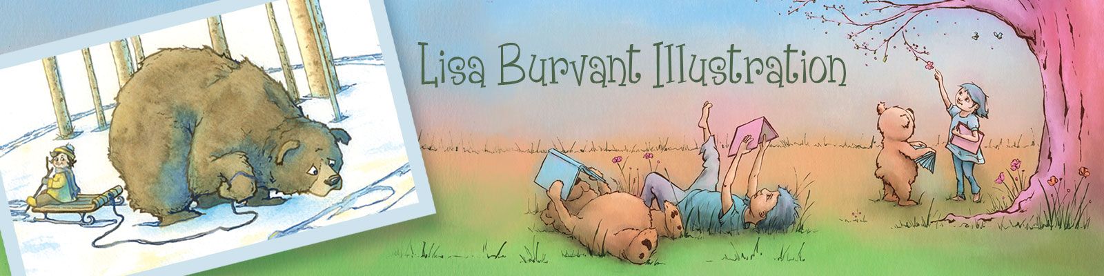
I will share the new one here when I'm done. Surprisingly it will involve a girl and a bear. LOL
Lisa Burvant
www.lisaburvant.com
Instagram & Twitter & SVS: @burvantill -
@gavpartridge
! Tell your girlfriend THANX! -
@burvantill Ohhhhh that's lovely!! I really like that first one!
