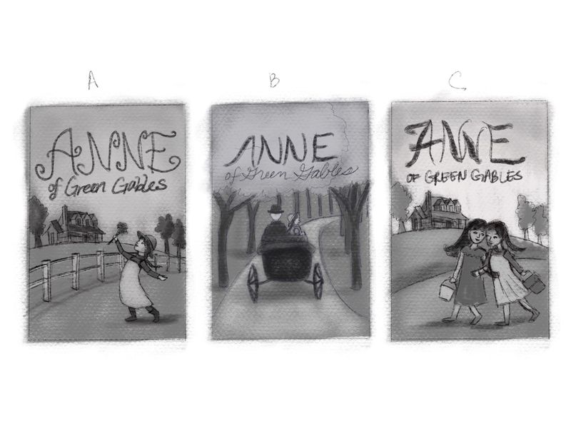
Which thumbnail do you like?
-
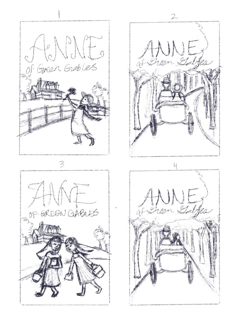
Hi I am doing a cover of Anne of Green Gables for my portfolio. My keywords are carefree, wonder, and charming. Which thumbnail do you like best 1-4?
-
I like A best. It has great energy to it and captures Anne's free spirit.
-
I like the first one too. 3 is good too but a solo character brings out more of the emotions.
Although the other concepts are also great, but keeping in mind your keywords, the canopy of trees and the characters sitting so still in the vehicle seem a little claustrophobic.
-
@holleywilliamson such a great idea!
I like 1 for the words care free and charming.
I feel like 4 could work for "wonder" and be really pretty with her looking at the woods, but I think it would be stronger if you maybe angled the road like you did in the first one? That way it's not just a straight path in.
-
i like #1.
-
For the keywords, 1 is definitely the best.
-
Hi! I like 1, for all the reasons already mentioned, and 2 - that little carriage/buggy/wagon(?) bumping through the woods is pretty darn charming. But the figures sitting stiff and looking straight ahead doesn’t quite convey “carefree” or “wonder.” I’d like a mix of 2 and 4.. or wait, how about a mix of 1 and 2??
-
I like 1 the best, it communicates the ideas you want best.
-
I agree with @carlianne . 1 or 4 with the changes she mentioned.
-
I like 3 the best.
-
@holleywilliamson I like 1 and 3, but 1 best for those keywords.
-
No. 1 for me, too!
-
Thanks so much for the input everyone! For 2 and 4 I changed the road because I wasn’t sure about needing to draw the horse if the road was curving, but I guess if you make it look curving way off in the distance that would work. I was thinking about doing more polished sketches and keeping the sketches of different cover ideas with the finished one on my website. Some feedback I got was to include more sketches in my portfolio.
-
@holleywilliamson I like #1 because she has movement she looks happy and carefree
Mara -
@holleywilliamson I like the first one (A). It sends a carefree playful vibe and it's more dynamic than the other ones.
-
I will probably still go with the first one but I wanted to take each one a little further. Let me know what you guys think
-
I really like the first one the best. I think it best captures your keywords, and it’s just a sweet image.
-
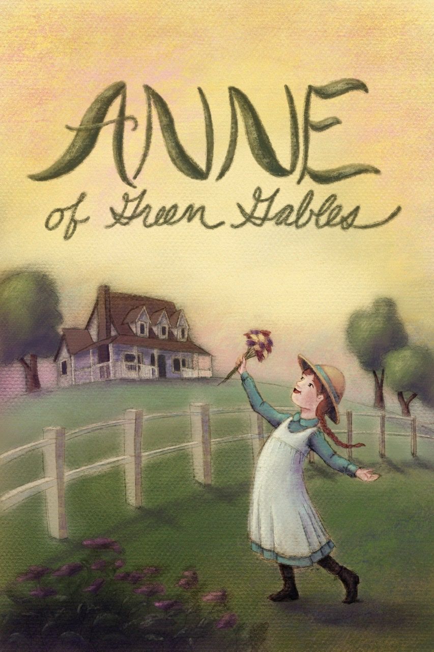
Here is what I did with it. I recently started leaving the lines in to speed up my process but not sure about the outcome.
-
This is very cute! It reminds me of an oil painting. I like the subtle pinks woven into the sky.
Bailey Vidler
Portfolio: baileyvidler.com -
@baileymvidler thanks so much!