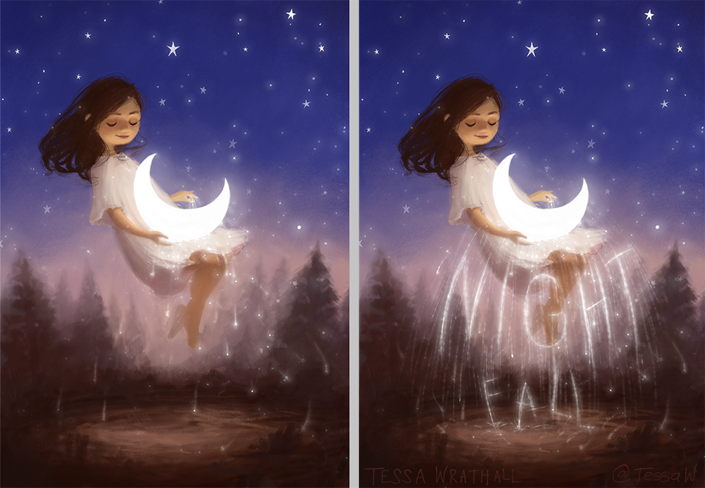
Quick Vote Please! 🌙 With or with out text?
-
Hi guys! For my portfolio, do you think I should keep the text on this piece or leave it off? I'm willing to redo it, if the idea is good, but maybe the phrase or styling is not the best. Thank you.


-
I can't figure out how to edit the poll, but the last one was supposed to be :
With text, but with some modifications.

-
@TessaW With the text it looks like it was designed to be a book cover. Without the text it seems like it's missing something

-
@TessaW i love the text one. It looks like the moon is a sparkler or something. I just find it more attractive
-
@Braden-Hallett makes a good point that the text version looks like a book cover. If it's not a cover, I think I prefer the non-text version, because it seems more organic without the text. But I do like how the text-version has more starry streaks.
I love the little splish-splash the stars are making on the ground of the text version!
-
Perhaps try a version without the text but has the same density/energy of the night fall text.
I agree with other posters that the version without text feels like it is missing something - but I think it's that the words give a great movement and create so much magic because their are bright and shiny. I bet it could still feel that without text but just with more shiny sparkly wonderfulness.

Beatiful piece!
-
@TessaW I love it with text. It fits the piece so well.
-
I prefer without but not sure why. I think maybe the text covers her legs a little too much so it removes the floating effect a little. But it still works. And I’ve already said it before but I love this , and I love it either way. It’s just very sweet and dreamy, and the character is


-
Thank you so much for the feedback you guys!!! After reading all of your comments and seeing the poll results, I think I'll play around with both versions more. I added the moon sparks in the hour or so before the contest deadline, so a few more hours of playing around with it is in order I think.
Thanks again for your opinions and suggestions.

-
I love it with the text just because I've seen it and I get biased towards any sort of typography that blends in so well will the illustration.
I'd just make the text brighter in some parts, as much as the moon.BEAUTIFUL illustration!

-
I absolutely love both these images. I agree with others that the version with the writing would be an excellent book cover. If you were going to use the version without text I also agree with @baileymvidler that you could perhaps add a little more of the splashing stars she mentioned falling on the ground as that is such a beautiful effect. It’s a beautiful piece either way! Well done!
-
@EliaMurrayArt agreed! I like the openness to interpretation of the one without text but enjoy the brighter more magic stars dropping in the one with text.
-
It does look like that space below her needs something, but I'm not sure it has to be text. Or slightly thicker text, maybe cursive? Or am I just throwing a wrench into things?

I think you're right: Play around with the possibilities and you'll happen upon the solution!