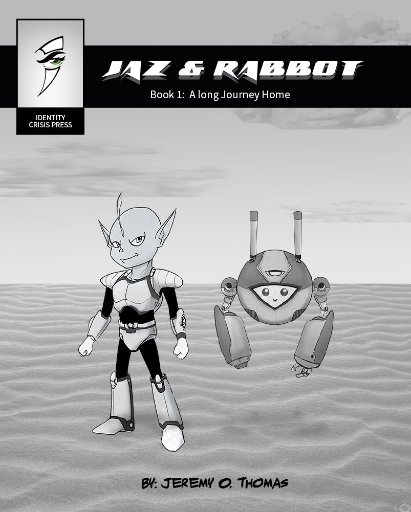
Comic Cover feedback
-
I've been working on the first chapter of a short graphic novel series (My first attempt)
And I quickly made a mock up cover and want to get some feedback. At this point I probably should do more thumbs but I want first impressions on the quick shot.
Thanks SVS'ers!
To Thy Self be True
-
@jthomas yes definitely do more thumbs. When I see it it tells me that it’s about an alien named Jaz and a robot named Rabbot and what they look like. It needs to capture my interest so have them doing something related to the story. If there are evil aliens chasing them have them running from them or something, if theres futuristic tech or space ships they have to fix, have them doing that. Something.
-
Agreed. Thanks for that. I'll post some thumbs.
To Thy Self be True
-
Hey @jthomas I really like your characters! You did a great job giving them personality. The first thing I thought beyond that is that the left character (Jaz) doesnt really feel grounded in the scene. I think he is on sand, but it also could be water? Maybe just some slight cast shadows from Jaz would help and a bit more from Rabbot
")
-
@jthomas cool. Remember the book cover is meant to be captivating. The image on it has to be either equal to or better than any image in the book itself. Either in concept and quality. Or in design.
-
@Annaaronson Excellent suggestions. I appreciate that. It feels really static and and Jaz definitely doesn't seem like he's grounded even though Rabbot is floating.
-
@jthomas I would at least pose them in a more dynamic pose and make them bigger. I would also angle them and make one more prominent than the other. By making them equal weight you have made both of them less interesting. Cool idea for a robot!
-
@jthomas cool! I think it still needs more action though.
-
@jthomas nice characters!
The alien seems a bit blueish, is that right? I would give darker background or make the characters darker cause they blend with the background at the moment. -
Adding to what others have said re: dynamic poses/grounding, I think you have too much space around the characters with nothing going on. Maybe add some background elements or pose your characters to fill the space in a more interesting way.

-
Hi I think you have 2 interesting characters there. I would agree with what others have said and do more thumbnail ideas.
If I was doing more thumbs I would look at avoiding splitting the page in half with your horizon line.
Also with perspective you would see less detail in the distance so the ripples would not be as prominent or would gradually fade as you go further back to the horizon.
On the concept it doesn't really tell much about the story, but that could be a preference, however the background is quiet bare so a bit more character there might help.
I know this is a mock up, so I'm sorry if i'm pointing out stuff you know or will look at. The contact shadow under the character on the left would help cement that character in their world.
I would have a bigger title, maybe no black banner, you could mess around with this in your thumbnails. On the fonts i'm not sure the bottom one works well here. Also the 'Jazz & Rabbot' text, maybe you could play around with the layout size etc. maybe have a look at other titles and see how they are laid out.
Hope that helps, the characters are cool, can't wait to see more progress.