December WIP - feedback really appreciated
-
I like this idea!
 It’s so cool to see how different people approach a prompt. The body on the moon is giving me trouble. I don’t think you need it.
 -
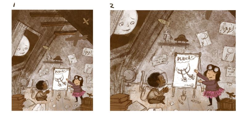
Wow that is great! I like the atmosphere of secrecy and mischief you created. Great touch adding the goggles and space helmet to the children and the flight paraphernalia as well. The moon looks like she's bittersweet sad. Is your plan to have the moon happy about the children's plans or to be tickled by their naivety? If the latter, maybe draw her chuckling to herself with her hand over your mouth?
-
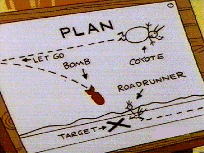
The expression of the moon is perfect. She very much looks like a mother checking in on her kids. I agree with @Braden-Hallett about the easel. I think the plan needs to be bigger and easier for the viewer to see. Like Wile E. Coyote's plans!

Loving what you're doing. Can't wait to see the next stage!
-
Wow, thanks for taking the time to give me feedback on this piece during the Christmas break, I really appreciate these.
@Braden-Hallett I think you are right about the little drawings are too little to make the point across. I will try to do something about it.@burvantill I will try to remove the body. I was very eager to sell the idea that the moon is a "She". Maybe the facial feature is feminine enough to sell the idea.
@danielerossi I had a hard time describing how the moon feel. @Braden-Hallett helped me out, and his speech bubble for the moon was very much what is in my mind.
@IanS thank you for weighing in. The diagram was a good inspiration

-
@xin-li This is so good!!! Fits the prompt perfectly - i really feel that with the prompt attached to the image that it is perfect. It invites us to explore the drawings on the wall and floor and the meaning of the drawing in her hands and it is also clear to me what the connection between the prompt and the image is and what the kiddos are up to - (l agree with maybe not having the body of the moon) - I love the crescent moon canoe

-
It's excellent, really love it! I agree with above comments. In terms of the body, she could still have arms , maybe they have a "they;re so sweet sort of expression, something like hands clasped and up towards her chin or one cheek, if that makes sense! The facial expression may carry it without arms anyhow, it's really great.
-
just wanna say the story idea is so sweet. Love your art!
-
@xin-li I love the concept. Can’t wait to see where you go with this
-
@xin-li said in December WIP - feedback really appreciated:
Maybe the facial feature is feminine enough to sell the idea.
I believe that it is.
-
I really hope this becomes a book one day!
-
I'm noticing several tangents near the edges that sort of take the eye away from the focal point (i.e. airplanes, cup of pens in the bottom left corner)
Maybe cropping the composition a bit more could bring the attention to the children more, and solve those tangents? Idk.
I agree that the the moon's face is plenty feminine.
I love that you took a positive spin on the prompt; it definitely could lead to some very depressing images if not carefully handled.
-
I love your concept! I love the little details you've put here with the tiny astronaut and the planes. And the story is on point!
I just have 2 things to add:
-
The floor line is slanting down to the right and it's throwing me a wee bit off. It looks like the room is tilted and since the attic roof is also slanting and the characters are also leaning to the right.
-
The moon looks like it's right up at the window. How about shifting the moon to the left edge of the window (remove the window door if required or you can put one open on the other side) so that there's some breathing room on the right side between the moon and the window.
I'm really looking forward to see this in color!

-
-
Thank you so much. So many constructive and actionable feedback.
@Kevin-Longueil @Coley Thank you so much. I will play a bit more with the design of the moon.
@idid @peteolczyk thank you. I hope I get to finish this one before the end of the month :-).
@danielerossi I had one more image with these 2 characters I have done earlier this year. I have no story for them yet. But I want to develop a few sequential images for my portfolio, to make it looks like it could be a book :-),
@Debra-Garcia Really good catch with the tangents. I will definitely work on that.
@Neha-Rawat I want to avoid having a straight line for the floor, to add a bit more energy. But maybe it is too much. I will try out another way. -

An update on the WIP:
Which comp works better for you?I am very unsure about the color of this piece. I might end up doing a mono-color piece for now due to not having enough time to explore the color at this moment.
-
@xin-li i like the vertical format. #1
-
@xin-li My vote's for #1. It gives me a nice sense of height, which I think is necessary to make the moon comfortably in the sky

Awesome work. I think it would look great mostly monotone with small spots for the characters and moon

-
@burvantill @Braden-Hallett thank you for the feedback. Now I am ready to paint this piece :-).
-
@xin-li I agree with @Braden-Hallett i think monotone would work out really well. maybe adding a little colour to emphasise the places you want people’s eyes to bounce around.
-
I only just saw this, but really like the take on the prompt and agree that the vertical version is the way to go. Good luck with the finish!
-
@xin-li Lovely concept! 1 works better. however, you may want to consider make the comp a little bit more dynamical. Right now this image has a tendency of being symmetric (a big trangle, with things distributed almost equally on its left and right) and thus being stable instead of dynamical. Change the position of the boy and objects in front of him should help. Shifting the position of moon a little bit may help, too, from my perspective.