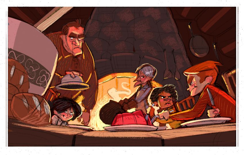
Critique for colour comp would be most appreciated
-
@Braden-Hallett I think it totally works. If you wanted a cool color to offset you could add a cool grey to the shadows up top but I don't think it's needed at all.
-
@Braden-Hallett I agree that it is working well. I was thinking that if you wanted to bring even a tighter focus to the dueling forks you could add some coolness to the silver. It is almost doing that now, but I think you could push it further if you wanted to.
I think you could use cool colors to focus on a few other things (if desired) as well, the woman's hair or the knife. If you don't want to focus on any of those things make sure to warm the greys in those places as well.
The angle and tightness achieves your snug feeling very well. Nice composition.
-
@Braden-Hallett the colours definitely feel harmonious Braden. Nice work
-
@Braden-Hallett Long time follower of your art. You talked about the harmony of the piece and how you are trying to achieve it with color, I think you nailed the colors. However, you asked what would I change.
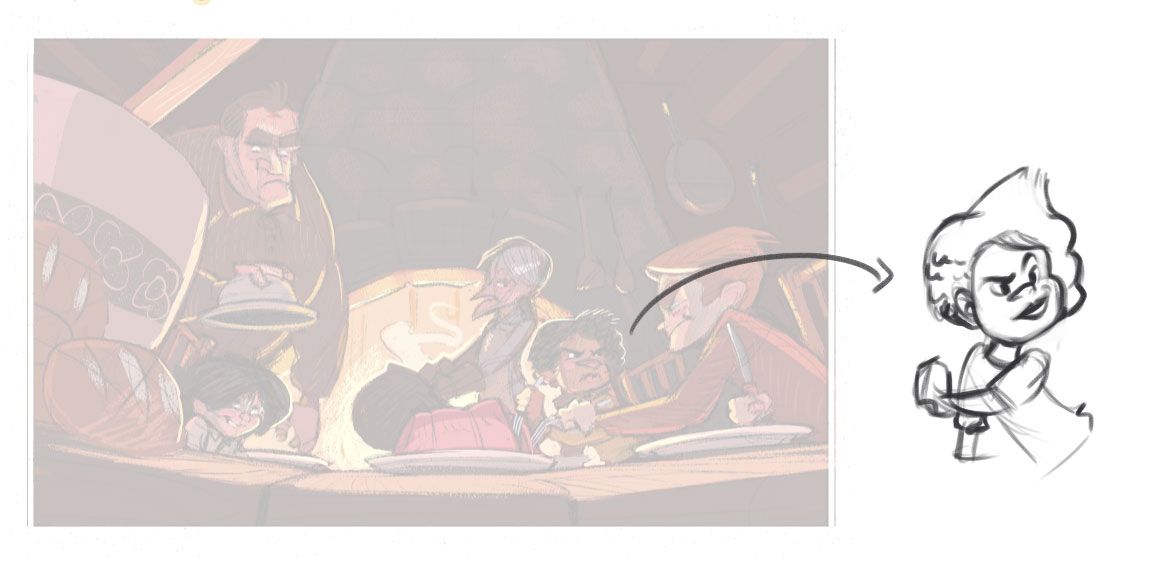
If harmony and family dinner at the end of the day is what you are looking for I will change the one character's expression below, they both have a similar frown and it makes the relationship between these two characters very aggressive. If sibling rivalry is what you are looking for I'd think a bit of a smile on one of them should do the trick.

-
@Braden-Hallett
I'm going to be a rebel. I think the addition of the greys make the work feel more cool (taking away the warmth at least for me). I realise certain objects are grey or silver. I would focus on how if possible to warm those areas and certain silver will be reflective, you could pick up the surrounding colours which for the most/all are your nice warm colours. And for the grey on the buns/loafs, darker where the light doesn't touch them as much and the shadows on them (not sure if you've completed the shadow part).
p.s its late, my house is cooling down and my right hand is cold - may have influenced my comments...or not because silver can be very cold.
I hope that rebel heart in me helped.
-
Thanks everyone for the feedback! I really like it so far, but I've learned to not trust my initial reactions when it comes to colour

@josegalue25 said in Critique for colour comp would be most appreciated:
makes the relationship between these two characters very aggressive
Their expressions do read more as 'I'LL CUT YOU' instead of 'I want the end piece tonight' :smiling_face_with_open_mouth_cold_sweat: I'll see what I can do to make it more of a friendly rivalry.
@Heather-Boyd Interesting! Keepin' the greys fairly warm was definitely at the back of my mind, but maybe I'll throw a colour layer over top to make everything just that wee bit warmer to see how it effects things

-
I like the colours! It feels warm and welcoming as you intended. The one thing I'd change is the spoon/ladle coming from the bowl in the foreground. It's very prominent and draws my eye out of the frame. I would suggest removing it or toning down the hues as it's brighter than the foreground elements.
I've de-saturated the spoon handle and pumped up the saturation of the characters.

This is top quality work and I'm looking forward to seeing the finished piece!
-
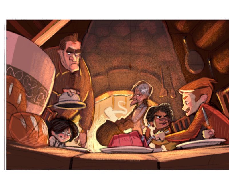
Hi, Braden! I love your work. I love the colors. Very well done. I understand that you want to show a warm, homey feel for this illustration. My advice is to add a warm glow especially around the fire. Also you might want to make more of your characters smile for a lighter and more jovial mood. Right now, it seems that all 4 characters are frowning. Only that black-haired boy is smiling and it’s not really sending off a happy vibe. Below is a quick paint over. I hope my input was helpful. I’d love to see what you do next.
 )
) -
I agree with nyrryl! That paint over works well. your colours are already almost there, but a nice bright glow from the fire sets the characters off more and gives it all a nice cozy diffused lighting. I personally don't mind the kids on the right being quite grim with each other. kids can take their siblings rivalrypretty seriously after all, and if you have the Mum smiling at their silly little hostilities I feel like it establishes all the family dynamics very nicely. Love the sheepish expression on the boy on the left XD Lovely piece.
-
@Braden-Hallett I love this. I think the warm colors are working. I’m not that great at painting and coloring so I’m not an expert. But, the thing I found interesting is the contrast between the warm inviting feel of this and the arguing going on in the picture. I like it.
-
Hi @Braden-Hallett yes the colors definitely feel harmonious. It is depicting warmth well But I sense kind of cool mood from it as well. It could be the grey areas or maybe it is that the colors feel a bit more grounded - desaturated. Maybe you can punch out the focus areas a bit more
 (but That is just maybe because it is in early stages - your other works are well saturated every time)
Otherwise, it works great! looking forward to the result
EDIT: or it could be just my monitor..
 on my pc it feels a bit cool. On my Cintiq it feels much warmer..
  (now where is the problem
  )
) -
@IanS I'll totally tone back that handle in the foreground! Thanks for the feedback
 I think it'd be tough for me to get things that saturated with the colours I mixed, though I'll do some spot saturation near the end absolutely!
@Nyrryl-Cadiz said in Critique for colour comp would be most appreciated:
Below is a quick paint over.
Oh wow! Thank you so much for doing that! Throwing around that nice warm glow really helps and ligntens things up while still making it seem fire-lit. I always freak out over getting shadows right to the point that I forget I'm allowed to play with the light. I'll totally play with a nice warm glow before moving forward

@Nathalie-Kranich said in Critique for colour comp would be most appreciated:
I personally don't mind the kids on the right being quite grim with each other. kids can take their siblings rivalrypretty seriously after all
I remember some blood being drawn around the dinner table growing up
 And those two are absolutely rivals, lol.
@Pamela-Fraley said in Critique for colour comp would be most appreciated:
warm inviting feel of this and the arguing going on in the picture
I hadn't picked up on that! You're right, though. Nice warm cabin but a bit of a chilly family dynamic

@Jonas-Zavacky said in Critique for colour comp would be most appreciated:
On my Cintiq it feels much warmer.. (now where is the problem )
I HATE trying to colour calibrate my cintiq, lol. It never ever wants to play nice. Thanks for the feedback

-
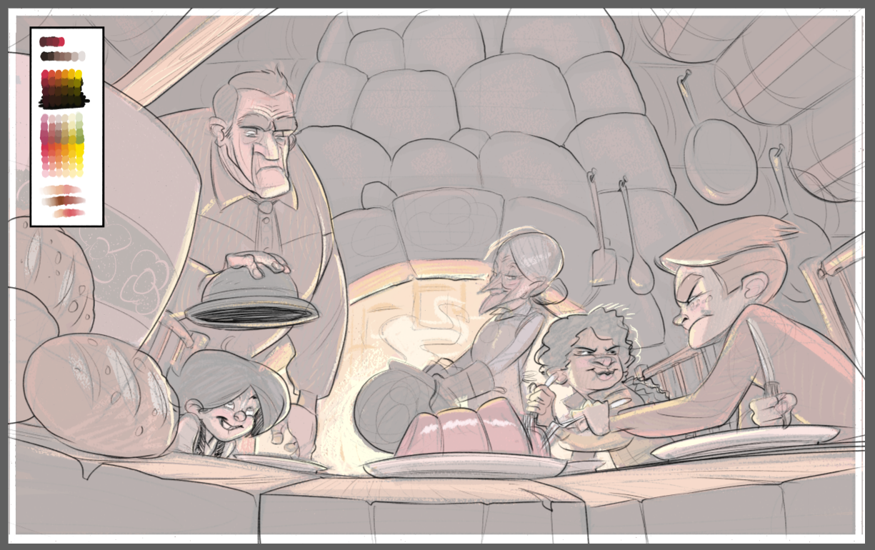
Figured I'd post an update. Thanks again everyone for the feedback! I think I'm in a good place to start inking and painting


