Comments Needed
-
Hi
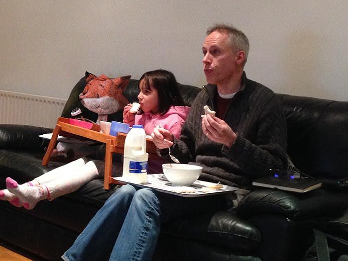
I wanted to add my character Flanigan the fox to a picture. It's mainly an exercise to see if I could light it correctly.
I've been looking at him for a while now and I think it's very close but I need a second opinion ( and 3rd and 4th.....)
Let me know if you see something that needs addressing.
Thanks
-
@MF-James Well when I first looked at this picture I didnt notice anything out of place. In my mind I was like *okay 3 people". I noticed it is your character after I read what you did. So for me you did a great job

-
@Jonas-Zavacky That is good to hear!!!! Thanks
-
What an absolutely amazing job. I couldn't notice him either. How did you do it? I'm really interested!
Great love and respect!
-
He looks like he is supposed to be there. Blends right in.
-
@MF-James looks like a stuffed animal at first. It wasn't till I stared at the photo more that I noticed. I did something similar with a character I created. I took my kids on a small vacation and when we got home I painted him into some of the photos like he was there with us the whole time. I even had the kids pose like he was with them. Fun project and the kids got a kick out of it.
-
I think he looks great well done, didn't notice until I read the description. One thing I see is there is a tangent running from his right cheek under his nose and the nose is dissappearing into the sofa, I think a little spot of light hitting the nose might fix that. And maybe have the snout and nose protrude a bit more similar to your profile icon image you have, i hope that makes sense. Good job tho very well done.
-
@Phil-Cullen I see what you mean. Thanks. I didn't spot that.
-
@Ashton-H I did a sphere test using the pink colours of the top and then change the levels to make it orange, that way I would know how that colour exists in the scene.
Did a lambert only pass first and then added the fur. I ended up playing a lot with levels and curves at the end as well and added some noise and blur to fit the bad quality of the picture.
Hope this makes sense. -
@MF-James it’s so good to see Flanagan
 I love him!
 -
@BichonBistro Thanks. He is fun to draw
-
I think you've done an amazing job. If I could offer any suggestions it would be that perhaps the shadow could be a bit darker on the underside of his face. If you look at the forms on the rest of the picture (the girl's legs, the guy's nose, the folds of the guy's sweater, etc) it's quite bright where the light hits, and has a noticeable shadow on the underside of the forms. The exceptions would be the forms close the the white tray because of the bounce light, and as a result the shadows aren't as strong.
But on first glance, it looks very well integrated. Great job!
-
@TessaW Thanks. I'll try to make the changes people have suggested and I'll upload a new version in a couple of days
-
@MF-James i thought he was a stuffed animal too!! So clever!
-
Everyone is saying that it looks like a stuffed toy. What can I do to make him feel alive? Is it the type of eyes? Pose?
-
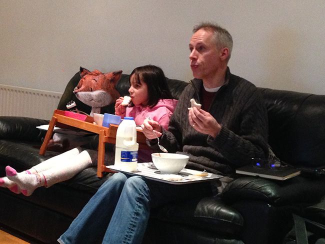
I've made the changes, thanks for all your comments.

-
That is brilliant!
Like Jonas, I didn't notice until I started looking
 I think you did a fantastic job...
 -
@MF-James Great job! I had to go back and look to see what you were doing. i thik the additional lighting helps the fox seem even more 3D. What's in his paw (I actually typed "hand")--it looks different than the cookies the other two characters are eating. The difference might be important-or it could become more cookie-like if you want the 3 to seem even more similar.
-
@Susan-Marks They are eating sandwiches, Flanigan's is just more square still. Maybe a bite?
-
@MF-James See-it WAS intentional. I saw cookies-maybe to go with the milk. But they work well as sandwiches.