WIP - Problems with Perspective - Starting over or Save it?
-
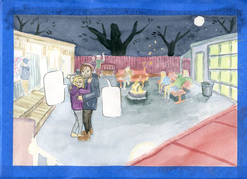
Basically a work in progress. I'm seeing that there are problems with perspective. I honestly am not a fan of the entire left side, it feels heavy and the trees in the back are too dark. I guess, I'm wondering if I can still save it by making adjustments to the perspective and adding another dark wash to the sky or should I start over? If I do start over, what would you change compositionally? Do you have suggestions/tips for multiple lights in an environment?
Thanks for any suggestions or advice in advance!
-
@gavpartridge
Thank you so much for responding. You make so many great points. I think the lightening was definitely something I was struggling with, which I think can be seen in my shadows.
Your suggestion for maybe sitting the couple on the bench is something I had considered. I decided not to do that because I wanted the couple to be the main focus. I was afraid that if I sat them on the bench, they'd fall to the back. Maybe I can revisit this idea though.
The setting is a music venue so there are a lot of people kind of hanging around, smoking, listening to the music (while some are in the venue listening, it was sort of a garage set up). I wanted to capture that feeling.
I think to really pull this off or to nail it, I need to get the lightening to be solid. It's something I struggle with because light tends to bounce off things and with so many different light sources, like you had said, it can be tough.
-
@gavpartridge
Haha, it's funny you use the word delicate because while I was working on it I just kept thinking how muddy it looks. I really love the clean lines people seem to get with watercolors or gouache and I'd love to get to a level with my skills where my work is more crisp. I tend to go back and forth with outlining things. I don't like the starkness of the black and think outlining in a softer color or more muted tone would be better, however I'm having a hard time finding waterproof pens that come in a variety of colors. I've used colored pencils to outline before, but on watercolor paper that can look pretty grainy/gritty.
I appreciate your advice! I definitely think I'm going to end up redoing this illustration. I'll have to post the new one when I'm done.
-
@Sarahmaeliz I would like to suggest maybe figuring out your process a bit more before going to finish. Once I am at the stage where I am going to paint a watercolor, I have worked out the perspective in a number of drawings. And I've also taken care of composition by doing a good amount of thumbnails. Then a value study just in grey scale. Then possibly a small color study.
It may seem like a lot of work, but each of those stages goes pretty fast. In the end you get better work out of it because your problems have been solved already. I always say with watercolor "Plan carefully, then paint freely". I still use that to guide me with that particular medium.
Good luck and hang in there!
-Lee
-
This post is deleted! -
Thanks so much for your response! I do think you might be onto something here. After you suggested reviewing my process I thought about it and my process could be smoother. I tend to do a lot of thumbnails, then I go to a final sketch and then I go to watercolor. I think nailing down perspective and a value study would be extremely helpful. With composition I usually figure that out in my thumbnails. I think I will improve with each illustration I do in that area.
Do you have any suggestions for working with watercolors but getting cleaner looking lines or for your final comp to be less muddled? Also how do you go about skin tones? For my skin tones they always seem to be a bit grey.
Thanks!!!
-
@Sarahmaeliz For clean lines and clear images, you need to plan out your order of painting. Using masking fluid is the only way to maintain control of some areas while keeping the current wash loose. If you havent seem my "Loosening up in Watercolor" video, go check it out. I show exactly how that process can benefit you.
For skintones, a good mix to use a cadmium yellow and cadmium red mixture. Both are very opaque colors and require very little pigment. Try to get your wash right the first time and avoid constantly layering on top of previous washes.
Hope that helps some! : )