WIP Critique Please! Pig and Bunny Roasting Marshmallows
-
Hello everyone,
The houses and all the trees are not rendered yet.
This is the ending to a children's book story. The scarf is a gift from the rabbit to the pig. They are BFFs.
I am trying to capture a sweet moment of a heartwarming friendship.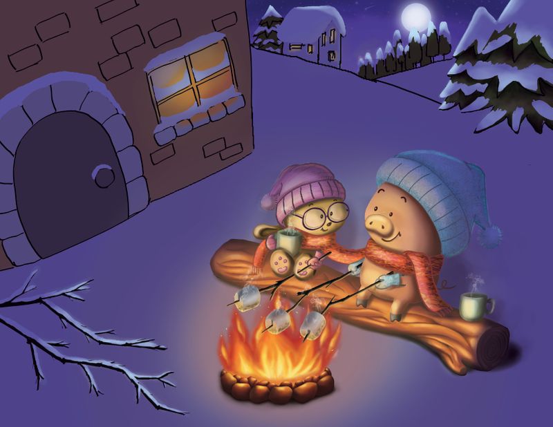
May I ask for critiques regarding:
(1) Color: is everything working well together or not? If not, which color is not working? Do you think the characters are too dark and should be brighter?!
(2) Am I communicating that the scarf as the focal point? It is the object that threads through the story.
(3) Do you feel whether anything is distracting and should be removed or replaced or resized?
(4) Anything that looks odd or out of place? Or out of proportion? (Besides the window; I will fix that)
(5) Composition: Any suggestions for improvement?Thank you so much!
-
Oh nice looking way better! I’d say do a bit more shadow behind them on the snow
instagram and twitter: @artofaleksey
alekseyillustration.com -
@Aleksey ok! Thank you!
-
This is definitely a sweet moment, so I think you really captured that feeling well. I think your snow on the hills might need some color differentiation from the sky. Especially since it looks whiter on your trees. I think breaking up the snow color might help your characters stand out more, too. I don’t think your characters are too dark, but their hats are kind of disappearing into the snowy background since they are so close in value.
I think the scarf does read as important, especially since it has a different texture than the rest of the piece.
Great work. I think it’s a really cute piece, and is coming along nicely! -
I think a crucial fundemental of perspective is missing in this. I think you're going for a look where you are almost allowing persepctive to loosen, like what @Will-Terry does, but even in his work there is a sense of form and solidity that makes the scene feel alive and believable. You need to practice perspective!
The color and value scheme I think could be pushed a bit, but thats an issue you need to fix early on when you do thumbnails, so just do what you can and do better next time.
Much of this feels flat, again that can be because of perspective but also the lack of work into it. I also don't like the super focused air-sprayed way of applying the final colors, It makes everything seem shiny. You some-what get away with it in the characters, but generally you may need practice painting with brush strokes and not playing with every single bump of the scene.
Generally I can appreciate this piece, just somethings can be pushed farther, and some fundamentals of art need to be better practiced on your end. lot of the problems need to be fixed during the early stages, when you are cheaply experimenting and working out major problems with thumbnails.
-
- I really like the mood here created by the colors. It feels so cozy by the fire. I'd agree with another comment that gradually fading the snow to a lighter value in the background might give the piece a bit more depth and interest.
- I think the scarf looks great.
") ...though in case it's helpful, the first thing I notice when I look at the piece is the fire.
...though in case it's helpful, the first thing I notice when I look at the piece is the fire.
3/4/5. I really do like the composition of this illustration. It's from a creative angle that gives a sense of peeking in on a special moment. Just some general impressions - First of all, it feels to me like the background is a bit cramped near the top of the page, which adds a bit of subconscious tension that you may not be going for. Perhaps the house, moon and tree line could be lowered to give them some more breathing room? Secondly, you might consider some shadows from the moonlight. Finally, I actually like the wonky window, and if it feels nice to you, I wouldn't feel pressure to change it unless it's really not feeling right.
Thank you for sharing! I've enjoyed watching this develop and have learned from your process.
-
@lisanganart Good start. I like the characters and concept you are going for. Here are a few points.
-
Having the pig hold 2 marshmallows is very distracting. I keep looking for a third person.
-
I would agree with @KathrynAdebayo that the first focal point is the fire. I would say the scarf is a ways down the focal point list. If you hadn't pointed it out I might not have even noticed it.
-
I agree also that adding shadows would do a lot for it as well.
Just my 2 cents... take it for what is worth.
-
-
They are really cute and do seem to be telling a story about friendship both being wrapped up in the scarf and sharing a special fireside moment.
I think they are fairly well lit but I would change the tone that lights them both up to reflect the close proximity of the fire, make it a little more golden yellow and a bit brighter on their faces.
The shadows on their sides of their faces are quite strong so a brighter light source would reflect that more accurately.I would also lighten the snow around the fire as well making it a bit brighter with a shadowed ring directly beneath the fire on the snow and the ring of light around the fire stretching a little further out and more evenly.
The shadows behind them should be a little stronger but not too much and should stretch behind them a bit.
Add a little bit of color on that snowy branch too, just a little at the tips that are closest to the fire. The snow is so white that it will reflect the yellowish light of the fire and this will add a more polished and natural look to it.The bottom right corner of the house should be brought down a bit while the bottom left corner is raised a little.
The angle of the bottom of the house is a little too sharp and it appears as if it is stretching into the air a little too much.The angle of the image looking down from above to the characters below would have the house on a more even level with the ground that the characters are sitting on just like the log is more level.
You may also want to make the door a little bit smaller to compensate for the fact that when you bring the bottom left corner of the house up a bit you are losing a bit of the door in its current size and position.
Making it a little bit smaller will help keep more of the door in the frame.Everything else looks really good.
-
One more thing, I didn't really mention the background much at all.
There is a stand of trees in front of the moon, the top of the snow on the tree disappears against the moonlight.Here is a photo of the trees directly in front of the moon illustrating that the shadows should be stretching directly forward towards the foreground but not completely into the foreground as they are in this image. Keep proximity in mind here.
The tops of the trees as you have in your image would tend to blend into the moonlight a little bit as the snow is the same color value as the moonlight but if you make the most forward-facing part of the trees that are closest to the foreground a little bit darker with the left and right sides of each tree being lighter to reflect the moonlight and brightest at the top it will give your background a little more dimension.
-
Such a cute concept! I love the kinship you created between the bunny and the pig.
(1) Color: is everything working well together or not? If not, which color is not working? Do you think the characters are too dark and should be brighter?!
-
Would it be possible to cool down the color of the fire and do something a bit cooler? I couldn't find a perfect example but something like this?
-
I think making the fire a bit cooler would bring out the red in the scarf a bit more...
(2) Am I communicating that the scarf as the focal point? It is the object that threads through the story.
- As mentioned before, perhaps cooling down the color in the fire would help emphasize the scarf? If you keep the other colors cooler, maybe it would make the scarf pop a bit more?
(3) Do you feel whether anything is distracting and should be removed or replaced or resized?
There are a lot of marshmallows in the fire. Perhaps you could have the animals sharing a single marshmallow and that could also help to emphasize the scarf?
(4) Anything that looks odd or out of place? Or out of proportion? (Besides the window; I will fix that)
The house adjacent to the fire seems a bit askew from the fire/animals. Perhaps it could be brought into the background a bit more and the perspective changed a bit so it doesn't seem at quite an angle. It may be possible that the house in the foreground is not needed with the one in the background?
(5) Composition: Any suggestions for improvement?
Overall, a nice piece! I hope my comments are helpful. I'm a newbie so please take with a grain of salt.
-
-
@jennymwine @Ben-Migliore @KathrynAdebayo @theprairiefox @Jessica-Jolicoeur @djly Thank you all so much for stopping by to post your suggestions for improvement. I will take everything to heart and work hard at all the weaknesses that you pointed out. I really appreciate your time and help!
-
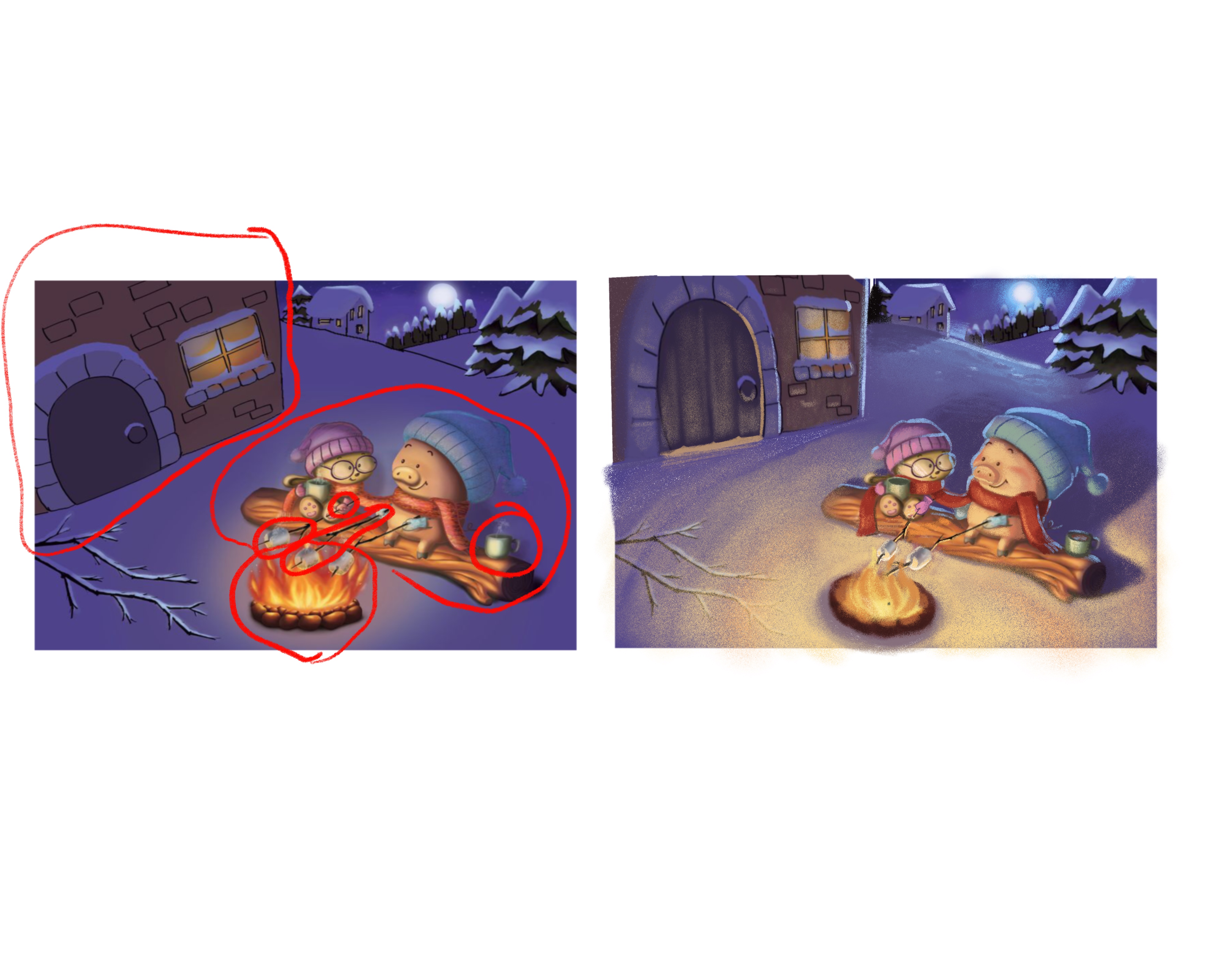
@lisanganart Hi! You have great concept going on here. Your characters are cute. However, I think we can still improve the piece more. Here are the issues i’m seeing.
- Lighting. Your piece is too dark. Despite having a huge bonfire, your piece is very dimly lit. Your light is bouncing nicely on your characters but seems to be very faint on your snow and the building. Snow easily bounces off light. If you have a fire as big as the one you have, the whole environment should be lit brightly. Added to that, There is also not that much of a value diffrence between the background and your characters. Notice how they almost seem to blend in with the surroundings in the image below. I suggest, painting the snow a warm bright color especially the area near the bonfire and also increasing the brightness of your characters. You should also have long dark shadows behind the characters given tha the source of light is very strong and is located below them. You could also added a strong cool ream light behind the characters coming from the moon.
-
The bonfire. I personally think that your bonfire is too huge for roasting marshmallows. I’d reckon it would burn your smores in a few seconds. Also, your fire is too red. I’m not an expert on fire but flames made by coal/wood/fuel most of the time look more orangy/yellowish than red. I’d suggest toning it down and making it more orange/yellow. I also undrstand that you want to focuse the attention more on the scarf warped around our characters but since both the scarf and the flame are both red, they’re kinda fighting for the attention. And since the flames are more saturated that the scarf, they’re kinda winning and your scarf get thrown in the backdrop. I honestly did not notice the scarf thing until you mentioned it.
-
The pig’s marshmallows. I really think that your pig having 2 marshmallows is just too excessive. I understand that it might be a part of your story like if the pig had this really big appetite but it just makes the area between the pig and cat(?) too busy. Your piece would really benefit if you get rid of that extra marshmallow and make it more simple.
-
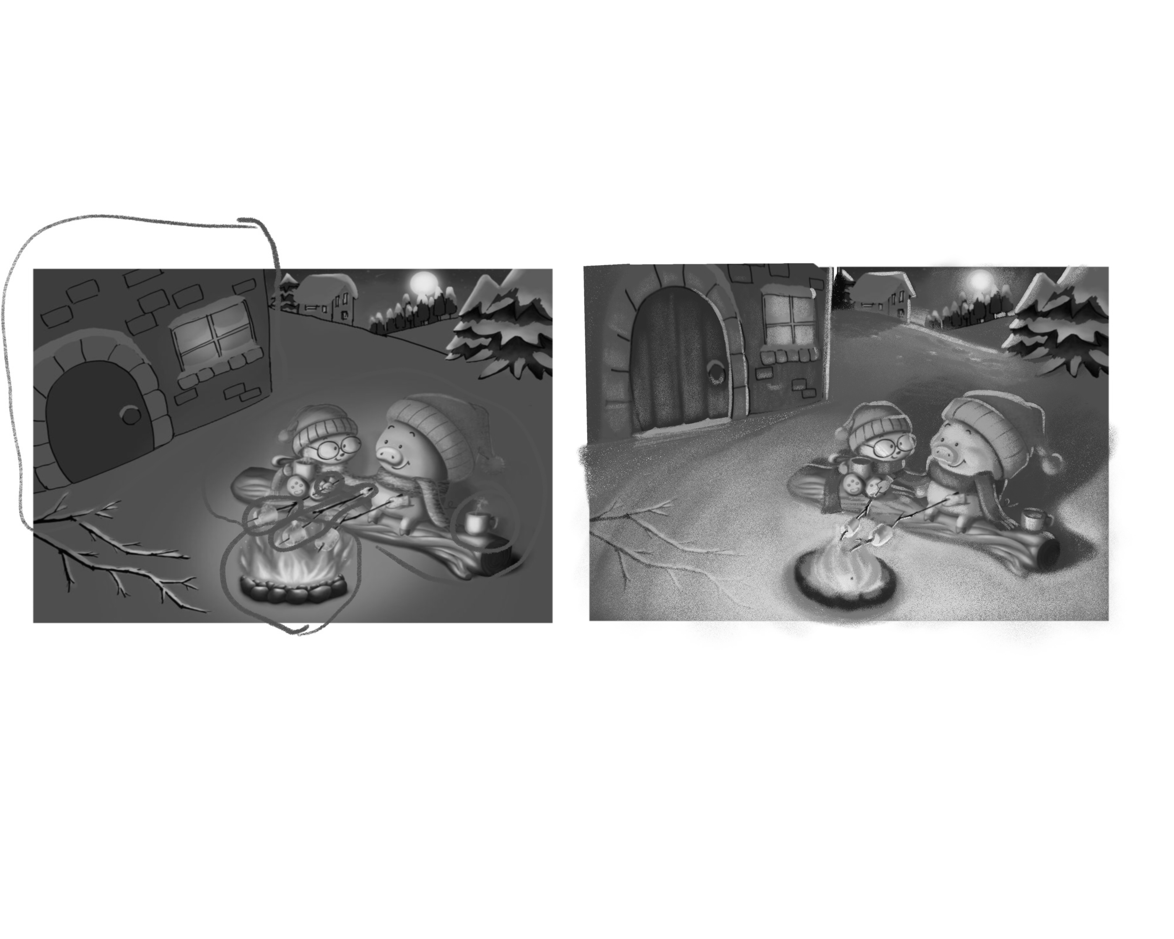
The Perspective. Now this is a huge glaring issue for me. Your characters and the background seem to have a unified perspective but the house and your bonfire seem to be doing their own thing. Let’s first talk about the bonfire. Your camera angle is set at a higher angle that means we should be getting more of a top view and seeing the circumference of the stones around the flames but you’ve painted the fire pit as if we’re directly viewing it from the side. We need to fix this. Now let’s go to the bigger issue, the house. You’re house seems like we’re viewing it from a bird’s eye view. It’s so foreshortened. It really contradicts the whole piece.
Below is my paint over of your piece. We need to fix a few things but your piece has big potential. I hope this helps.
-
Wow, nice paintover, Nyrryl! @nyrrylcadiz As a word of encouragement to @lisanganart , I don't think Nyrryl could have done that without such a good foundation to work on. Thanks for sharing your art for everyone to learn from!
-
@KathrynAdebayo the piece definitely had great bones. Great concept. Good composition.

Portfolio: nyrrylcadiz.com
Instagram: https://www.instagram.com/nyrryl_cadiz/
YouTube: https://www.youtube.com/channel/UCbJCF1Im8ZO7hpGWTKOJMuA -
@nyrrylcadiz Thank you so much for taking the time to explain everything to me and also to do a paint over. It looks so much better! @KathrynAdebayo thank you for your encouragement! Thank you everyone for stopping by. I learned so much from all of you and I appreciate the honesty and eagerness to help. You are an amazing group!
-
@lisanganart you’re doing amazing work! Keep on practicing and making art and yuo’ll surely improve.

-
@lisanganart Very cute concept.
@nyrrylcadiz Wow. the paint over is great. Love the lighting in your paint over. -
Your paint over was also helpful to me as well, thanks @nyrrylcadiz
-
Great paint over, @nyrrylcadiz!
That is exactly what I was thinking and suggesting in my comment.
It looks great.