Boy licking a shop window WIP
-
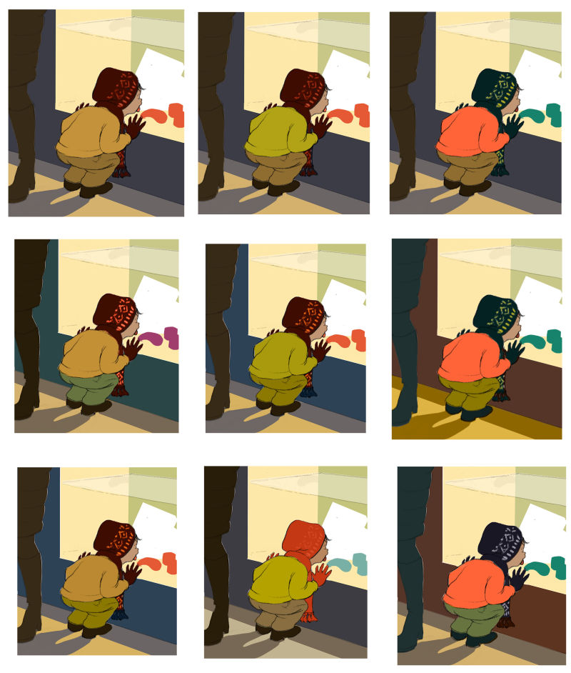
Here are some color comps for the value study I posted last week. I was trying to keep the values consistent, but in the end, I couldn't resist deviating--one of these comps is not like the others!
I'd be interested in getting your opinions, as I've been doing color comps for days now and have lost all objectivity

My key word is "curiosity."
I still need to refine some things, including what's going on inside the window, but it's going to be a display of carnival treats, since we're approaching that time of year. I'm even open to cropping the composition.
Here are two other related threads:
Resources for choosing color schemes?
and
Can you tell what's going on in this scene?
Thank you for your input!
-
Hi
")
I think I like the colours in number 4 & 7, I prefer his shadows being that light blue against the yellow from the shop window. I also prefer his hat and scarf colour in these ones -
Ack! I forgot to number. Here's a version with numbers:
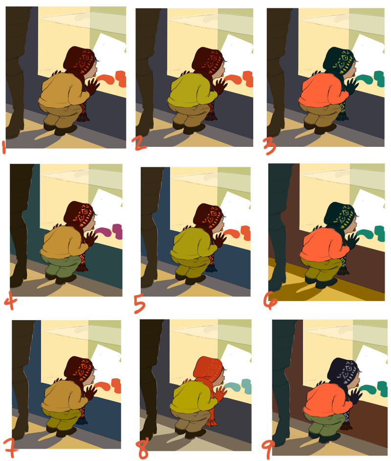
@hannahmccaffery Do these match up with your numbers? If so, it would mean you like the combination of the red hat/scarf with the gold sweater. The shadow colors are slightly different, but still cool in either case. Thanks!
-
@lauraa I really like number 8 with orange/red hat. My second choice would be number three. Seeing these I realize that I really need to take the time to do colour studies. Are these part of one of the classes?
-
@lauraa Yes that's matched up
-
@hannahmccaffery Ok, thanks! Vote taken down.

-
I like 4 but I also like the hat in 9.
-
@inkandspatter I'm not sure whether it goes with a specific course, but it goes with the general idea of what the courses teach, and I've seen it elsewhere as well. SVS gas two color courses, though: Painting Color and Light and Choosing Colors for Storytelling.
Also see the link above to the other thread about color resources. People posted some great stuff! I found some of these colors while playing around with Coolers, linked in that thread.
What I did here was to create a value study with a mask for each object (makes selection easy), put them in a folder, and then on top of that I created a folder for each scheme with most of the layers set to color mode. Color mode just adds color to the values, and that keeps the values consistent. The obvious exception is number 8, in which I made the cap bright red. I had made the cap dark to draw attention to the boy's head against the glass, but I always have this thing about vibrating color, especially red. It just works its way into everything!
I tend to like 2 the best, but would be hard pressed to say why. I could make the cap pattern brighter, of course. And I like 8. It doesn't have the value effect I wanted, but maybe the intensity of the color makes up for it? But I really like getting all your opinions, because it reminds me that we all see things differently. And if enough people like one particular color scheme, it may mean that one has something universally appealing about it.
-
I like number 1 the best!
-
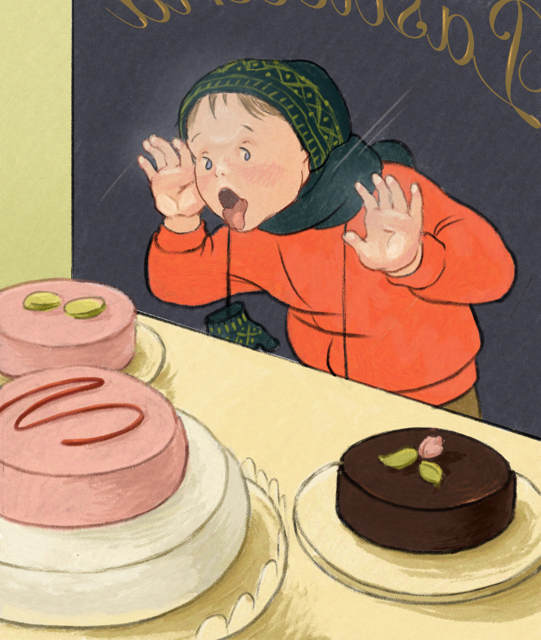
Submitting final (tweaked and cropped) color comps for critique. I like all of these, but I think I'm going to go for the red version.
I'm going to refine what's going on in the window, though. The tough part is going to be to render the idea of something good to eat, but still have a lot of teal green.
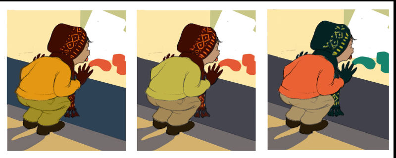
I have a long way to do on this, especially since I'll likely be trying out different stylistic ideas. The point with the last couple of pieces I've posted here has been to start a 100 kids streak and develop a style in the process. As usual, your opinions are more than welcome!
-
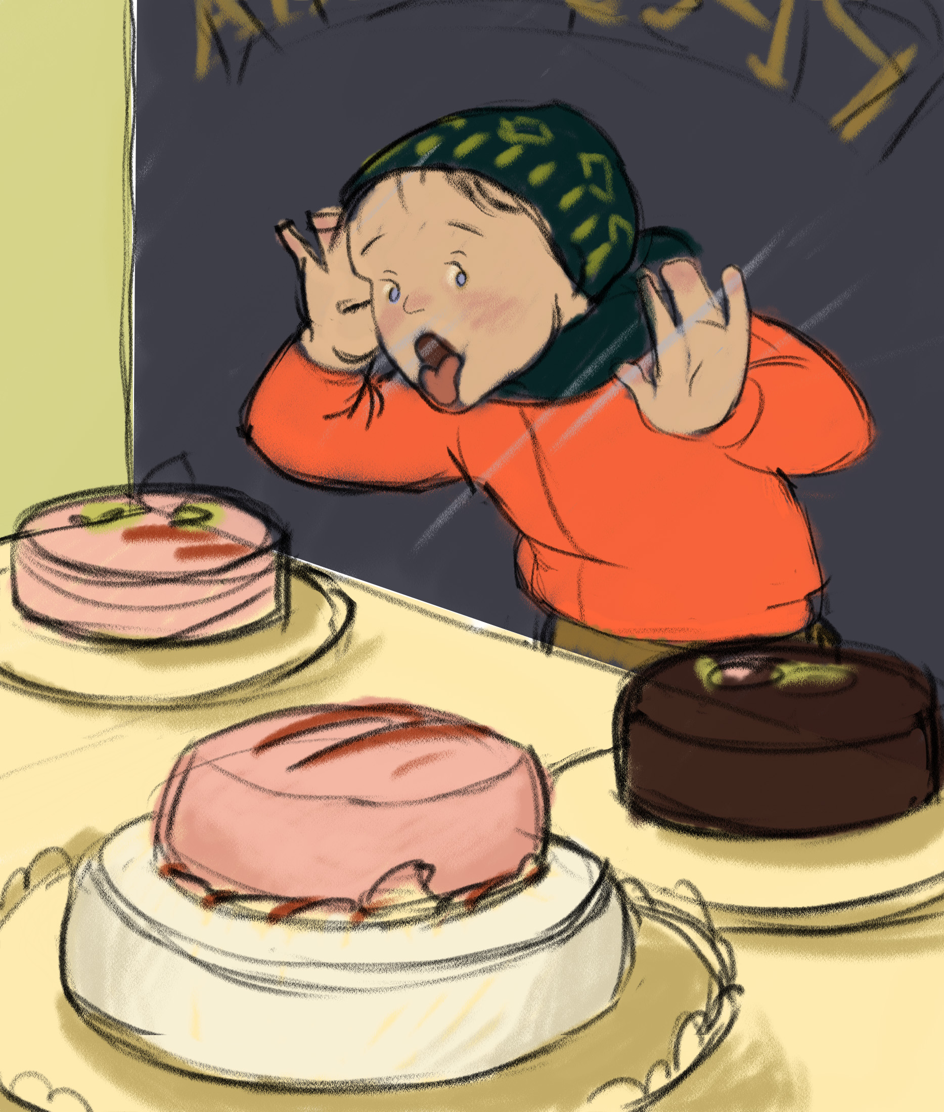
Today I rethought this whole composition, came up with a color sketch, and I think I like it better! Maybe he needs his gloves on, but I even sort of like the cold hands. They'd leave such nice smears on the window! The gloves could go around his neck...
Any thoughts? Thank you!
-
I like this version because you can see his face. And it makes me hungry
-
Oh yeah! That looks way better. I think if you exaggerate it more by squishing the face and hands up against the glass more and add that weird breath fog on the glass it would look even better. Cause kids are gross sometimes kinda like this:
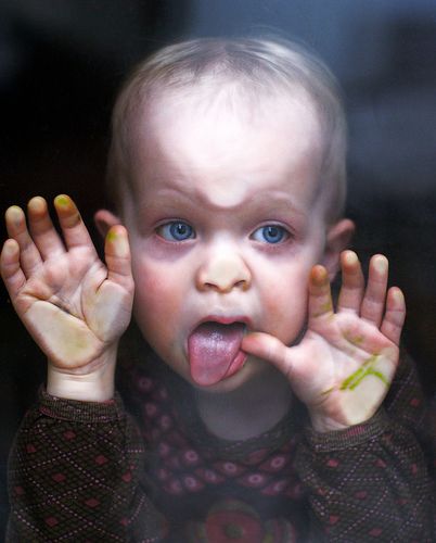 https://i.pinimg.com/originals/d6/64/1e/d6641e5ede6fb007872fddc5e287b754.jpg
 -
@LauraA This reminds me of my silk screening days in college -so many colour combinations and your edge crispness too. I like #4 the best but not purple (in the window).
-
@LauraA This is a more dramatic and dynamic angle. I can feel his love of cake. Although, I think you could build this into a comic strip about the mission to get some cake! Also a cold smear of saliva and a bit of mist on the window would add to that barrier between the boy and the cake.
-
@sigross and @Aleksey I love your comments about the window and especially your reference photo, Aleksey! That was going to be worked into my next step. It's going to be hard to get that squished face and pane of glass figured out just right, but I'm going to try. I spent a lot of time with my face and hands pressed up against the mirror yesterday.
@Heather-Boyd I am really attracted to flat print color, but also to light and drawing form. It's so hard to choose! The only thing I know to do is just keep producing work and hope the style question works itself out. And now that I have a dark background to make the red stand out properly, I've pretty much decided on color scheme 3, adding some pink on the cakes. The red/yellow green/purple combo decidedly appealed to me when I returned to the color comps.
In retrospect, this angle was the obvious choice, but it took a while to figure that out because I thought it was plenty funny in real life seeing it from the other side. And since I had liked the way his chartreuse hat looked in real life, I kept trying to get that in the composition too. But story-telling/composition factors have to come first.
I am working especially hard at the moment on being honest with myself and letting others be honest with me, because it's how we grow. So thanks guys, for letting my know what you think!
-
Here's an update on the window-licking piece. Still working, especially on making those cakes look appetizing, but I'm wondering, is it starting to lose its freshness? Also, any tips on the face-pressed-on-glass aspect would be especially welcome. Aleksey, I did use your photo reference--thank you!
And now that I see it enlarged, I'm not too happy with that signage and will probably draw over it or modify it in some way. It's just too obviously font type.
Thank you for your input!
-
It looks beautiful
-
The cakes are very appetizing! I think the flesh pressed against the window is working and the signage looks ok to me. My only critique is that his eyes aren't directly looking at the cakes but more above them which makes me wonder if there is something even more delicious that we can't see!
-
@demotlj Good point!