My First Entry - "BIG" WIP
-
My first entry into the monthly competition. I'm excited and a little nervous.
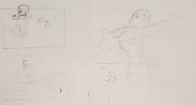
Below are some ideas I'm just throwing about.
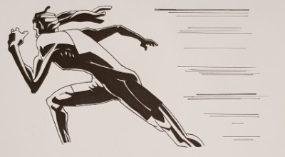
I recently watched 'Redline'. A Japanese Movie with a very unique art style. (@Jake-Parker You will love the movie - fast cars, robots, awesome animation and a killer sound track.)
Takeshi Koike who was the director and lead animator has a very unique style. He is also known for his short "World Record" as part of the Animatrix.
What I like about his style that I want to try and emulate in this peice.
- Black shadow shapes mixed with bright, vivid colours
- Slight distortion/characterisation of everything.
- Great use of perspective.
Here are some studies I did of his style. (At least the shadow side of things)
His style is very different to what I usually do, so I want to challenge myself and bring the above to this piece. I get the sense that the end result may look a bit creepy, or scary. I'm willing to play with that.
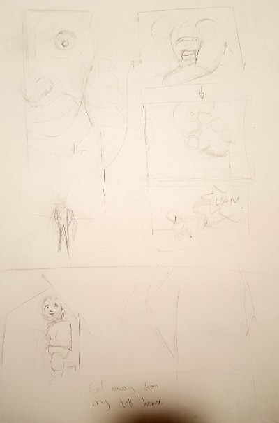
Here are some ideas I've been playing with.
1. Younger brother getting into the sisters doll house (comic short)
Apologies for the lightness of the image. It is more of a brainstorm that a proper concept sketch. Essentially what is happening in the photo.- LIttle brother is looking through the doll house door at the doll inside. He looks BIG and ominous.
- Shot of doll looking scared
- Shot of hand reaching to the doll.
- The scream of the sister yelling out the kids name.
- Pans out to see the back of the sister, and the little brother sitting next to the doll house with the doll in his hand.
2. Just the face looking through the door at the toy.
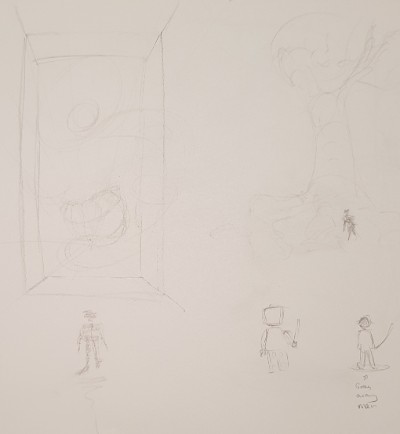
I liked the idea of the massive face peering in. I played with putting a lego person or toy soldier instead.3. Giant Robot Covered in Trees
The idea here is that a young girl finds a giant, old robot. The robot is so old that trees and vines have started growing all over it. I have two images. One with a mountain background, or the robot is found in an old forest with giant trees.4. The Giant Poo
This was a redesign on Frank Frazettas cover peice for Conan the Adventurer
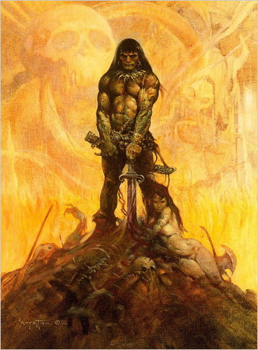
Essentially it is a mother standing on a big mountain of diapers with baby in hand, husband exhausted at her feet. A human hand and skull can be found in the pile (they didn't make it). The background is the mother shocked at discovering the size of the mess as she changes the babies diaper.5. Giant Babies on the move.
I'm thinking of doing a landscape style peice as the babies are moviing towards something in the distance. Possible have blocks and blanket made to look like houses and mountains.Anyways, these are some idea sketches. I'm going to choose one and build it out.
Which idea do you like the most?
Check out my latest drawings: https://www.instagram.com/nathan_creates/
-
@nathan hi! I really like the studies that you did. I love how the shadows compliment your form and mood. However, i can’t give much comment on your WIPs. Prehaps if you can flesh them out more, make more finished sketch thumbnails of each idea, then we can provide you with better feedback. I hope this helps. I can wait to see your pieces. Thanks.
-
Thanks @nyrrylcadiz Yeah, they are very much capturing ideas down on paper. I thought I'd include them just as something to show. I'll create a couple of detailed thumbnails and post them up by the end of the week.
-
@nathan as far as ideas I really like the giant robot with the trees and girl. I think that would be a really cool idea to work on.
-
Thanks for the feedback everyone.
I plan to continue with a lot of my previous ideas. Particularly the girl and the robot - I started writing a little story to go with it. However, what I have in mind for them is bigger than a months work.
I ended up getting an idea last night after watching Dead Poets Society (Brilliant movie - I can't believe I haven't seen it before.) I liked its theme of individuality. The idea of defiance against the machine. That's what sparked this idea.
A girl squaring off defiantly against a big monster. I'm thinking two panels. The first is the monster looking to devour the girl as she stands there definantly, maybe her little brother protected behind her.
In the next panel, she gives a roar, and the monster shreeks back in fear. Maybe the little brother is shaking a fist from behind his sister.
I might also include a short poem telling the story.
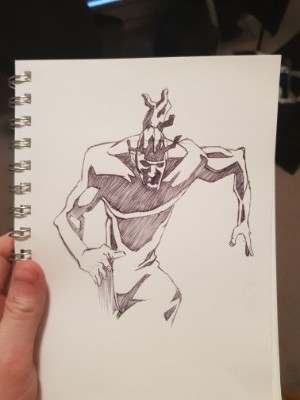
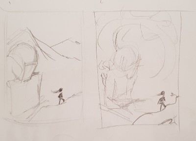
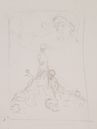
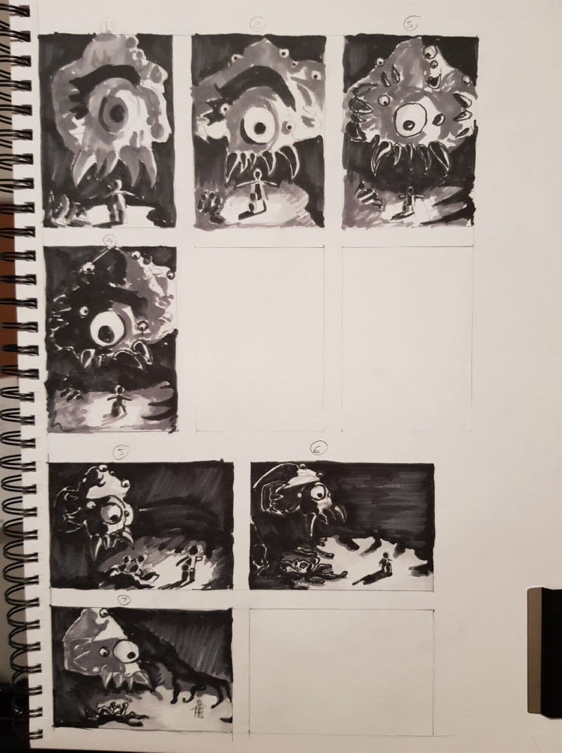
Here are some quick ideas I sketched out.
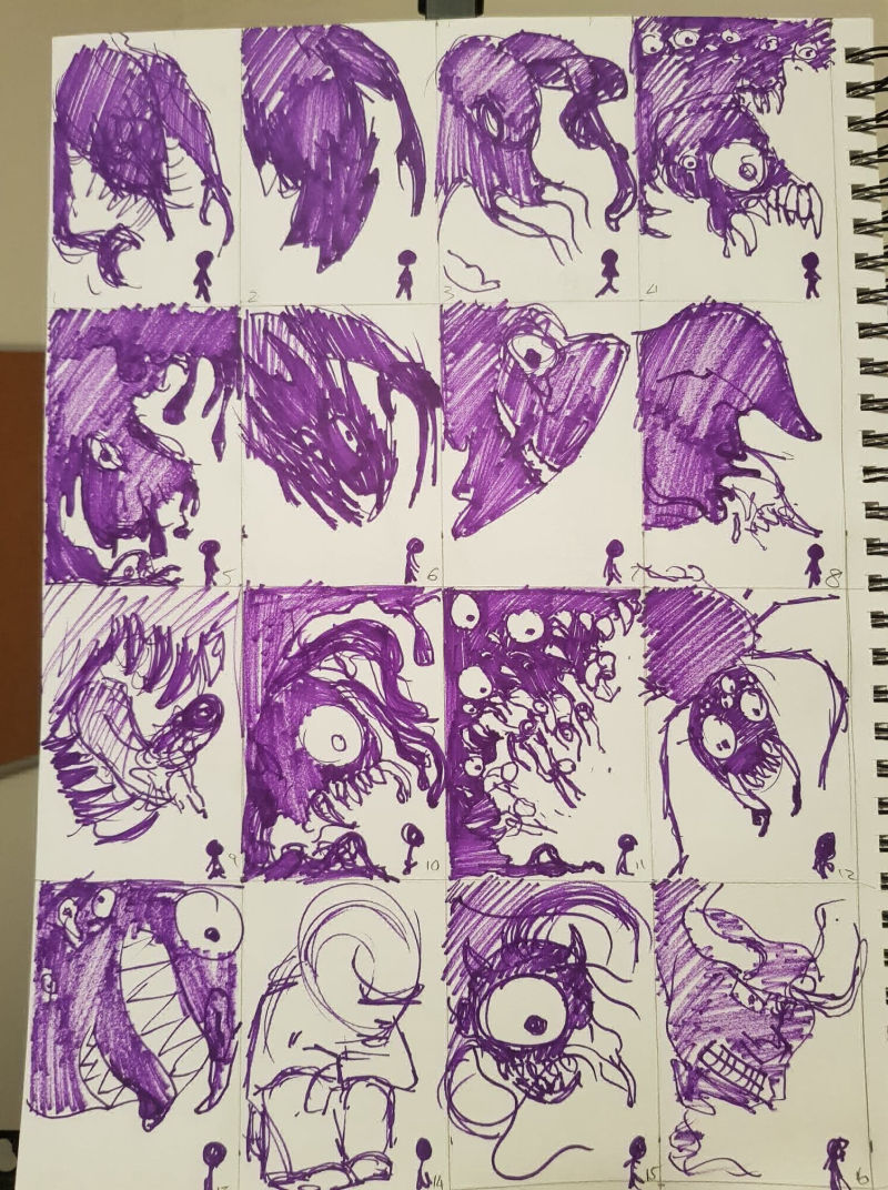
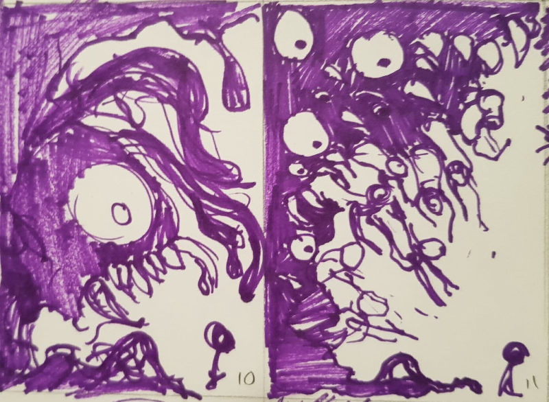
My favourites are 10 & 11. I'm leaning closer to 10. I have always enjoyed drawing eyes and teeth. I was inspired by the slime monster and the outreaching human element in 11. I will include the slime and I'm thinking of including some little "demon's" hidden in the slime at the bottom of the page.The inclusion of appendages (claws/tentacles/slime) will allow me to physically show the body retracting in fear (as well as the surprise of the main face). If I include the little demon's their posture and facial expressions will reinforce this too.
Anyways. I'm liking this idea. I'm going to have a lot of fun with it. I think it will suit the strong shadows of the style mentioned in my first post.
I'm going to play with the different expressions of the girl (and possibly baby brother). Might study some stills from Youtube videos of kids saying no, haha.
Check out my latest drawings: https://www.instagram.com/nathan_creates/
-
11 is my favorite. The people coming off sort of tentacley is really visually creepy and enjoyable for me.
-
I really keep getting drawn to 14? I don't know why... I think that 11 would be my second choice though.
-The Prairie Fox
https://www.instagram.com/theprairiefox
https://www.theprairiefox.com -
Thanks @theprairiefox . Yeah 14 is different from the others. From 12 onwards I was struggling for ideas. This ideas was just going to be a large curious giant squatting down. I think it's the large dark value that makes the eye drawn to it - it separates it from the crowd.
I'm glad others are finding 11 good. I really like it too. I think I can make it really creepy - which will be a lot of fun to do.
-
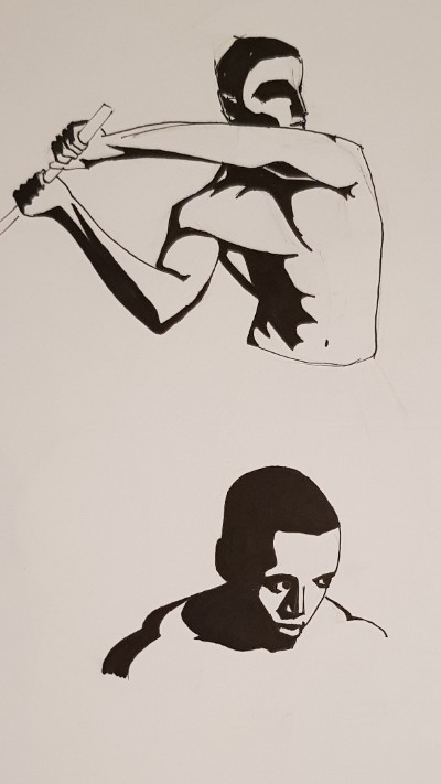
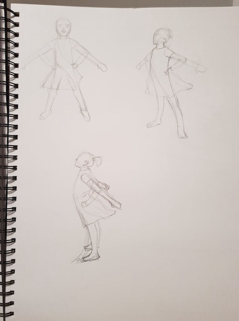
Ok, so I haven't drawn many children, so I decided to find some youtube videos of children who had similar angry/defiant expressions and draw them. These are more quick studies, but I had a lot of fun with these. I think I started to find my flow by the second page
")
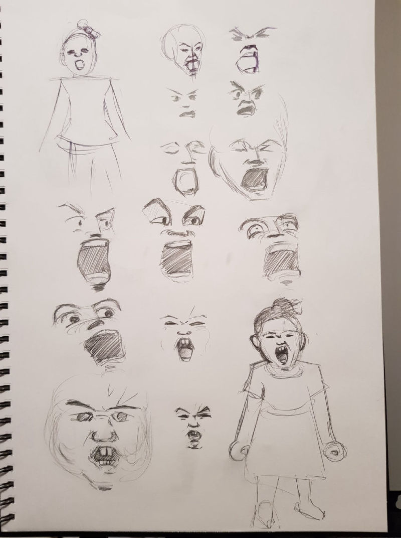
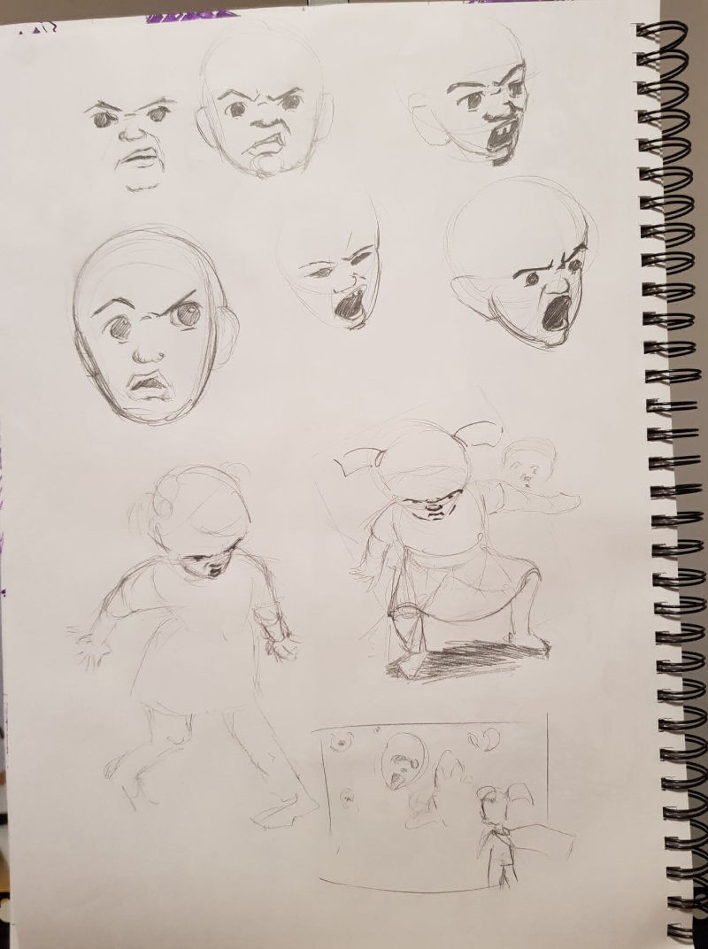
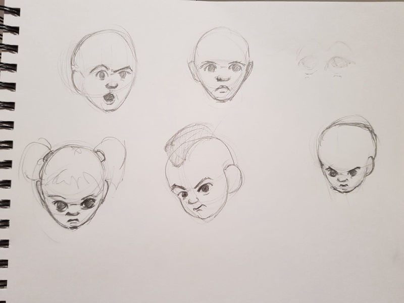
The girl standing defiantly is definitely my favourite so far (I put a shadow under her to separate her from the rest of the page).
Tomorrow I'm going to play with gestures I think will fit the peice. And also hands. I can see the way the girl holds herself, and the expressions on her face and hands will be a focal point.
I will then come back to the piece I have in mind and refine the composition, establish the values etc.
-
@nathan #10 and #11 both work for me, but if I had to choose, I'd go with 10. With #10, I like that one big eye staring at the tiny girl figure, plus the monster seems to have a mouth which gives more opportunity for expression. With #11, the many eyes work as long as each eye is really interesting and different in shape. I also like your idea of having a little brother that's being protected. Gives the girl incentive to be brave.
-
Quick Updated.
Played with poses I liked.
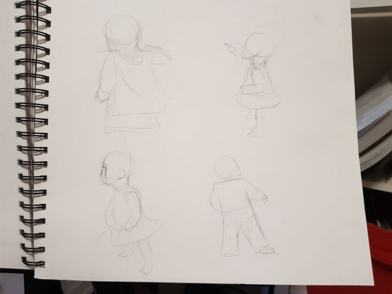
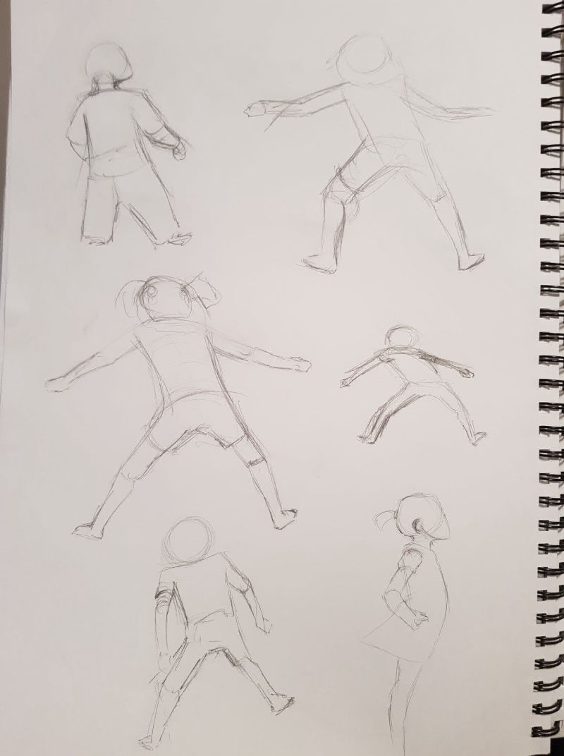
A lot of these sketches were from screenshots from youtube videos of kids. The final sketches were inspired by the Fearless Girl Statue. I just loved the power in the pose, and also the gesture lines in the pose and her dress. I think I'm going to use a very similar pose in my peice.
Tomorrow I'm going to play with the composition a bit more, and start looking at values arrangement.
-
I like #4 with the variety of eyes and teeth. The shape is interesting as well because the one tooth could come down on your kid and scoop her into its mouth while bulldozing the ground. If you watch Doctor Who reminds me of the giant slug that was suctioned cupped to the roof of a space station and the place was freezing to help keep the massive creature cool (season 1 of the new ones -Rose Tyler and (The Doctor) Christopher Ec. He wasn't just slimy he was a heat magnet lols.
-
Ok so I had a bit of fun over the weekend
The style I want to try with this peice relies a lot on shadows and perspective. I have no problem understanding how shadows and perspective works with many objects and the human figure, however, I was struggling to get my head around the shape of the monster and how it would look.
To overcome that I ended up using a technique I read in James Gurneys 'Imaginative Realism' Book. I spent a couple of hours making a model of the monster, the girl and some bodies writhing and clawing in slime. With help from my wife I ended up taking a bunch of photos of the scene from different angles and different lighting. It helped a bunch.
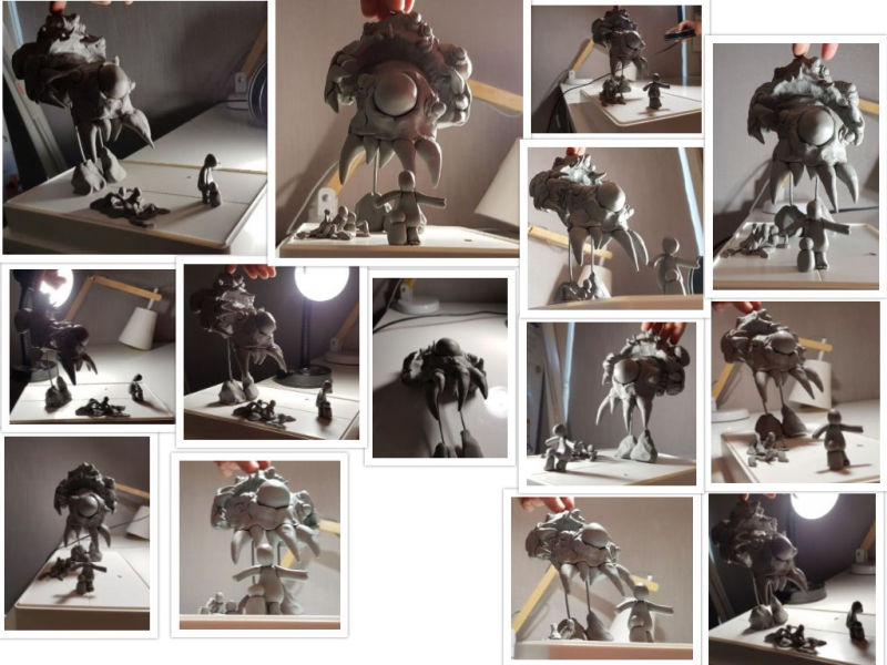
I ended up liking the angle and lighting in the top two on the left (the bigger ones).I used these as references and played with value compositions.
Some notes from these compositions that I will include in the piece.
- The 'black' shadows on the body of the monster, with a slither of light on the opposite site - very similar to redlines style. Looks great. (like in #4, #5, #6)
- All eyes of the monster will be significantly lighter (white?) that any surrounding values
- I like the spotlight effect, and the shadows of tentacles creeping in. (like in #6 & #7)
- I also like the idea of a silhouette of a giant claw/arm in the shadows. It won't be detailed but it will be hinted at. (like in #7)
My only question is should I do the 'portrait' styled peice of the monster standing over the girl and her brother, or the side-on 'landscape' peice of the monster facing off the girl? I'd love to hear your opinions.
I'll get a start on this over the next couple of days. The plan is to to do the inkwork on paper, then scan it and do the colours in digital. Should be fun
Check out my latest drawings: https://www.instagram.com/nathan_creates/
-
The portrait approach is definitely intimidating and you are standing there hesitant but firm with your girl character. (Like the second portrait bottom half, the third monster with all those variants but the shadow contrast and the eye looks more bulging forward in the fourth one).
However I really love the depth created in the landscape ones. First one monster has a real nice accumulation of form but I find your girl character a bit big and like the second landscape (has a lot more white space). I like landscape 7 with the possible tree root (edited sorry you said tentacle, my bad) as a hand/ arm but it could be added distraction.
You have pulled together a lot of cool elements and the light and shadows you have created are really effective and adds great drama!
Instagram: www.instagram.com/heatherboyd.illustration/
Website: https://heatherboydillustration.ca
Shop: https://www.inprnt.com/search/products?q=HeatherBoydIllustration
Ko-Fi: https://ko-fi.com/heatherboydillustrationBe blessed,
-
@heather-boyd Thanks Heather. I'm glad the 'feelings' of the piece and the girls hesitant by firm posture have come across the way they have. I agree with some of the scaling with the girl. I'm glad you have enjoyed the play with light and shadows. It's been a fun process.
-
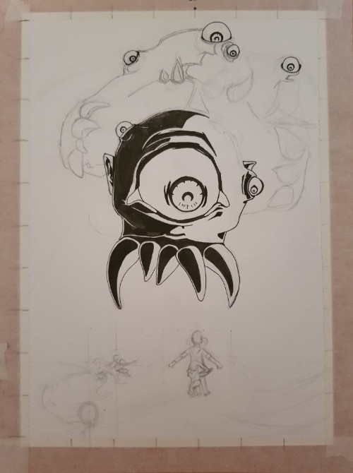
Quick update. Started inking
I got myself some new watercolour brushes (squirrel fur) and they are amazing to use with ink. So much fun. Can't wait to see the finished result 
-
Another quick update. Inking done. Thoughts so far below.
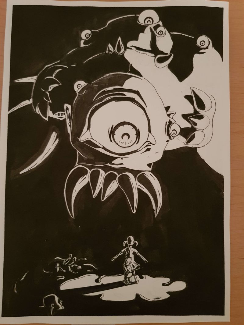
It was great to get this part of things done. I plan to scan it into the computer and do the colours in photoshop. Do some touch ups as well.
All in all, I'm not sure on this peice. Sometimes I hate it, sometimes I just interested to see what it looks like when its done. A couple of reasons for this:
- it is in style this is very different to my own
- It is a medium that I am not familiar with
- It is a subject matter that I'm also unfamiliar with.
I think taking on one of those differences would make the peice enjoyable yet challenging, however taking on all three has meant that I haven't been able to just lose myself in the piece. It's been a slog.
I'm going to finish it. But the lesson I've learned, is not to bite off too much that I can chew.
I would love to hear your feedback. Anything you like, or things that can be improved? Cheers
Check out my latest drawings: https://www.instagram.com/nathan_creates/
-
@Nathan I use to pen like this -mine having more line texture (sometimes wild lols). My first thought was epic! with the bold contrast.
Must have been a lot of ink for sure.Instagram: www.instagram.com/heatherboyd.illustration/
Website: https://heatherboydillustration.ca
Shop: https://www.inprnt.com/search/products?q=HeatherBoydIllustration
Ko-Fi: https://ko-fi.com/heatherboydillustrationBe blessed,
-
@Heather-Boyd Thank you, I'm glad you liked it. Ya, ended up using a paint brush with bottled ink
Lots of ink -
Finally done and submitted. "BIG sister"
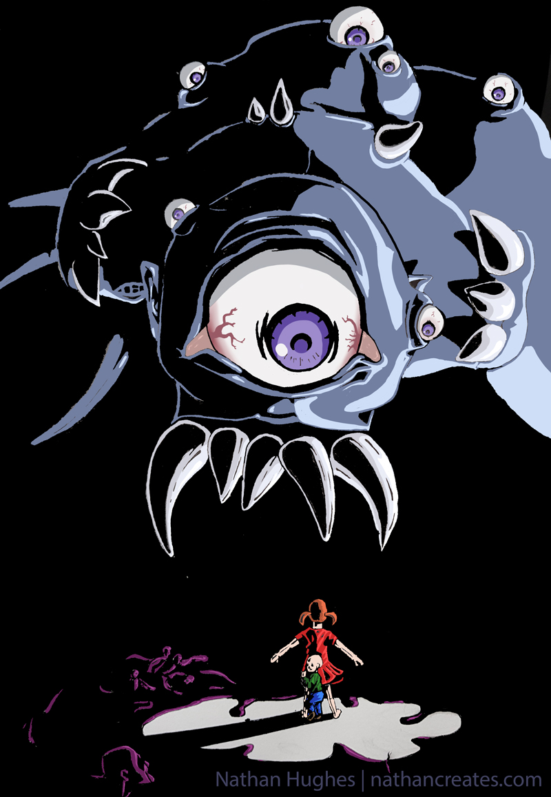
This was a toughy. Am I 100% happy with it? Nope. But finished not perfect is the ways things go.
I learned alot. But I'm glad to move onto something new