Characters for my comic
-
HI all,
So I am starting to create some characters for a comic I want to get around too.
I started working on some of these years ago, but looking at them now, I do not think the limbs have much potential (left most drawing).Let me know what you think. I will be posting more of the characters here as I work on them.
This is Finn (open to better names), he is the lead character.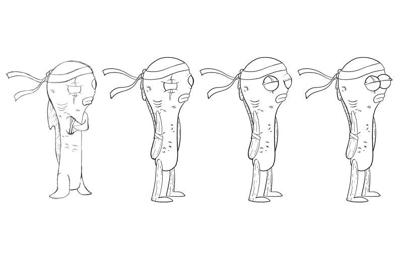
-
@reddprime I also like the one on the left the best. It has more fish like qualities.
-
Thanks, Chip. I agree it has more fish-like qualities, my main concern of using that style is that the smaller fins will limit the types of moment and action poses I can get from the character. I do want to change the dorsal fin to match the original sketch.
-
I'm a fan of the one furthest to the right.
Seems like it has the most potential for expression and movement (there's a reason a LOT of cartoons use that style of eyeball).
Though the biggest reason I'd pick it is because it seems the easiest to draw consistently from page to page. There's nothing worse than over spending time flipping back to reference pages to make sure that you get all those tiny little details and proportions right :smiling_face_with_open_mouth_cold_sweat:
-
I like the one on the far right as well!
-
@reddprime Cool! It's fun to see these different ideas. What's the story behind this character? That might help a bit in terms of giving feedback. Is he a straight up stylized fish? Or some kind of mutant fish man? His arms and legs in the 3 on the right make me think of wood right now. Not that that's a problem, but that's an association that's coming up for me.
-
I like the far left one best … might be the pose, but he seems like a bad ass
 What is Finn's back story? Is he a bad ass? I'm guessing from the Ninja head strap thingy that he might be a fighter?
-
Thanks for the feedback, extremely helpful.
Some background on the character. He is a normal pet store goldfish, who gets bought and taken home to discover that his fishbowl is a portal to another dimension.
Here is discovers that the region that he lands up in is being ruled by a cruel crimelord Kingfin (might change but liked the play on Kingpin), who is an octopus. He is trained by an old koi in order to take down Kingfin...That is a very basic explanation of the story, all of the sudden it seems a lot less original.
-
The limbs on 2-4 are better long-term for movement/expressions, I think. I like that you're keeping the original dorsal fin. Are you keeping the scarred/missing eye?
-
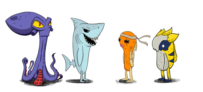
Here are a few more characters. Kingfin, one of his henchmen. Then Finn and his best mate
-
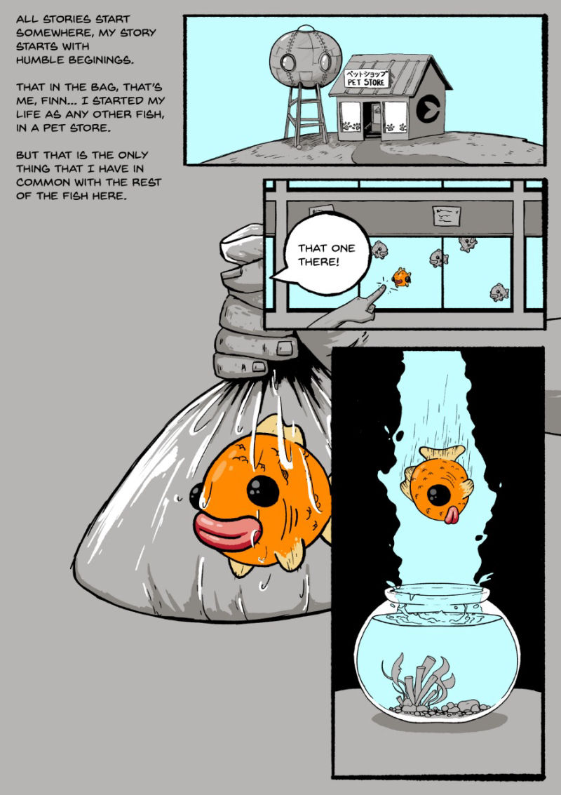
I have finally finished the first page to Fishtales.
Let me know what you think, it looks extremely different from the images above, I wanted to origin section to be grayscale with some colour.
-
@reddprime I think my favorite designs here are the most left and most right. The octopus just speaks of all kinds of potential with dynamic expressions and poses like a cartoon villain, which I think sounds fun. The character to the right seems like a chill laid back kind comedic of character. Plus, I like the color schemes of both, they pop out.
-
@rinovarka Thank you. Yeah, the octopus is going to be so much fun to use for expressions, also going to have him change colours depending on the mood he is in.
-
@reddprime I'm wondering why the shark has their tail fin but the other fish character's tail fins have evolved into legs? In any case, looking good

-
@laura this is a good point! I had not even given that any thought... I will have a look at what the shark looks like without a tail
 thanks for pointing that out.
 -
Happy Monday everyone!
I have almost completed the third page of FishTails. From page 3 one they will all be on my site: https://reddprime.com/comics/I do need some suggestions on how to make some female characters.
-
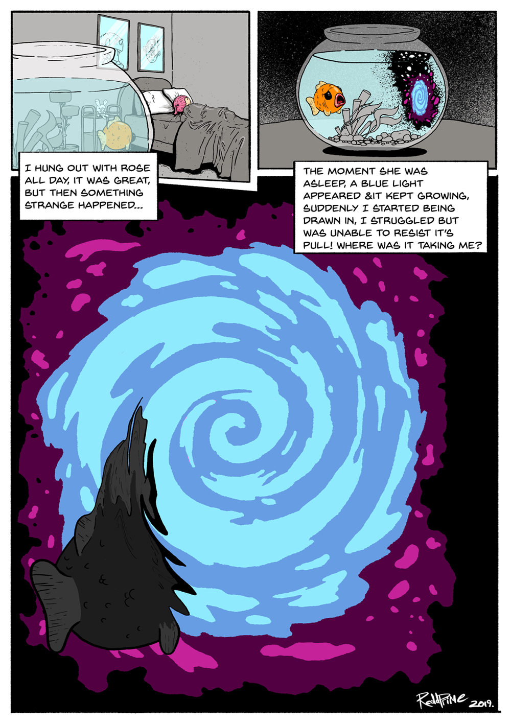
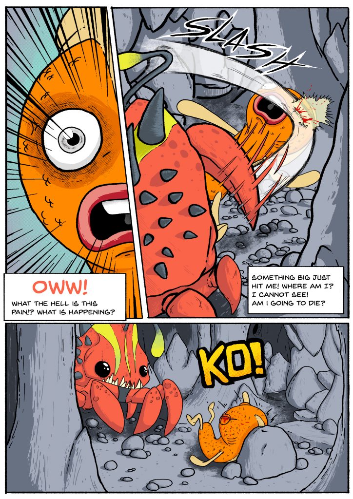
Finished up page 3 about a week ago, this one was a challenge. I was never happy with the illusion of movement that I needed for the claw slash.
Please let me know what you think. I am about to start the next page.
-
Hi there! I like what you're doing, the characters have really nice designs.
With your third page, I'm not sure if I completely understand what's happening. The first panel looks like he's scared by something coming towards him, but the words seem to state he's already been hit once. Could it work to have a small panel first showing something coming towards him, maybe in silhouette above him or something, then what was the first panel as his reaction to seeing this thing above him, then the slash. I think one hit works just as well if not better.
Also, I'm assuming he's evolved by going through the portal? As I was reading about your character design at the top of the post, I was wondering if that might be how he becomes more anthropomorphic.
EDIT: I just re-read it, and realised the pain he's experiencing first is his evolving, right?
-
Maybe it would help with the transition from the second to third page if you show the swirl from the portal in the background behind the face of the main character? It wouldn't necessarily need to be in any of the others--but still maybe include it as small and disappearing behind the fish character in the second panel (for story flow)? Hope that makes sense.
Keep up the good work! You're doing great.

-
@reddprime probably late in the process but I don’t think your main character should be called Finn if the villain is named Kingfin (although I appreciate the pun).