Feedback for thumbnail sketches for Howl's Moving Castle contest
-
I've decided to enter this contest:
https://houseofillustration.org.uk/get_involved/bic-2019
...Even though I haven't got the time. Because it is one of my FAVORITE books (and I love the movie as well) and it's an excuse to make more pieces for my portfolio that are more MG focused rather than picture book stuff.
So I would really love these to be portfolio quality pieces (crossing fingers...). I don't really expect to win, but having a contest gives me a due date to shoot for... and who knows, right? You miss all the shots you don't take.
So here are my favorite thumbs for my three illustrations (still working on the cover design.)((And how I'm going to complete four illustrations during Christmas season is anyone's guess...we'll see if anyone gets any presents from me this year.))
For the contest each one is only allowed to have a 25 word caption maximum, which isn't long at all, so below I'll post a little bit longer excerpts to give people who haven't read the book a little bit more context.
")
Longer excerpts:
-
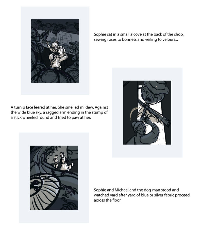
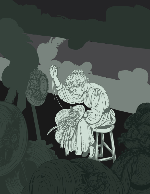
In fact, Sophie did not sell hats very much. After a day or so observing in the workshed, and another day going round the clothier and the silk merchant’s with Fanny, Fanny set her to trimming hats. Sophie sat in a small alcove at the back of the shop, sewing roses to bonnets and veiling to velours, lining all of them with silk and arranging wax fruit and ribbons stylishly on the outsides. She was good at it. She quite liked doing it. But she felt isolated and a little dull.
-
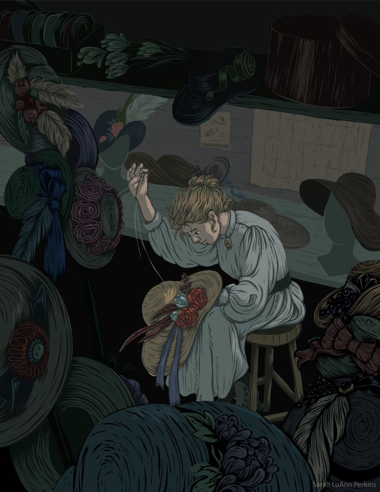
Then it was Michael back for some reason, Sophie thought as she opened the door. A turnip face leered at her. She smelled mildew. Against the wide blue sky, a ragged arm ending in the stump of a stick wheeled round and tried to paw at her. It was a scarecrow. It was only made of sticks and rags, but it was alive, and it was trying to come in. “Calcifer!” Sophie screamed. “Make the castle go faster!”
-
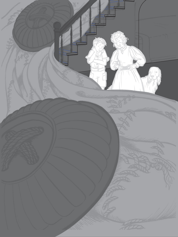
[Howl] set off with dignity to the bathroom, wading in blue-and-silver suit. The rest of the blue-and-silver suit followed him, dragging step by step down the stairs and rustling across the floor. By the time Howl was in the bathroom, most of the jacket was on the ground floor and the trousers were appearing on the stairs. Howl half shut the bathroom door and seemed to go on hauling the suit in hand over hand. Sophie and Michael and the dog-man stood and watched yard after yard of blue or silver fabric proceed across the floor, decorated with an occasional silver button the size of a millstone and enormous, regular, ropelike stitches. There may have been nearly a mile of it.
So... feedback is appreciated! I know these are really rough at this point, but I want to make sure they're working at this stage before diving spending more time on them.
-
-
Ah! I meant to respond to this days ago, but I also love Howl's Moving Castle, and then promptly decided to jump on your band wagon. I imagine the rest of the community did the same thing as well
")
I find your images dynamic and they have so much movement in them - especially with the first one - even though it's just Sophie, in a room, with hats.
The pieces feel full and lush, which is definitely the feel I get with the book.
I don't know how far you've moved from your thumbnails, but I have one quick thought.
The first image feels very reminiscent of the film's set up of the room, but I can see how that impression could change as you begin to render it further. I think it's how the table is set up in front of a window that really makes it feel familiar.
Can not wait to see how these pieces turn out! -
I've been working on my own illustrations for this contest too! Still playing around with my compositions and what I want to do. I think it will be cleared up as you add detail but something to watch - to me Sophie already looks like an old woman in the first thumb because of her hunched pose. In the last ons she's coming across as younger, maybe hunching her pose a bit would help.
-
I really like the one of Sophie and the Scarecrow. It's really dynamic and the scarecrow is quite frightening.
I'm not sure that the hunched pose is a problem in the first image -- after all, she's an old woman in attitude before the Witch of the Waste turns her old.
In the bottom image - is that a button in the foreground?
Good luck with this! I look forward to seeing your progress. I really love Howl's Moving Castle, as well as Diana Wynne Jones's other books. I wish they received more love and fanart.
@StudioLooong Good luck to you, too! I hope you share your work with us. I need more Wizard Howl and Sophie in my life.
-
@Sarah-LuAnn These are all really nice so far! I don't have anything to critique, just wanted to give some encouragement. I think it's great that you're going for it even though you feel like you don't have the time. No bad can come of it. Looking forward to seeing these taken to the next step!
-
Thanks for the feedback, all! I've been doing my best to make time for this and these are actually moving forward, and it feels SO GOOD to be getting back to illustrating again.
I got some comments from a few other art friends, and I've had some interestingly contradictory comments on the first image. Some like it as is, some dislike the whole thing. But I like it so I'm moving forward with it.
@kaitlinmakes my actual intention was that its a calendar on a wall rather than a window, though that isn't super clear in the thumbnail. And though I see what you're saying @StudioLooong about her looking old there, one of the things I love about the book is how she acts old when she is young, and then becomes all bold and adventurous only AFTER she's turned old. So the hunch was totally intentional in that way, along with the more strong attitude of the old version of her.Oh, and @StudioLooong I would LOVE to see your versions as well! I'm excited to see all the entries really. As I said, I don't expect to win, I'm doing it for the portfolio and the love of the book. So post yours on the forum if you're inclined, I'd love to see :-).
@TwiggyT Yes that is a button, at the suggestion of a critique I got from I friend I added another button up on the stairs so its easier to tell what the close up one is.
@robgale Thanks for the encouragement! It really is helpful to get comments and feedback of any kind. I am indeed going for it despite the craziness of the holiday season, and life with two little kids.
And in case anyone cares, here is where I'm at on the first image. I'm trying to get it to work with general values before I put any color in, and I want to keep the palette fairly limited anyway.
-
@sarah-luann this is really good. Would work well as a wood cut too. I'm so used to the Miyazaki version its great to see Howl's Moving Castle characters in another style. Aces.
-
@sigross Thank you! The reason it looks like a wood cut is that I actually use a reduction-type process to create the final linework, though the finished illustration will be totally digital/vector when complete. It's something I played around with once thinking it would just be for one project, but now years later I find myself unwilling to give it up because I just enjoy the process so much and love the unique quality it gives to the lines. So I'm glad you picked up the woodcut vibe from it, a lot of time is spent giving it that look.

-
Aaaand here is what I have so far. Still very much ready and willing to edit this according to any critiques I receive, I particularly am wanting feedback on the colors--I want the hats to look colorful, but without drawing the eye away from Sophie. Also if there are any really distracting tangents or other little things to shift around. Or any thoughts at all, really.
-
And how I've started on the third one. Because going in order is boring. Right?
I've inked the drawing, scanned it in, fixed some of the wonky perspective I had going on in the stairs, and laid down the overall value pattern I'm thinking of. Any comments are welcome, along with any on the Sophie Trimming Hats image above.
-
@sarah-luann This is really working for me! I have a hard time seeing anything I would want to change. One potential area that may want a little more love is the black area beneath the table where the hat she's sewing is. On one hand, I like that it's clean and makes this nice shape really allowing the hat to pop, but maybe just a little something more to break up the blackness a bit.
Honestly though, it feels really solid to me. Looking forward to seeing the others!
-
Thanks so much, @robgale ! You're right, that space is a bit dark. Though I drew the base of the hat stand there it is kind of getting lost, I may just lighten that a tad to occupy that space without totally ruining the overall dark shape.
-
@sarah-luann Cool! Forgot to add that the colors in that one really work for me. I am partial to a muted color palette and I like how you've balanced the warms and the cools.
-
@sarah-luann oh my gosh this is looking so nice!
-
@sarah-luann I LOVE that huge button!
-
I can't remember the film well right now, though I have seen it, so that may be good. I can remember more of the spirit of Miyazaki than the details of the plot. I only recall that Howl is proud and he moves around in a large contraption, and that as usual there are various spirits.
I especially like your illustration with the silver suit. It flows so well and makes such a nice composition!
And I really like your "woodcut" technique as well. The color is not my "mentality," but I think it works well. Just looking at the thumbnail for your first one, I might have said the figure needs to be bigger, but I saw the finished piece (I think in the November slideshow?) and I really liked it.
-
@Robgale Thanks--I am also partial to a muted color palette, obviously. And I made a deliberate effort to choose my warms and cools in a balanced way, thanks for noticing.
@Studiolooong Thanks! I'm pretty pleased with how it came out as well, though I'll be coming back to make a few tweaks.
@Burvantill I love the button too. I think its clear what it is in the larger detailed sketch, but I like how having a second button works in the composition, so both are staying.
@LauraA Sounds like its time to re-watch the movie!
JK. I'm hoping to have a distinctly different look and feel from the movie, so I hope that means I am succeeding.I really like the silver suit composition as well, I'm having a lot of fun as I'm diving into that one. It feels like a kind of yin/yang vibe if that makes sense, with the button on one side and the little section of the castle with Sophie and Michael almost exactly opposite from it. All I can say is: thumbnailing works, my friends! DO IT! Also, watch @Will-Terry 's re-make of the composition course, it is awesome.
I'm glad you like the woodcut technique--for quite awhile I would tell myself that I need to move on and try something else, but... I just enjoy the process so much. I think that is the point of experimenting--keep trying things until you find something you can commit to, for awhile at least. I'm not bored of the process one bit--in fact, when I get to the point where I get to start "cutting out" the image I get really excited, its where the fun starts in many ways. So, we're sticking with the woodcut process for now. Maybe one day I'll do a tutorial on my process, if that is something people would be interested in. Although I do it all in Adobe Illustrator (vectors for the win!) it could probably be adapted to Photoshop fairly easily.
-
@sarah-luann Yes, the yin/yang makes sense! And I am re-watching the composition course as well and getting new things out of it. And yes, I would love to see a tutorial of your technique! I really love all kind of printmaking, collage, and especially stone lithography (which I have never found a good way to approximate in Photoshop). It can be so hard to choose a technique!
Keep us posted on how the other pieces are going!
-
@sarah-luann It was great to see this project develop. Did you get your entry in to the contest?
-
I did! With the holidays my work was interrupted and then it was a mad rush to get them done before the due date, but I did get them in! I am glad I did it because, win or lose, I feel like they are some of my best pieces to date. I will post them all when the long list is announced (whether I’m on it or not
)