New Hammerhead - Redo - i think it is better
-
Here is another redo
") i think i'm pretty happy with it so far..it has a few cut and pasty areas but i think i am close to being done - The original Hammerhead was looking pretty low budget...not sure how it looked ok to me for so long...(same as with the Witch)
i think i'm pretty happy with it so far..it has a few cut and pasty areas but i think i am close to being done - The original Hammerhead was looking pretty low budget...not sure how it looked ok to me for so long...(same as with the Witch)
A question i do have is the chin...it was pointed out that it is similar to "Thanos's" chin....i have not seen the film with Thanos in it but i am wondering if it might be true enough that i should change the chin?? I am leaning heavily toward no but i'm hoping to hear from a more objective voice - Critiques and comments always much appreciated - thanks!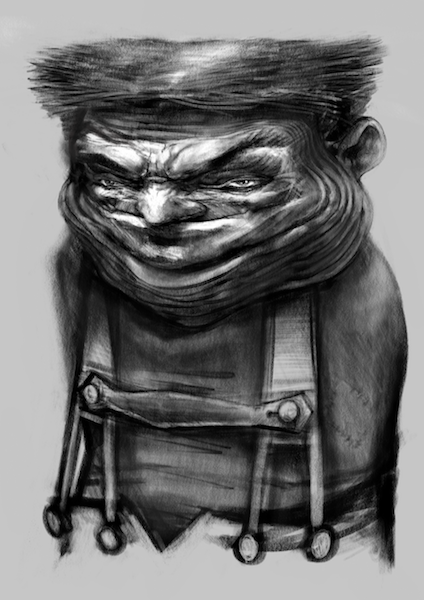
-
It's a "Thanos" chin purely in the fact it has vertical lines, so I wouldn't get too hung up on that. I'm loving the hair and the eyebrows!
-
I think your good on the chin, I only see Thanos in there because you pointed it out. If you didn't saying I would have not connected the two.
-
I like the new design. Is that supposed to be a soul patch on his chin or is it just wrinkly?
-
Yes, definitely improved. And no, I don´t see Thanos chin in there at all.
-
Thank you all for your feedback and the reassurance! - i will stop worrying about it - @TessaW The chin and neck are supposed to be Very wrinkly - here is the description of the Hammerhead from L Frank Baum -
The Hammer-Heads are rather funny looking and short, stubby and stout with no arms at all, not even stubs. Their big oversized heads are flat on top, with a very smooth surface. Their necks are incredibly long like elastic, stretching out like an accordion. They can shoot these necks out like a spring of a Jack in the Box. This allows the Hammer-Heads to defend themselves as they will strike out at intruders with their heads to knock them down hard to keep them away from their turf.
After hitting their targets, they then quickly pull their slinky like necks back to their shoulders and back into place until someone else steps foot on their mountain or comes too close to their turf. -
I think both designs are great Kevin, but the new one has a much better silhouette to it and I love the hair. I think that the wrinkles could be worked on a bit more though as they are reading as more like gils rather than wrinkles, same goes with the chin in it being hard to see it as just wrinkles. Your original one worked well in that regard as the chin was evidently bunches up together, whereas this one reads as though it is on a flat plane and doesn't fit the anatomy as well as it should.
I hope I am guessing at which one is the new one (the shaved head one right?)
-
@gary-wilkinson I see the gills now Gary! I will make the wrinkles more wrinkly - thank you for the feedback.
-
@kevin-longueil I really like the new design he has a lot of character, great work. You must be tempted to colour them, I would be.
-
Ah, I see. Thanks for sharing the description, it makes viewing the piece even better.
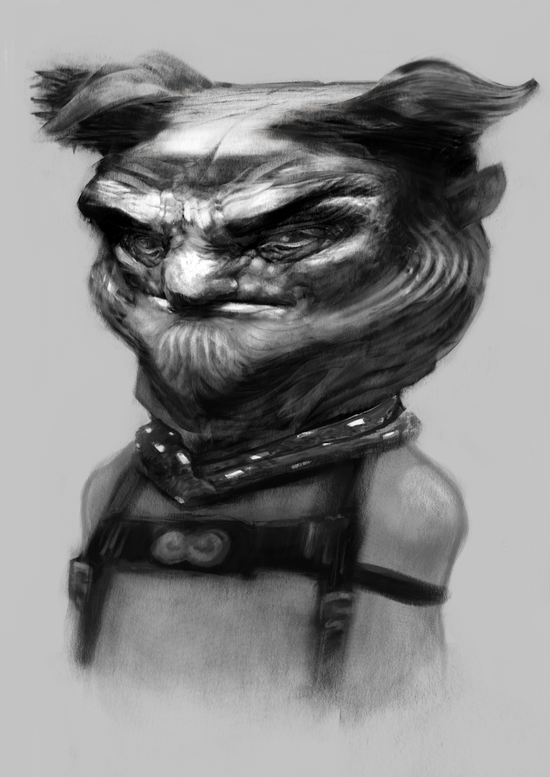
Just have to say, your updated Oz portraits are really turning out beautifully. I think I'll have that witch image burned into my brain for a while. (In a good way, lol) It reminds me of being a kid and just staring at artwork in awe, wondering how someone could do that.
-
@jason-bowen Thank you Jason - i have messed around a bit with coloring some of them but i think i will definitely want to use color in my next project whatever it may be - i feel like i have a much better handle on value than i did a year ago and that that will make for a valuable (pun intended) building block for really pursuing color and light. Looking forward to sharing my struggle here on the forum
@TessaW Wow - thank you Tessa - such a great compliment - i start every drawing with the feeling that i do not remember how to draw and that my last drawing, if it had any merit, was a fluke - my wife often reminds me that the more i struggle with a piece and feel frustrated with it the more i seem to like it when i'm done....so there is some solace in the struggle Thanks again!