I'm old(-ish) yet new at this...feedback/advice/critique anyone?
-
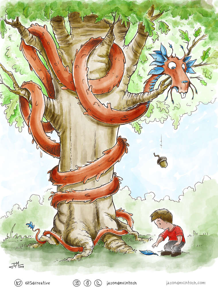
This is my first dabble in watercolor style. At 41 years old I feel like I'm super late to the game. I like how the medium feels to use, but I'm pretty sure that I'm not using it effectively. This was my entry for the 'Hidden' SVS contest and I feel like I sort of bombed it. I welcome any and all thoughts on style, color, balance, composition...Anyone care to hit me hard with what you think works, doesn't work, and what I could do better? Thanks so much!
-
I think this is overall a successful illustration! I love the dragon and the way it simulates the texture of the tree. The colors in the background are very light, but that can work well for this style. Have a look at the illustrations by Nick Butterworth for “Percy the Park Keeper” - the books, not the TV series. He is a master at this kind of style.
The only thing that I would say doesn’t work is the gesture and proportions of the kid. The legs feel short, the anatomy of the legs is a little off (particularly the lenght of the calf) and the gesture looks like he is squatting rather than reaching out for the feather. Also, the way he supports himself with the hand is a typical older person gesture, so the position makes him look old.
If I could give any advice, it would be to do a bunch of gesture and figure studies, particularly kids.
As for being late, I walk on the same side of the road") I started doing illustration seriously at 39, and I’m now 46. Still a lot of creative years to go - don´t let the age thing get into your head. Unless you plan to apply for studio jobs, nobody cares.
I started doing illustration seriously at 39, and I’m now 46. Still a lot of creative years to go - don´t let the age thing get into your head. Unless you plan to apply for studio jobs, nobody cares. -
@smceccarelli Thanks for taking the time to look this over and for your great advice. I can totally see what you mean about the child...You're so right on! That's very helpful and I will also check out the Nick Butterworth books. (And I appreciate your advice about not caring about age). You're awesome!
-
I think it turned out great, but I also agree with the feedback over the design of the boy. Other than that though, I love the color palette and rendering, you've nailed the expression on the dragon, it's really telling a story, you've controlled your focal points well, and the comp flows nicely.
Do you feel you bombed it because you didn't place in the contest? I hope not! Every month there are so many amazing pieces that don't get chosen. Your piece here looks very professional and you should be proud!
Website: www.tessawrathall.com
Instagram: www.instagram.com/tessawrathall_art/
-
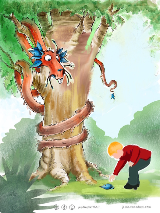
@jasondmcintosh Hey Jason - this looks very good to me - i did a quick cut and paste to try a rule of thirds type of composition - it feels like all of the action is maybe on the right of the page at the moment - the tail may be leading me off the page to the left also so i put in the tail in place of the acorn to direct the eye to the boy - also added foliage that leads to the boy - (the boy is a cut and paste from google) - anyways - those are my thoughts - feel free to ignore
")
-
I think your illustration is brilliant, I like the expression of the dragon and the life you have put into him. Your drawing is really good and the composition works fine. I use a lot of digital so I can't really say much about the watercolour technique, but the colour choices work well.
website: https://thimblefolio.com
-
I like this quite a bit! I love the dragon and the tree. Nice colours too. This is way better than my first attempts at watercolour. I agree with the others, the kid does need work. That acorn though... it's very big. Look out kid!
-
I think the technique is spot on, looks like you can control the medium. The dragon is so cool, I agree the kid sticks out, maybe its the gesture. but the use of watercolour is awesome and the character design on the dragon is cool
-
@kevin-longueil i agree. flipping the dragon to the other side of the illustration while the boy remained on the other, balances out the illustration. The illustration already looked great but just needed a few tweaks.
-
@tessaw Thanks so much for the encouragement! It means a lot to me. I felt like I bombed mainly because I just wasn't sure of what I was doing. It felt off to me but I couldn't figure out why. Thanks for the comment!
-
@kevin-longueil Ok...I'm not much of a hugger... but for YOU - I'd cave in! THANK YOU! The time and energy and advice you have provided is EXACTLY what I needed. Your cut and paste / paint-over is a huge help. I knew something was off and I feel like you helped solve my mystery! Much appreciated!
-
@christine-garner Thanks for the encouragement! Being new at this technique, I need to know what is working and what doesn't, so I'm glad this resonated with you!
-
@bnewman Haha! You're SO right! That acorn is the Concussion Award Winning Blue Ribbon Finalist at the Tree Dragon County Fair!
-
Nope, I'd say you're off to a pretty good start to watercolor.
This is very pleasing to my eyes, the dragon and the tree have very interesting designs. Others have already given you pretty spot on critiques. I'd say this is a pretty awesome illustration. Keep going with it.
@Kevin-Longueil that advice can be appreciated by everyone, thanks so much for the awesome input! -
@tianlian Thanks so much for commenting...and for the encouragement. It really helps!