New Cover Ideas for Wizard of Oz
-
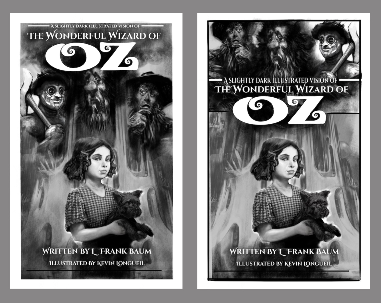
These are very cut-and-pastey at the moment but i was hoping for feedback as to whether or not these might be a better direction than my last attempt at a cover - i feel like my first cover design may have been the lowest of the low hanging fruit - i think this is better - I will try to work out a color version maybe with the emerald green again - also not sure about my lettering (which would need to be cleaned up a bit if i did stick with it). anyways ... let me know what you think if you have the time
")
( The format is 1.6:1 for Kindle and does not require a back jacket)
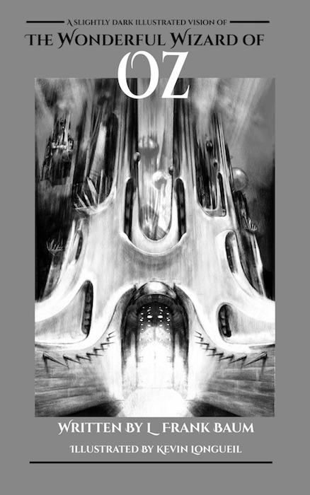
EDIT: forgot to add this one
-
@kevin-longueil I really like the first one, I think you need to bring the three characters down a bit so the lion doesn't clash with the OZ lettering. Looks great though.
-
@kevin-longueil I also prefer the first one.
-
I prefer second one and third one could be a good option. I choose second one because of composition of elements.
-
This may be a somewhat silly question, so please forgive me if the answer is obvious, but I have been wondering for a while... is this a book comprised completely of your illustrations or the original text of the story plus your illustrations? My first impression of the cover was that it was the text of the book plus your illustrations (which is super cool if that's the case). I suppose a description on kindle would clarify, but I just thought I'd mention the question in case it's helpful in considering what you want people to know from a quick glance at the cover. I really like the versions with Dorothy in the foreground... I'm drawn to her expression.
-
I especially like the first one with a few personal tweaks:
- The title "OZ" feels squished in with the Lion's head, maybe a bit more breathing room would be better.
- I like the third option only because more of the background/castle is visible; so if you could shorten or make Dorothy smaller ( a young girl in a big new world ) to see more of the door, or front window detail.
- I find the Lion's beard and the Tin Man's hand/arm is coming too close to Dorothy's head.
Anyways I think your drawing/painting style works really nice with this story, a quirky edge and would really love to see it in colour!
Love how the Lion is looking down at Dorothy and Dorothy is suspiciously looking towards us. All the eyes are framed just right.
I hope this helps,
-
Your values are fantastic!!!!!!!! I love 2, 1 is great also Great work!!!!
-
I love the first one. But perhaps you can adjust the book title a little so that it doesn't stick too near to the Lion. I love the text on the second one Is there any chance you can use the illustration on the first and match it up with the text on the second? Thanks. I can't wait to see your finished product.
-
@Kevin-Longueil This is killer! I agree pretty much with everything @Nyrryl-Cadiz said too. I like the first one a lot. If I was buying a book I'd definitely pick that up to give a second look.
The Illustration is great, but the type at the very top is bumping the edge. Remember that type is part of the composition too! It's too cramped and needs more air around it. Also even though this is for Kindle, think as if this would be printed, and that type is in a danger zone and in trouble of accidentally being cropped off. The black bars are unnecessary and it would be much stronger without them. Actually be careful of that with your characters too that they aren't too close to the edges.
Yay, I love this!
-
Definitely the first one for me - and a great improvement to the previous versions! I`d definitely pick that book up. As it has been mentioned, needs some compositional tweaking with the text, but otherwise I think it works really well!
-
Thank you all for your help with this! It is so helpful to get all of your views on these and to get your advice on needed tweaks - To answer your question Kathryn, the book will include the original text also - The Wonderful Wizard of Oz is in the public domain now, which makes it possible for me to gratefully use it - Thank you all again
@Jason-Bowen @Chip-Valecek @umutdulger @KathrynAdebayo @Heather-Boyd @lmrush @Nyrryl-Cadiz @Teju-Abiola @smceccarelli
-
@kevin-longueil Wow, this cover has evolved. It looks fantastic! I definitely prefer the 1st one. I've been away from this discussion while focusing on preparing for a conference, so forgive me if I'm repeating a question already answered: Are you planning to do a final version in color? I hope so because I think it could look even more amazing and marketable.
-
These look amazing i love the first one
-
@kevin-longueil Wow, I had never thought of the possibility of illustrating a book in the public domain. I think your finished work will be a big success. Thanks for taking the time to answer my question!
-
I also prefer the first one... awesome work, as always.
-
Love the first one! Very cool.
-
These look awesome, I like the first one also
-
These are great! It would be a toss up between the first two for me - images with characters in are much more engaging, you cant hep but be drawn in when a character appears to be staring at you. I do like the verticals used in the building and the sense of longevity and foreboding it creates and for that reason i'd lean slightly more towards the first image - the text cuts that off a bit in the second. If i was going to nitpick the first one i'd say shrink the top three characters slightly and move them down a little to play up the scale of the building and give your text a bit more breathing space.
-
It looks like the first one will be the direction I go with this -Thank you all for your feedback - It helps me a lot! Kathryn, you should check out http://www.gutenberg.org/ there are so many public domain books out there! I may do another after I finish my Oz project - just need to find the right one
@johanna-kim @DOTTYP @KathrynAdebayo @Sarah-LuAnn @AirenHall @Eli @sheri_p79