3x3 Challenge - and a triceratops on a tricycle
-
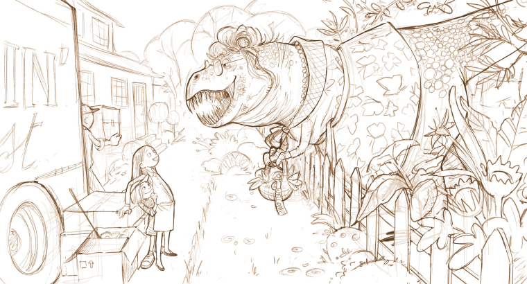
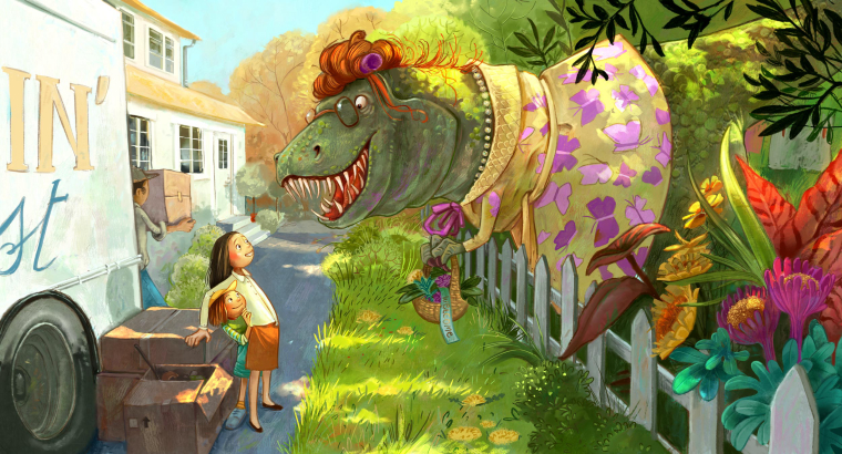
So, here is the most complex illustration and one where I would really like some feedback: Mrs Rex welcomes the new neighbours.
Anything you notice that is not working - I really appreciate your input!
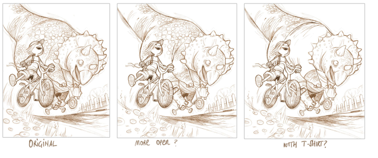
And another opinion - I moved the kid out left, as suggested by @markoman. Now I'm wondering if it's lost some of the tight quality of the original or it actually works better. And again, wondering wether the triceratops should have some clothes...
-
I think the "open one" reads better. It creates a better silhouette. Not so sure abut the t-shirt. Cant wait for you to color these.
")
-
@smceccarelli This is a fantastic series you're doing! I've really enjoyed seeing the sketches. On the triceratops I like how the original treats the tail. On the others the bottom line of the tail flows right to the corner of the page leading the eye right to the corner. I also think that based on the other images the clothes feel more appropriate since this could be a real series that you flesh out. It would feel odd to have one naked while the others are clothed and living "normal" human lives. As for Mrs. Rex something about the trucks perspective feels off. Either the back line or maybe just the wheel. It's not much but it does draw my eye to that area trying to figure out why it feels off. Everything else is pure gold! I know this was started as a fun project to perhaps break up the monotony but these would be really neat to see completed.
-
@smceccarelli I love this one! For feedback i think the only thing i can see is that Mrs Rex's head should maybe turn toward the girls quite a bit. I feel like the picket below the sternum of the t-rex is in line with the center line or axis of its body - so if i run a line from the bottom of that picket straight to the left of the canvas it runs into the fellow with the box instead of the girls - you could probably just adjust the eye of the t-rex too but i think a head tilt would look great - anyways feel free to ignore - super nice image!
-
@smceccarelli I see what you mean about losing the tightness of the original, though the openness may be needed in order to clearly define what's happening with the triceratops' limbs in relation to its bike. The one thing that's stumping me--what is that roundish shape below its mouth? Its other foot?
And yes to the t-shirt since Mrs. Rex is wearing clothes, although it's a shame to lose the interesting body texture. Maybe you can add a pattern to the t-shirt? A striped shirt?
This sketches are amazing, so full of life.
-
Thank you @Jon-Anderson @Kevin-Longueil @Johanna-Kim all good points and I will correct. I can easily move the triceratops` tail down and I was already thinking of redrawing Mrs Rex head - I want a larger upper jaw and you’re absolutely right with the fact that she should be turning towards the girls.
The shape hanging from the tricycle handle is a kindergarten bag in the shape of a frog - I guess it will become clearer with color... -
@smceccarelli As always, I love all of your drawings. Two minor things on the Mrs. Rex drawing: Mrs. Rex she doesn't look like she's looking directly at the kids (but if you are going to re-draw her head, that would change anyway). The other thing is that the two children both have beaming smiles but also look like they are backing away/hiding a little (which I would too if a huge T. Rex were looking at me even if she was holding a welcome basket!) Anyway, you might make their faces smiling a little more uncertainly to match their body posture. Can't wait to see more.
-
Color keys! After binge-watching Bucci's YouTube channel for a day. Particularly influenced by his video on "staging".
Input more than welcome....
I'm out of the studio next week - maybe I'll paint these with the iPad.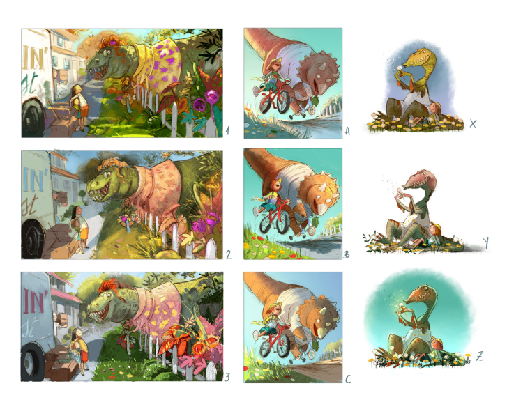
-
@smceccarelli I love the color!!! You are rehabilitating the whole idea of binge-watching ;-).
My quick gut reaction (without glasses, which may not be a bad idea) is 1, C and X. I feel fairly sure Will, Jake and Lee would go for 2, because the light is on Mrs. Rex's head, but I can't resist what you've got going on with the sunlight in 1, so I'm going to come up with the justification that the focus is on the girls and Mrs. Rex should be in the shade because it makes her look scarier (though she isn't).
I second that Mrs. Rex's head should be more dynamic (I see you've already turned it a bit). That's because I've been watching Wouter Tulp and I know that's what he would say--vary the body angles!
-
@smceccarelli I like 1 (With a tad more light on Mrs. Rex's head to separate her value from the background) C & Z. This is really coming together!
-
These are great pictures, I like 3, B and Z.
-
@smceccarelli Wow, you work FAST. If you're looking for our favorites, my picks are 3, C, X! I kind've like Y as well, but prefer X's coloring of the dino.
-
@lauraa I'm sort of in love with 1 too - and you're right, my intention was to have the girls as first focal point and Mrs Rex as second read. In 2 it's exactly the opposite It's what Marco Bucci explains in his video on staging, which I really recommend.
@Johanna-Kim it takes me about 15-30 minutes to do a color thumb and it makes the whole process afterwords enormously easier - it's a good investment of time for me. After that, all major decisions are taken and I can just put on a audiobook or podcast and paint.Does anyone like A? I know it's backlit and everything, but for some reason I like the mood....
-
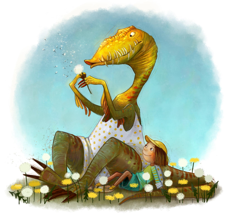
@smceccarelli I do like A but to be bashfully honest I imaged being on the other side of the hill and after the thought of things being sunny side up I couldn't bring myself to vote for it.
-
@smceccarelli I love A. It's my favorite--I do really like the mood of it. For the other two, I like 1 and Z
-
@smceccarelli I do like A as well. The figures read clearly together in silhouette and I just like the feel of the lighting/time of day. Maybe there's a little less emphasis on the dino face, but you certainly feel his hilariously huge presence on that tiny bike, and you really get the feeling of the joy of the girl. It's kind of "riding off into the sunset" in reverse
-
Finished the first one - I started with the simplest one, to settle the style. Incidentally, these are doubling as style explorations for a book I'm working on (nothing to do with dinosaurs, unfortunately...)
-
@smceccarelli I love the colors on this piece! Especially the lighting on the dinosaur's face. However, I think it may be too dark on the girl's side of the illustration. I might just be me though. I love what you did. I can't and see the other illustrations.
-
At this point I could either spend another 20 hours on this one or leave it as is....what do you think?
-
@smceccarelli This is FABULOUS! And I love your dinosaurs lols. Last year I worked at a Toy and Games store and I recall a game with dice that would add to your dice collection.! https://www.storycubes.com/
After some more intoduction/review work I would definitely be into this challenge!