Old and New concept wip help needed.
-
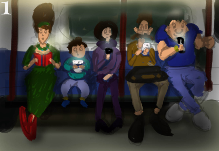
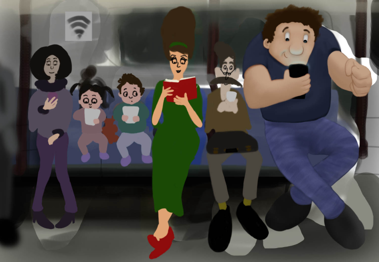
So I have dived into the Old and New competition and I have come up with this idea. Which version do you think is the best 1,2 or 3... thanks for your help.
-
I like the idea! We see this scene everywhere now, it's relate-able. I think 2 has the most appeal. The screen glow could be fun to play with as far as lighting, and perhaps the book reader would be wearing sunglasses as a "protest" or something.
Or even go as far as her reading a newspaper like how commuting was back before tech devices.
I look forward to the updates! -
I agree with #2 being the stronger. It puts the focus on the reader vs the users on phones.
-
I would put the reader in the middle as a way of saying tech is encroaching on society
-
I like #2 as well, and agree that putting her in the middle might make this a stronger piece.
-
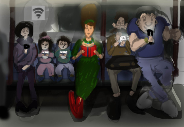
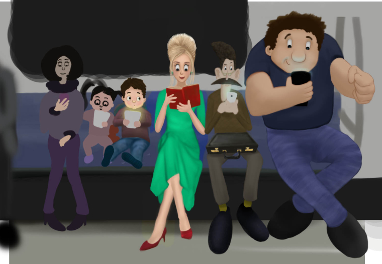
Thanks for helping. I have made some changes too which definitely improve things
")
-
@jason-bowen i like this one and looking forward to The final

-
@jason-bowen Awesome! Maybe push the size a bit more on the big muscle guy on the end. That's funny!
Happy Creating
www.charlieeveryan.com -
@charlie-eve-ryan He does keep growing each time I draw, I will try making him a little bigger, thanks.
-
Started work on the details of the OLD and New Painting... Going to try and make my pictures look more friendly after a little self evaluation on my work. Lots to do but I like it so far. -
@jason-bowen Great concept! I like how you moved the book reader to the center. Right now, the big guy on the right is drawing too much of my attention, even though his colors are muted compared to the book lady. Perhaps because he's also the same height as the lady's hair? Playing more with scale might help--i.e., making him the same height as his neighbor, but keeping his width.
Also, I wonder if there's a way to have the characters interacting more--for example, the book lady can be reading to the boy beside her, and the little girl with the device could be sneaking a peak. The big guy could be talking to his phone on a video call, or playing a video game, while the mistachio-man can be glaring at him with annoyance. I can't wait to see how this develops!
~Johanna Kim
-
@johanna-kim Some great thoughts thanks. I will play with sizes again I didn't notice the size caparison with the big guy and the womans hair... hmmm... I will have to play with this scene a little more.
-
Hi Jason--Maybe this won't be an issue when you add more color, but right now I'm having a tough time with the mustache guy's face. The color is the same (almost) as the detail behind him on the window, and it's making it a little murky to read. I guess it's a similar issue with his hair--that blends into the background a lot. Maybe you can just lighten the area behind him and move or lighten the window detail...? Or you could lighten his hair and mustache. Hope that makes sense! It's really coming along! I like the kid next to her peeking at her book, and love the expression on the big guy's face.
-
@eli thanks for your thoughts, things have developed a bit more, still a lot more thinking to do though but I am staring to see a finish line on this.
-
WOW it's looking awesome!!
-
@eli thanks
-
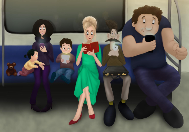 Spent more time on this painting. It's coming along but any thoughts still welcome
 -
HI Jason, characters are looking good and this is a fun concept. While I do like the concept, I feel like it might not be taken as far as it can go. You have all the ingredients here, just need to play more in the beginning stages (in my opinion).
Is this the best composition possible for this story? Have you used good shapes and design to your advantage? Would there be a benefit to having a foreground middle ground and background? Could perspective and overlap help? What about camera angle? How about a framing device? Etc. These are things I play with in the thumbnail stage and really try to make sure I can answer yest to those questions before refining the paint.
SVS Faculty Instructor
www.leewhiteillustration.com -
@lee-white thanks for your opinion. I will try and push my compositions further. Still happy with what I have here though. Making progress