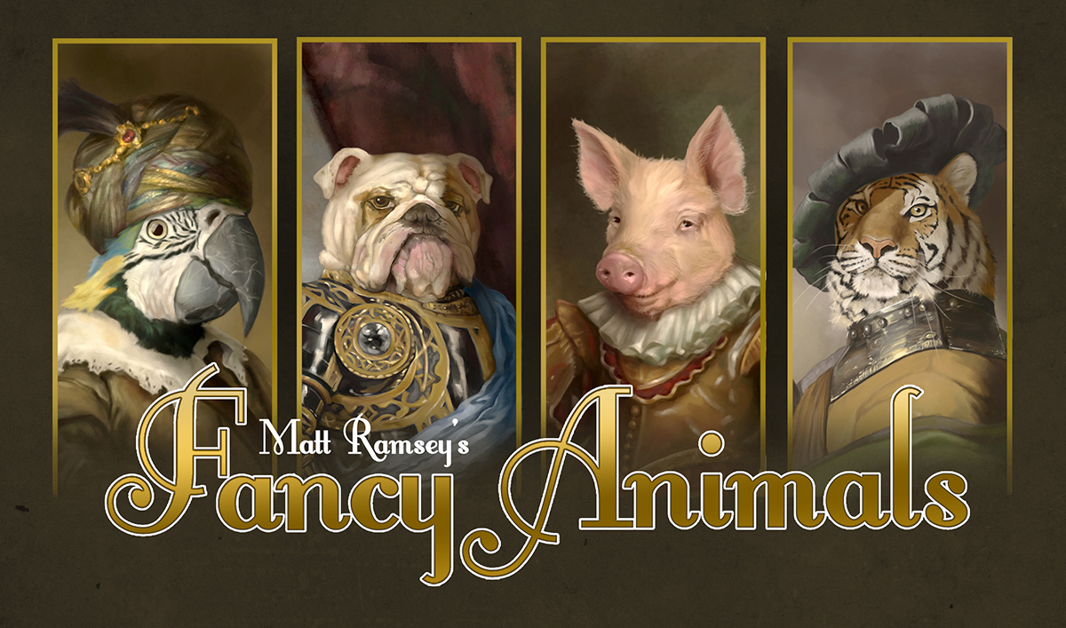
Fancy Animals...struggling with the graphic design
-
I tried throwing together a box design the other day. I'm getting a box sent to me so that I can check to make sure all the cards will fit and my wife suggested I put some images on it since it's the same price either way. It's a standard "tuck box", almost like an oversized playing card box. You have to visualize how it all folds together!
So using their image template I came up with this:
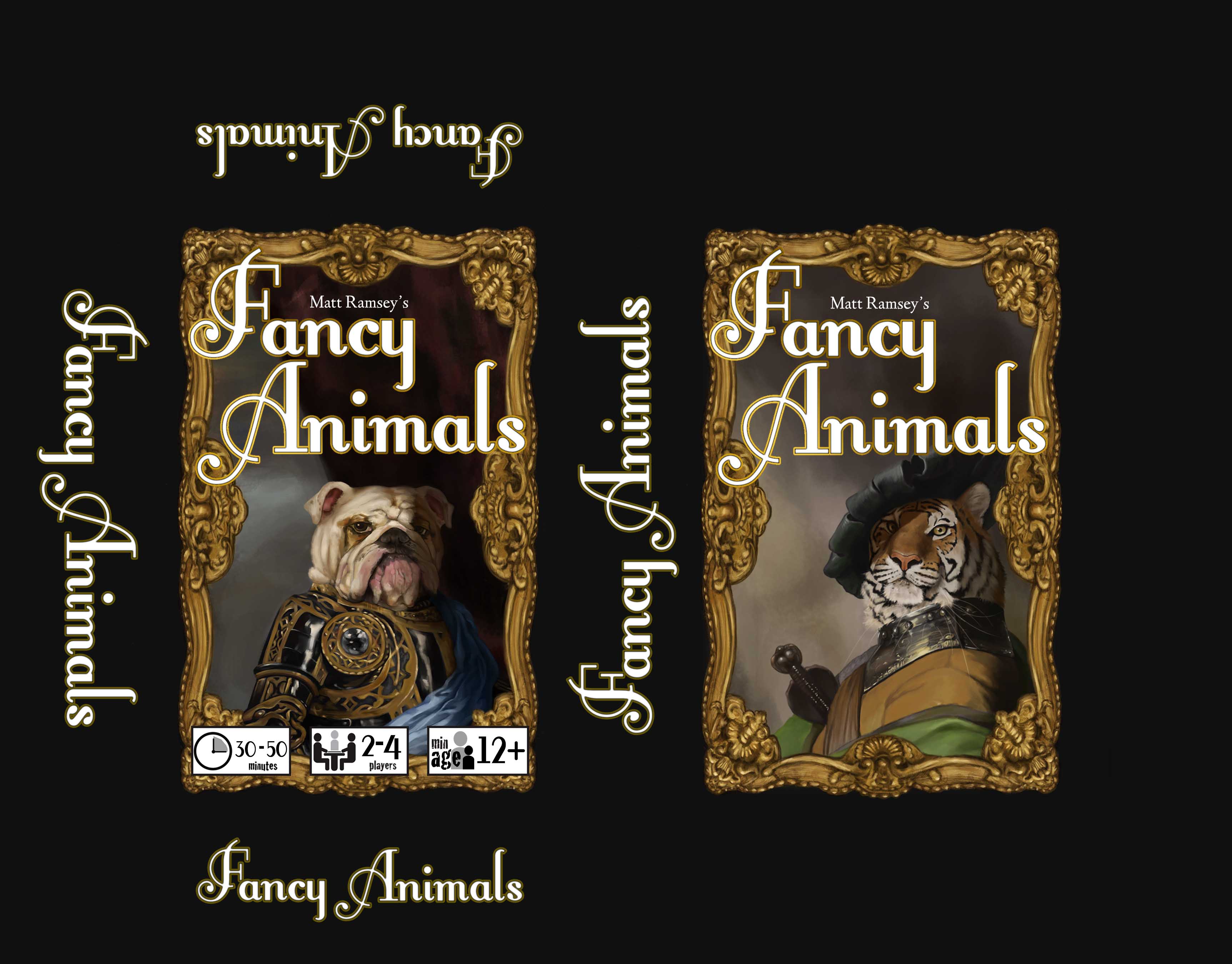
I'm really not excited about it. I might ditch the gold boarder or maybe just tweak it some. Any suggestions?
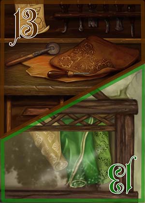
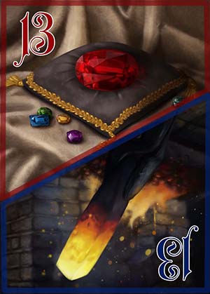
Also: I've finally finished the playing cards. Once I get my final logo design set I'll be able to have these cards printed--the logo will be on the back of each of the cards.
-
I think your font is too big and too white. It overpowers the wonderful illustrations. I would probably play around with reducing the size of the font and making it slightly off-white. I believe the frame should stay, but the writing should not overlap with the frames.
Just my thoughts - graphic design is a lot of fiddling and seeing what works (at least for me). -
My first thoughts were much the same as @smceccarelli 's... the font looks too bright white compared to the subtle subdued tones in the picture. I also agree that making the font sit within the frame would help make the overall feel of it work better.
I think the way you used the number text on the playing cards works much better - for sure I would try using a more subtle off-white colour to start with, because that may well fix it.... but as a second option you could try a coloured text with a white border, like you did on the cards (eg you could try a golden yellow ochre, like the frame but lighter to make it come forward - OR a shade to match the clothes of the featured animal - eg blue or green). Will be interesting to see the final results
")
-
I love it- I would maybe just shrink the font to fit Fancy Animals in the gold frame. So professional looking
-
I agree with the thoughts of everyone, I would add that the frames are Awesome, just maybe a little too thick. Think them out and add color/dimension to your lettering and your animals could be bigger. I am an instant fan! great job!
-
I appreciate all the suggestions! I will work on them all and see if I can it better--I can already picture some of them and I agree it would improve things greatly!
Also: I'll post a picture of the box when it arrives--just to see how it looks "in the flesh".
-
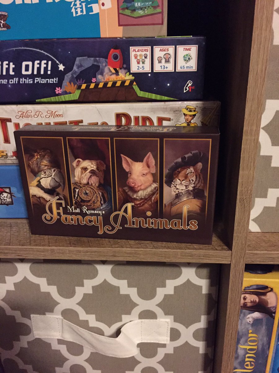
This is an updated design for the box (different sized box). I am actually really happy with it:
Here it is in action on my shelf:
-
@mattramsey This looks so great Matt!!!
-
I would pick this up instantly. Looks awesome!
-
Rally really awesome. People will like to have it on their own shelfs.

-
Very Cool. I'm Jealous
-
Fantastic!
-
This looks great .
-
@mattramsey The updated look is great! Well done!
Is this for a games publisher or a self-pub? Sorry I guess I don't know the backstory behind the project. I have started doing a fair amount of work in the board game industry so I have been wrestling with restrictions native to that particular way for printing, etc.
Love the industry, hoping to get more work there.
Andy Jewett
ILLUSTRATOR | DESIGNERPORTFOLIO: andyjewett.com
TW/IG: @andyjewett -
Thank you everybody for the kind feedback! It means a lot to me.
@andyjewett This is a game I've designed and am doing the art for (I'm not finished with the point (clothing) cards)--I plan on submitting it to various publishers and hopefully one will pick it up. I've done a lot of research on Kickstarter and I'd really rather not have to go that route but it might be a possibility.
I'm also working with Robert Couch (he is the designer of the new Saloon Tycoon game) on a card game he designed. It's tentatively called "Eight Arms to Hold You." I am just doing the art for that one--I have a separate thread on here that I will keep updated.
-
It looks fantastic and really professionally finished @mattramsey - congratulations! I hope you have success finding a publisher for it.
-
@Dulcie Thank you! I think I did pretty good on the design if I do say so myself--I'm bragging because I am NOT a graphic designer and I really struggle at things like that. Plus I know that a real graphic designer could find a lot wrong with what I did.
I don't think I even did any kerning on that font. I just let er rip. Turned out good to my eye. If I do get this sold I am sure a publisher will change it.
-
@mattramsey You should be really happy with this Matt - it really looks fantastic! And like the others have already said, seeing that box I would definite pick it up to find out more about the game for sure. Really really nice how this is all coming together!
-
@mattramsey Looks great!