Is this too weird for a portfolio? Thoughts?
-
@KatrinaF Hey! Nice to see you posting this on the boards. Lovely color and concept overall as per usual. I do have a few notes. Feel free to disregard if it doesn't feel right.
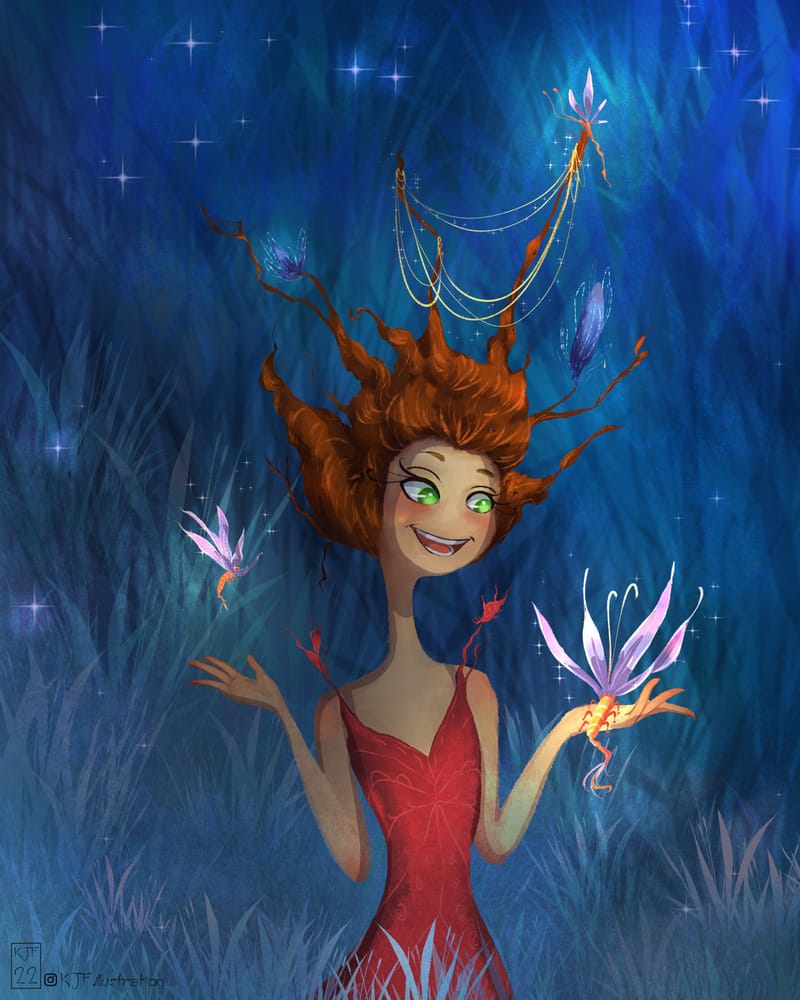
The only crit I would have is the character design and focal point. Right now, to someone just coming in and seeing the piece, I'm instantly confused by her hair. Wrapping around her neck and combining that with a long neck, I was thinking she is being strangled and looking to find who/what is doing that to her. I would definitely rethink the character design a little bit. And I would base that design on what do you want people looking at? What is the concept? If the concept is simply "she is playing with these cool little shrimp thingies (which I love btw), then you need to take the emphasis OFF her and put it ON them. The character design is only distracting from how nice this piece could be.Keep them the most interesting thing in the image and take some focus off her hair and neck. Have her looking at ONE of them and scale the other one down and put in the background. Simplify, Simplify, Simplify. Hope all that makes sense!
Can't wait to see what you end up with.
-
@KatrinaF I think this kind of weird is fine; it's memorable and it's human-like. Maybe make sure to include 2 more pieces that go with this one to show it's part of a narrative story of a world you invented. Then be prepared to explain the story when an art director asks. Having more conventional people and animals, though, will help an art director envision you for a project they may be need an illustrator for. If you're really into creating fantastical characters and worlds, maybe you would create a separate page on your website for fantasy.
-
Katrina, I really find these characters fascinating every time I see your designs. I really want to know more about them.
Steve. -
@Lee-White Hey Lee! Thank you for the thoughtful comment and critique! Yep, I'm back at art and putting in 110%. I'm spreading it between Illustration and Comics right now and seeing what sticks. I really need to make it work this time so I'm diving back in with both feet. I just finished with a local Con and can refocus on illustration and comic episodes. I didn't realize that even this small con would take so much effort! phew
I took your suggestions, like I would an art director, and adjusted the hair (which in my head was supposed to be 'wood' but no one knows that but me.) I simplified the 'flutter-shrimp', which I will trademark and copyright [Haha!} and brought her eyes down to look at one and shrunk the other. I think it looks okay... but -
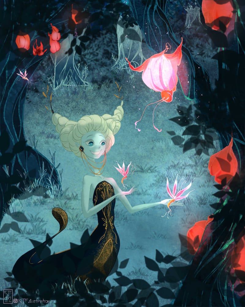
I wasn't happy with that and decided to revamp the whole illustration and give her a story. She's now in the forest where these 'flutter-shrimp' are hatching from the glowing blooms in the surrounding trees. I'd like it to have a secret garden/nursery feel where she's there to welcome them to the forest. That sort of feel...I'll be working on it this week.
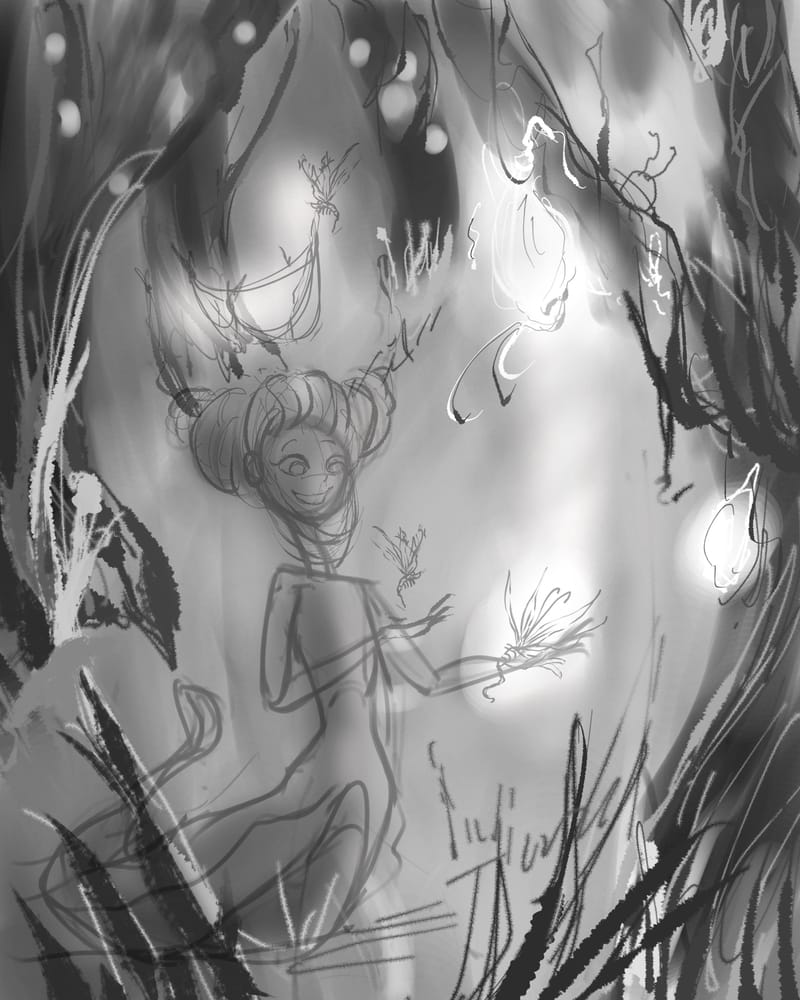
Thanks again for your comment! You and the SVS team have been so supportive over the years now I just need to make it work. And I need a mentor! LOL So I stalk your YouTube/podcast every week.
Cheers
Katrina -
@Johanna-Kim Thank you for the feedback! I'd definitely have similar pieces (in fact my two entries for Lucky - March fit right in this realm) I've actually started a story line to work these creatures into. I can't decide whether to go a comic route or stick with a picture book. I'd have to simplify for a PB and a comic I can really flush out a cool story. I'll be adding more traditional looking kids/animals/environments as well into my portfolio.
Thank you again.
-
@PenAndrew Hey there! I've got some ideas going with these characters. I just need to decide if I want to go a Picture book or a comic. I can really get 'into' a comic story but not sure an audience would be there for these creatures. So I'll keep plugging away.
Cheers
Katrina -
@KatrinaF nice work! I love how open you are to feedback and making it work! It's lookin good!
-
Still plugging away at this... WIP
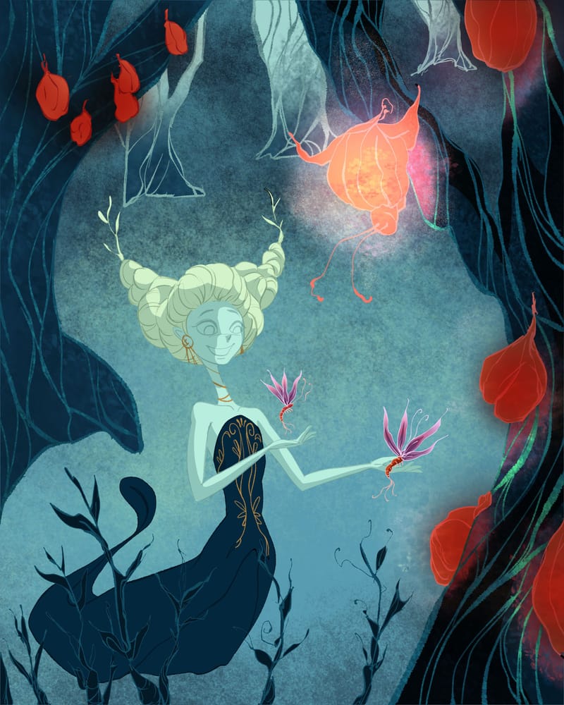
-
I love your dreamy style @KatrinaF. I've spent so many years having to create everything in such a technical form in various graphic jobs I would love to be able to imagine something as lovely as this. This is unique so I think would make a great portfolio.
-
@KatrinaF This is a really lovely style that you are evolving.
-
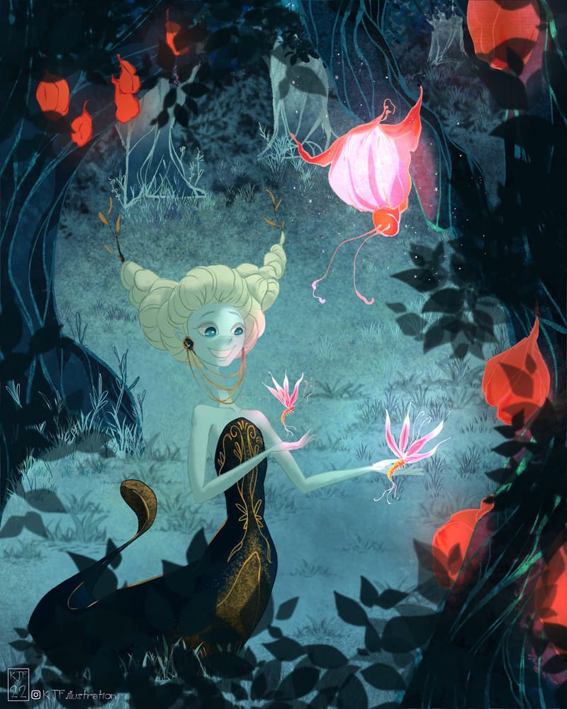
I feel like this is SO CLOSE to being done. Does it feel more like a 'story' now? Any other thoughts? suggestions? Comments? @Lee-White
-
@KatrinaF I love what you’ve done to this. It looks a little more like a fairytale moment than just a random girl now. I think it’s reading much more clearly. I like her hair better too, and the perspective.
 ️
️ -
@Pamela-Fraley
 Thank you Pamela! I love that you think it looks like a fairytale! It's sort of what I was going for.
  I'm glad you like the hair - It does look a bit more clear and 'regal' which I was going for. Thanks again for the comment.
 -
It was wonderful to see the evolution of this! Your most recent piece is much clearer than what you started with and it's interesting how your color palette changed as well, very beautiful work

-
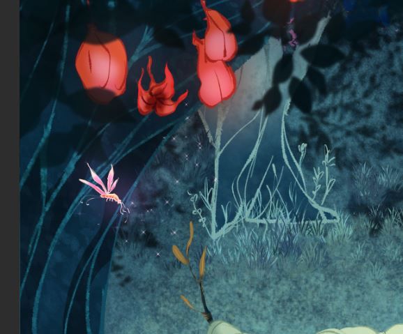
Showed this to my sister and she recommend to add a little 'blooming' creature in the background to help drive home the idea that these flutter-shrimp and tree pod/cocoons are linked. I think it helps and draws the eye more around the image. The sparkles match the ones in the foreground too. I'm pretty happy with this. Thanks everyone who commented. !
Cheers
Katrina.I'll have a 60 second time lapse vid on my Instagram if you wanna watch it.
-
@KatrinaF I adore it!
-
@Kristen-Lango Thank you Kristen! I changed the color of her dress to lessen the attention on her rather than the pods. The original image colors were very bright but with changing the story I wanted it to be night and the creatures 'blooming' (emerging) from the pods. I hope it didn't turn out too dark. If I want to print these I think I'll be doing a bit of value adjustments.

-
@AlliFaith Thank you!!!
