Is this piece a portfolio piece?
-
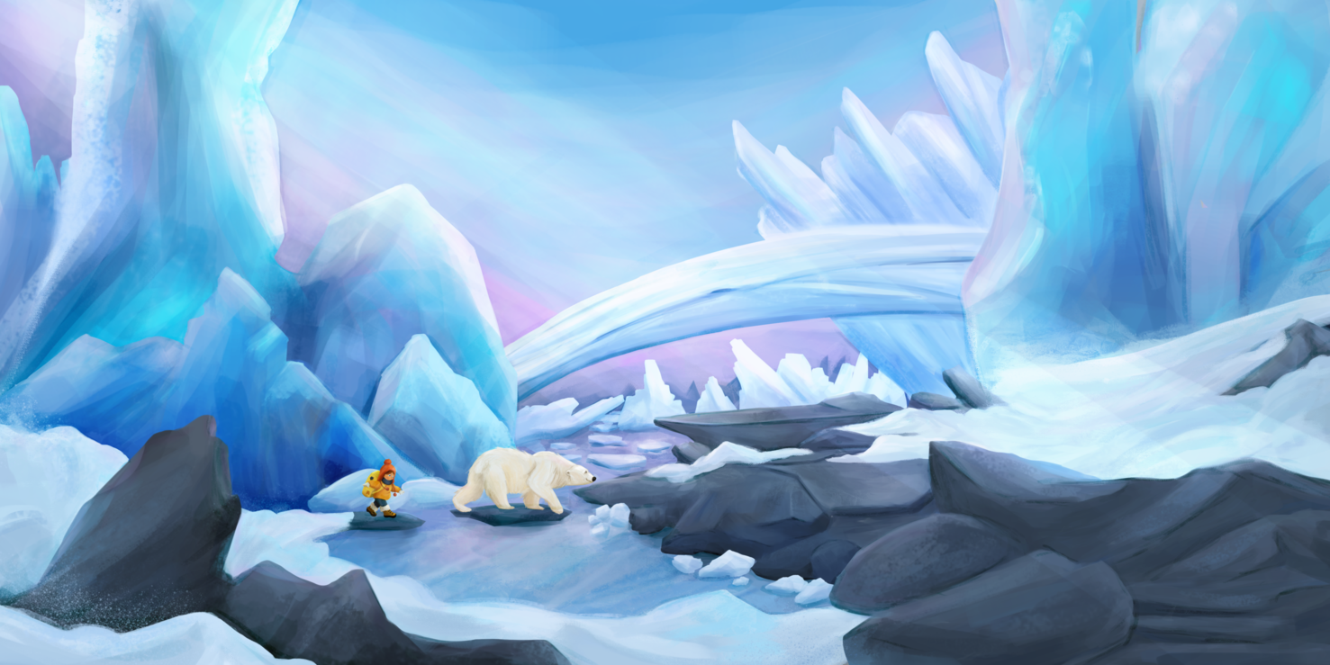
Hello, guys! I've started to work full time, a few months ago, on my dream to become a children's books illustrator and here is one of my illustrations that I want to include in my portfolio. The idea is to create a series of illustrations with little kids exploring the world together with their animal friends, which are their guides. Here is a spread where I wanted to present the adventure of these 2 small characters in the big arctic world. What do you think about:
- the composition
- the rendering style
- values and colors
- is this a good spread illustration? Is there enough space for text?
- most importantly, is there enough storytelling and emotion in this?
I would really appreciate your feedback about it! I'm super excited to be here and to learn from you!
-
Hi @simonaburlacu,
I think it’s a great piece for your portfolio.
The storytelling feels like adventure, but the girl seems scared whereas the polar bear is happy. Personally, I would make them both happy and excited to explore rather than mix up the emotions.
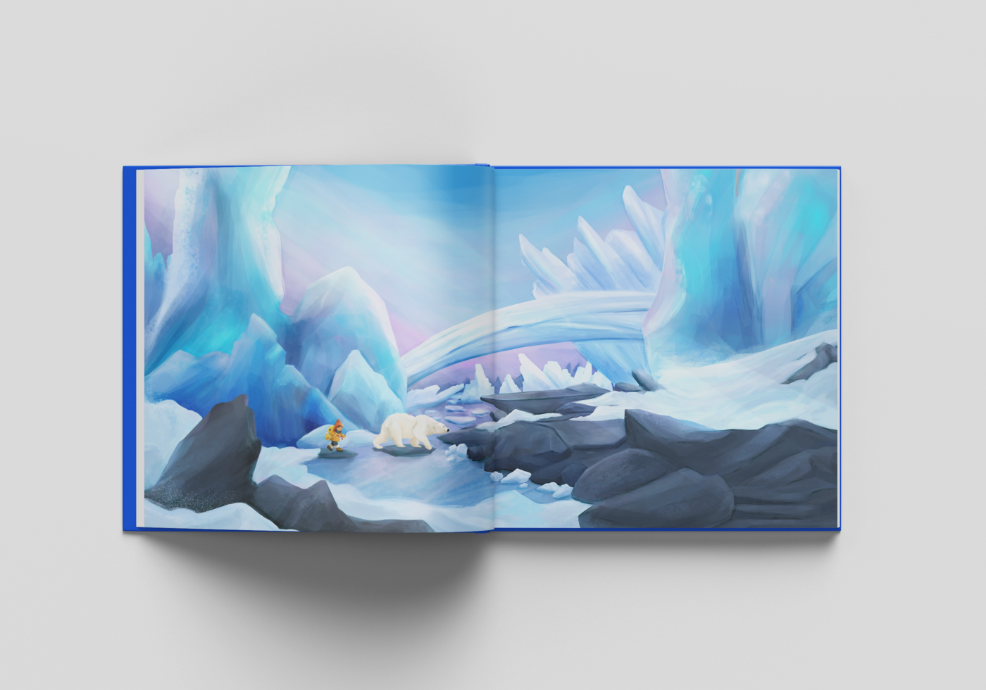
The composition looks nice, though I completely missed the polar bear in the thumbnail double page spread. Maybe contrast with dark grey rock behind the polar bear to provide strong silhouette will make it pop?
The rendering and colors are really nice, magical even.
For text, I see a spot in the top left spread, but can’t say it’s enough without knowing how much text you need there.
Look forward to seeing more!
-
I find this to be quite enthralling. I like the different emotions, but maybe have the bear show more assurance of safety than happy, connecting the uncertain unease of the girl with her more confident travelled companion. Colours I agree are dazzling! Composition, maybe have the characters a wee bit larger if your able, they get a little lost if it wasn't for the girls warm coloured clothes. And I like story wise how there are two bridges across.
Instagram: www.instagram.com/heatherboyd.illustration/
Website: https://heatherboydillustration.ca
Shop: https://www.inprnt.com/search/products?q=HeatherBoydIllustration
Ko-Fi: https://ko-fi.com/heatherboydillustrationBe blessed,
-
I love your pallet and the feel of the piece. Is the ?ice which bridges the gully necessary? It looks like a bridge to me and makes me wonder why they aren’t using it to traverse. The child is sweet but looking very scared and the bear happy - is it leading her astray? Nice double page spread for folio!
-
Hi, @jeremy-ross ! Thank you so much for your valuable feedback. You are perfectly right. The bear is painted light on light, I will definitely make the iceberg behind him darker. I agree also with the mix of emotions. I wanted to express the fact that the girl is trying to keep her balance on the rocks, but it doesn't show up the excitement that I intended to show in the overall piece. Thank you!
-
Hello, @heather-boyd! Thank you so much for your suggestions! I really like your alternative regarding the bear's attitude. I actually wanted him to be the girl's guide in this arctic world, which is his home and he knows where to go for a great adventure. I was also concerned that the characters are a too small. I wanted them to feel like being in this vast, stately landscape, but maybe a different camera angle would have been better for that. What do you think?
-
Hi, @helen! Thanks a lot for you reply! I confess that the decision to draw that bridge was made from the composition point of view and not thinking about the storytelling. I wanted to have an element to make a transition from one page to another, around the gutter. I totally agree with you that the bear might look like a negative character here. I actually wanted him to be her guide, her companion in a beautiful adventure in this arctic world. I will definitely change her expression to actually be excited for this adventure.
-
@simonaburlacu The colours in this illustration are beautiful, you have captured the cold and made it look inviting. I have an opinion about the composition, I would like to see the bear where the girl is and the bear walking closer with the girl and the white iceberg behind them moved to the left or smaller. Just prefer characters away from the fold. Beautiful work.
Website http://www.judyelizabethwilson.com/
Instagram https://www.instagram.com/judyelizabethart/
Sharing positivity through art.
-
@simonaburlacu Hi!
Beautiful piece here!
I love your choice of colours and the two characters are adorable")
My advice would be - move the characters away from the fold, it creates unnecessary tension.
And - I feel a bit conflicted about this but - if this image tries to convey the feeling of a huge empty landscape with two little travellers - it does exactly that for me! So great job! However, if a child would look at this image, there’s not much going on, it’s a bit boring maybe? My three year old would not spend a lot time wondering through this image, because there’s actually not much to look at. So if you have other images in your portfolio, where an artdirector can see that you know how work with props, rich environment, etc, this illustration is cool and good enough to go in your portfolio. However, if the rest of your images is also a bit “empty”, I would consider adding some that shows you can handle more complex images. -
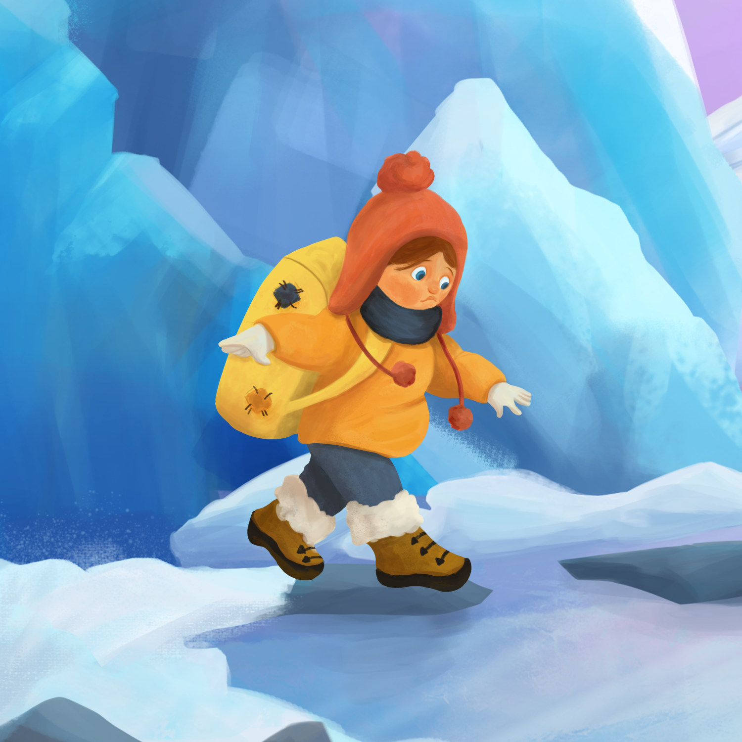
@simonaburlacu This is a great illustration, does really well in the composition, rendering, colors and the landscape. It doesn't do as well in the emotion because the characters are so small. And it's okay to have an illustration like that once in a while in a book! Just keep in mind most of your illustrations will have to show the characters much closer because they're the most important part. You show us a zoomed in portion of the image to show the emotion, but on the full version it's impossible to see their faces well. We can assume that the reader will not see it since they don't have the benefit of the zoom.
vanessastoilova.com
instagram.com/vanessa.stoilova/Check out my Youtube channel for tips on how to start your career in illustration! www.youtube.com/c/ArtBusinesswithNess
-
Hello, @judy-elizabeth-wilson! I really like your suggestion to move the characters closer to each other and away from the fold. I will definitely do this change too. Thank you so much for your reply! >:D<
-
Hello, @mag! Thank you so much for your feedback! You are right, this might be quite boring for a child. I will totally consider adding more complex illustrations too. I am currently working on a illustration for the draw 50 things challenge. I will post it soon
-
Hello, @nessillustration! You are so right. Because I work digitally and keep zooming and adding details, I have the impression that people will see everything I see on the screen. Your comment gave me the idea to actually print my work from time to time and look at it. I will definitely consider adding more close ups pieces and characters design on my portfolio. Thank you so much for your feedback!
-
@simonaburlacu Hi again. I think the camera angle is okay -not really my strong suit, plus you have done such good work with the environment I wouldn't want you to scrap it. Really if you can just make them larger, conscious of course the relative size of character vs character and the environment around them. I would however note an increase in some of the more forward pieces of snow (you have 3 piles coming towards us on the ice, they look relatively the same size) and maybe adjust the size of the forward rock formation in order to allow for the characters size to be increased. For the bear character as "guild" you could maybe have his/her head curled down and around looking partially back at the girl (while keeping a good silhouette), might help evoke empathy.
Instagram: www.instagram.com/heatherboyd.illustration/
Website: https://heatherboydillustration.ca
Shop: https://www.inprnt.com/search/products?q=HeatherBoydIllustration
Ko-Fi: https://ko-fi.com/heatherboydillustrationBe blessed,
-
Thank you, @heather-boyd! I love your idea with the bear looking back at the girl!