Yeti Cooking WIP | Wolf Kibble Soup | Feedback Welcome!
-

Sorry, it's a bit of a mess atm
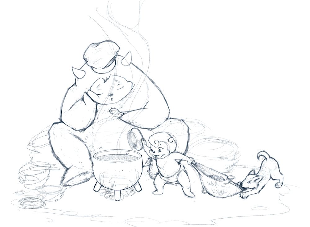
 The scribbles along the edges will be bags of food, cooking supplies, and so on, to try and keep the image balanced.
My intent is the parent/chef has fallen asleep, the toddler has taken over to add wolf kibble to the soup, and the wolf pup is grabbing onto the corner of the kibble bag. I'm thinking of making the wolf pup more concerned like he's trying to stop the kid

Does the perspective, placement, and anatomy of everything seem reasonable? Any other thoughts or feedback so far?
-
I love this! The story totally comes through. I wish the pot and spoon were a little bigger, and I think a dog name on the bowl would be better then labelling the bag is the only thing I can think of. I really relate to that yeti parent!

-
@miranda-hoover I think it looks great. I wouldn't worry about making the wold look concerned, he looks like he is playing with the young yeti and the two of them are having some unsupervised fun.
-
This is absolutely adorable! it’s really great comp wise, character wise, everything can’t wait to see the final!
-
@HeatherBouteneff Thank you! I'm glad the story comes through! Good idea; I'll try making those things bigger, and try something on the bowl instead of the bag, maybe a bone...

@jenithornhill Thanks! That's good; think I'll go ahead and stick with the wolf as is, then. Thanks for the feedback!
@Asyas_illos Yay! Thank you!
-
@miranda-hoover I understood the story right away! Very cute idea, I can relate to that yeti parent lol
-
@KaraDaniel Yay! Thank you!
-

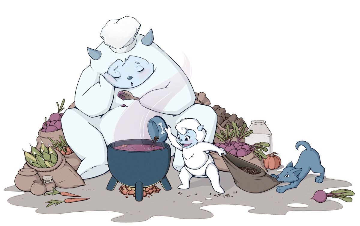
Getting close to the final version
 Any thoughts at this point?
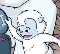
Something seems off with the kid's head. A friend suggested the hair might be too big--but is that the cause or a symptom of a wonky face. I keep trying to fix it, but the expression always seems to lose a bit of the charm--which probably means I've been looking at it too long. Is there something I'm missing? Or should I simply try cutting down on the hair fluff?
(Also, I think this is the most colors I've ever had in a single piece--yay personal growth!)
-
@miranda-hoover this looks awesome! I think what strikes me about the head is the parallel straight lines in the front and back - the tuft of hair in the front seems alone in the way it is stylized - I think rounding the back of the head and opening the curl up and maybe increasing the forehead size ( did I get the forehead idea from just watching one of Ness’s videos?. I think so
 anyways here is a quick sketch of what i was thinking - great piece as usual
-
You did stray from the original a little bit I think if you reduce the top of the hair a smidge it would look a little better but also I noticed you added teeth I think it actually took away from the cuteness you had in the sketch. It’s still a great image hope that helps you a bit!
-
@miranda-hoover looking good! Love your color harmony.
For me, what feels off with the baby yeti is that its head and shoulders are a different silhouette than the mom yeti’s. The mom yeti was drawn very stylized with smooth lines, no separation between head and shoulders, which works beautifully for the character. But the baby has defined head and shoulder.
It seems that a juvenile yeti would mimic the same overall shape as its parent, only smaller and rounder and fuzzier/plumper. At least that’s how I see it.
Really looking forward to seeing this spot all finished! Two thumbs way up!
-
@miranda-hoover Great concept! I really like this image :D.
-
@Kevin-Longueil Thanks for the feedback/image; I can defiantly see how the larger forehead makes it look more baby-like. Massive hair seems to be my default for some reason, haha. I'll try to smooth it out and work on increasing the forehead. Thanks again!
@Asyas_illos I see what you mean
 I suppose the mouth seemed a bit empty, but maybe I just need to make the tongue a bit larger like in the sketch. Thanks! I'll play with it a bit more.
@Melissa-Bailey-0 Thanks! Good point; I didn't even think about that! I'll see if I can try to smooth out the transition between head and shoulders a bit.
@Richard-Matthews Awww! Thank you!

-
I really like your illustration. It is so funny! Nice color palette too!
-
@Kim-Rosenlof Thank you!
 I'm so happy the colors are working out!
 -

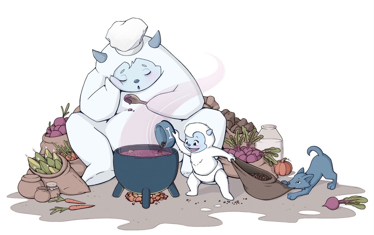
Ok! Made some adjustment to the kid's head and feeling much better about it. Thanks for your feedback, everyone! Looking at it now, I might get rid of that little Alfalfa spike on the back of the head, though.
Any final thoughts?
-
I prefer your yeti with the previous hair “)
Either way it is a super sweet idea!
-
@hayleyannececil Thanks!
 I'll see about playing with it a smidge more, then.