Serious Critique requested for Sept contest.
-
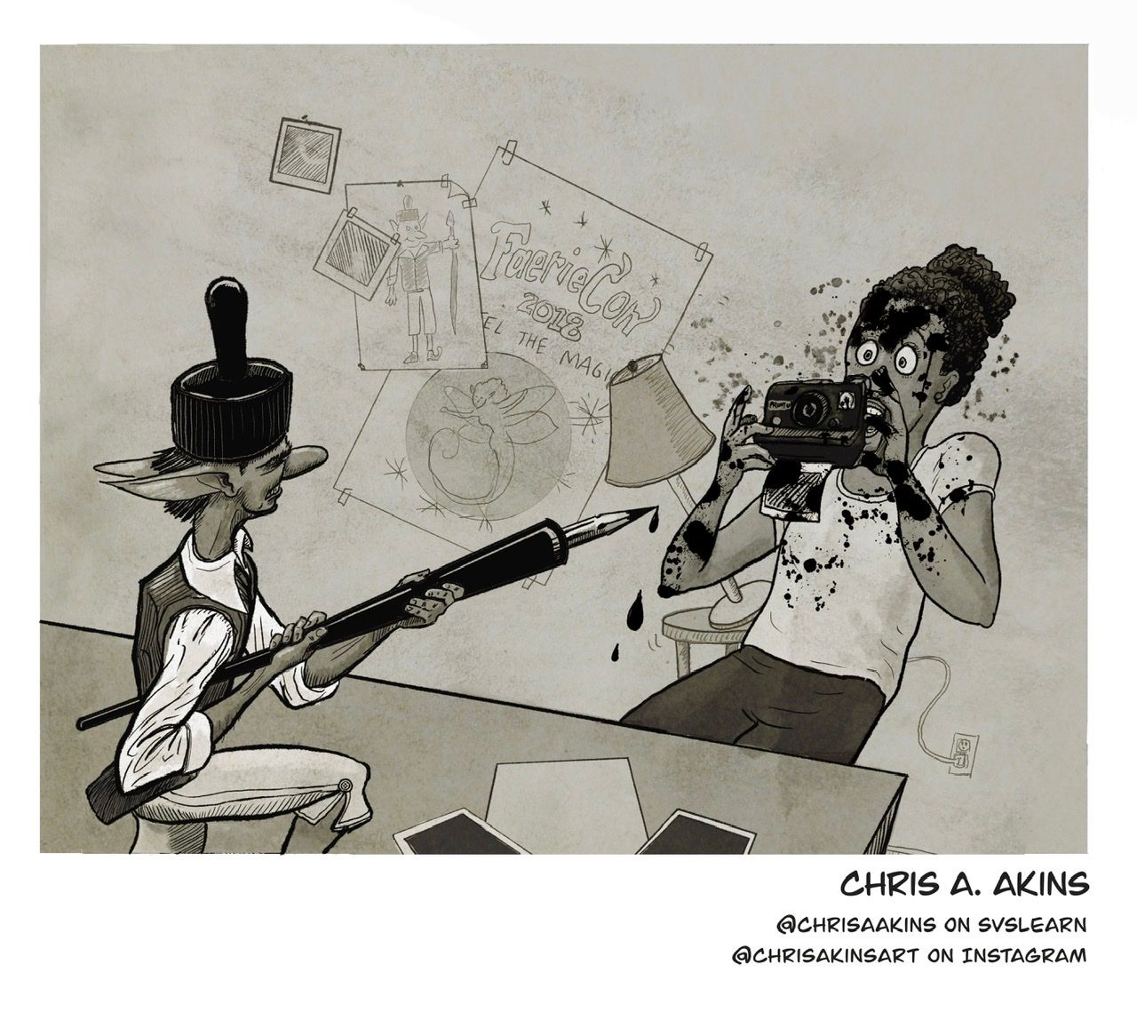
Alright, I’m trying to improve each moth. I took the critiques @Will-Terry and @Lee-White made last month on my dragonfly piece and applied them to this month. I thought I had a much stronger piece but I didn’t even make the list of “we might have picked these but...”
SOOOOOoooo... I am trying to not feel sorry for myself and quit entering (Take my toys and go home, haha!) and get some constructive criticism. I really do want to be excellent at this and I probably shouldn’t make getting picked for the critique arena a benchmark but...
I probably have a blind spot or two (or ten?)
Can you channel your inner wills and jakes and lees and give me a critique?
Also, some affirmation for what is going right would be nice, too.
")
-
I’m not sure Chris, I’m in the same boat. I was pretty disappointed mine didn’t make the cut this time either so I’m gonna bring it for October lol. If I was being nit picky I would guess a more dynamic perspective? Closer up on the fairy and Ellie further away? I think your ink fairy design was really creative though and it reads very clear. Plus it was funny. It could have made top 16 in my opinion so don’t get discouraged. Sometimes I do feel like if it doesn’t have a more traditional children’s book vibe it gets dismissed more easily.
K.Flagg
-
@K-Flagg your piece was good, too. Maybe it was just a matter of taste.
-
@chrisaakins yeah there were like five (yours included) that would have been in my top 16 that didn’t make it so I’m sure it was just a matter of taste. It would be nice to know if there was a reason, but I really liked the ideas they were kicking around about the invitation versions Of the contest so more people that don’t get critiques to have a shot.
-
@chrisaakins There were definitely some headscratchers in the judging decisions this time around, and I think that comes from the fact that the criteria changed between the posting of the prompt and what they were considering when it came time to pick the top 16.
-
"Needs to be black and white" absolutely leaves interpretation that entries without value added would be considered, which they ended up not being. This lead them to pick some pieces that had clear drawing construction and execution issues because they liked their value ranges.
-
"Needs to be ink or looks like it was made with ink" wasn't stuck to either, as some of the top 16 looked more like charcoal or monochrome paintings.
But enough about my rant - and I really, really liked the winners anyway - so here are a couple points that may have hurt you when it came to making the top 16:
-
They may have felt that your fairy may be reading more "elf" than "fairy." The inclusion of wings may have made that more clear.
-
Your Ellie is older than those depicted in the top 16, so it may have just come down to a matter of taste that the judges expected "Ellie to be depicted as a child.
-
The finger/mouth overlap is a tricky area to draw. It may have worked better to have the hand fully cover the mouth.
-
And the last thing is REALLY nit picky, but I don't feel that the pen would already be dripping before the lamp has fully fallen over, and there should probably be some splatter on the lamp shade.
All that being said, I really like your piece, it looks like ink/inkwash, and I chuckled the first time I saw it posted.
-
-
@chrisaakins I think this is one of your strongest pieces Chris, and the idea is really lovely and well communicated! There are so many pieces entered in the contest, that a lot of great ones do not make the cut

Some of the things that work a little bit less here in my opinion are the perspective that's a bit wonky. Perspective is not just about vanishing points, here I think it's hard to make out how the space works because there are scale, depth and placement issues. The fairy looks like it's supposed to be small considering the size of the pen, but if he's standing on the table then he's actually much bigger. Look at him in comparison to the papers on the table. Or is he flying? If he is, the way the piece is cropped out is not communicating that. The composition seems a little busy, with so many opposing diagonal lines everywhere. The posters could have been a good opportunity to emphasize the perspective of the room, but by making them all very rotated you are creating more directional lines. The lamp in the background interferes with the girl's silhouette and creates tangents - this lamp could be put elsewhere.
The girl character is great and expressive, and I think it's too bad that her hand and camera hide half her face and her mouth. Lastly I feel that the room is kind of bland and non descript. What room is this? An office? Who's? In a background design class, I was told that you should be able to tell who uses a room and what they're like just from the environment. I'm not really getting any information from this room, so I feel like you just called it in by drawing an empty desk and lamp. While that can be considered good enough, it doesn't add the extra charm, the extra personality and pezazz that it could. When artists take a moment to think about every line, dot and pixel of their illustration, I think that's when it goes the extra mile and really shines
")
I hope this wasn't too harsh! Because all this being said, I think you've improved so much and it's so clear that you're working hard and putting a lot of love into what you do. This is a great piece!
vanessastoilova.com
instagram.com/vanessa.stoilova/Check out my Youtube channel for tips on how to start your career in illustration! www.youtube.com/c/ArtBusinesswithNess
-
Chris, this one boggled me for sure. I saw some (of what I thought was) better work than some of the ones they picked.
I think some of the character designs they chose were not as strong as some of the ones left behind. In terms of rendering, perspective and anatomy, some of the selected ones were way off. It just goes to show you that lots of it is a matter of opinion, not skill.
For sure, many of the ones chosen deserved to be there. The 2 winners certainly deserved it. I’d love to know why they dismissed some of the others that weren’t listed in the very beginning for lack of value contrast. I see why they didn’t pick those although I liked the low contrast quality of some of them. I appreciated that little segment too, pointing out why those were not going to make it. It helps to see a single problem spread across a wide group. I always appreciate watching the critiques because I want to keep learning as you do.Here’s my honest critique of yours.
I’d love to hear the same from you about mine.Pros:
Angles are present indicating action.
Lots of contrast and value range (dark, mid, light).
I like your concept because it shows action, however it may be that they thought it was too “middle of the act” which seems to be a repeated theme of their critiques.
You downplayed the background which gives the action more prominence, drawing attention to the main idea.
It looks “inky” as if you used traditional materials, not overly rendered. (Kudos)Possible Improvements:
Last time you got picked but you didn’t have people characters in it.
-Ellie looks a little outdated in terms of what’s trending on Pinterest in terms of character design. (I need a ton of help in this area. I have no idea what I’m doing. Lol. My background is in oil painting and realism. I draw and paint what I see, not from imagination.) It’s hard to design a character, period.
*There is a class on character design at SVS and I binge watched it. I’m gonna slow down and go back through it. Her thought processes were interesting and I’ve never considered designing things that way.
-Fairy- same issue. He’s a little hard around the edges (face area) although I like his clothing design a lot.
-Maybe there is too much negative space up top?
-Maybe don’t crop at the knee.
-Maybe change proportions to where the fairy is not the same size as Ellie. From this view he looks the same size which may make the table look a little out of place.I hope this is helpful. It’s really the only reason I want to make it to critique arena, for some honest, helpful feedback. Winning is nice but to me winning is a good critique no matter how much it hurts.
All the best.
-
@chrisaakins I thought your piece was funny and I really liked the concept of your fairy. Here a couple of suggestions, I am not sure if they are reasons why they didn't pick your piece or not. Overall your piece feels mostly mid-tones with a few dark tones. I didn't really see the whites very well until I looked really close. Maybe make the background white or add more white somewhere. I also feel like the fairy is cut off at an odd point on their body. I want to see more of it or its whole body. Maybe you could move the whole bottom edge of the composition to show the rest of the fairy's body. I thought your piece was really nice, and what I am saying are just suggestions. It always seems like they pick ones that I would pick, and others I wouldn't pick. It was nice when they critiqued all the pieces a few months back so you could know what could be improved upon or why it wasn't picked.
-
Chris, I’m with you. I’m really deflated right now. I too was believing my piece was stronger. I have strong feelings for their process. Well I realize I’m just venting so I’ll get back on topic.
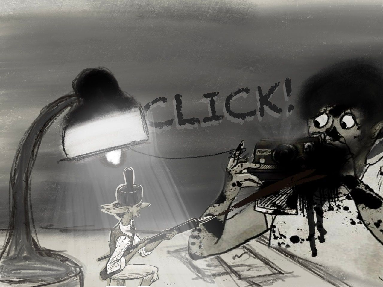
I’m thinking the angle of the ink pen stands out to me, however i don’t know if that is even an issue. He sprayed the ink and it is off it’s path.
I like yours a lot. We may have to just hope they are feeling ours that day. Keep your head up. Your work is great and it is a pleasure going through these trenches with you!
Much love
-
Hi @chrisaakins, I think you have a strong piece and feel the drawing elements are very good.
Personally, I feel like the lamp and table are unnecessary and don’t quite fit in the perspective. For example, the bottom right shows the wall touching the floor, but the lamp looks farther back which is off.
Also, I feel the fairy and pen are too big. Lee likes to preach big, little, small, so I would scale down the ferry and move Ellie slightly.
I ho’pe you don’t mind, but I did a draw over pretending I know what I’m doing (I really don’t), but if it helps a little, I’m happy.
-
@NessIllustration Thanks for saying this "In a background design class, I was told that you should be able to tell who uses a room and what they're like just from the environment." I don't know that I had ever really thought too much about that. It makes complete sense, now I will have to make sure that I do it.
Instagram: https://www.instagram.com/kiminyrose/
-
@Kim-Rosenlof It blew my mind too when I heard it haha! Thank you Nicolas Demers, my background design teacher
There are so many possibilities. If it's a living room, then are there toys around because the person has a child? A cat tree? Old lady furniture and carpets? Messy with books everywhere? Super modern and clean freak? Is it pink all over? Are there African masks or decorative landscape paintings? You can tell so much from an environment about the people who live there. It can help as an exercise to draw some backgrounds without any characters in them - it's great practice because it forces you to stop using them as a crutch and let the environment do all the talking. -
@chrisaakins
Hi Chris!I really liked your take on the prompt. I think your character design is really good (I love his hat and his style), but I agree with @ajillustrates that he could have used some wings to push him closer to faerie instead of elf--that might have been a big deciding point for them.
For a critique, I'm noticing a couple of things with the composition. The top 1/5th of the image could probably be cropped off since it's virtually unused and doesn't add anything to the image. Also, both characters are the same size in the image (which I believe Will talks about in some of his videos). Since the characters would be dramatically different sizes in actuality, it's might be more interesting to take advantage of that in your composition.
Other than that, I think your values and lines are really good. I look forward to seeing what you submit for next month!
-
@chrisaakins My support systems keeps reminding me it is just their preference. It's frustrating. I always enjoy your pieces and and I thought it was dope. I know we are just trying to close the gap, but its difficult without that guidance. Maybe ultimately I'm thinking it's time to find a mentor. Probably would allow me to take these live critiques punches better. Like I said before, keep your head up and keep putting in that work.
Much love and God bless!
-
Hi @dafoota, love your piece by the way, and best of all, you have a portfolio piece!
Mine was next to yours on the critique (left) side. For my piece, I agree I didn’t have enough value contrast to make it interesting. Hundreds of submissions were entered, but you made the semifinals! That’s HUGE! Don’t get discouraged or disappointed, keep going!
-
@chrisaakins Yeah basically echoing what has been said, I do really think it was a great piece. I would be pretty confident it would do very well when the voting starts it would do rather well in the mix. In terms of community votes, yours was very well upvoted, so to me that's probably one of the better barometers.
I think my only real critique for improvement would be the surrounding area. I almost feel like maybe it would have been stronger with just a white background. Spatially, I think I'd be looking for some other objects around where that lamp and table might be. I don't know why those two things would be in the middle of an empty wall. She's knocking the lamp over, but the plug is behind her, so that table and lamp seems like it's kind of the middle of the floor. I'd either add more to the background to make it feel like a real room or take that stuff out completely and focus on the character (which your faerie is one of the more interesting designs which didn't follow the standard conventions imo).
@ajillustrates I agree with your comments there. It's a bit difficult sometimes to determine because it seems like the criteria sometimes is so broad it leaves way too much room to figure out what the "right" focus is or it's more narrow but despite following the prompt, pieces get pushed through or held back. And after pieces are sorted through and selected, it's not even the people that picked them that do any of the voting. I'm not saying this is a bad way to go; it's just something to bear in mind with this particular prompt/contest.
Something to maybe think about is to have more than one type of prompt (they talked a little about doing a champions battle yesterday), or maybe an ongoing rotating prompt type, for example you could do something like:
- November is a community driven prompt that operates much like they do now where the community is the only party voting. The top entries would be easy to select - it would just be the top 16 or 20 or 24 entries based on number of upvotes on pieces. Lee/Will/Jake/ could still give feedback as they normally do.
- December would be a judge driven prompt where pieces are selected by the judges, voted on and winners are exclusively selected by Jake/Will/Lee.
- January would be a runner's up contest. We'd still have a monthly prompt and everyone is invited to make pieces for it, but the arena would be exclusively a battle between the runners up.
- February could be a champion's arena where the winners battle it out in a similar way.
-
@chrisaakins i think this piece has good foundations. The composition is good, the postures and expressions are alright, the values are working, etc. What I think this piece falls short on is the concept. I’ve seen the concept in many if not most of the other entries. I don’t see anything new. If I were the judge aside from evaluating your use of the fundamentals, I’d also look at your concept, your story. If it’s bland, that’s a point off for me.
-
@Jeremy-Ross Thank you. I really think the mentor part should be my focus. Thank you again for the reminder.