Critique request for book spreads.
-
@StudioLooong thank you so much for the input. I always find the color green very challenging. I will tweak a bit for the green color, and the flowers.
The expression of the boy is not quite right, now that you pointed it out. I will fiddle a bit more on that. -
Lovely work! I love the movement of the grass and flowers, it definitely makes me think of a spring morning.
I think, with the girl having such a warm coloured outfit, I might add a few pink flowers as well to balance the image out. I'm not sold on the boy's purple jumper, not sure why but to me it doesn't quite fit (maybe cause there are no other purples?) I would play around with the colour of his jumper. -
Made some adjustments based on @StudioLooong and @eriberart 's inputs. Thank you.
-
@xin-li this picture did cheer me up. Lovely
-
@peteolczyk thank you. I finally got 2 spreads done, and 12 to go :-).
-
I have no clue how much I can share from the book-in-progress. But I really want to get some feedback from fellow artists here before I send in as final art.
Here is another almost finished spread. The song is very energetic, and a bit absurd. It goes something like this "Jump, says the goose. Danse, says the fox. So we jump and we dance, and we sit down".Any thoughts?
-
@xin-li could you delete the post once you have the feedback you need? Just to cover yourself.
It looks really good to me. The only thing I can spot is there seems to be a line either side that cuts off some of the clouds. But I don’t know if there’s a reason for this. Is it due to a fold when it was scanned? -
@peteolczyk thank you so much for letting me know about the line cutting off the cloud. It was a mistake. I rotated the cloud to give the image a bit more dynatic, and I forgot to fix the edge, hehehe. I have been staring this image for too long I guess.
Removing the post sound like a good solution. I will do as you suggested after I get enough feedback. I will of course share some images once the book is out
")
-
@xin-li Love the music notes on the boy's sweater. Nice touch.
-
@Laurel-Aylesworth thank you. I thought it helps to have the boy's cloth with a distinct pattern, as he is the character that appears in every page, and also on the cover. This was the editor's wish - have a character that the little readers can follow throughout the book, even though there is no story plot (it is a collection of classical songs and rhythms)
I actually tried to make him look more gender-neutral. But it seems that everyone thinks he is a boy anyway. I guess maybe it is the hairstyle.
-
I am finalizing the Twinkle Twinkle, little star spread.
I have not finished the character and the bed, only put in the flat color to show the value.I am wondering: Does the landscape work? or is it too busy for this scene?
Currently, I completed 8 spreads, still 6 to go. Based on how much time used for the 8 spreads, I have just enough time to reach the deadline. It is a bit scary. I just hope no one gets flu before the book due day. I have lost so many days during December because of that.
-
I am a bit blind towards this spread. I think I call it done for now, and maybe revisit it a couple of days from now. Any thoughts? (keywords: "magical" and "hopeful")
-
@xin-li I think it's wonderful and conveys your keywords!
-
@xin-li stunning piece! I think you nailed both the keywords.
-
@xin-li definitely magical and very beautiful. It is a joy to look at. Well done and good luck with the deadline on the rest!
-
@xin-li Xin, this is a beautiful spread! I think you have a really nice balance in contrast and your color palette is really intelligently designed. This is the sort of piece you can get lost in, really great work.
-
Thank yo guys. I will just keep painting :smiling_face_with_open_mouth:
-
Hi @xin-li! I took your piece into Photoshop to look at it in black and white, and if it were mine I'd take down the value of the snow just a little so that the focus is more on the sky. I know it's counterintuitive because snow is so brilliant, but it keeps the overall composition (clouds vs. scene) cleaner. The trees in front are almost as light as the surrounding clouds. Or anyway, you could try a quick value adjustment mask and see what you think. (Now I've remembered that it's traditional watercolor! But you could still do it afterwards in Photoshop, right?) I like the house and the deer! And I have always like the constellations.
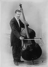
And I love the little mouse playing the bass in the previous spread! Don't know whether you feel like changing it now because truthfully not many people would even notice, but the violin mom in me notes that he's playing a little high up on the fingerboard. The bow should be closer to the bridge (to produce sound) and his hand should be near the far end of the bow (see below). Of course, it's just to give you an idea. Your mouse is much more festive than the photo below and fits the spirit of the book much better!
Overall, great work that fits the spirit of the subject matter well, and it's so lovely to see you doing a whole published book! Yay!!!
-
@LauraA thank you so much.
I only painted underpainting with watercolor for this piece, to get some nice texture for the piece. Most part of the painting is done in Photoshop, so adjustment on value should not be a problem. I do agree that I need to keep the focus on the constellations, especially for the theme of this poem.I did not know how one plays bass at all. So thank you for pointed out the unrealistic posture :-). Yes. No one has noticed it so far(the mouse playing bass is also on the cover, which has been passed for everyone involved to see). I will see what I can do if I still get a bit of time when I am done with all 14 spreads. I reserved the last couple of days to go through all images one more time.
-
lovely pieces! Just one small thing, constellations don't have to be all in same orientation, they can have all different orientation like upside down or 45 degree northeast, etc.