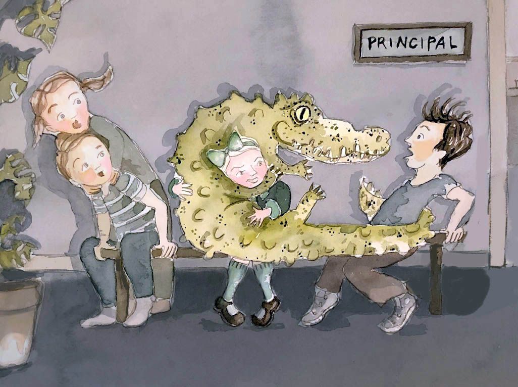
SEPTEMBER CONTEST: Everyone was shocked to see her show up to school with...
-
@Coley That reflection looks really awesome! Great Work!
-
Put my son to bed and fell asleep/forgot to submit, I realize I missed it but wanted to share here anyway-great entries everyone


-
@chrisaakins thank you

-
@zacharygephardt thanks

-
@zacharygephardt Your drawing recalled a flashback from elementary school. We were instructed to bring leaves to class and I actually brought branches!
-
@SFischer I'm not sure about what it takes to make it portfolio ready but I do which there were areas of more clarity -without the light difference the touch of your brush is all the same. so more definition in areas would help in my opinion.
 I like it.
 -
@SFischer Love the concept, perspective, and color palette! I do agree with Heather though, I think choosing to tighten up some edges of characters either in the foreground or background would help.
Personally, I think tightening the background figures/ground/sky to be more crisp and leaving the foreground figures out of focus and blurry like they are now would really pull it all together and direct the eye to the kid on the dino. Right now I'm drawn to those kids silhouetted in the front row first, and the dinosaur read as a tree initially until I looked closer.
-
So... how do we attend the critique and winner reveal live?
-
@Shara-Mills you will get an email the week of with a link to a ZOOM webinar.
-
@Heather-Boyd @Kasey-Snow Thank you for the feedback! I certainly can see the clarity issue now.
@Kasey-Snow I think tightening up will certainly help solve the clarity issue. Thank you for the feedback!
-
@Kerisa Thank you so much Kerisa!
 I love your dino, it's so cutee
-
@danielerossi lol Nice! The concept was actually my wife's idea. Maybe she did the same thing...
-
Just caught the end of the critique live. When will the video be added to the critique arena course?
-
@Shara-Mills Next week:smiling_face_with_open_mouth_smiling_eyes:
-
Congrats to the contest winners! Well deserved.
I am a bit torn about the new format of the critique arena though. While I appreciate having positive elements of each image highlighted, I feel I learn so much more from discussions or draw overs on how images can be improved. just my 2 cents... -
I just started watching the critique video right now. Looks like I missed out a very fun live critique party :-). contrats to the contest winners.