Art Book Cover March Challenge - WIP
-
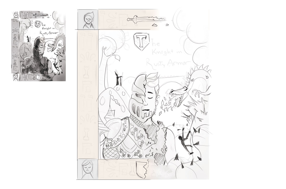
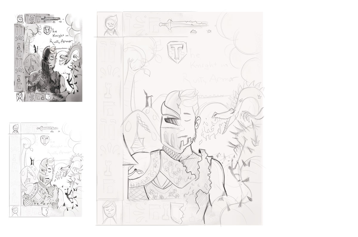
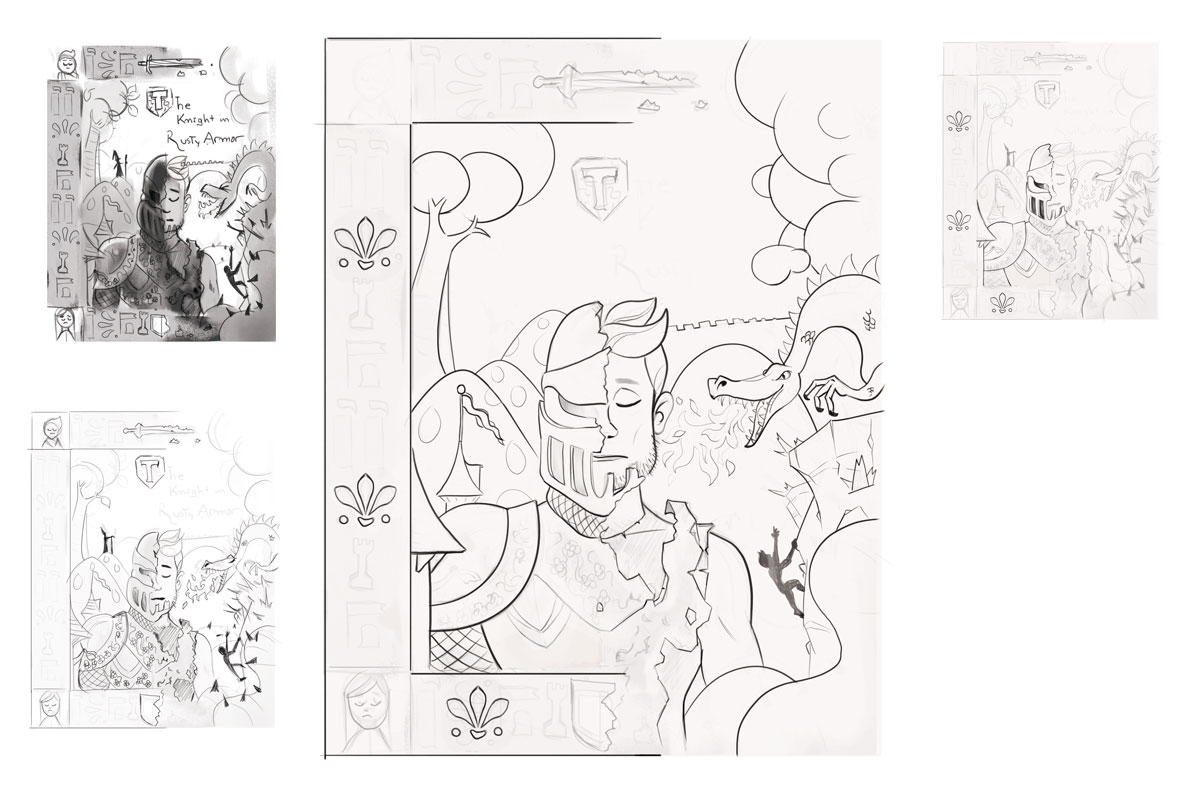
Here is a more concrete sketch,
I decided to add an ornamental border around him, it will help me add more story to the piece.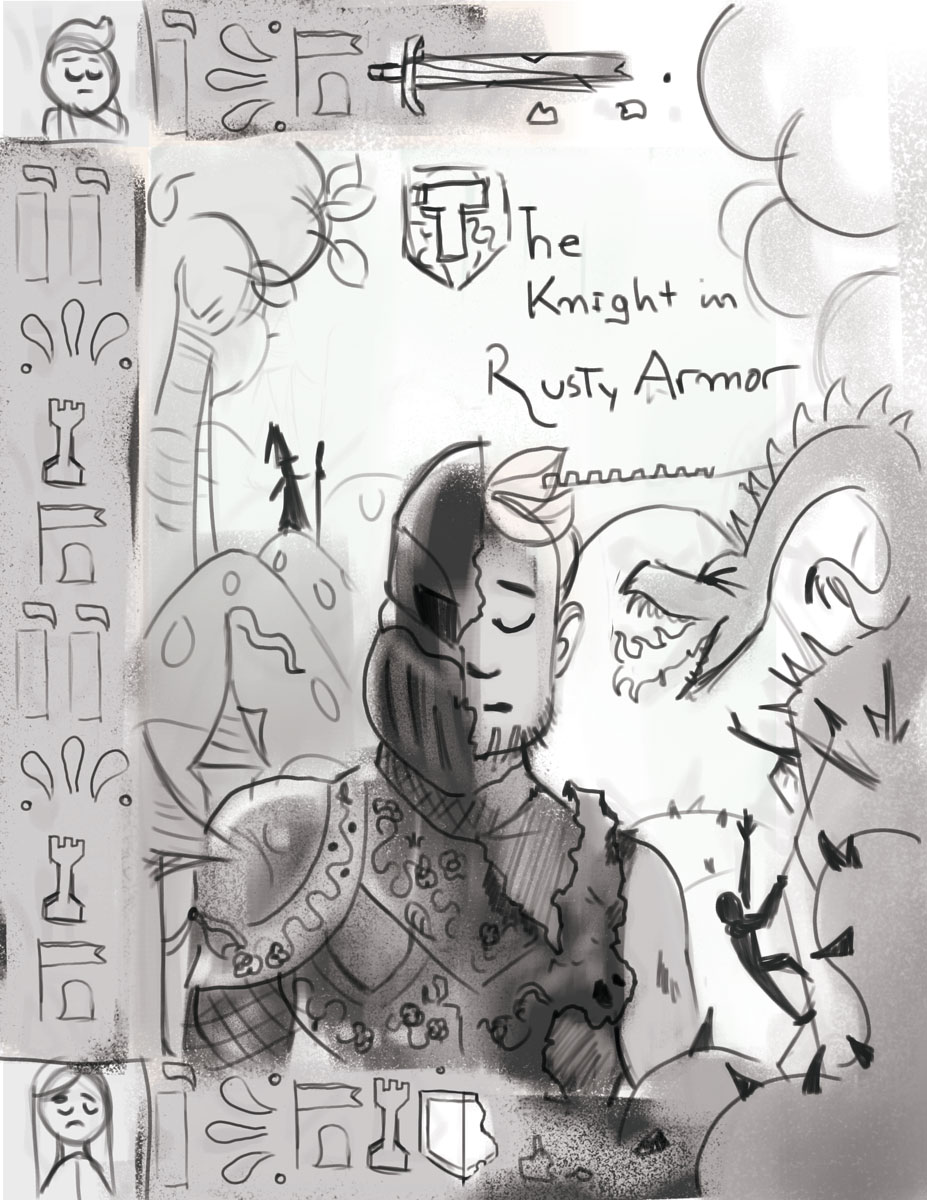
@Braden-Hallett That's a great concept, funny how that works!
-
That was kind of big, sorry. I kept working with it for another 45 min. I'm almost happy haha! maybe 1 or 2 more passes.
-
One more before going to bed!
-
Looks really good, looking forward to see more. I like the border and the half/half idea.
-
Love the idea and your sketch. Think you need more or a better place for the text. Looks like it pushes your other elements to much on each other so they become a cluther (hope i used the right English word and you do understaind me...). Keep on going... love to see the rest of the proces
-
@Bennie Yeah, i was thinking the same thing last night. The title will be the last thing i accommodate, i am not feeling it yet. Thank you
-
Doing my final pass!
Jose A. Galue
www.instagram.com/artofjosegalue/ -
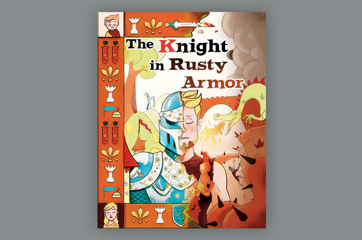
@josegalue25 Not having read the book (yet), I read the synopsis on Amazon. My takeaways are that this knight is trapped in his armor, so the armor is rather important, and he's also on a journey of self-discovery, so the character is somewhat introspective. I think your sketches are interesting in that there's lots of clues as to what happens in the book. I also like the half armor covering his face, and his closed eye. My initial thought, though, is that the title and the author and perhaps also illustrator text needs to be given more space. My second thought is that I want to see more of the armor, since it's it's a significant element.
One idea that came to mind is the enlarge and bring the knight up to fill the cover more, and keep it dark like you have it your value thumbnail, so you have a strong read of the armor from a distance (your first read of the cover). Then adding the text within the armor itself, the chest/stomach area.
Then the other story details could then be placed around the armor, lighter, delicate (your second read of the cover once you pick it up from the shelf).
Loving the spine details, and the figures on the top and bottom of the spine!
-
I have not read the book so i can only comment on the art. I really like the idea of the decorative border. It reminds me of the old illuminated books.
There does not seem like a lot of room for the title, though. Maybe, you could bring the tree on the left down to give the title some more space.
The value study is working for me.

-
@josegalue25 - I'm loving the thumbnail and the border is gorgeous!
The only piece that sticks out to me is the helmet on the knight (sorry I have not read the story). It seems like it should be slightly larger on the left. Right now it looks like it would be approximately the same size as the other half of his head but I think it would need to be the other half of his head + the material of the armor, if that makes sense.
I'm loving this idea and can't wait to see how it comes together!!
-
Hi Everybody,
Below is what I have so far! I think I'm gonna start coloring now, maybe the color palette first. I read your feedback and I appreciate it a lot, thank you. Therefore, I think it was time to address the title.The title is a graphic design issue. I noticed the little space on the top but if my font is bold and strong I can cover a lot of room. I don't want the title to be that big and fight for relevance with the knight. It is mainly an illustration cover. The title can hover above the trees on the right and the clouds on the left.
@Johanna-Kim Thank you for the critique, I tried to fix some of the problems. One of the things I did and will do with the armor is to add some flowers and it is gonna be shining and beautiful. Hopefully, the amount of detail will give it the "significant element" you mentioned and I agree with you.
@burvantill "old illuminated book" is what I was looking for
 . I made the title to hover over the trees, I think this works what do you think?
@djly you are right! I flipped the image and noticed the helmet issue. Thanks.
-
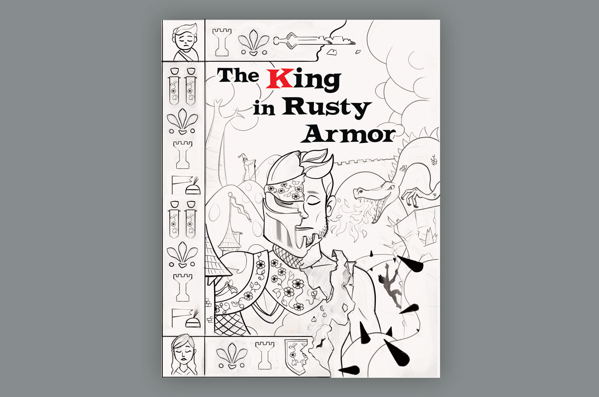
The Knight in Rusty Armor... I wrote The King in Rusty Armor on my previous post.
Brain fart!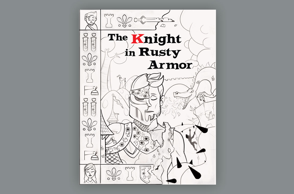
-
I'm gonna take a break! I need to sleep on these palettes. Yellow maybe?
I think the piece is about 4-5 hours away, thank you all for keeping up!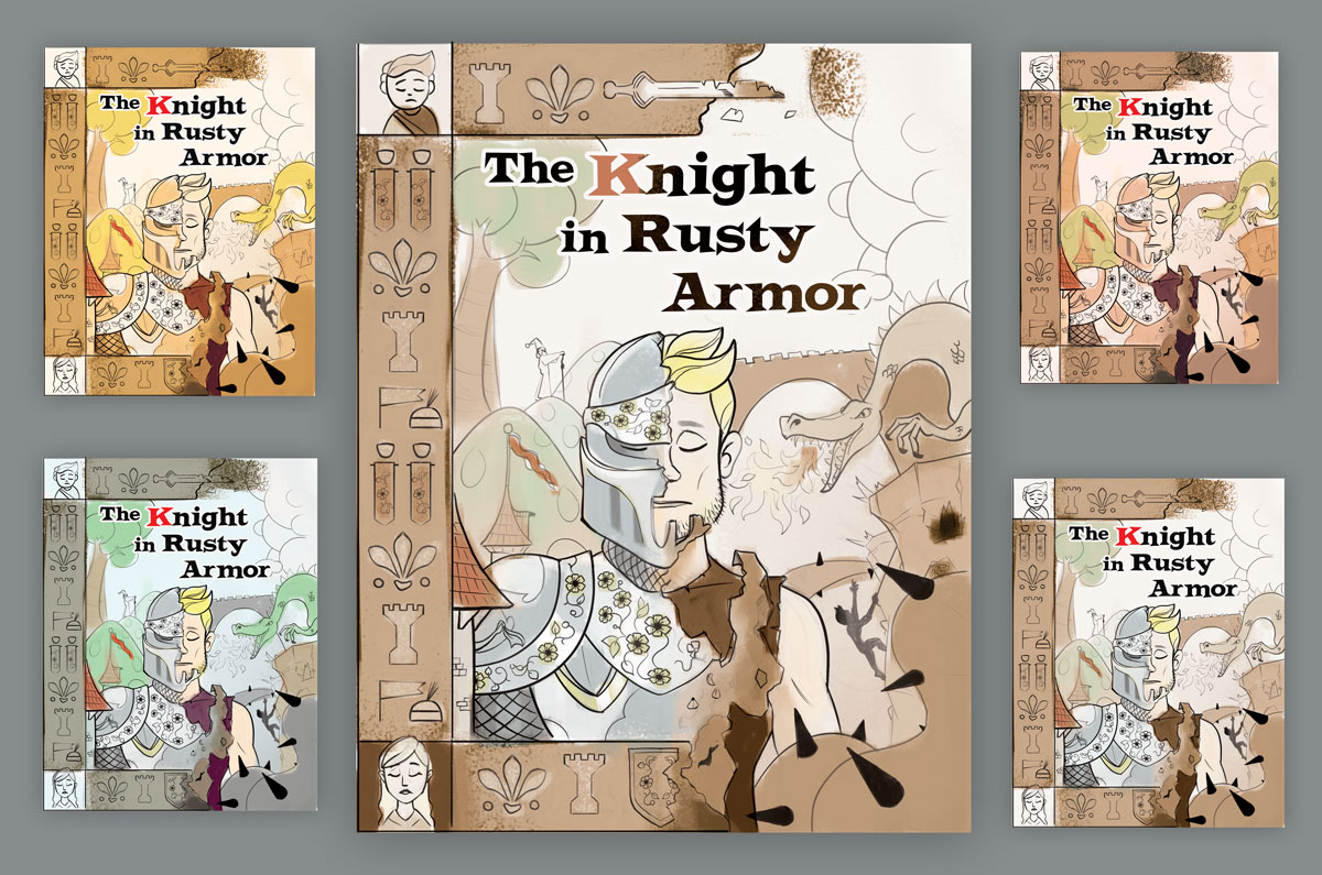
Jose A. Galue
www.instagram.com/artofjosegalue/ -
@josegalue25 I like the yellow and also the one in the upper right.
-
@josegalue25 I don't know the story, so I'm just going on what I can see. I reckon if you're going for this yin/yang splitting of the cover style, the title looks like it's been plonked on top. The rest of the cover has a harmony to it. I'd like to see the title more involved in what's going on around it. Invite it in to become a part of the rest of the cover.
-
I like the yellow one also the most and as other have said, I would try to change the font style. You have really great concept.
-
top left or top right.
-
Top right would be my choise... title is better this way... now the rest of your illustration isn’t pushed in by the text anymore...
-
Hi everybody, I've read that some of you haven't read the book.
I read the book many years ago, but I found this summary that is pretty good.Great story about family, self-help and hard challenges. Highly recommended!
Below my take so far on this cover. I'm almost done but I'm gonna take a break.
Jose A. Galue
www.instagram.com/artofjosegalue/ -
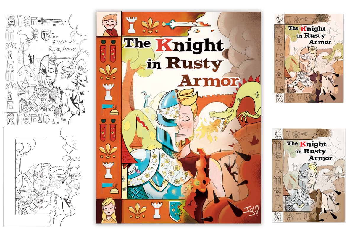
For those of you who like to skip until the end, here is part of the whole process and final piece.