Dragonfly WIP | Another book cover! | Requesting Feedback
-
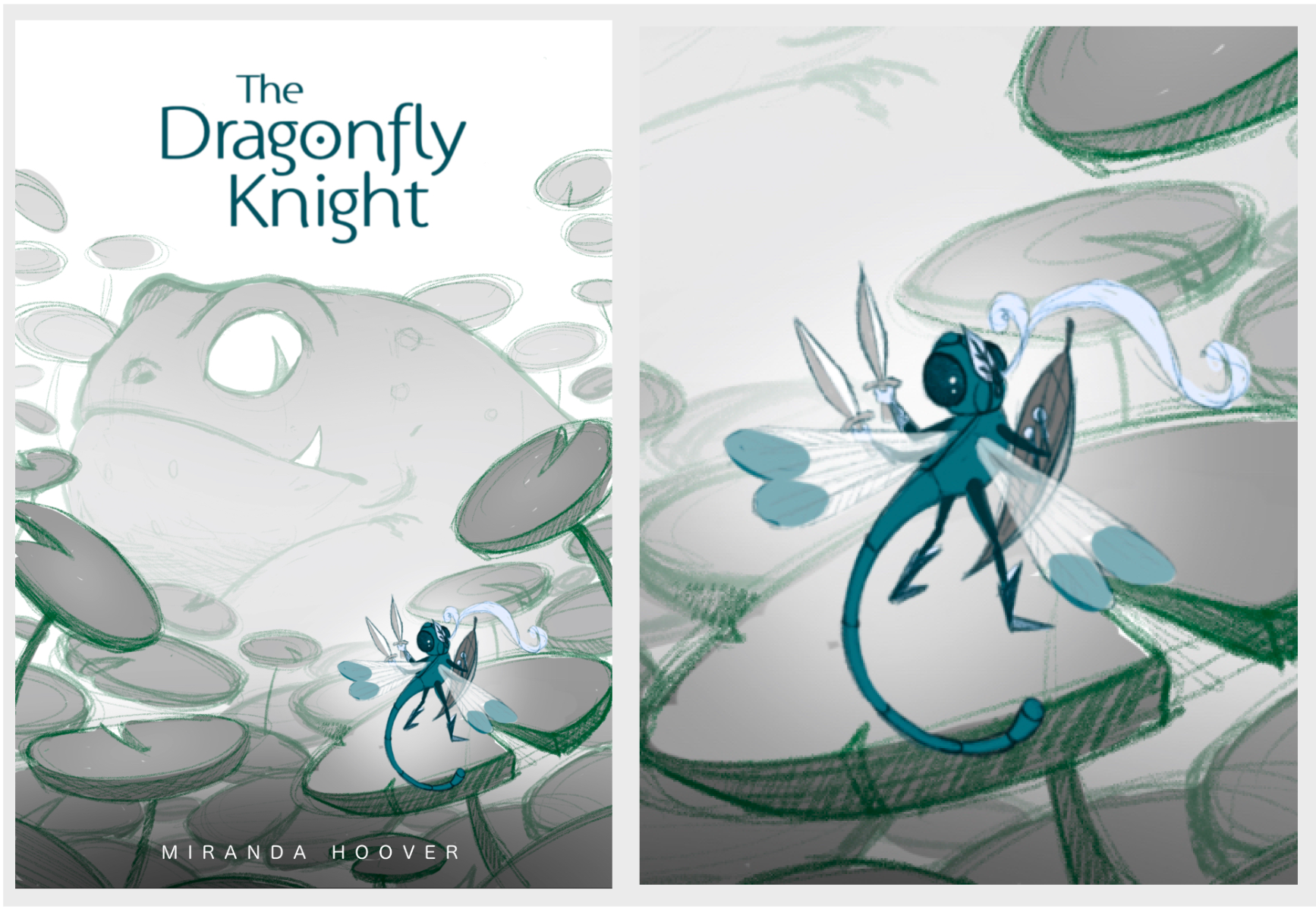
Hi everyone! I want to try another book cover this month.
What I have is mostly just a sketch of the composition and characters; it's not representative of colors or values just yet. My biggest concern is if the dragonfly is reading ok (and all of his gear, limbs, and wings--so much stuff on one little bug
 ). I've been staring at it too long now and would love some fresh eyes (can you even tell what's on his head?). I would also really appreciate feedback on anything else (e.g. composition, frog design, typography) or how I could try pushing this further.
 -
I love it! The frog is so cool. The only thing I'm kind of questioning is the stance for the dragonfly's legs. They look a little neutral and I'd see what it would look like if you bent one of the knees more and angled the front foot toward the frog more. Just a thought.
I'm very excited about this one!
Website: www.tessawrathall.com
Instagram: www.instagram.com/tessawrathall_art/
-
Hi @miranda-hoover
 This composition is really interesting and nicely balanced. I’m excited to see your colour choices!
I can’t actually see what is on the dragonfly’s head...there is a feather so presumably a little helmet? It’s not instantly clear which direction he is looking because of the positioning of his eyes...at first I thought he was looking away from the frog. I also can’t really tell what he is doing/thinking from his stance. Is he just wary of the frog or is he being aggressive towards him? I’m not sure about the double sword idea, especially both of them on the left side..especially if he also has a shield. I’d like to see the sword/s and his wings be a bit longer.The frog design is nice. I like it’s weight and the addition of the fang, it makes him more threatening, although the expression seems to show him as being simply nonplussed at the appearance of the dragonfly knight.
I like the font of the title as it’s modern meets medieval in style, but it’s looking a bit basic and lost up there, which may just be because it’s floating in white space right now. I’d keep working with it.
-
Miranda, I love the cover so far. I especially love the way who've designed the dragonfly (two swords and the way he holds the shield). I understand your concern with the plume(?) and leaf on his (her) head. Perhaps simplifying the design to only be a leaf, maybe making it a bit bigger in proportion to the head? Other than that, I have no critique atm. I love where you're going with this and can't wait to see the final. I hope that helps.
-
@miranda-hoover Oo! I love the concept! I think the frog is really well drawn.
I don't understand the significance of the leaf/feather thing on his head. If it's supposed to be part of his armor, I would consider skipping it since the sword and shield are enough to prove he's a warrior and personally because I don't understand it, my attention is going to it.
I'm also not 100% sold on the dragonfly gesture. Since the body is facing away from the frog, it doesn't feel like a courageous confrontation. To me, it reads like he's trying to escape while being on guard. Though I love the S curve the body is making, his personality isn't as appealing, especially for a book cover. Maybe try a few more gestures with a stronger more courageous body posture?
Overall, I love the concept and design! Love to see this develop! Good luck!

-
@TessaW Thank you! I'll definitely try exaggerating his stance. Thanks for the feedback!
@Lovsey The direction he appears to be facing was one of my concerns, so thanks for pointing that out. I'll play with his head, swords, and wings a bit more--anatomy-wise, I suppose his wings are a bit short for his body
 . I'm still unsure what expression I want from the frog, so that's probably why he looks a bit unsure as well, haha. I think you're right about the title--I'll try to push that a bit more too. Thank you! That was all very helpful feedback!
@Jeremiah-Gorrell Thank you! The plume and leaf were holdovers from a previous design, which may be why it doesn't work quite right. Thank you for the suggestion! I'll see if making it larger helps the readability.
@Neha-Rawat Thank you! The leaf/feather evolved from a helmet/plume design I had previously--so it looks like I need to work at it a bit (but since you think he looks enough like a warrior/knight without it, then I might go ahead and remove it as you suggested). I think I was imagining the dragonfly being a bit wary/timid/startled--but you make a good point about a more courageous pose being more appealing on a book cover. Thank you for the feedback! That was very helpful!
-
Since everybody already gave great feedback, I would just like to add, I would swap the frogs tooth with a tongue - maybe give the tongue some movement like it is reaching for the dragonfly knight. Also maybe give the frog some warts and bumps on the back to make it more grotesque ? a bit more toad like. And maybe some dark bags under the eyes. Right now it reads a bit to clean for me.
Loving the idea by the way!!!!
-
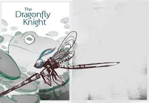
@miranda-hoover this is a really cool idea! For feedback I was thinking it would be helpful to increase the scale of the foreground to make it easier to include details and have the dragon fly look like a knight - I did a super quick draw over with a joust ready dragonfly to show what I was thinking - one other tiny thing is that the tail does not read as “dragonfly “ to me with the smooth curve to it - feel free to ignore - I’m sure it will turn out great with whatever you end up doing
")
-
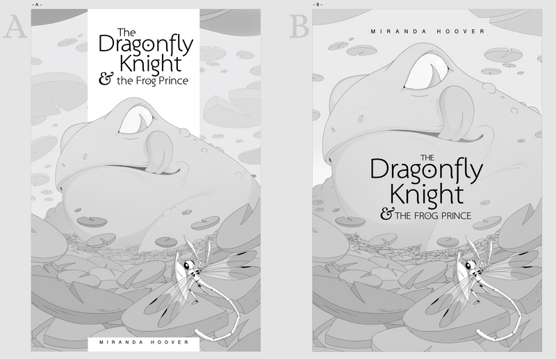
Well... I've given myself a bit of a challenge
... I know I have a focal point issue with our eyes being drawn to the frog first, but I'm hopping (haha, sorry) to solve that by picking a single hue for the lily pads and the toad, then giving the dragonfly a contrasting color to pop. I might also add some atmosphere or make it a night scene (then maybe give the dragonfly a glow effect ) to bump the toad down in the visual hierarchy. Any other tips you might have would be great!These are a couple of book cover directions. I'm leaning heavily towards B (please ignore the lily pads not lining up with his belly and leg for the moment), but I'm hoping to get some other opinions before scrapping my initial direction.
@Aisleen Thanks! Your suggestions were very useful. I liked the teeth at first because it gave the toad more of a dragon feel, but when I tried out the tongue, it helped me figure out where I wanted to go with the toad's design. Thanks for your feedback!
@Kevin-Longueil Thanks for taking the time to do a draw-over! That's a really cool looking dragonfly knight! Unfortunately, it's not the direction I'm going for; for better or worse, I'm determined to make the toad seem giant and still make the composition work (which is giving me a real challenge
). But you inspired me to increase the scale of my foreground lily pads, and you're totally right about the tail so I tried to make the bends look a little more realistic. Thanks again for your feedback! -
I like A because there's no separation of text between the frog and dragonfly and I can really feel the intimidation factor. I personally don't think it's a problem that we notice the frog first. It's a big menacing bad ass, and then I go straight to the dragonfly and sympathize with it's size disadvantage- I think it works well reading it that way!
Website: www.tessawrathall.com
Instagram: www.instagram.com/tessawrathall_art/
-
Either option looks awesome. You always produce such lovely work!
-
This is a great illustration (wherever you put the title)! It is striking how the changes made from the 1st draft improved the composition and the strenght of the illustration. Well done! You can be proud of this one!
-
@miranda-hoover hi! The 2 pieces looks awesome! I prefer A but B is definitely a great choice as well.
-
@miranda-hoover I like B!
The font is nice too. Good choice!
Looking forward to seeing this coloured.Don't worry about the title until the last moments. It looks fine for now.
-
@miranda-hoover I love the concept so much!
I'm leaning towards A being my favorite layout. I feel the lettering on B is kind of distracting for me. My eyes go to the words instead of the image. -
Thanks to everyone for your feedback! You've given me a lot to think about
@TessaW Thank you; you've made me feel better about this
Drawing a menacing toad was apparently so fun, I couldn't help but make him the focal point, haha.@Coley Thank you
 You did a great job with yours as well!
@Julia Awww, thank you! A received some great critiques that gave me the kick-in-the-butt that I need, haha.
@Nyrryl-Cadiz Thank you! Maybe I will go in the directions of A after all
@jsnzart Thanks! The font was a pretty lucky find!
@Jacy13 Thank you! You make a good point; the dragonfly does seem to stand out even less with the giant letters next to it. Thanks for the feedback!