Society of Visual Storytelling

    SVSLearn Forums

    • Register
    • Login
    • Search
    • Recent
    • Tags
    • Popular
    • Users
    • Groups
    • Search

    July contest - any feedback please?

    Artwork
    8
    20
    266
    Loading More Posts
    • Oldest to Newest
    • Newest to Oldest
    • Most Votes
    Reply
    • Reply as topic
    Log in to reply
    This topic has been deleted. Only users with topic management privileges can see it.
    • silvialcg
      silvialcg last edited by

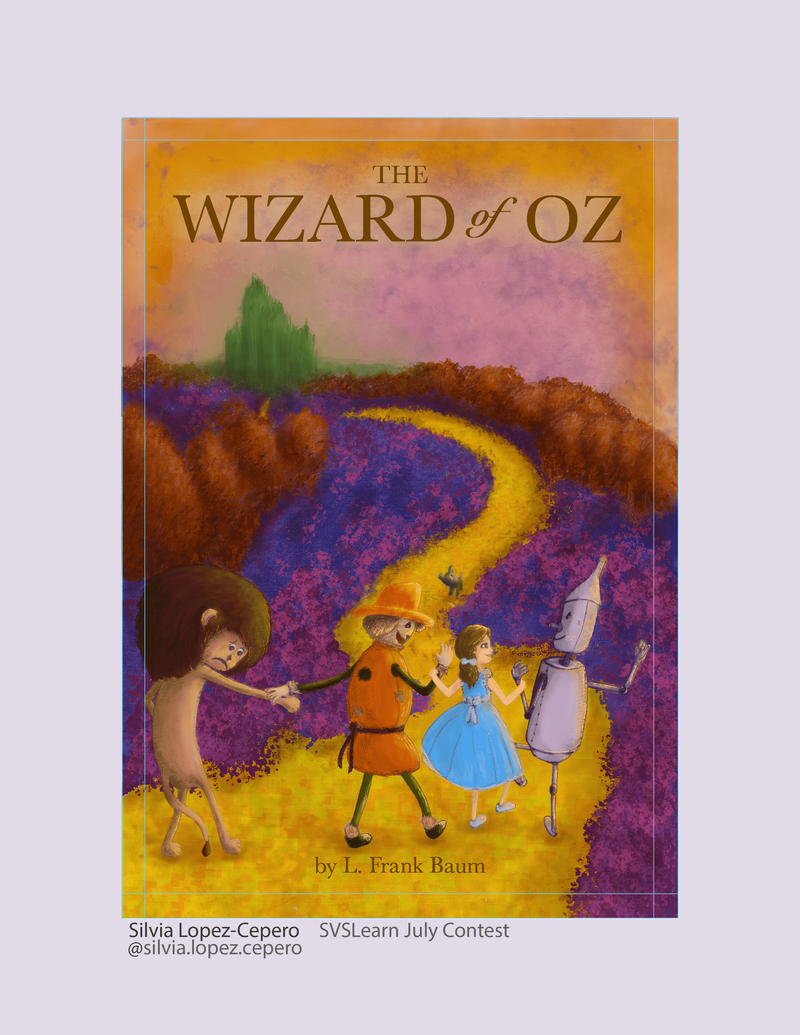
      Hi! First time sharing my work before I submit, so very excited 😃 Quite happy with it I think, but not sure if anything could use more tweaking... anything you’d improve or even change? Thanks for your help!
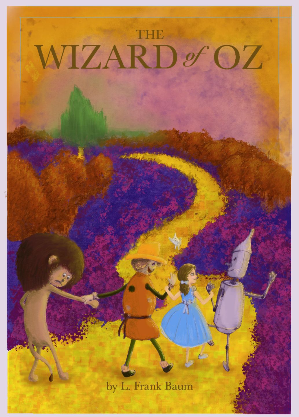
      EFFCA095-D9F3-44E5-8029-11B92CF2FFE5.jpeg

      Silvia Lopez-Cepero
      https://www.instagram.com/silvia.lopez.cepero/

      Jeremy Ross miranda-hoover 2 Replies Last reply Reply Quote 3
      • Jeremy Ross
        Jeremy Ross @silvialcg last edited by Jeremy Ross

        Looks nice @silvialcg! Maybe consider darkening the font?
        I like the textures and overall design!

        https://www.jeremyrayross.com/

        1 Reply Last reply Reply Quote 0
        • K.Flagg
          K.Flagg last edited by

          love the characters...the lion especially! I would maybe turn it Grayscale and see where you need to lighten and darken to make it pop more.

          K.Flagg

          1 Reply Last reply Reply Quote 0
          • miranda-hoover
            miranda-hoover @silvialcg last edited by

            @silvialcg Nice characters and expressions! My critiques would be that • the scarecrow's hat blends in a bit with the road and • Toto's hard to notice at first (which is a shame because he's so cute!). I agree with @K-Flagg to look at a grayscale version to see where you can create more contrast with your values.

            https://www.instagram.com/mirananemone

            1 Reply Last reply Reply Quote 0
            • Laurasketches
              Laurasketches last edited by

              Really fun characters..Maybe consider the saturation of the background. Right now the purple is so intense it is overwhelming the scene. You could likely get more "pop" out of your characters if the saturation of the color was pulled back a bit--I agree with @silvialcg if you adjusted the placement of the hat (maybe scarecrow is taller or more left?) then the silhouette of the hat could read better. Also...at first glance I read the emerald city as a tree.. perhaps some geometric shapes?

              1 Reply Last reply Reply Quote 0
              • silvialcg
                silvialcg last edited by

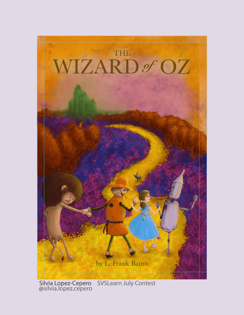
                Thanks, everyone! Great feedback! I’ve made a few changes, hopefully better now. I’ll give the purple saturation advice a try later, and maybe move the scarecrow, but that may be hard! Running out of time 😱

                41973B09-5BA1-4F2F-8A5D-DCAFD4171BAB.jpeg

                Silvia Lopez-Cepero
                https://www.instagram.com/silvia.lopez.cepero/

                1 Reply Last reply Reply Quote 0
                • JoshSchouwstra
                  JoshSchouwstra last edited by

                  Cool textures and character designs!

                  Though I have two critiques on your characters. The first critique is that Toto should be darker if not black, since he is described as black in the book, and he gets lost in the yellow of the road when white.
                  The second is the scarecrow's hat gets lost in the road with it being yellow on yellow. Matching the hat to the body might work, but contrast is needed to define where the hat is.

                  So great job on the overall piece, but there are a few things that I think could be adjusted. All the best in the contest!

                  1 Reply Last reply Reply Quote 1
                  • silvialcg
                    silvialcg last edited by

                    Thanks! Great tips. I didn't remember Toto was black! Oops! I was thinking of changing the hat to a more orange or green too... I think I'll give it a go

                    Silvia Lopez-Cepero
                    https://www.instagram.com/silvia.lopez.cepero/

                    1 Reply Last reply Reply Quote 0
                    • silvialcg
                      silvialcg last edited by silvialcg

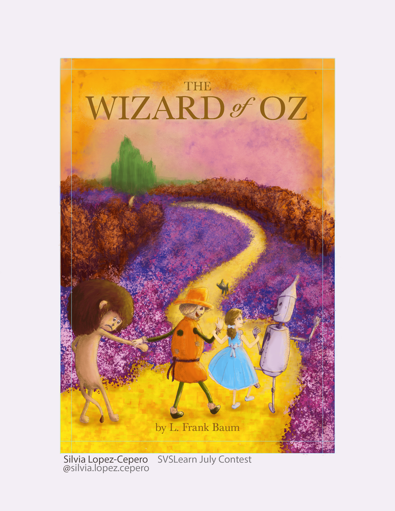
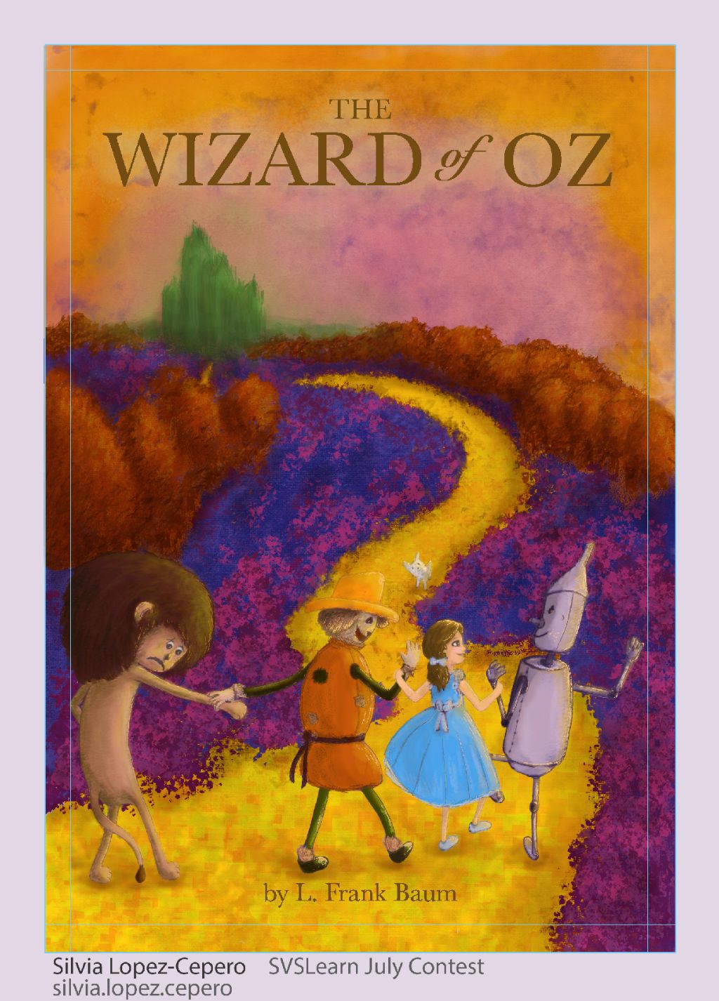
                      Ok, this is it! My last two versions, with black Toto and an orange hat for the scarecrow... one with reduced saturation... now the question is... which one is better? Thank you everyone for your help!

                      AD73DC61-9D9D-4B84-9DF2-7D13AFDDCA50-min.png 616F9F21-2F52-4D7D-AC15-BF6F693834AD-min.png

                      Silvia Lopez-Cepero
                      https://www.instagram.com/silvia.lopez.cepero/

                      Nyrryl  Cadiz 1 Reply Last reply Reply Quote 1
                      • Nyrryl  Cadiz
                        Nyrryl Cadiz SVS OG @silvialcg last edited by

                        @silvialcg hi! With your permission would you let me do a paint over of your work?

                        Portfolio: nyrrylcadiz.com
                        Instagram: https://www.instagram.com/nyrryl_cadiz/

                        silvialcg 1 Reply Last reply Reply Quote 0
                        • silvialcg
                          silvialcg last edited by silvialcg

                          @Nyrryl-Cadiz You mean to show us here? Sure. Curious to see what you’re doing lol

                          Silvia Lopez-Cepero
                          https://www.instagram.com/silvia.lopez.cepero/

                          1 Reply Last reply Reply Quote 1
                          • silvialcg
                            silvialcg @Nyrryl Cadiz last edited by

                            @Nyrryl-Cadiz by the way, is Cadiz your last name? That’s the name of my province 😀

                            Silvia Lopez-Cepero
                            https://www.instagram.com/silvia.lopez.cepero/

                            Nyrryl  Cadiz 1 Reply Last reply Reply Quote 0
                            • Nyrryl  Cadiz
                              Nyrryl Cadiz SVS OG @silvialcg last edited by

                              @silvialcg yeah it’s my surname. 😅 I’m Filipino and we were under Spanish rule for 330 years since the 1500s to the 1900s. They gave us all spanish surnames like Gonzales, Garcia, dela Cruz, and sometimes Cadiz.

                              Portfolio: nyrrylcadiz.com
                              Instagram: https://www.instagram.com/nyrryl_cadiz/

                              silvialcg 1 Reply Last reply Reply Quote 0
                              • silvialcg
                                silvialcg @Nyrryl Cadiz last edited by

                                @Nyrryl-Cadiz Hmmm... in the name of my ancestors: sorry...

                                Silvia Lopez-Cepero
                                https://www.instagram.com/silvia.lopez.cepero/

                                G 1 Reply Last reply Reply Quote 0
                                • G
                                  gavpartridge @silvialcg last edited by

                                  @silvialcg im sure @Nyrryl-Cadiz will demonstrate this, but a good rule of thumb is 'light over dark, dark over light'. So as your background, largely purple, is so dark, in order to stand out, everything in the foreground should be lighter. See how tin man stands out ok, but lions hair blends in.

                                  But in nature, things rarely work this way. The further away things are, the lighter they become, because od atmospheric perspective. So if you just make that purple 'greyer' the foreground elements should read better. Im sure this has been said but i skim read the posts, and im drunk, so i apologise if im repeating other, surely better, advice. Compositionally though, and character design, i think its a really fun piece. I just think the colour theory/values are the things you could improve.

                                  silvialcg 2 Replies Last reply Reply Quote 0
                                  • silvialcg
                                    silvialcg @gavpartridge last edited by

                                    @gavpartridge Thanks for your feedback. Yes, I've been playing with the saturation of the purple flowers and I may bring it down more to emphasise the characters. My problem with that was that I really liked the bright, playful colours of the background. I'm trying to create a world that is closer to a dream than reality. Any other way I could increase the contrast without sacrificing the colours?

                                    Silvia Lopez-Cepero
                                    https://www.instagram.com/silvia.lopez.cepero/

                                    1 Reply Last reply Reply Quote 0
                                    • silvialcg
                                      silvialcg @gavpartridge last edited by

                                      @gavpartridge I'm thinking I could add extra flowers and make these a light colour to contrast with the lion... Not sure what I could change on the path to emphasise the scarecrow and Dorothy...

                                      Silvia Lopez-Cepero
                                      https://www.instagram.com/silvia.lopez.cepero/

                                      G 1 Reply Last reply Reply Quote 0
                                      • G
                                        gavpartridge @silvialcg last edited by

                                        @silvialcg one solution to help dorothy etc, would be to take the path colour, and lighten it a bit and desaturate it slightly, the paint the path around their heads this new lighter colour. Continue to do that as the path recedes into the distance. At the minute its all the same colour, from the foreground, to miles away in the distance, its all the same colour.
                                        Same goes for the purple, and for the brown trees, they need to fade out the further back they go, otherwise it removes all depth from the painting.

                                        The range of values you use should get smaller the further away things get. Save your darkest darks and lightest lights for the foreground characters and elements, you always get a the greatest value range for those things closest to you.

                                        You can paint really dark saturated flowers right up close in the foreground, but they shouldnt really be so dark if they are far away.

                                        silvialcg 1 Reply Last reply Reply Quote 0
                                        • silvialcg
                                          silvialcg @gavpartridge last edited by

                                          @gavpartridge Thank you so much! Very helpful feedback. Let's see how much I can apply before the deadline!

                                          Silvia Lopez-Cepero
                                          https://www.instagram.com/silvia.lopez.cepero/

                                          1 Reply Last reply Reply Quote 0
                                          • silvialcg
                                            silvialcg last edited by silvialcg

                                            Well, ran out of time, but I tried to apply as much of your feedback as possible. Thank you so much! Definitely an improvement.

                                            ABDFF99C-0382-41FB-8017-1DA44DBE5263-min.png

                                            Silvia Lopez-Cepero
                                            https://www.instagram.com/silvia.lopez.cepero/

                                            1 Reply Last reply Reply Quote 0
                                            • First post
                                              Last post