July Prompt - Silver shoes -Tiny bit of color..any thoughts?
-
@Kevin-Longueil The hint of yellow in # is really interesting!
Another thought is if your cover is primarily black and white, consider contrasting that with a color title. Here's an example:
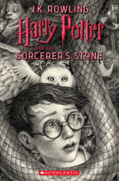
Carrie Copa
https://carriecopadraws.com/ -
The yellow gives it more depth of field. The bricks are gold but the mortar would not be gold. See how that change affects it.
-
@LauraA Thank you for your feedback Laura! - I had that same idea of the magical effect when i put the splash of color there!
@carriecopadraws Thank you Carrie! I had not considered colored text..i am wondering which one you found interesting though..2 or 3... your feedback has a bit of a cliffhanger in it")
@Kim-Hunter Thank you for the feedback Kim! I will use some yellow for sure. For some reason white mortar really bothers me on this ..too much contrast and it leads my eye all over the place... i could be wrong though - thank you again for the feedback! -
@Kevin-Longueil I was talking about #3, but you might feel differently if you use a color title. Curious to see what you go with.
-
Mortar - white would be too much contrast but a lesser tint of yellow over gray might work.
-
I think l’m close...maybe a bit darker behind illustrator’s name..way more saturated than I thought I would end with but it really enhances the reflection somehow...oddly ..it’s fun to put an image on book mock up
Any final feedback before I send it in?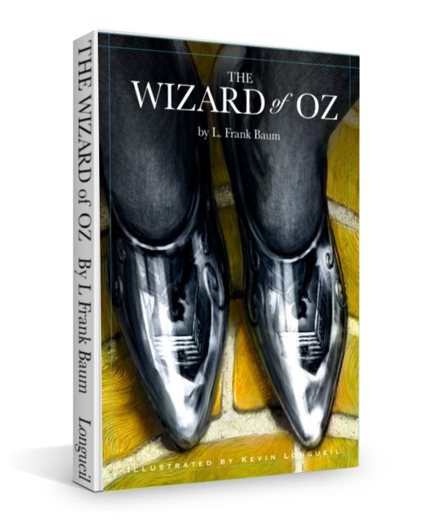
-
@Kevin-Longueil I totally love it!
Btw, if you’ll be sending the mock-up version, get rid of the bleed marks on your design (well, rather “cut” the design along the bleed marks and with that cropped image create the mock-up, but you probably know that.)
-
@mag Thank you! I won’t send the mock up in....I just posted it this way because i thought it was kinda fun to see it looking like a real book - thank you for the feedback!
-
Makes me want to do a mock up for my cover @Kevin-Longueil!
-
It looks really cool!
@Jeremy-Ross You should!
-
Super awesome. Just gorgeous. Totally pro. You figured the yellow out!
-
@Kevin-Longueil beautiful!!!
-
You CRUSHED it! Love the limited use of color. But my favorite part is the reflection in the shoes! Genius! Way to go!
-
@Kevin-Longueil My last suggestion is maybe lose the grid lines?
Portfolio: nyrrylcadiz.com
Instagram: https://www.instagram.com/nyrryl_cadiz/
YouTube: https://www.youtube.com/channel/UCbJCF1Im8ZO7hpGWTKOJMuA -
@Jeremy-Ross Here is the image i used Jeremy....fairly low res. but still fun
@TessaW Thank you Tessa!
@Coley Wow! thank you Coley!
@Nyrryl-Cadiz Thank you so much Nyrryl! I will remove the grid lines when i post it on the contest thread for sure - thank you again
@Eric-Droke Thank you Eric! -
Thanks @Kevin-Longueil
-
I would go with the yellow for sure. Particularly considering that it’s meant to be a book cover I think there should be some color to grab the eye. Love the reflection in the shoes by the way!
-
Tried my hand with the mockup @Kevin-Longueil, Definitely had fun trying this; Here it is!
https://forum.svslearn.com/topic/9866/wizard-of-oz-book-cover-mockup -
@Griff Thank you for the feedback Griff!
-
@Nyrryl-Cadiz now I’m wondering if I should leave the grid lines in when I post it to show what is and is not in the bleed zone...?