Basic Perspective - Final Assignment
-
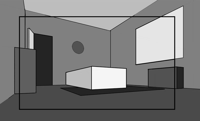
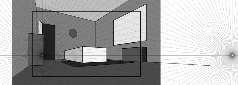
Hello! I'm tackling my perspective fears by taking @davidhohn's Basic Perspective class, and I was hoping to get some feedback on the final assignment! Does this look wonky in any way to you? Do you have any suggestions?
I really struggled figuring out where to place the walls, floor, and ceiling. The room is a boxy shape, but the camera is inside the box, and I wasn't sure how to draw that. Did anyone else struggle with this? Or find a trick? I ended up placing them somewhat arbitrarily.
Thanks so much!
-
It looks pretty good to me. Only thing that looks a bit iffy is maybe the circle on the wall, like you didn't extend the bottom left corner into the perspective bounding box enough or something. I haven't taken this course yet, so I don't know the parameters, but I'd suggest showing some width/depth to the doorway and window, and possibly the circle on the wall.
-
I really struggled figuring out where to place the walls, floor, and ceiling. The room is a boxy shape, but the camera is inside the box, and I wasn't sure how to draw that. Did anyone else struggle with this? Or find a trick? I ended up placing them somewhat arbitrarily.
It doesn't look like you had any trouble at all! What you drew here is how you do it. Establish a horizon line, pick a left and right vanishing point and start drawing! I can't help but wonder if you made this all a little "too complicated" at first. But if I'm missing something please explain your issues further.
The element that stands out for me is the dresser on the west wall. The top and bottom taper from the left side to the right side in a way that is noticeable. Now I know that based on the "rules" of perspective (as outlined in this very class) this what happened when the top and bottom orthogonals of the dresser tracked to the RVP -- but if you sit yourself down in an actual room you'll never see this phenomenon. (You might see it if you took a photo with a fish eye lens.)
Before you get frustrated there's a super easy fix -- just grab that RVP and pull it further out to the right.
Like way out.
Like move the RVP as far out as you think it should go -- and then double it.
As you do so you'll see the entire room start looking more "correct" . That is, your drawing will look even more like real life.Great job!
-
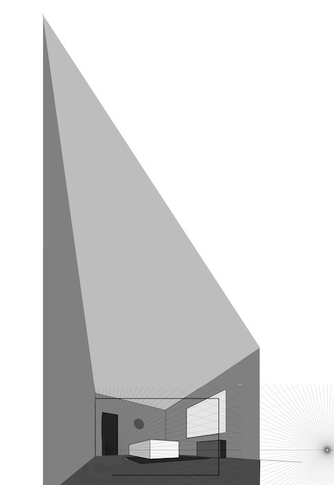
@baileymvidler This looks really well done! The thing that catches my eye is the open door - the top of the door should have a much steeper skew to it much like the room itself and i think it is drawn too short as though it would not fill the space of the open door when closed - where you place the vanishing point for the door on the horizon line will determine the steepness of the top - i am thinking too that the door when lengthened might actually intrude into the space of the rectanglular object in front of it so much so that it would pierce the plane that we see so that might need to be pull forward a bit - I included the quick draw over to show just how dramatically the room is pushed in perspective - it is easier to imagine how the door might look this way i think - I hope you don't mind me cluttering up your thread with this (i can always remove it if you want
 I could be wrong on this stuff too so feel free to ignore
-
@TessaW That's a good point! I'll make sure to add depth to the door, window, and clock during the details pass. Thanks!
@davidhohn Thank you for your response! I probably did overthink it a bit. Although @Kevin-Longueil's edit demonstrates what I felt was goofy about the walls. I going to try extending the RVP waaaayyy out like you suggested, and see if that helps correct the fish-eye effect! Thanks again!
@Kevin-Longueil Thanks for taking the time to make the edit!
-
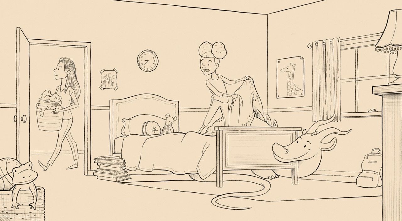
Okeydoke, so I extended the vanishing points wayyyyy out, as suggested. I also cropped out the third wall on the left, because I felt like it was a little awkward. And I think it looks better! Much less fish-eye.
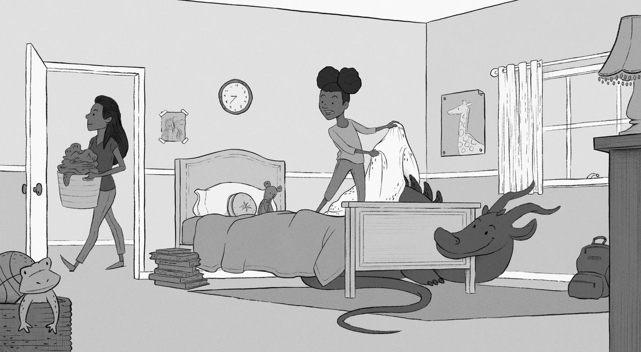
I ended up changing the floor plan a bit, and I’m turning it into a finished portfolio piece! Line art is almost complete, need to finish up some textures, then color. Constructive criticism is appreciated, as always.

-
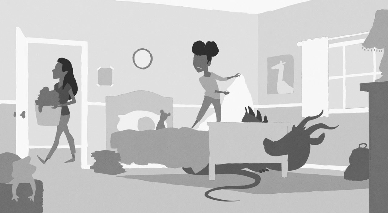
Local values. Goal for next piece: start thinking about values BEFORE inking the whole thing.
I actually found that it’s easier to check values with line art turned off.
-
@baileymvidler Looks great! The value study reads really well too, just by itself. I would love to be able to just draw in values like some people can but I can’t seem to get my head around it.
-
Looks great! Love the scene you've turned it into. Maybe the door frame is a little short? Not actually sure if it is, but that was the only thing giving me any pause.
-
-
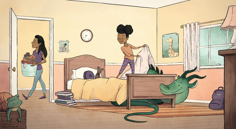
Finished piece! Thank you to everyone who gave input.
-
Cute! Love how it turned out.
-
@baileymvidler This is excellent! Way to take the basic shapes to a finished piece!
-
@TessaW @davidhohn Thank you!
