Basic Perspective - Final Assignment
-
@TessaW That's a good point! I'll make sure to add depth to the door, window, and clock during the details pass. Thanks!
@davidhohn Thank you for your response! I probably did overthink it a bit. Although @Kevin-Longueil's edit demonstrates what I felt was goofy about the walls. I going to try extending the RVP waaaayyy out like you suggested, and see if that helps correct the fish-eye effect! Thanks again!
@Kevin-Longueil Thanks for taking the time to make the edit!
-
Okeydoke, so I extended the vanishing points wayyyyy out, as suggested. I also cropped out the third wall on the left, because I felt like it was a little awkward. And I think it looks better! Much less fish-eye.
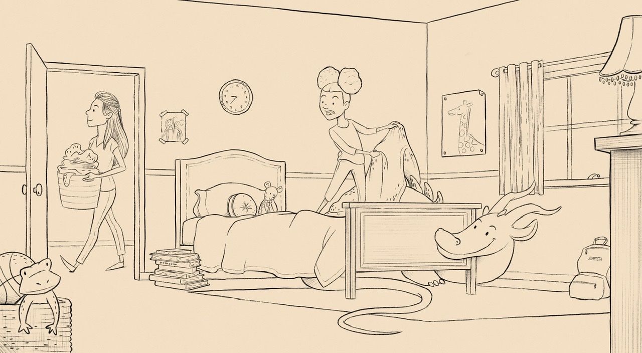
I ended up changing the floor plan a bit, and I’m turning it into a finished portfolio piece! Line art is almost complete, need to finish up some textures, then color. Constructive criticism is appreciated, as always.


-
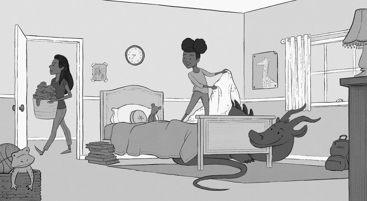
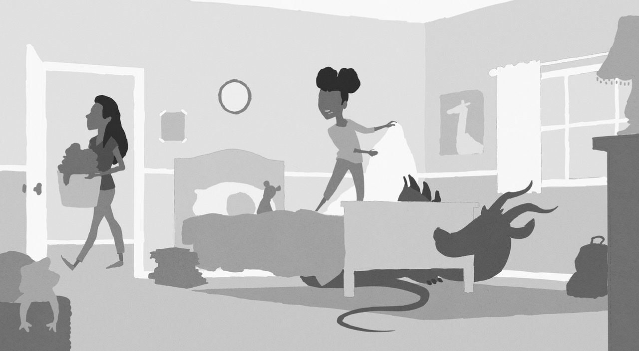
Local values. Goal for next piece: start thinking about values BEFORE inking the whole thing.

I actually found that it’s easier to check values with line art turned off.

-
@baileymvidler Looks great! The value study reads really well too, just by itself. I would love to be able to just draw in values like some people can but I can’t seem to get my head around it.
-
Looks great! Love the scene you've turned it into. Maybe the door frame is a little short? Not actually sure if it is, but that was the only thing giving me any pause.
-
-
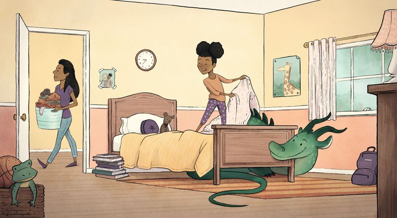
Finished piece! Thank you to everyone who gave input.

-
Cute! Love how it turned out.
-
@baileymvidler This is excellent! Way to take the basic shapes to a finished piece!
-
@TessaW @davidhohn Thank you!
