Workrooms are dangerous APRIL WIP
-
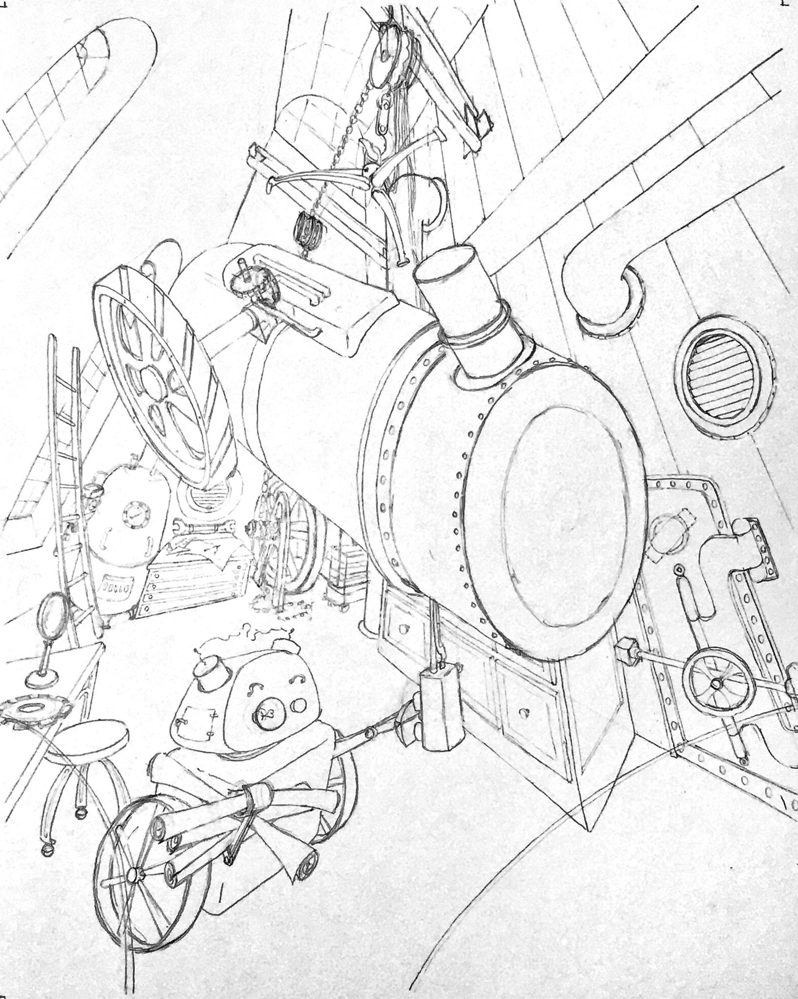
I’m having fun.
I know there are as bunch of mistakes in my perspective. Is it enough that I can identify them? Lol. -
@burvantill said in Workrooms are dangerous APRIL WIP:
I’m having fun.

Ha that made me laugh

One thing you could do to help know your in the right place for the perspective is make a thumbnail sketch as a flat drawing real quick, then go to Transform > Warp and at the top you can change it to "fisheye" and set the bend to 100 and you can play around with where the lens starts.
You can overlay that on top and reduce the opacity and it could give you a basic guide you can turn off and on to help make sure you're staying somewhat in the right place.
-
@jdubz I would probably do something comparable to that if I wasn’t actually using a pencil and paper

 . I took a pic and flipped it in snapseed though and was able to SEE exactly what needed to be done.
 -
This is where I’m stopping tonight. Tomorrow I will put in Lisa. I’m, I mean She
 is drawn, just on another piece of paper.
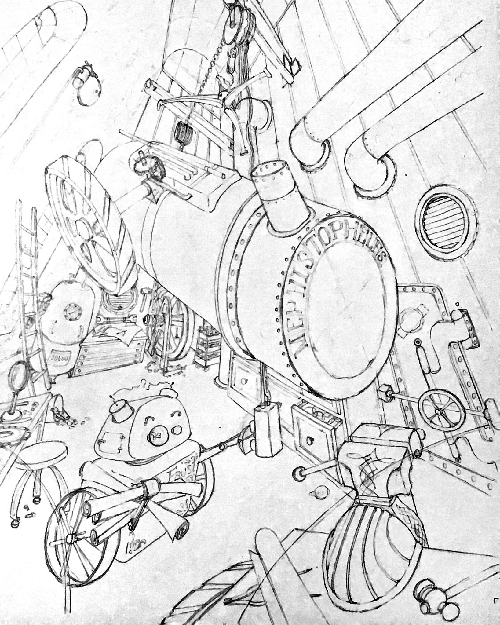
PS. If you want to see my process vid of setting up the “perspective scaffolding “ for the table vice, go to my IG. It was a lot of brain work but worth it for the proper result.
-
@burvantill This is turning into such a cool looking piece - so many details to take in!
-
@sarahlash thanks!

-
Very dynamic ! Looking forward to Lisa showing up!
-
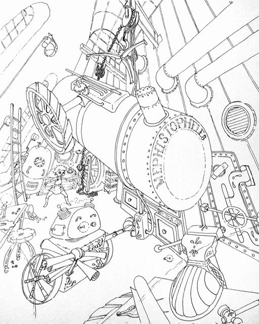
All inked and ready to scan. Tomorrow is value and color sketching.
-
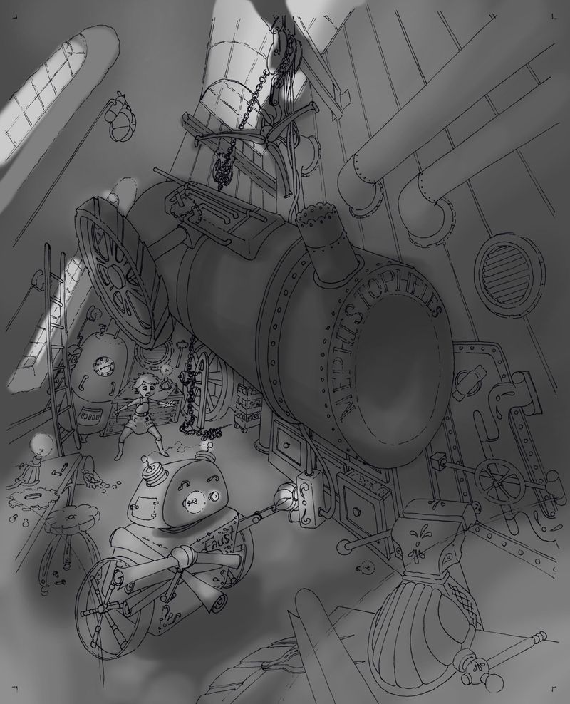
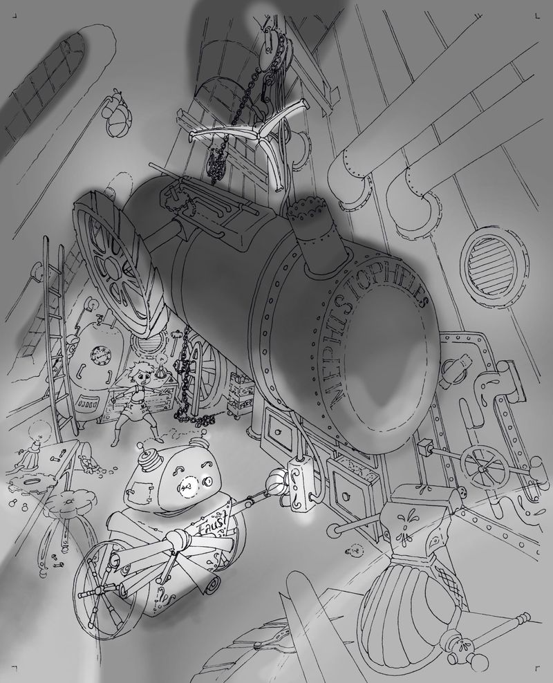
Which one do you think?
Daylight in the windows and darkish room or night in the windows and lamp lit room? -
@burvantill Looking at this on my phone, the top one reads better.
-
Hi @burvantill! Wow this is quite a complex illustration in terms of perspective, composition and just the amount of things going on! On my lunch break I started to playing with some values and just ended with a values pass using your great linework, I hope you don't mind! My approach to an illustration like this would be as follows, and again sorry if I got carried away, but I was having fun

1.) I try to identify at least 3 distinct depth layers (foreground, mid ground, background) a block in some base values:
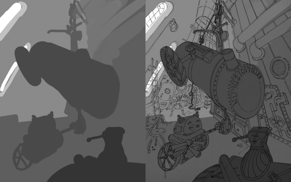
2.) Experiment with some basic lighting that brings focus the main subjects of the illustration:
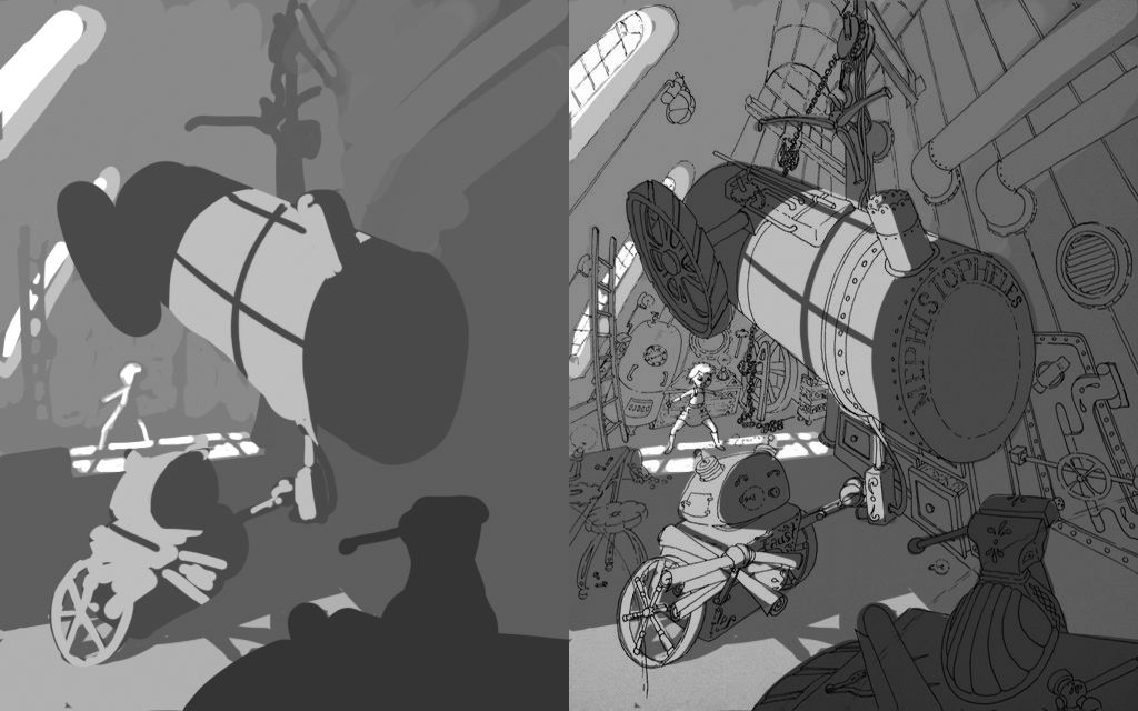
3.) I usually do a balancing pass using the gradient tool in PS, where I can add a bit of extra light or dark the further push the eye towards where I want it to go:
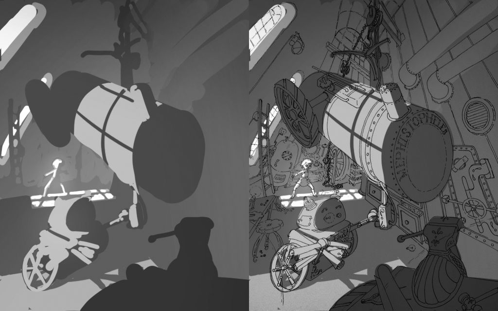
I know you didn't ask, but I hope this is helpful, looking forward to seeing it progress!
-
@natiwata thanks for the tips. I like what you did with the window lighting.

-
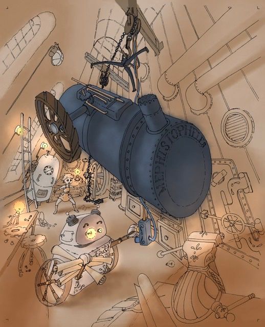
In progress. I was playing with layer effects in procreate and managed to turn the lights on. Lol. Still a long way to go with this but just wanted to share.
-
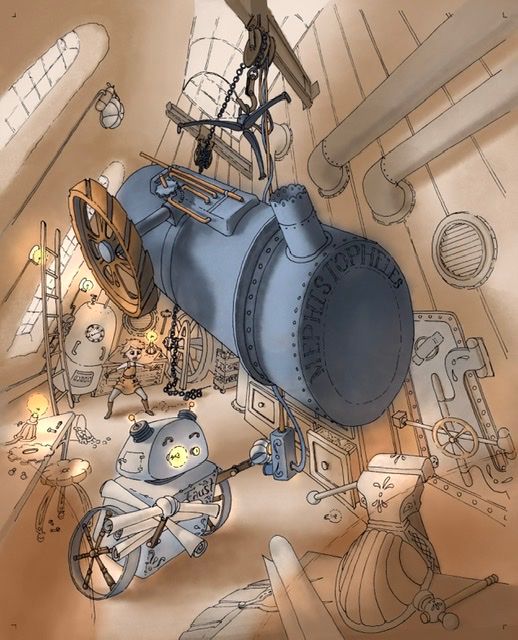
Today’s progress.
-
Man you are really going for it with this one! Look at all of those objects in crazy perspective!
Lisa, is that you in the background?
-
@TessaW Yup! Lol. Me at 13 in my steam punk workshop.
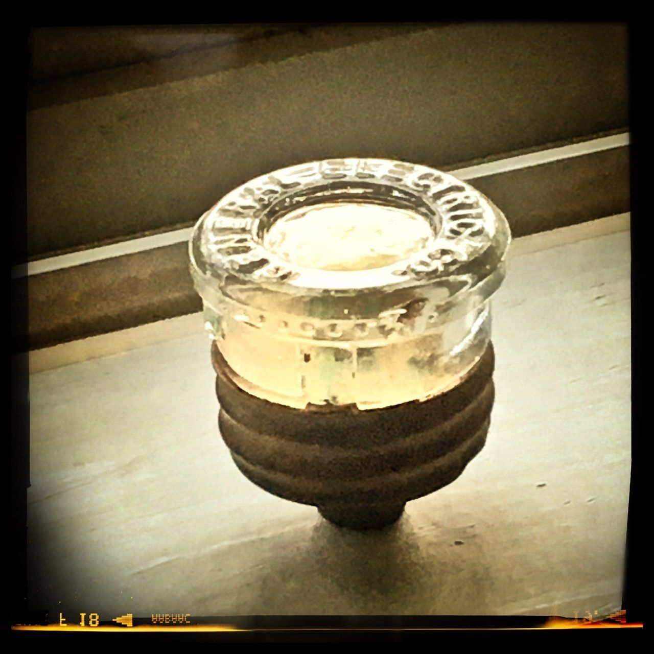
 I sure do miss that little bot. I still have his left eye. I keep it on my windowsill so the sun reflects in the glass. It keeps him alive in my heart.
-
Lol, I had a feeling the contest prompt was about you.


-
-
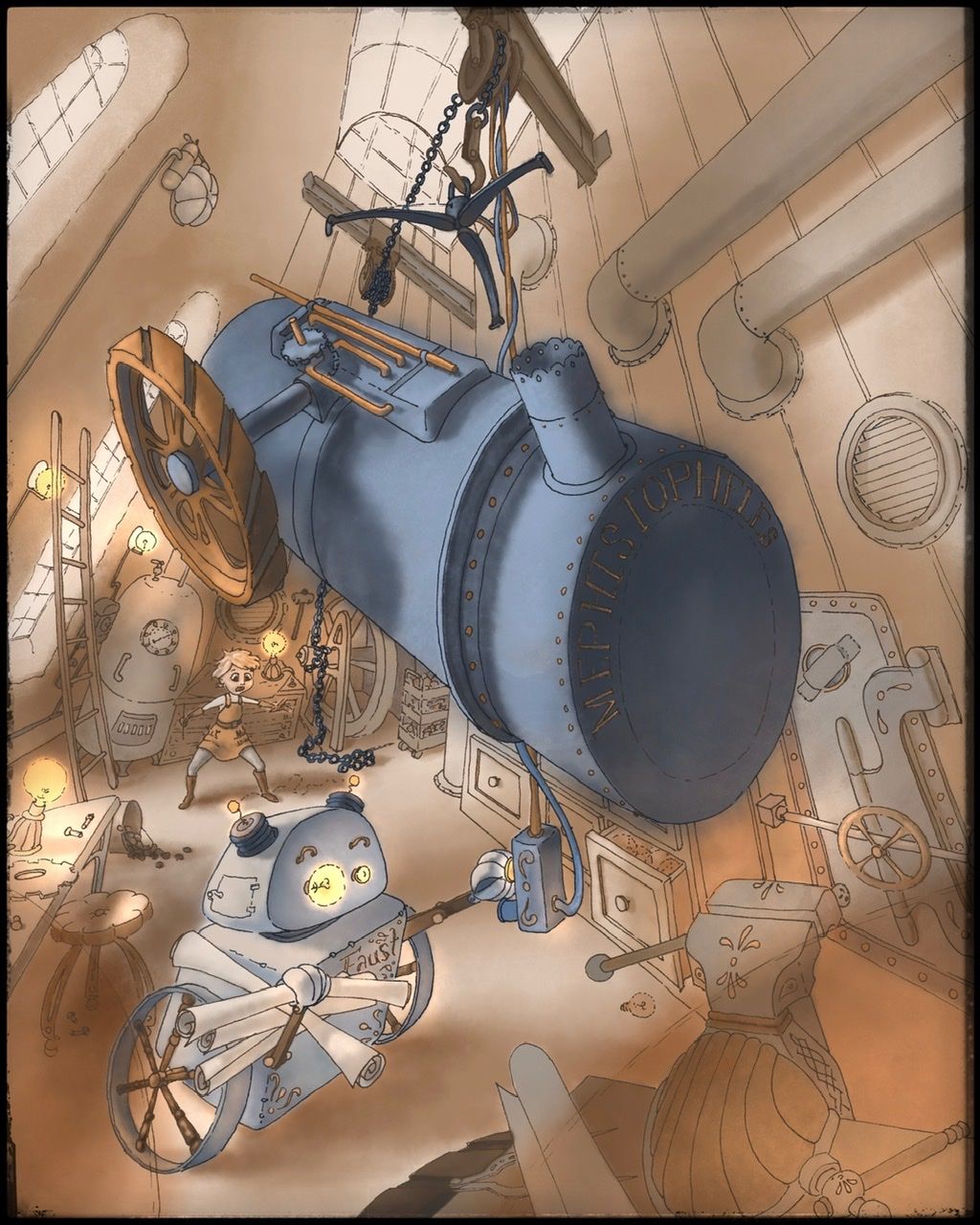
I think I’m done. I’m gonna sit on it for a couple days before I submit it, just in case I see something glaringly obvious that I missed before it’s due. Do you see anything glaringly obvious that I should fix? Nows the time to speak up. Lol.
-
@burvantill I like the colors!