Workrooms are dangerous APRIL WIP
-
Hi @burvantill! Wow this is quite a complex illustration in terms of perspective, composition and just the amount of things going on! On my lunch break I started to playing with some values and just ended with a values pass using your great linework, I hope you don't mind! My approach to an illustration like this would be as follows, and again sorry if I got carried away, but I was having fun

1.) I try to identify at least 3 distinct depth layers (foreground, mid ground, background) a block in some base values:
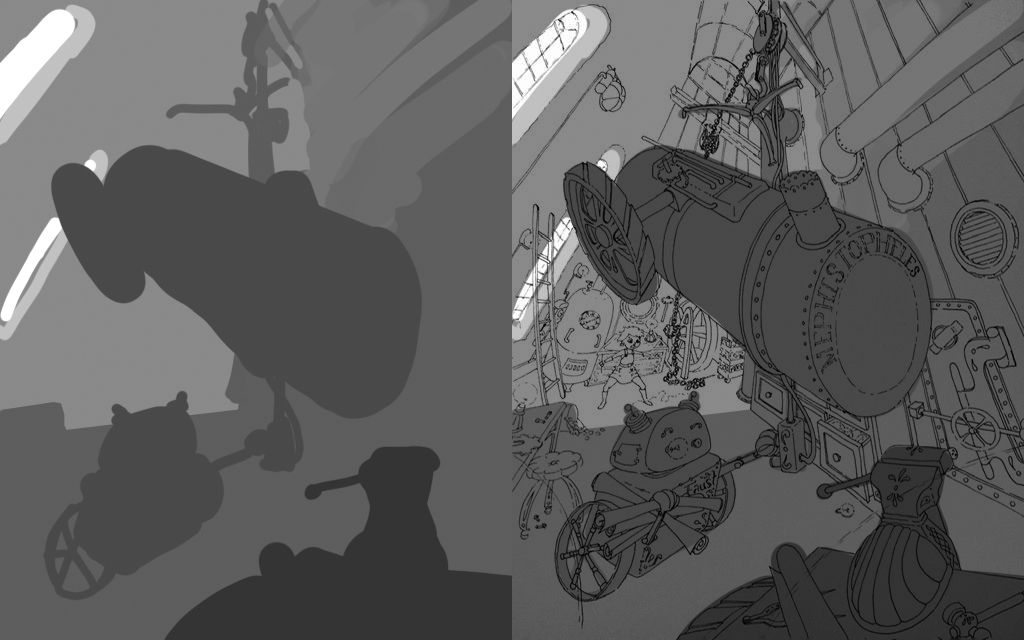
2.) Experiment with some basic lighting that brings focus the main subjects of the illustration:
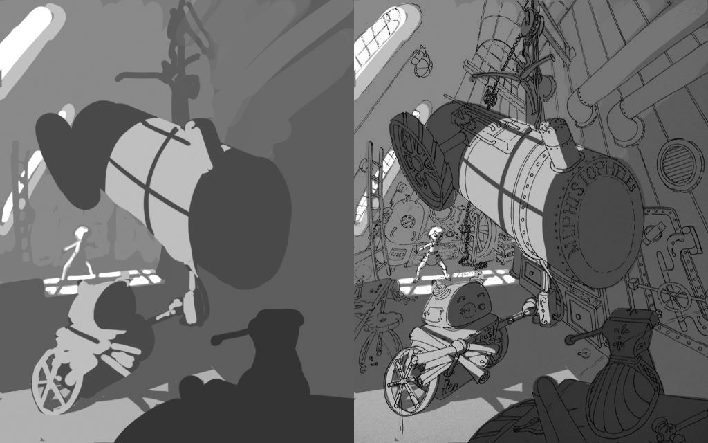
3.) I usually do a balancing pass using the gradient tool in PS, where I can add a bit of extra light or dark the further push the eye towards where I want it to go:
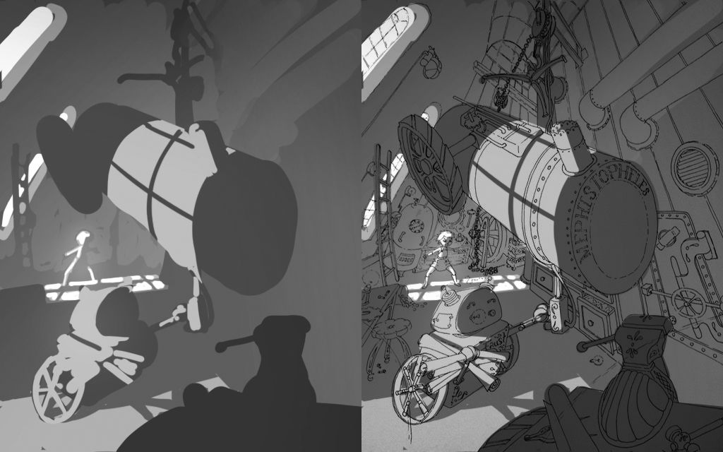
I know you didn't ask, but I hope this is helpful, looking forward to seeing it progress!
-
@natiwata thanks for the tips. I like what you did with the window lighting.

-
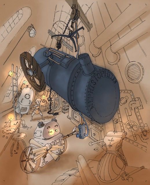
In progress. I was playing with layer effects in procreate and managed to turn the lights on. Lol. Still a long way to go with this but just wanted to share.
-
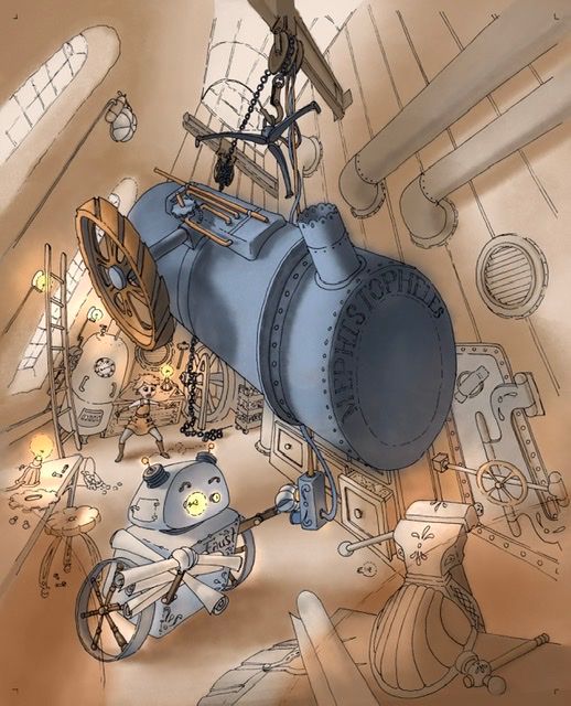
Today’s progress.
-
Man you are really going for it with this one! Look at all of those objects in crazy perspective!
Lisa, is that you in the background?
-
@TessaW Yup! Lol. Me at 13 in my steam punk workshop.
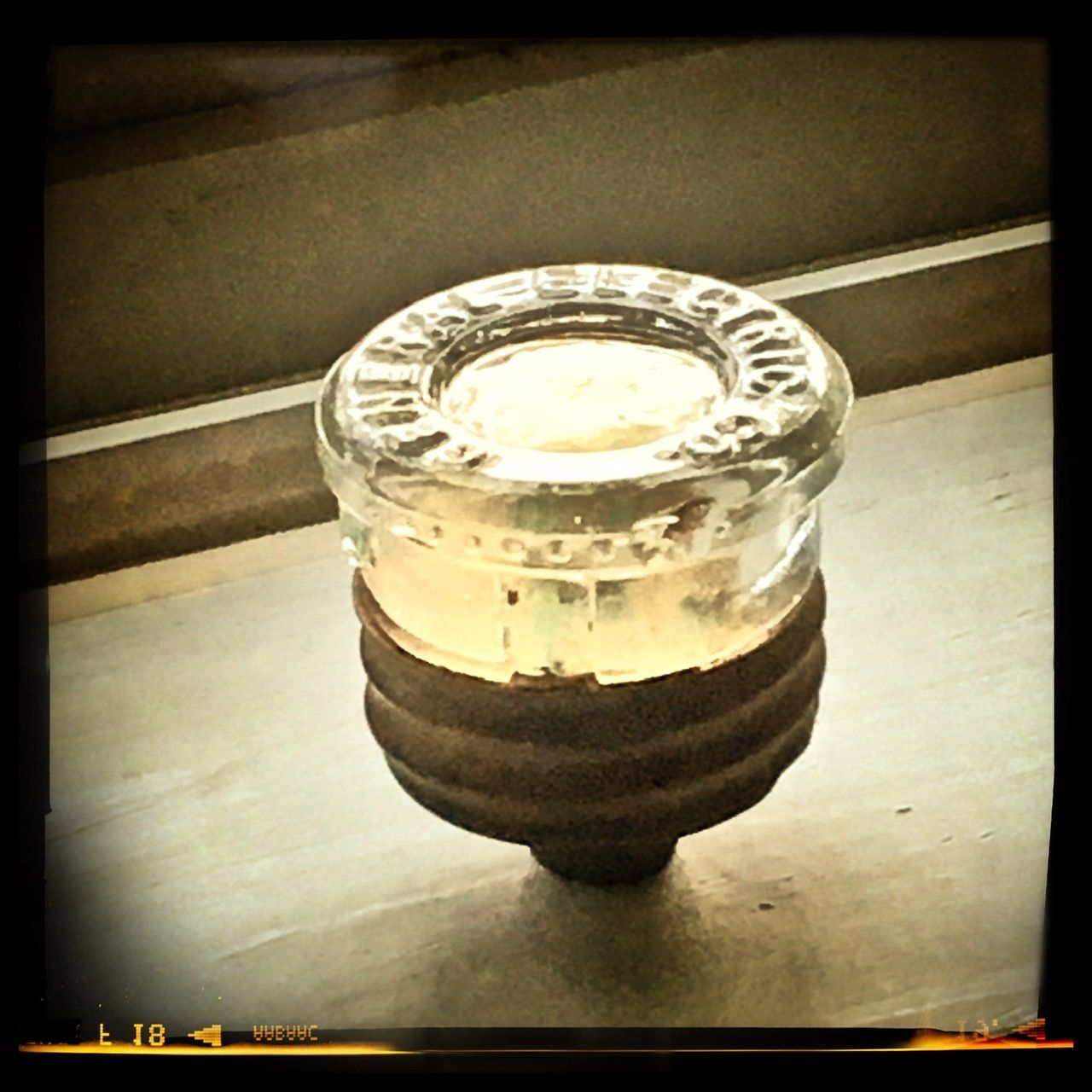
 I sure do miss that little bot. I still have his left eye. I keep it on my windowsill so the sun reflects in the glass. It keeps him alive in my heart.
-
Lol, I had a feeling the contest prompt was about you.


-
-
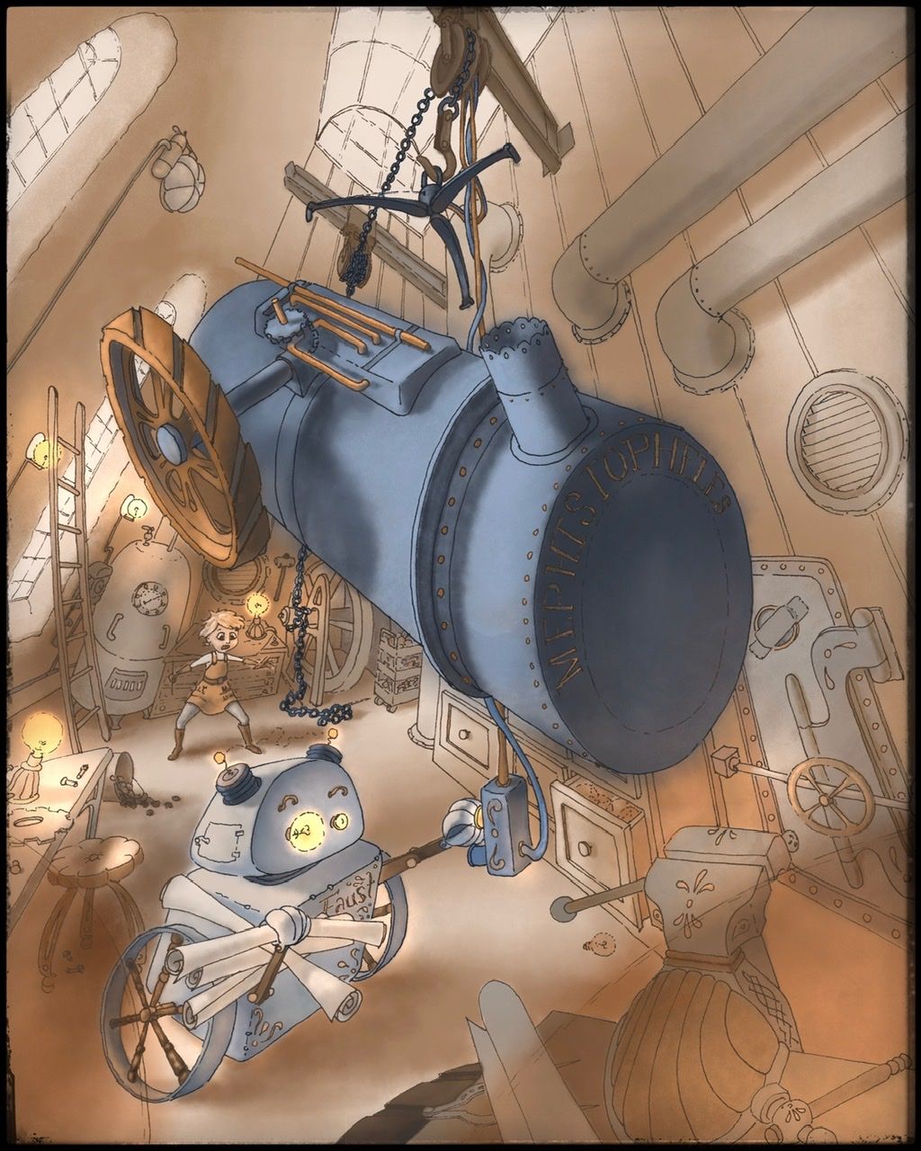
I think I’m done. I’m gonna sit on it for a couple days before I submit it, just in case I see something glaringly obvious that I missed before it’s due. Do you see anything glaringly obvious that I should fix? Nows the time to speak up. Lol.
-
@burvantill I like the colors!
-
@aska Thanx! =)x
