Brutal honesty and love requested...
-
Hey guys, I would like more feedback. (if this comes off ranty, I have the flu so maybe this isn't a great idea...) Lee talked about how this forum was a great place and a safe place for us artists to get feedback and input. I just watched the critique area again and learned a lot from it, but what I really learned was how valuable feedback is. My work has only made the top 16 once (for which I am so grateful!) and I feel like something is wrong with my work but I don't know what.
I honestly feel like I am not getting much feedback lately on the forums for my WIPs for the contests. At one point I saw that there were 83 views on my latest piece, no comments, and no likes, either. I asked specific questions, too. I really wanted feedback on this one because it was my first time painting in digital. Is everyone just way too busy? (I totally get that. )
Sometimes the most loving thing we can do for one another is to help point out areas that need improvement. Is my work just too uninteresting, or bad, or meh, or what? If it is terrible, please tell me. What can I improve? If it is nice but boring, please tell me what I could do to improve it. If there are some problems with my rendering, please let me know. Some affirmation wouldn't be a bad thing, either if you like it.
(if this sounds like the whining of a middle schooler, I apologize. "Nobody likes me...Everybody hates me..." However, I really value your opinions and count you as my art friends and community since I don't have one in Atlanta. )
Also....the flu.
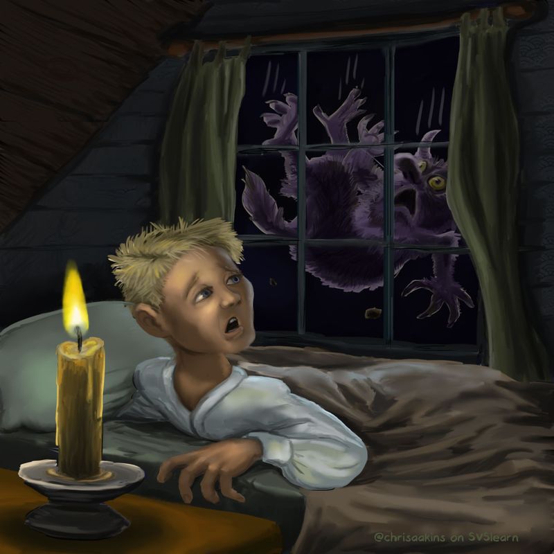
Here is my latest piece, (which I may take down since it has no positive feedback) Please give me some honest critique as to why you would or would not pick it as one of your sweet sixteen.
-
I like the monster a lot. But he looks like he's been cut out of a magazine and pasted onto this drawing. The character design of the boy isn't very appealing to me, and many elements look 'photoshoppy'.
That's all i got! Great monster!!! -
@chrisaakins It's interesting to hear you say all of this, because i thought that when I asked for feedback I didn't get any because I was new and didn't approach it in the right way.
I'm still learning how to talk about other people's work and worry about being abrasive. It feels sometimes like I need to know how to make super successful images in order to be qualified to comment. I wonder if other people have this problem? So I'll go ahead and tell you what I see in case it will help.
Your image has a great concept and you show that you can render and design characters but it doesn't have as much appeal as it should. You don't need to make it 'cuter' or anything, but the expression on the boys face should be softened somehow or maybe he shouldn't be looking back. I would rather see him delighted at seeing a monster or only a hint of his face while he is holding the candle, for instance. The candle is the focal point since it's more crisply rendered and the brightest contrast than even the boy, when I want the focal point to be the falling monster. I would also like to know more about the falling monster. Where was he when he fell? Is there something he can cling to as he falls to tell his story more?
He has a sort of modern haircut, but the candle leads me to believe this is not a modern setting.I think the more technical problems I see are that the hand is way too big for the boy and ages him along with the worried look on his face, and that the whole image is so dark. Not sure what to say about that because realistically, the stronger your interior light, the less the boy would be able to see out the window, and so maybe it would be best to have a source of light outside with the monster. Since he has what looks like moonlight on him, maybe it would also be softly illuminating everything outside, so it wouldn't be as harsh of a black everywhere.
Sometimes this forum can be a bit intimidating to speak up in!
-
I'm very new to digital illustration, too, so I fee completely unqualified to give you a critique. But the main thing I think would help your drawing is to add some texture. Try experimenting with some different brushes in photoshop, instead of just sticking with the round and soft brushes. This will make is look more organic and not so "computer generated".
I really like the way you have the wax dripping down the candle, and the attention to detail you put into the characters hair. You also did a good job with following the light source from the candle to his face, and creating the wrinkles in the fabric of the bedding. I can tell that you're a painter.
Another suggestion I have is, really think about the story here. Yes, there's a monster falling off of the roof, but why was he on the roof to start with? Was the character sleeping and heard something that woke him? Has he seen the monster? Has the monster visited there before? Subtle details in the background can help build the story.
I can tell that you're very talented!!
-
I really like the monster, and the concept is pretty cool! I like the rendering of the room. If there was one thing I would improve it would be the boy's face, I know the light source is close up but it still looks harsh on his face? I'm not the best critiquer, I am sure others will give you better advice! I think for him to look younger he needs to look rounder in the face perhaps? I think the harsher shadows might have a lot to do with it. Did you use any reference? His hand might be similarly a bit harshly lit and or a little big? There is so much good about this piece! I think soften the features and he'll read better.
I get down about my art too. It's hard to always be positive. So hopefully just ride it out as you do so much fantastic work. Your mice, your your Penny and dog and your Hansel and Gretel pieces really all jumped out at me as totally awesome. And you're just learning Photoshop I think!?
I have had posts that don't get many comments either, it does feel disappointing but I understand too because I don't always comment on or read every post. But I understand the feeling and think it's normal! -
@chrisaakins I really enjoy the composition of the piece. I think what I would recommend is to really simplify areas that shouldn’t be in detail. It seems like every area of this piece is in super high detail which can be confusing at a first glance. I would also recommend looking into warming up the colors. I really enjoy the contrast between the unsaturated background and the saturation in the light, but all of the colors are leaning on the cooler side to me. I think you’re on the right track here and I really enjoy the story being told
")
-
I forgot to mention values!! In the curtains, I notice that there is no shadow where the curtain is hung from the rod. The loops the rod go through would restrict light and cause a shadow, which would create a darker value. You can never go wrong with learning more about value even if you have the basics down, so I would recommend practicing value to anybody but I think it would also help here.
-
Hi @chrisaakins, I feel ya buddy! I worked really hard on my avocado piece and thought (hoped) it would make the sweet sixteen. I learned a lot from the critiques while watching today’s voting, and now realized my piece was too boring (lol).
From today’s top 16, it doesn’t look like your monster piece will make it either... Obviously, I know nothing (like John Snow), but that’s my opinion based on what I saw today.
The final 16 pieces all look professional, so I have a loooooong way to go, especially since I’m doing art on the side.
I’m thinking my Feb piece is equally boring, so I might just try another if time allows.
One thing I’m learning for sure, you just don’t know if you don’t try! Not making the top 16 is a great reality check too, because it forces us to work harder.
Anyway, it’s all good. Hope you feel better.
-
@Jeremy-Ross Are the “sweet 16” chosen based on forum votes or the judges?
-
Hi @Kaela-McCoy, I believe the judges and possibly SVS staff select the top 16, but I’m not 100% certain.
-
I can't speak for anyone else, but it takes a lot of time and thought to give critiques and most of the time I don't feel confident enough to offer advice. There also seems to be a lot of new people around and when that happens, a good chunk of them don't return, they ask for feedback and don't give any in return. That can spread out the balance and focus of the forums as a whole. At least, that's what I think, I could be off base. Also, have you personally been taking the time to offer feedback to others? That can make a big difference in how much response you get back.
As far as your piece goes, my overall impression of it is that the storytelling and focus isn't quite "here or there" and I'm not really getting a strong impression of who the characters are, what's going on, what the mood is, etc.
-
The candle, the boy, the monster, all have equal weight and focus. Who are we meant to empathize most with? I can't tell. Playing with the size, lighting, values, and sharpness of all the different elements could really help us with that focus.
-
The candle hints at a moody, dramatic atmosphere with lots of warmth, but it doesn't actually appear to affect the rest of the scene much, yet you've given it a lot of visual weight.
-
This appears to be set in another time period, but it feels like an afterthought. You haven't pushed it far enough to mean anything to the viewer.
Those are my main criticisms. Others have pointed out the character design and the values could be improved upon.
-
-
@Kaela-McCoy they are chosen by the judges. I think what he was saying is that this one is not in the same category as the other pieces that were picked today because it is lacking in polish.
-
@chrisaakins I totally hear you. It can be really disappointing when you're not in the top 16, which happened to me too. I'm not sure what I did wrong (maybe because it's in black and white? too boring? poor concept? I may never know - lol), but onward I go. I think @TessaW did a great job summarizing why we sometimes are reluctant to give comments. Sometimes all I have time for is to "like" something. She's right about how all the elements have the same weight, so I would actually go back to the value phase of the process to work out the lights and darks and where to emphasize the storytelling. Rendering will come in time. And seriously, if you JUST started painting digitally, this is a GREAT start. Keep going and keep posting! I know I'll try making more of an effort to comment when people ask.
-
Thank you everyone! These are exactly the kinds of things I needed to hear. When I get better I will work on some of these things.
@TessaW I really do try to give good feedback to others as much as possible. I don't want to be a taker and not a giver. It seems that some posts get more than others, so I especially try to give feedback to newcomers and those with less feedback. I was really thinking that my pieces were in the "that's nice" category but not turning anyone's head. I wanted to know how to fix that. -
First I'd like to say, that with 74 entries, there were many other good pieces besides the 16 selected that were very, very good! I've only been doing this since November myself, I feel like if I improve each month, by my standards that's all I can ask of myself. The work done here gives me so much inspiration. Yes, the bar is set high, but that gives us newbees something to aim for. I may never make the top 16, but I am having so much fun and learning so much! This month I went through all the pieces and looked at them closely. I had my favorites picked, so it was interesting to see how it compared with what they picked. It's also a reality check for your own piece. I hope that helps!
-
Im always worried my criticism would come off mean in some way And that people on the forums already think im a weirdo but that might be my insecurity talking. But here are some things I’ve noticed in terms of your work and this piece. I hope you know you’re great and i love you dearly.
-
I notice you submit your piece sometimes in a very short time, I think you should take more time playing with compositions and placement of things before you start the final drawing and rendering. Like i know it’s February but you submitted it yesterday and its not even half the month yet. Take advantage of the time, play with the piece, the camera angles, the feeling you’re trying to go for (is the kid scared? Is he curious? Etc)
-
The composition, i know it’s a window and you want to show the monster falling in the window so some stuff you can play with is the point of view (do you need to show the the scene from the inside? Why not from the outside?). Does the kid need to be turning his head like that? Why can’t his body be facing the window a bit more and him holding the candle? Also consider giving your piece a bit more breathing room. It’s very cramped, The “ kid” also includes the bed and the pillow and everything hes interacting with So he takes up a lot of space while the monster is super tiny in comparison. You can even make the window larger and dont have to use a square cropping.
-
Sometimes it feels like you take shortcuts and it comes off as if you are trying to hide the fact you cant draw something. Not saying you cant but it comes off that way. Like for example look how the back arm looks like it’s being cut off and sunk down into the pillow. Also the way the torso and body is angled is a little weird to me. Try that pose on your bed using a camera or a mirror. I do that and it reallyy helps.
-
Color. Im not the best at color but ill try my best with this one. It’s clear you love to paint and you’re very good at painting. However you use extreme darks and extreme lights. Like the walls are almost black and so is the night sky outside it. You can use darks but maybe not that dark. The shirt is clearly white but the candle is the brightest light source and needs to be a lighter value than the shirt.
Dont feel like you need to do all or any of these but definitely suggest taking more time and playing with ideas and composition more.
-
-
@chrisaakins you do provide a lot of feedback and comments. I see your name on posts all the time. I appreciate it too! I'm new here, but I'm trying to do that too. My feedback may not be as helpful because I'm not as knowledgable yet, but I do my best to encourage people and let them know when I really like what they've done. We are all here to learn. Some of us are already working in this field, but you have all been so welcoming. I hope it stays that way. Perhaps if someone is thinking that they are giving more than they're getting it's time to move on.
-
@chrisaakins For some reason, some pieces or even some people's entire body is work is sometimes harder to critique than others. Usually I check out posts and if I can immediately identify an area that can be improved, something I'm able to articulate well and that I know would help the piece tremendously, then I immediately comment. And then other pieces, I look at them for a couple minutes and I can't come up with something specific, clear or helpful to say, so I just leave because taking the time to try and figure it out for myself, and then trying to explain it clearly, would be a 30+ minutes job and I have to get on with my day.
Your work falls solidly in that category almost all the time. It's not beginner enough that I know exactly where to point you at to improve dramatically, but it's not pro enough that the one little detail that doesn't work can easily be pointed out. It's a compilation of many different things which you're not doing terribly wrong, and not very well either. Right now you're falling a little bit into uncanny valley territory, where you have acquired a solid set of skills, but it's still not quite polished enough to pull it off. The fact you have a more realistic style doesn't help you, as this would pass more easily if it was more stylized. The boy's face is realistic but not done quite well enough; the mouth is in a slightly wrong position, the eyebrows look carved into the head, and his design is bland. All around the room there are little things which by themselves aren't deal breakers, but put together create an underwhelming whole. The hand is too big. There's no clear focus in the picture, The colors are kind of dull and the shadows grayish, despite the candle lighting which should be an opportunity for warm lighting. The curtains look rock solid instead of real cloth. There's the same amount of detailing everywhere no matter which level in the picture it is, front or back. The monster looks pasted on and remarkably stiff for a character in a falling/action pose. It might look like I'm piling on, but those are all small things when taken individually.
Apart from that, the illustration lacks a certain charm, a sparkle that makes it special. A warm glow from a candle lit scene could have given you this magic touch. Maybe the monster could have been just a silhouette, backlit by the moon. There just lacks a little something to make it special. I notice a lot of your work has that issue, and that's something hard to point out or explain, or teach. I think you're focused on making a good image, not a great image. You're doing the best you can, but at the idea/planning stage are you taking time to figure out what will make this illustration special? I have ideas for new illustrations everyday, but if I don't know what will be special about it, then it never goes past the idea stage.
I don't think you should interpret a lack of comments or critiques as "you suck". Rather, your work is at that stage where it's really hard to critique...
vanessastoilova.com
instagram.com/vanessa.stoilova/Check out my Youtube channel for tips on how to start your career in illustration! www.youtube.com/c/ArtBusinesswithNess
-
@chrisaakins said in Brutal honesty and love requested...:
I really do try to give good feedback to others as much as possible. I don't want to be a taker and not a giver. It seems that some posts get more than others, so I especially try to give feedback to newcomers and those with less feedback. I was really thinking that my pieces were in the "that's nice" category but not turning anyone's head. I wanted to know how to fix that.
I hope you don't think I was calling you out specifically @chrisaakins , (I haven't been thorough in reading through the forums lately, so I'm not as up-to-date on who the regulars currently are) and I'm not judging anyone who doesn't give much feedback to others. I just assume it does play a factor, so I threw it out as a possible reason.
Website: www.tessawrathall.com
Instagram: www.instagram.com/tessawrathall_art/
-
@Aleksey
Thank you for not holding back. I am in agreement with you on much of what you say. I do tend to work too fast and part of that stems from the fact I get possessed by an idea and want to go with it. I am also impatient with my skill level in illustration. I am much more comfortable with fine arts and inking. I really should take my time (although I confess that is hard sometimes with life and grad school). I do need to play around with composition more. I think sometimes what works in a fine arts piece does not work in illustration as well.(Believe it or not, I did use a photo reference for the pose, but I guess I did not draw it as well as I should have. I confess, I did not use a reference for the face. As far as his age, I was aiming for gangly middle schooler, not younger, but I guess he needs more work. )
@NessIllustration I always appreciate your time and thoughtful responses. I am an art teacher and I do know what you are talking about. I look at some kid's work and it's good, its just not great. And there are lots of minor things that could use tweaking. Hmmm. So death from a thousand cuts, huh? ouch. You have given me much to think about and work on. From what I can sum up I guess my biggest challenge is finding the right balance between realism and stylization. I either need to go full-on realism or a bit more stylized? Now that I think about it, my Penny piece was more stylized than this current piece and Lee really liked it. Thank you for taking the time to critique my work.
@deborah-Haagenson thank you for your words of encouragement. Thank you @Kaela-McCoy @Kali and @Coley for your positive input as well as your pointers.
I think I will pull this piece and either scrap it or rework it. I really want to convey a kid who heard the monster falling off the roof and wondering what the heck is going on, but maybe my focus should be on the monster and less the kid.