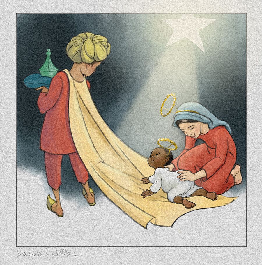
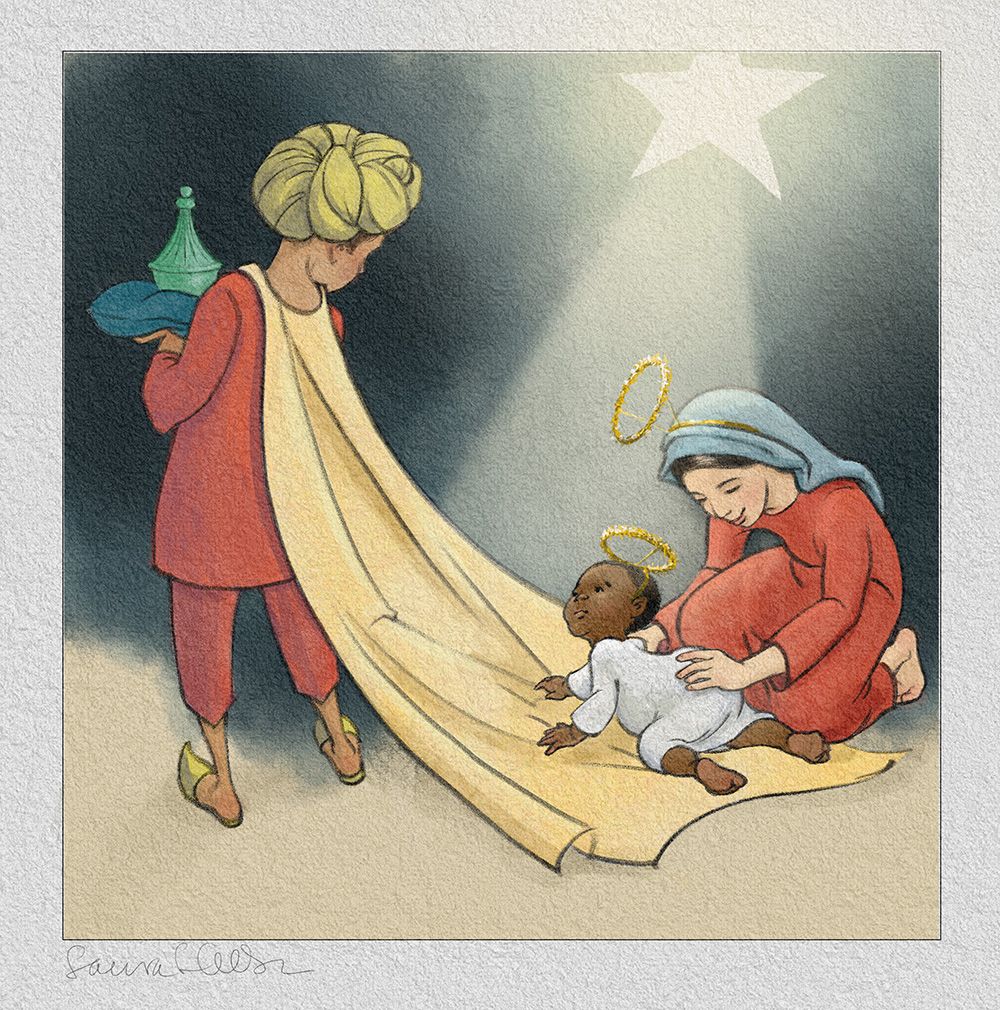
Final day to work--serious critique requested
-
@LauraA Hi Laura, there is only one thing that comes to my mind, and feel free to discard it as silly.
Maybe the lady is the baby 's mum? in which case maybe you would like to darken a bit the skin tone..
but for the rest...wonderful idea and compostion! I love it! -
Well, she's his mum only in the sense that it's a Nativity play and she's playing Mary to his Jesus. But in reality she's supposed to be about 12. The fact that two people have now thought she's actually his mom makes me realize that the story isn't clear enough! But now I have run out of time, so for now it will have to be like this, and maybe later I can make it more obvious. It's good to get an objective opinion on how it reads, though! And thanks for your comments!
-
@LauraA it’s really beautifully well drawn Laura.
-
@LauraA I like the warmth of the yellow start light. As for it reading as a play, maybe have a suggestion of the audience in the background since the start light is acting as kind of a spot light on the actors. Add some suggestion of floor boards in the foreground or small flood lights on the stage? The baby is just stinkin' cute!
-
Both version look good to me. Visually I like the first maybe slightly better- but if you are going for a stage play, the yellow star seems to convey that better. Maybe that's just me.
As for the age of the girl- I always read her as a young teenager- but it does seem like a couple of people are reading it differently. Interesting! I wonder if adding the tinsel halos will help sell the idea that's it's a play and these are younger characters?
-
Thanks for your comments! @Laurel-Aylesworth I kept the light warm, and though I didn't have time to draw in an audience (also because I keep imagining the star coming from behind somehow) I did create a version that suggests a floor. I haven't decided which I like best yet.
@TessaW I went with the haloes. In fact, I saw your comments right before I went to sleep last night and dreamed about cutting, pasting, selecting, adding layers before waking up early this morning drawing in the haloes. Anyone else every do that?!
I may have to choose a version and post today before anyone else can comment, because I have to pack! But thank you all so much for your input. It's so valuable to have a community for feedback!
And, happy holidays everyone!
-
@LauraA lovely! I love the 2nd one.
-
@LauraA the tinsel halos are perfect! I’m liking the second colour version best.
-
Thank you! Posting the final version in December studio
")
-
Laura, your paper texture is delightful. It really breathes a sense of depth to the whole piece. Do you mind if I ask you a technical question? Are you sandwiching your drawing/painting layers between two texture layers as I suspect? Because the effect is gorgeous. It really adds a level of richness to the whole, which contrasts delightfully with the clarity and cleanliness of the areas of color and shadow. I can't stop looking at it! LOL!
Children's Illustration Portfolio: https://www.coreyartusillustration.com
Art Portfolio: https://www.coreyartusimagery.com
Mastodon: https://mindly.social/@Coreyartus
Pixelfed: https://pixelfed.social/Coreyartus -
@Coreyartus I confess I bought the whole thing from Grutbrushes. It's a paper surfaces pack, and yes, you sandwich your artwork between texture layers. Then depending on how it looks and how you want it to look, you can adjust the effects. I don't always use textured paper, and I have made my own as well, but in this case I really wanted something that looked like watercolor paper because I wanted to limit the paint to a few simple layers. As you insightfully pointed out, a simple drawing with large areas of flat color often begs for a little textural warmth!