Society of Visual Storytelling

    SVSLearn Forums

    • Register
    • Login
    • Search
    • Recent
    • Tags
    • Popular
    • Users
    • Groups
    • Search

    After the storm

    Illustration
    9
    15
    3480
    Loading More Posts
    • Oldest to Newest
    • Newest to Oldest
    • Most Votes
    Reply
    • Reply as topic
    Log in to reply
    This topic has been deleted. Only users with topic management privileges can see it.
    • Naroth Kean
      Naroth Kean last edited by

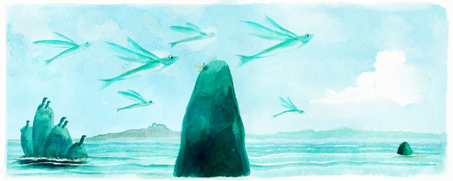
      Hi everyone! I would like to get some opinion on this piece. Do you think that big rock is way too center on the page? Does it matter when it is at the gutter? Text will go at the biggest white cloud. Thank you in advance! 12.jpg

      http://narothkean.com
      https://twitter.com/narothkean
      https://www.instagram.com/narothkean

      1 Reply Last reply Reply Quote 1
      • Kevin Longueil
        Kevin Longueil SVS OG last edited by

        I think so Naroth - my brain wants to move the big rock to where the rock with the birds are - and possibly put the bird rock where the little rock on the right is ....maybe not so far to the right but over there - you could paint another flying fish on that side at a smaller scale so it is about the same distance back as the rock with birds and you could have the little birds looking up at the flying fish....or not 🙂 long answer to a short question - yes i think it will be too large and mysterious if the the big rock is in the gutter - could be wrong though...i do love your painting though!

        Portfolio: kevinlongueil.com
        https://www.instagram.com/kevinlongueil/

        1 Reply Last reply Reply Quote 0
        • Naroth Kean
          Naroth Kean last edited by Naroth Kean

          @Kevin-Longueil Thank you, that is a very good suggestion. The original was only half page but I decided to extend the whole page and realized something is weird about the rock haha. it was like this. Thanks again.
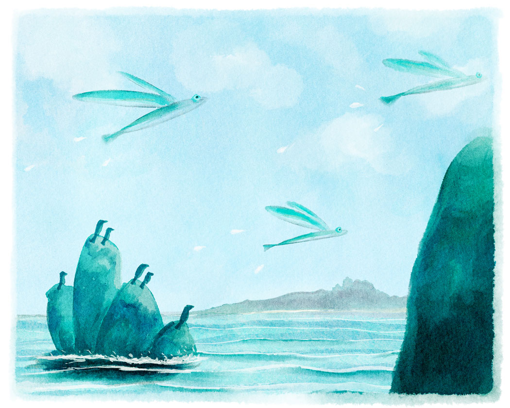
          19_Clear-sky.jpg

          http://narothkean.com
          https://twitter.com/narothkean
          https://www.instagram.com/narothkean

          1 Reply Last reply Reply Quote 1
          • Naroth Kean
            Naroth Kean last edited by

            here the change! 12.jpg

            http://narothkean.com
            https://twitter.com/narothkean
            https://www.instagram.com/narothkean

            S Leontine 2 Replies Last reply Reply Quote 7
            • Kevin Longueil
              Kevin Longueil SVS OG last edited by

              This looks good - each page reads well as its own composition and the spread reads well as a composition too - i don't think this is necessary but i think it is a bit of a home run when you make it happen - the text will add visual weight to the right side of the composition too as you said - i like how you changed the birds to have them looking in different directions with only a few having discovered the flying fish - really looks nice!

              Portfolio: kevinlongueil.com
              https://www.instagram.com/kevinlongueil/

              1 Reply Last reply Reply Quote 1
              • Naroth Kean
                Naroth Kean last edited by

                🙂 thank you so much I really like the change as well.

                http://narothkean.com
                https://twitter.com/narothkean
                https://www.instagram.com/narothkean

                1 Reply Last reply Reply Quote 0
                • Lee Holland
                  Lee Holland last edited by

                  looks good Naroth. The change really helped. I like the watercolour look and the cloud looks nice.

                  https://www.facebook.com/pages/Lee-Holland-illustration/285517801577676?
                  https://www.instagram.com/lee_holland_illustration/
                  http://lholla56.wix.com/lee-holland

                  1 Reply Last reply Reply Quote 0
                  • Dan Tavis
                    Dan Tavis last edited by

                    I think the change looks great! Excellent watercolor

                    1 Reply Last reply Reply Quote 0
                    • bharris
                      bharris last edited by

                      This is very sweet!Everything stands out really well , even in all blue tones!

                      www.brittanyharrisillustration.com/
                      www.instagram.com/britillustration/

                      1 Reply Last reply Reply Quote 0
                      • Rob Smith
                        Rob Smith last edited by

                        I like the change and your color choice is great. Nice!!

                        1 Reply Last reply Reply Quote 0
                        • S
                          seanwelty @Naroth Kean last edited by

                          @Naroth-Kean if this is a sunny day you can push that idea more by adding more contrast to the fish in the foreground. Most likely, the tops of the fish would be in full light and should be the lightest value in the image. Add some cast shadows from the wings/fins and wrap the shadows around the bod to show form. These fish would be very shiny and will have very defined specular highlights.

                          1 Reply Last reply Reply Quote 0
                          • Naroth Kean
                            Naroth Kean last edited by

                            @Lee-Holland @Dan-Tavis @Bharris @Rob-Smith Thank you guys I really appreciate it!
                            @seanwelty Thanks Sean, that is a very good suggestion.

                            http://narothkean.com
                            https://twitter.com/narothkean
                            https://www.instagram.com/narothkean

                            1 Reply Last reply Reply Quote 0
                            • Leontine
                              Leontine @Naroth Kean last edited by

                              @Naroth-Kean beautiful! Flying fishes are so funny! I love the colors, and the composition is very good. Good Job Naroth!

                              Leontine
                              "A picture is worth a thousand words."

                              https://leontineillustrator.com
                              https://www.instagram.com/leontine.illustrator/
                              http://www.facebook.com/leontineillustration

                              1 Reply Last reply Reply Quote 0
                              • Lee White
                                Lee White SVS Team SVS Instructor Pro SVS OG last edited by

                                Very nice!

                                SVS Faculty Instructor
                                www.leewhiteillustration.com

                                1 Reply Last reply Reply Quote 0
                                • Naroth Kean
                                  Naroth Kean last edited by

                                  @Leontine @Lee-White 🙂 Thanks a lot guys! much appreciate.

                                  http://narothkean.com
                                  https://twitter.com/narothkean
                                  https://www.instagram.com/narothkean

                                  1 Reply Last reply Reply Quote 0
                                  • First post
                                    Last post